Alternative Stereo
Caramel-inspired aesthetic for Korean indie beauty
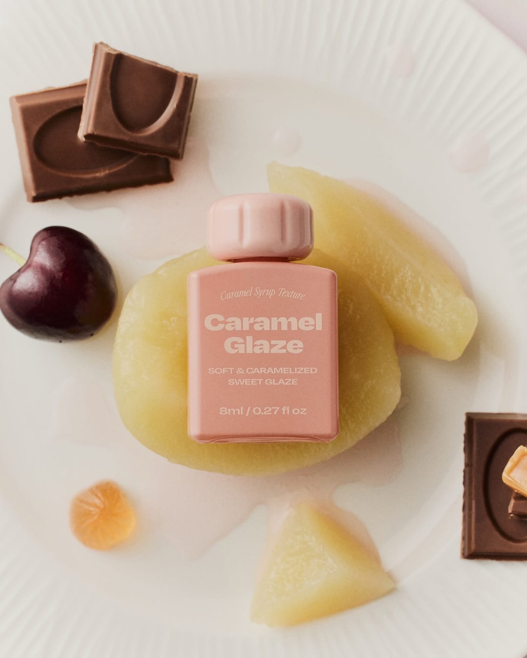
Concept-wise it's super tight: a sensual "caramel dessert meets beauty product" world, where everything feels edible, cozy, and a little luxurious at the same time. The compositions look pretty structured and graphic, with repeating product shapes, stacked bars, hands, shakers, fruit, so your eye moves in clear diagonals and clusters instead of chaos. Lighting feels like controlled studio work with soft but defined shadows that make the gloss, pearlescence, and "syrup" details pop without getting greasy, and the retouching is clean, pore-friendly, and very on-trend for Korean beauty photography.
From a brand alignment angle, it nails that niche: minimal sets, consistent color story (caramel, creams, warm browns, a few accent fruits), and typography that feels modern, so Alternative Stereo (@alternativestereo)'s line looks established and thought-through, not like random SKUs. Memorability is solid because the caramel-syrup visual language repeats across frames (fragrance, hand cream, makeup), so the whole thing reads like one little universe you'd recognize again on a feed.

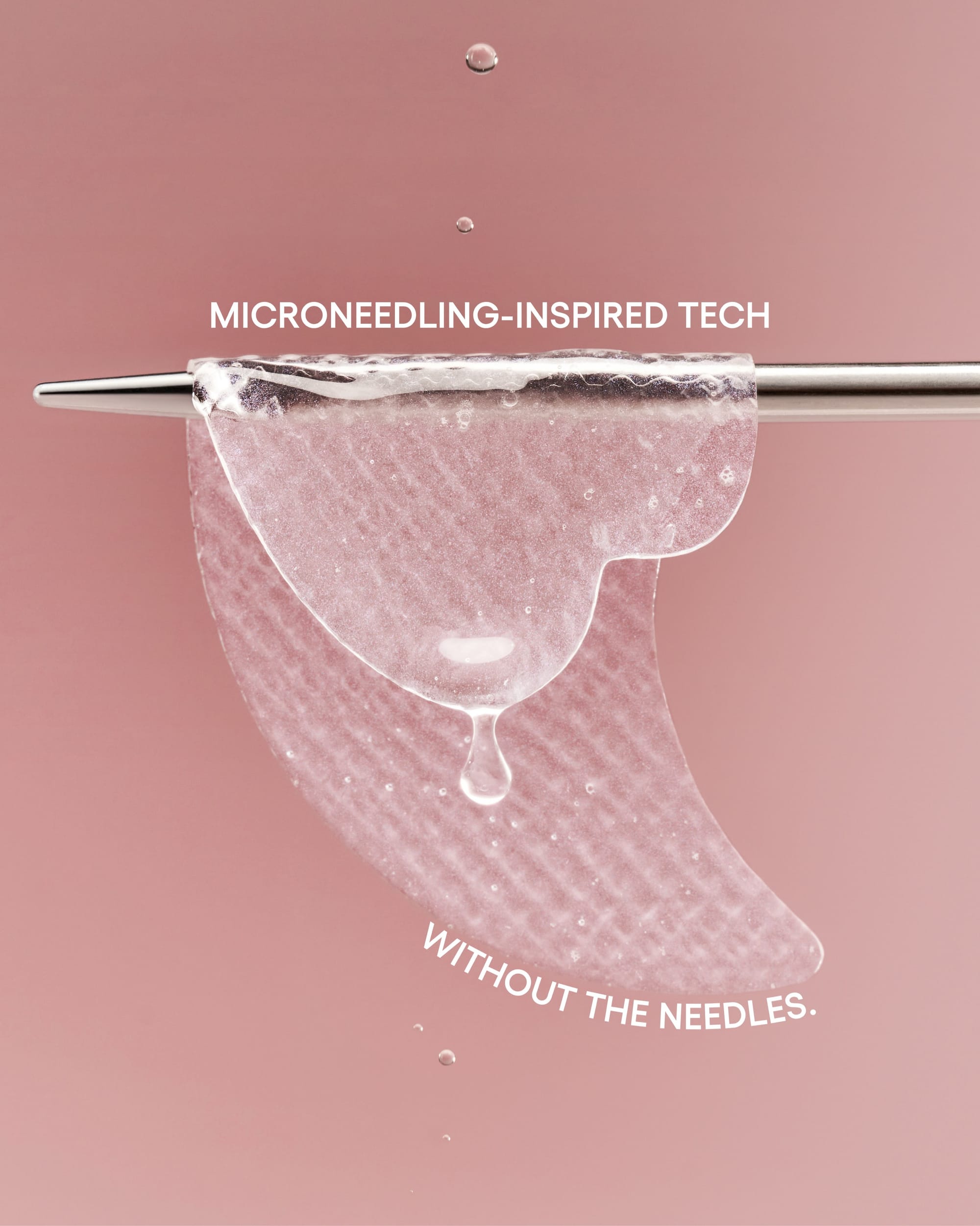 LANEIGE Bouncy & Firm patches1/4
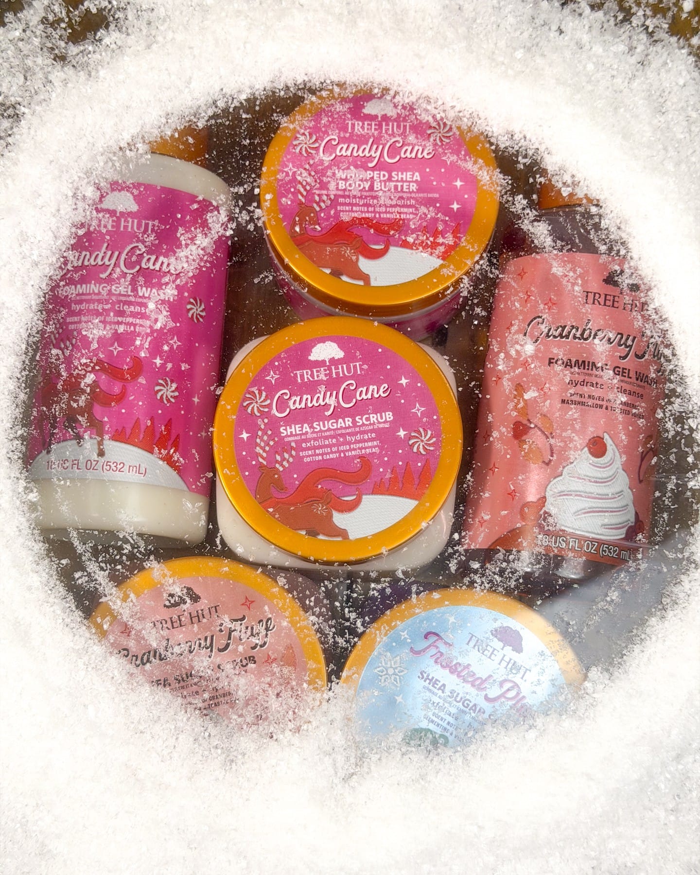 Tree Hut Fall 2026
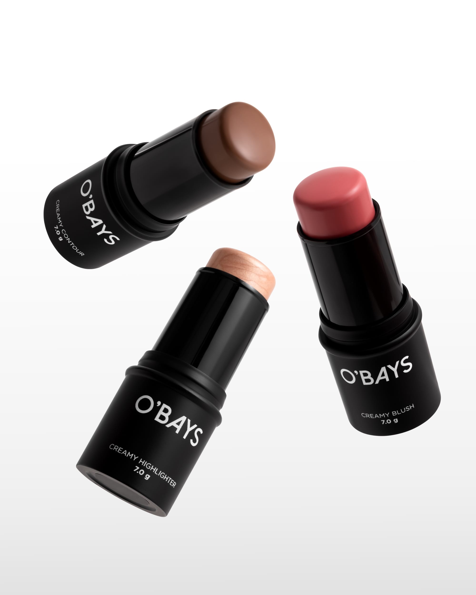 O'BAYS cosmetics1/3
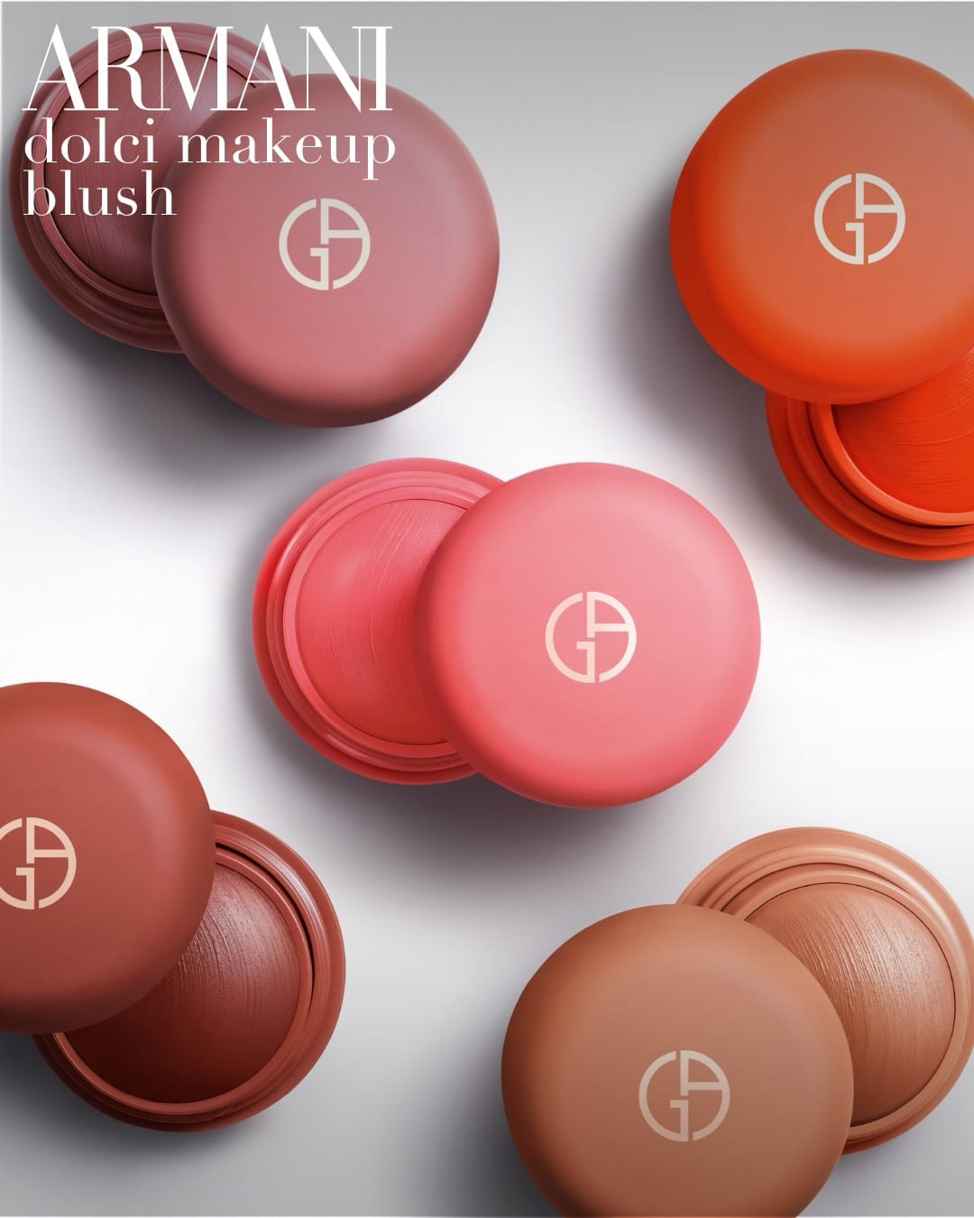 Armani Beauty blush compacts1/4
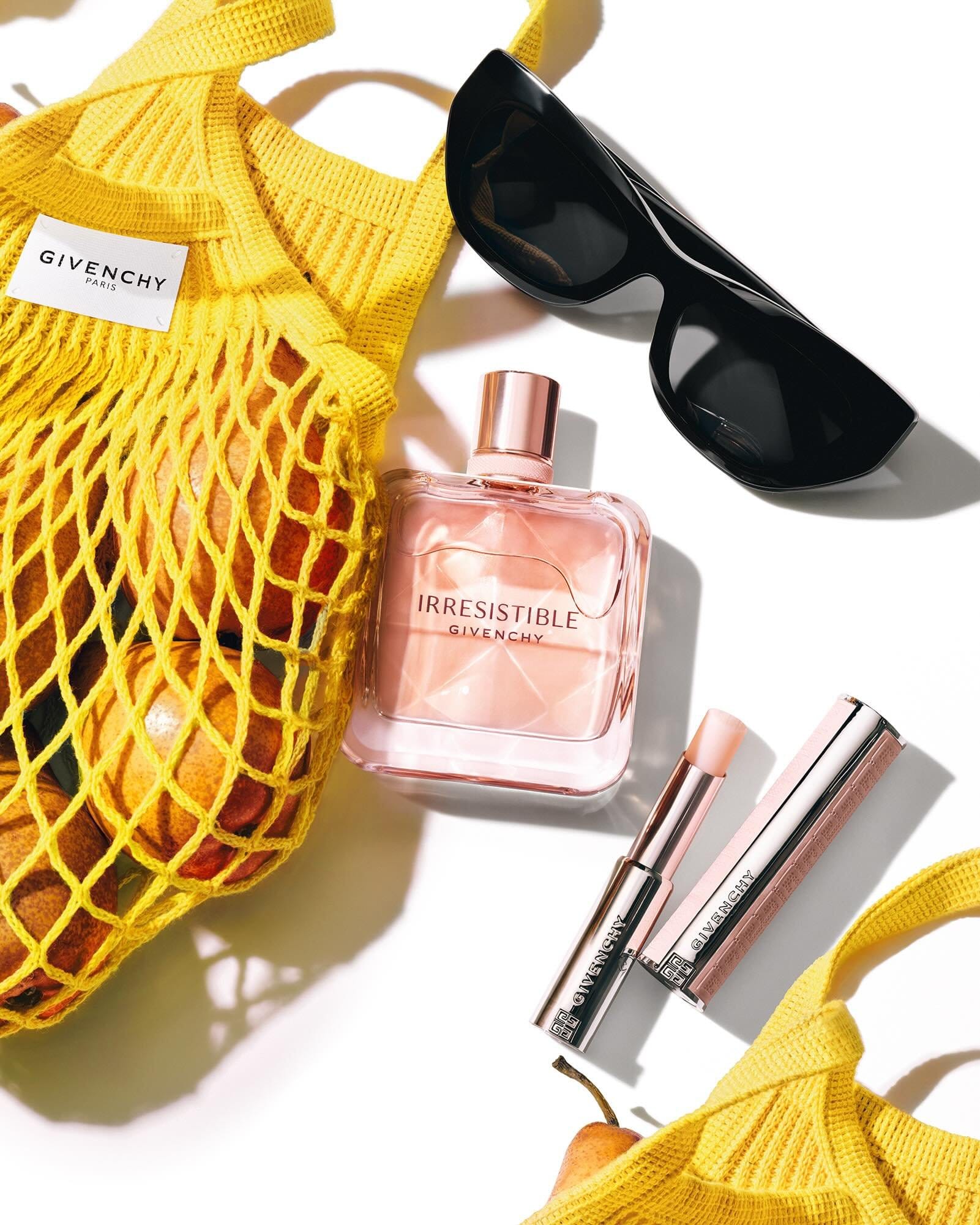 Givenchy beauty flat lay1/2
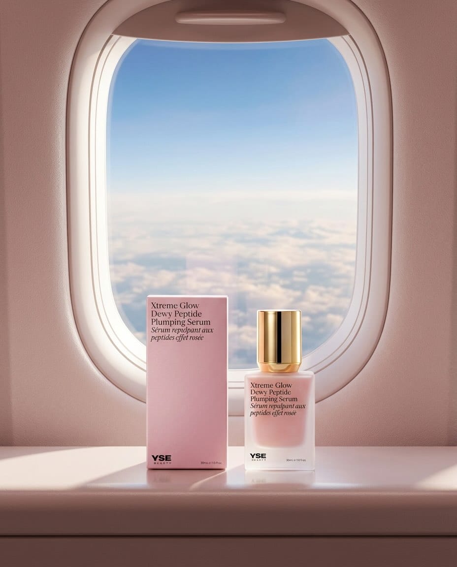 YSE Beauty's glow serum1/9
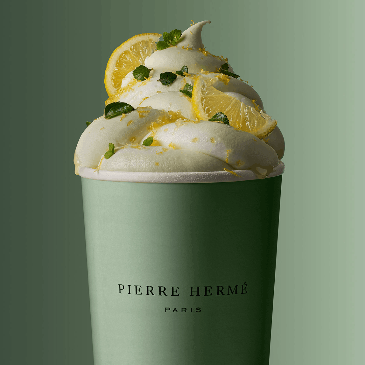 Pierre Hermé macarons1/6
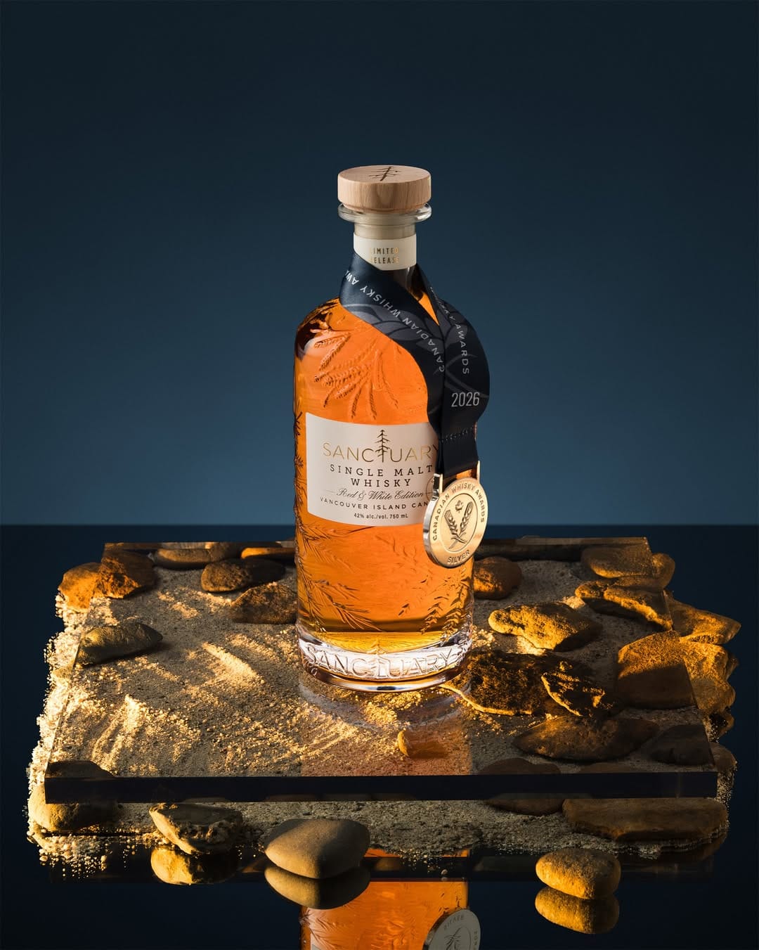 Sanctuary Whisky1/2
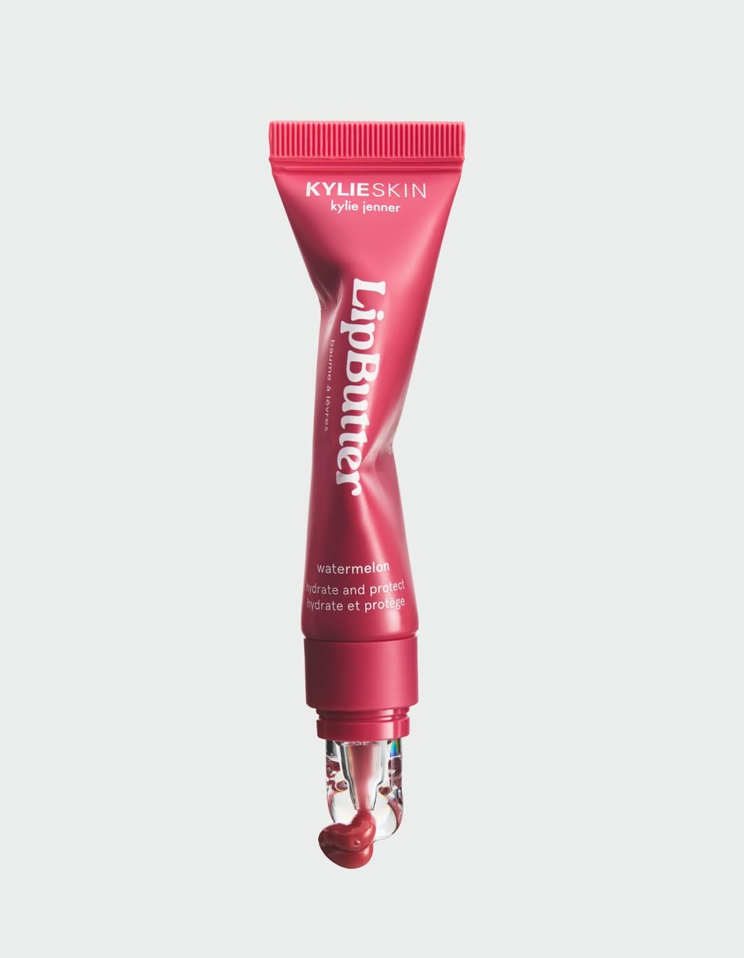 Kylie Cosmetics lip gloss1/3
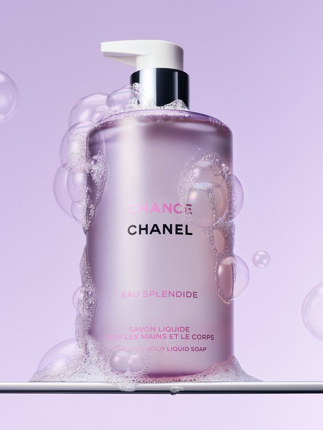 Chanel Chance Eau Splendide1/3
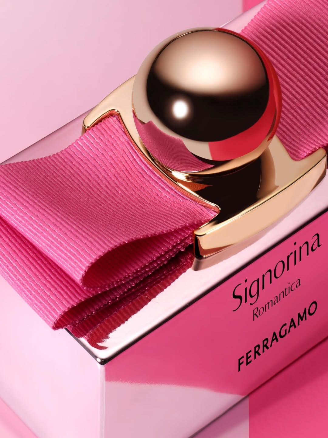 Ferragamo Signorina1/4
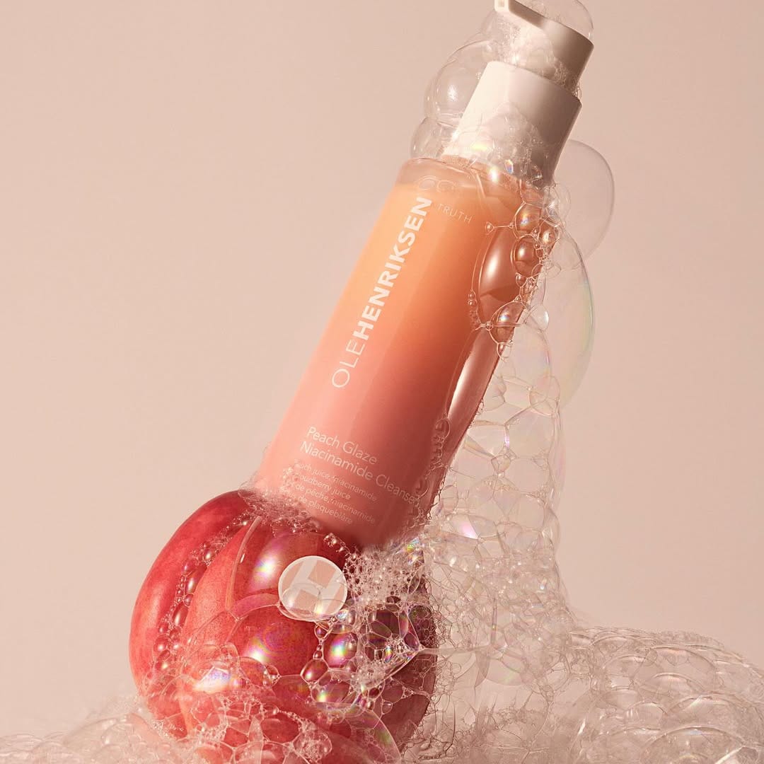 OLEHENRIKSEN Peach Glaze1/4