YSL Beauty Iced Cologne: Freeze-frame clarity and cool minimalism
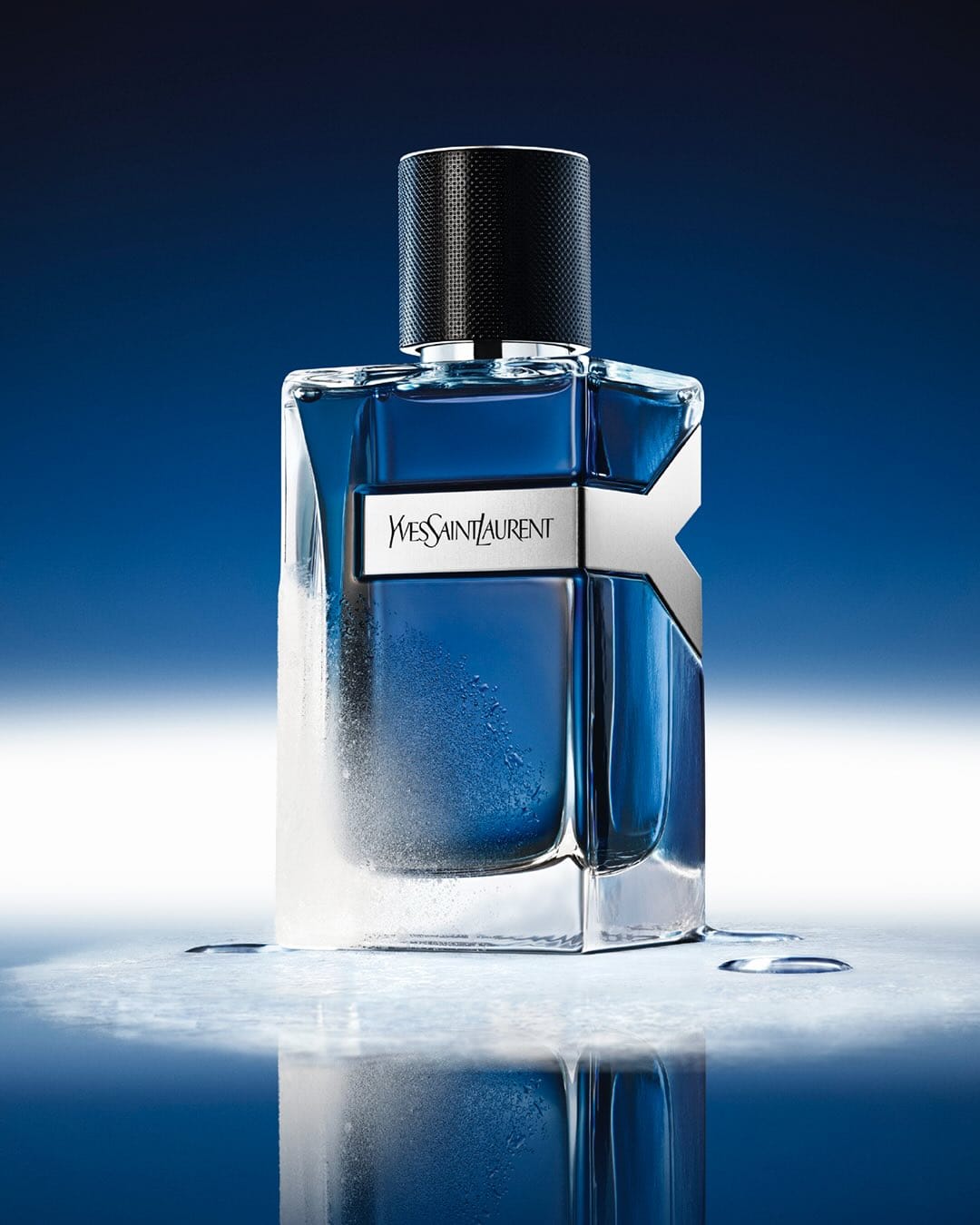

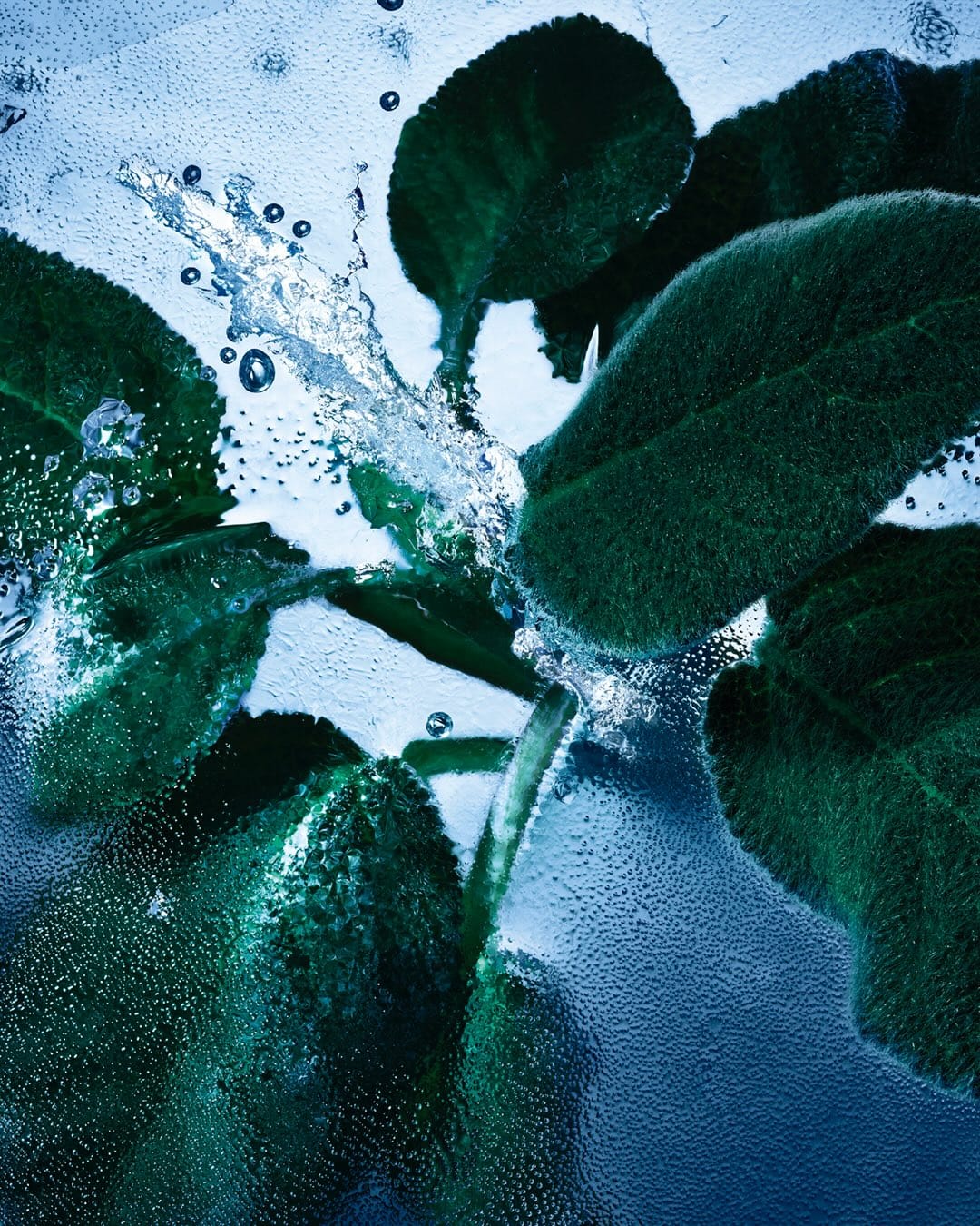
The post is built on a clear, simple idea: "freeze / icy mint that lasts." All the visual decisions are aimed at making that feeling read instantly at scroll-speed. [Category: Skincare] [Surface: Organic] [Lighting: Dramatic] [Style: Artistic] [Mood: Fresh] [Palette: Cool Tones]
The bottle and "Y" silhouette are treated as the main image, which keeps brand recognition strong for YSL Beauty (@yslbeauty)'s new Iced Cologne launch. The color direction leans into cool, icy tones that support the freshness story. Prop choices (ice, greens) stay focused and thematic, which is the right move for this kind of luxury fragrance work.
Pacifica's fragrance line: Playful pastels and product-dense composition
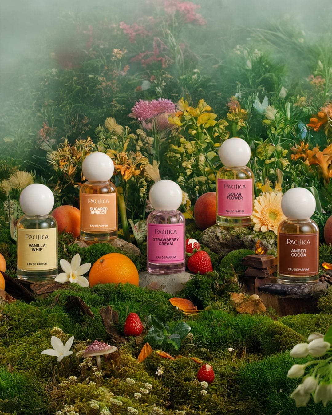
From a commercial photography perspective, this image is built around a dense, product-heavy composition that showcases the full fragrance line as a collection rather than focusing on individual bottles. The styling feels casual and slightly cluttered, which supports an accessible, mass-market positioning but sacrifices some visual hierarchy and luxury polish. Color-wise, it leans into a playful, pastel-driven palette that matches Pacifica (@pacificabeauty)'s Mood-Activating Fragrance scent names (vanilla, strawberry, apricot, cocoa, solar) and helps each SKU feel distinct while staying cohesive as a family. The lighting is soft and even, prioritizing legibility of labels and packaging over dramatic shadows, which works well for social feed performance but doesn't add much depth or dimensionality. Overall, it's an effective, high-impact thumbnail for Walmart and social retail contexts, but could be refined with stronger focal hierarchy, breathing space, and more intentional styling if the goal were a premium beauty launch. [Category: Fragrance] [Surface: Glass] [Lighting: Natural] [Style: Artistic] [Mood: Fresh] [Palette: Vibrant]
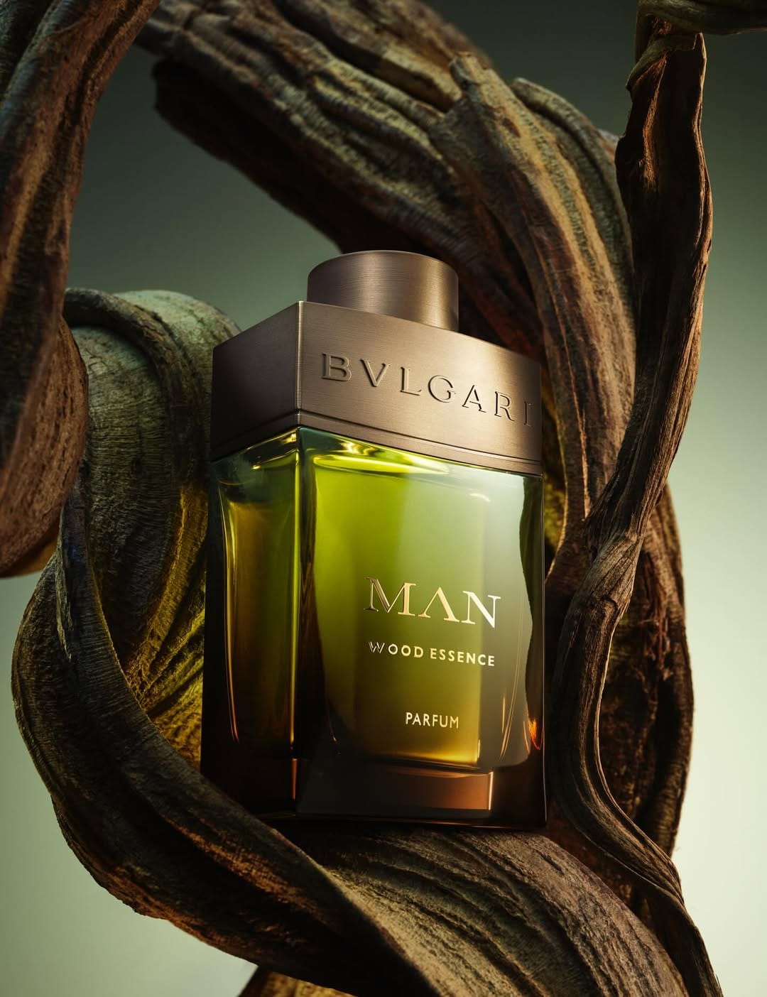
Bvlgari Man Wood Essence: Polished reflections and material contrast
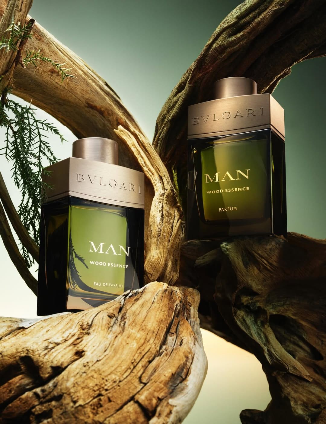

From a commercial photography angle, this shot by Stills & Strokes (@stillsandstrokes) is doing a lot of things right. The tight crop on the bottle and cap makes it feel premium and focused: this is the main object, no distractions. The typography and embossing on the glass and metal are clearly legible, which is crucial for a luxury brand where the logo and product name carry half the value. Lighting-wise, they're pushing that polished, harder light with defined reflections to emphasize glass, edges, and that wood-metal contrast, which matches the whole "Man / Wood Essence / Parfum" story. Jacob Sutton's fragrance work for Bvlgari (@bvlgari) reads expensive, confident, and very on brand for a designer launch. [Category: Fragrance] [Surface: Glass] [Lighting: Dramatic] [Style: Artistic] [Mood: Sophisticated] [Palette: Earth Tones]
Miu Miu fragrance: Clean glass work and floral-friendly lighting
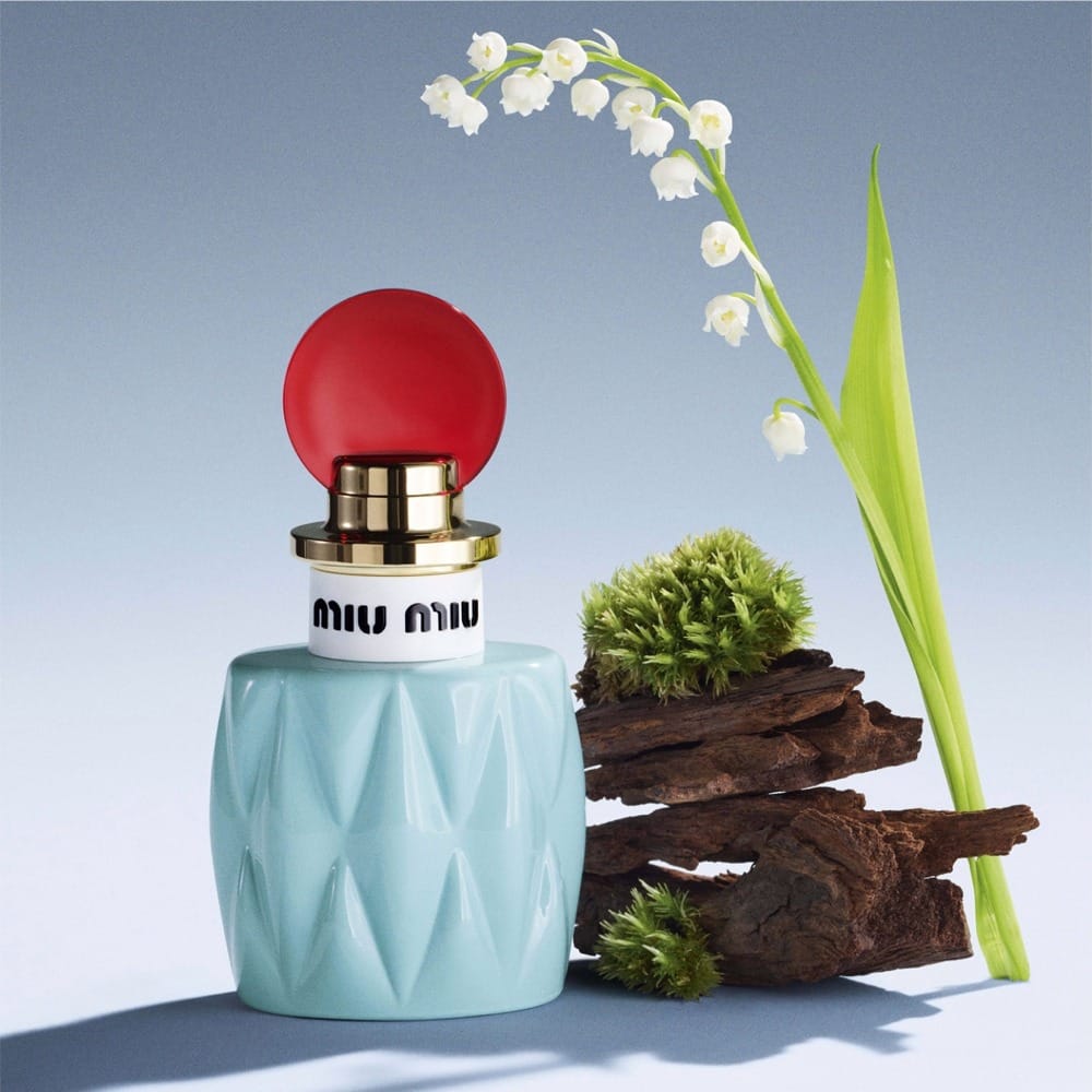
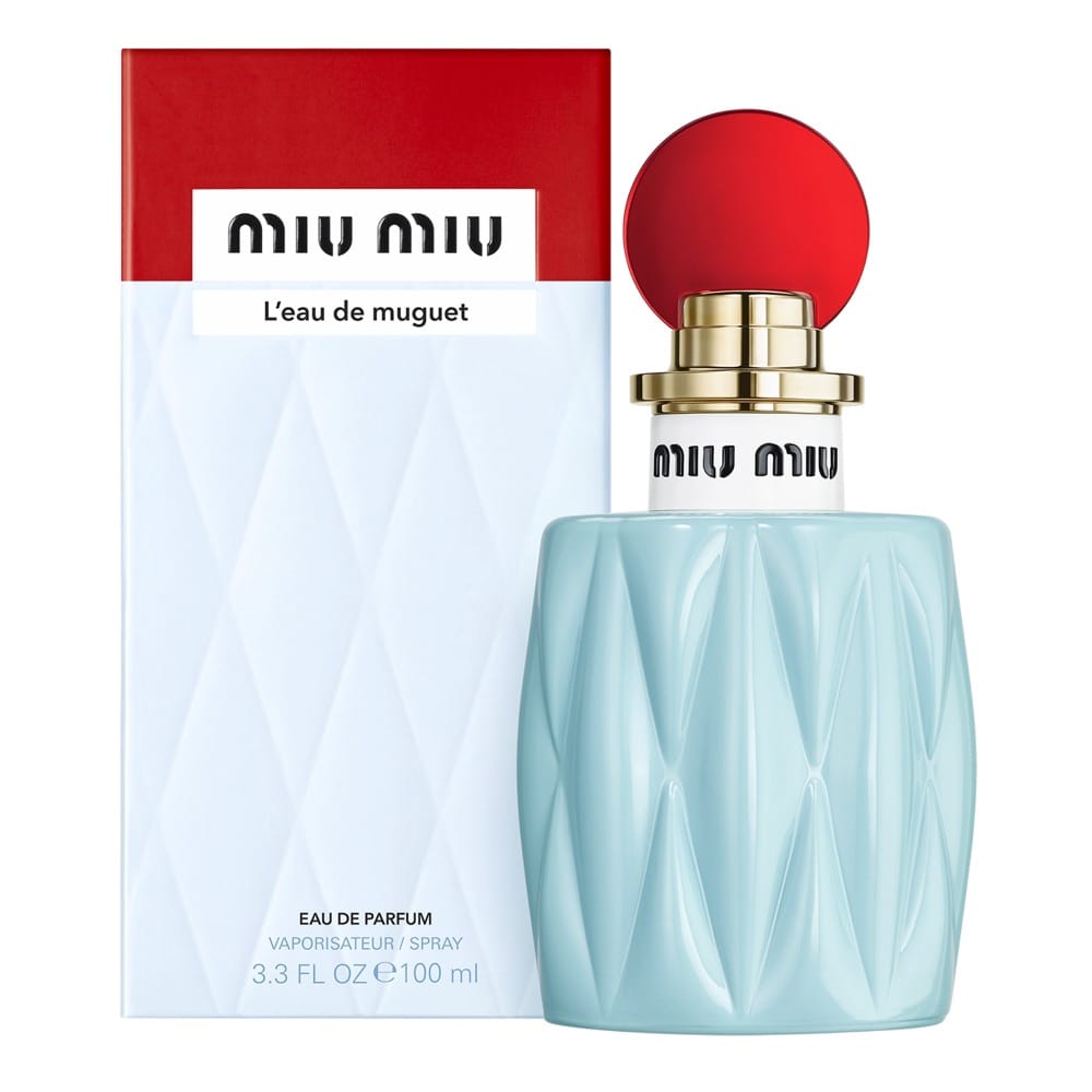
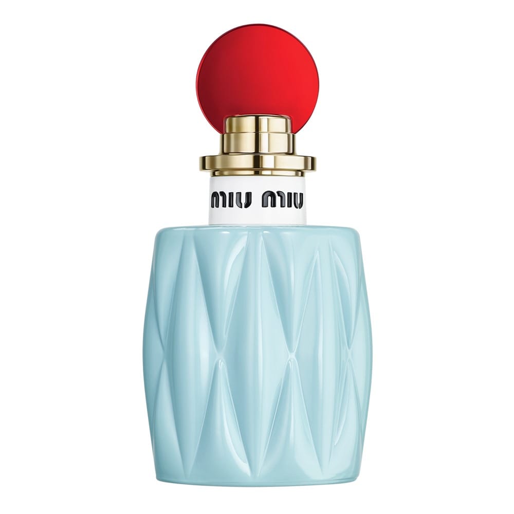
From a commercial standpoint, the concept is clear: a fresh, youthful, lily-of-the-valley story that matches the "joyfully floral" copy and feels very sellable. Composition-wise, the bottle takes center stage (as it should for a 30 ml EDP), and the framing feels straightforward and easy to read for social and online use. The lighting looks designed to keep things clean and polished, with enough contrast to show glass, facets, and liquid without killing the softness that a floral fragrance needs. Retouching seems focused on making the glass, label, and cap look flawless and crisp, so the viewer reads "premium designer fragrance" instantly. Overall it aligns well with Miu Miu (@miumiu)'s brand and fragrance retail aesthetic, but it's more functional than iconic. Memorable mostly as a solid, trustworthy product shot rather than a "wow, I can't stop thinking about that image" moment. [Category: Fragrance] [Surface: Glass] [Lighting: Studio] [Style: Editorial] [Mood: Sophisticated] [Palette: Pastels]
Alternative Stereo: Caramel-inspired aesthetic for Korean indie beauty
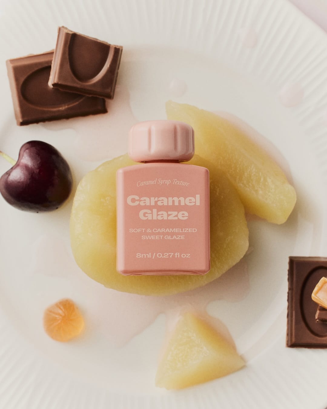
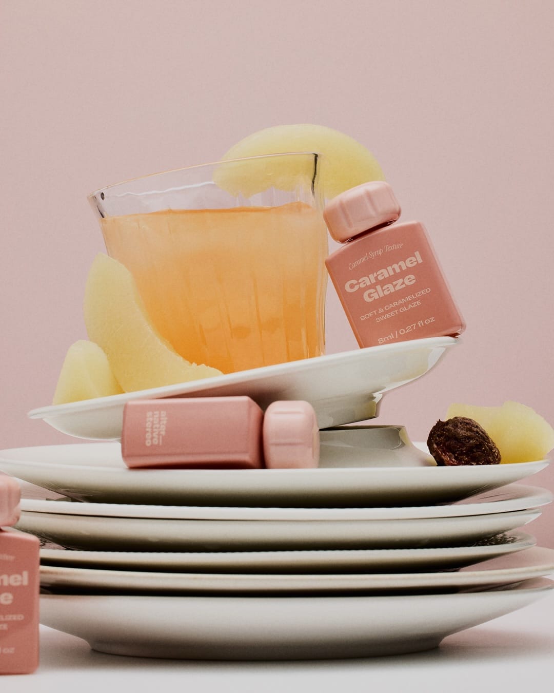
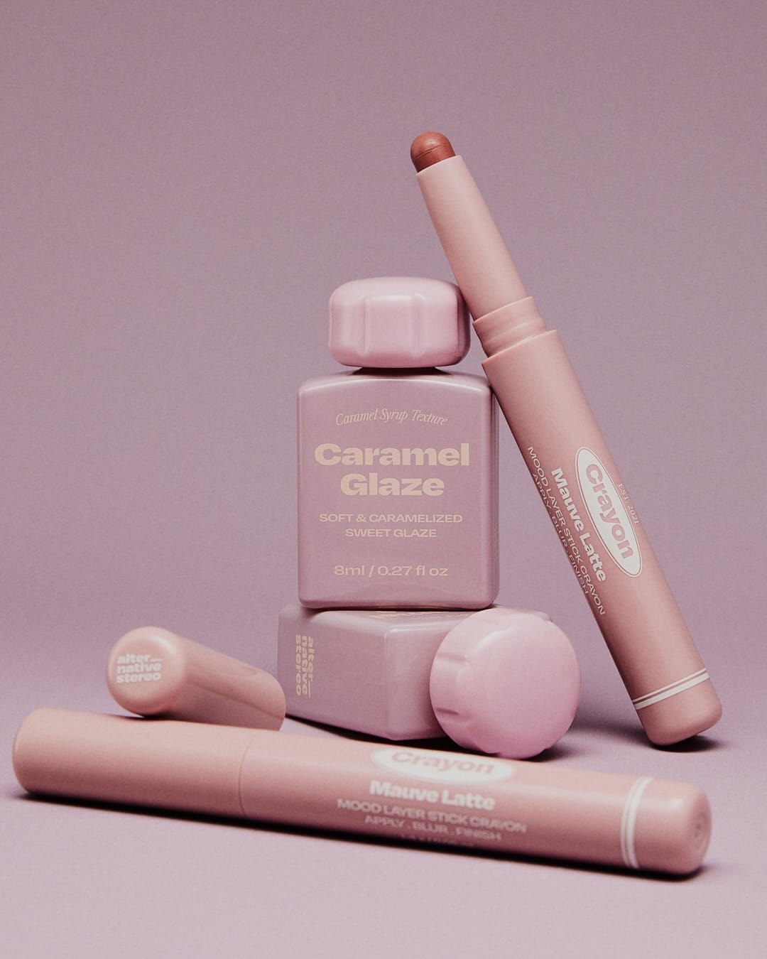
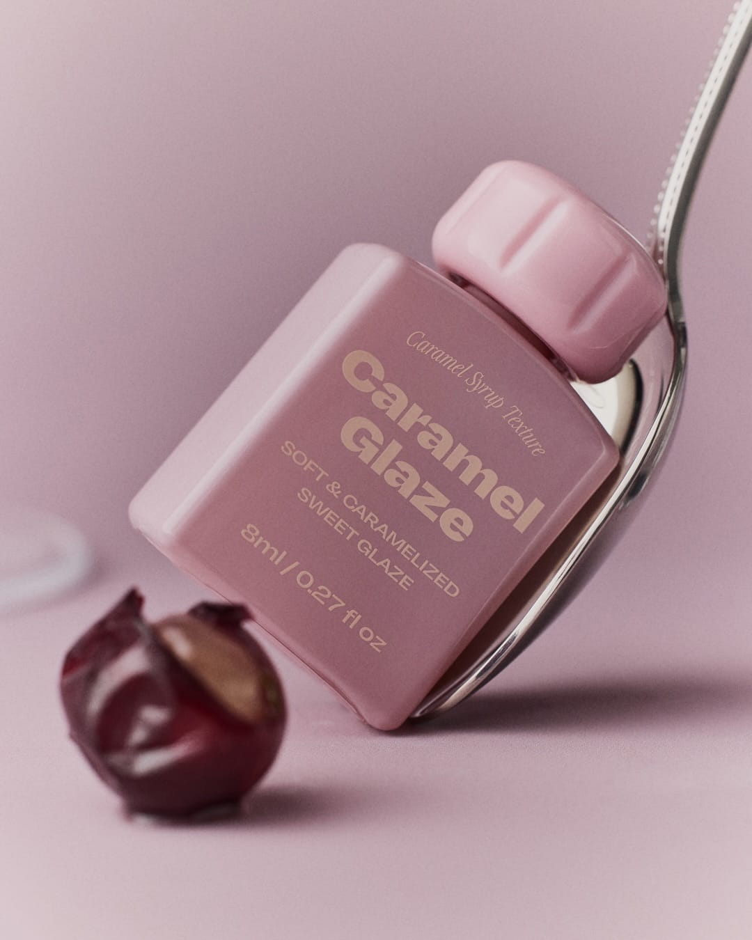
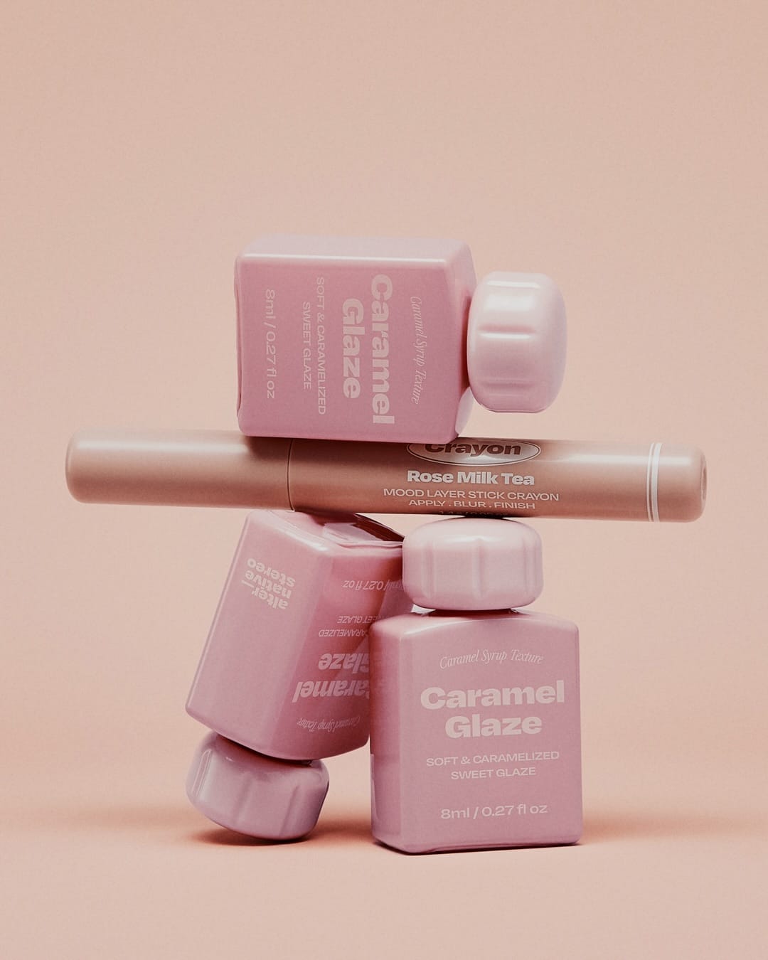
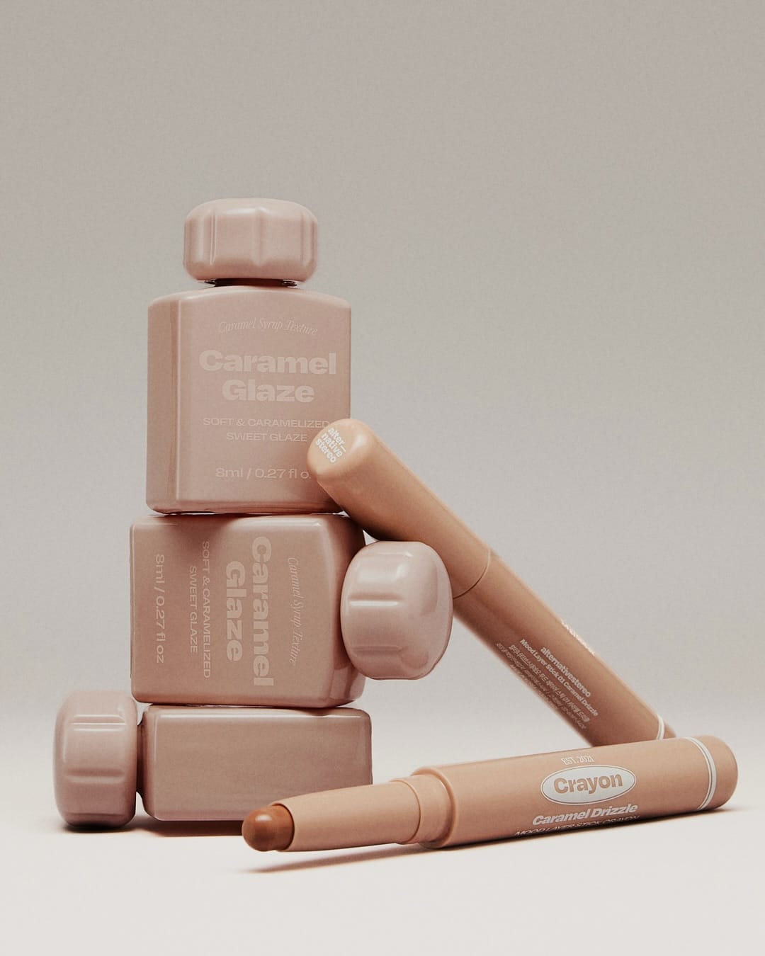
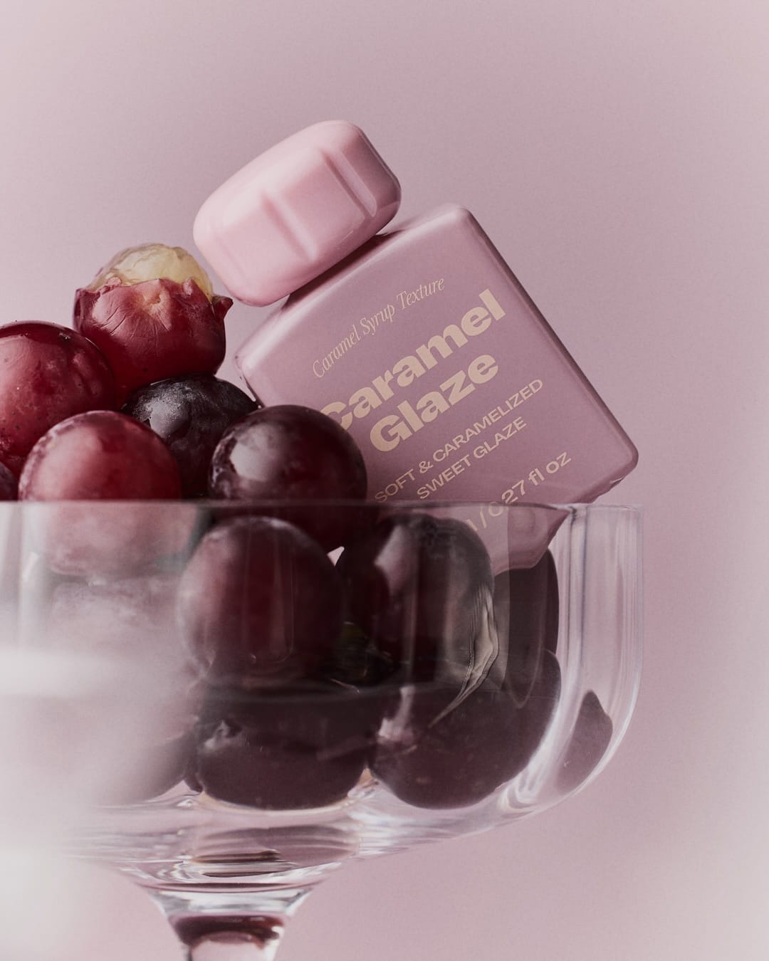
Concept-wise it's super tight: a sensual "caramel dessert meets beauty product" world, where everything feels edible, cozy, and a little luxurious at the same time. The compositions look pretty structured and graphic, with repeating product shapes, stacked bars, hands, shakers, fruit, so your eye moves in clear diagonals and clusters instead of chaos. Lighting feels like controlled studio work with soft but defined shadows that make the gloss, pearlescence, and "syrup" details pop without getting greasy, and the retouching is clean, pore-friendly, and very on-trend for Korean beauty photography. [Category: Food] [Surface: Plastic] [Lighting: Soft] [Style: Artistic] [Mood: Sophisticated] [Palette: Pastels]
From a brand alignment angle, it nails that niche: minimal sets, consistent color story (caramel, creams, warm browns, a few accent fruits), and typography that feels modern, so Alternative Stereo (@alternativestereo)'s line looks established and thought-through, not like random SKUs. Memorability is solid because the caramel-syrup visual language repeats across frames (fragrance, hand cream, makeup), so the whole thing reads like one little universe you'd recognize again on a feed.
About the Author
Elina is a Ukrainian-Canadian commercial photographer based in Vancouver, British Columbia.
Get in touch
Instagram: @elina.kustlyvy
X (Twitter): @elinakustlyvy
Photographers: If I've featured your work and you'd like a credit or to be tagged, DM me your details. I'm happy to update and showcase your name.