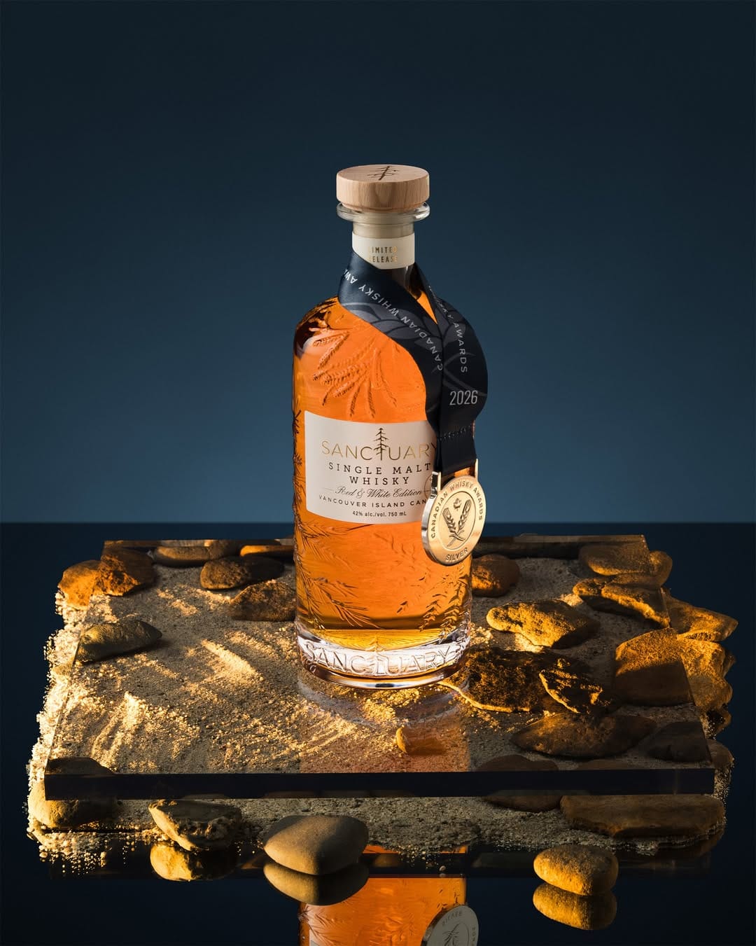
Sanctuary Whisky
When gorgeous colors can't overcome compositional chaos
I saw this photo as an ad on Instagram. My first reaction was: wow, beautiful rich colors. But my eye didn't stay on the bottle long enough to read what the product was. It immediately got distracted by a very busy bottom of the frame. There's too much going on: mirror surface, sand, rocks, acrylic platform, and all of this shot with hard "sunset" light. It's way too busy. So even though the photo looks gorgeous, it failed to sell. The second photo is definitely better as a main image for Sanctuary Whisky (@sanctuarywhisky)'s 2026 Signature Edition release.