Chanel, Lancôme, Skoah, Pierre Hermé, and Sanctuary Whisky Product Photography Reviewed: What These Shots Get Right and Wrong
Here's an honest breakdown of what's working, what isn't, and what separates strategic commercial photography from shots that just look pretty.
Chanel Hydra Beauty: Strategic water droplets and triangular composition
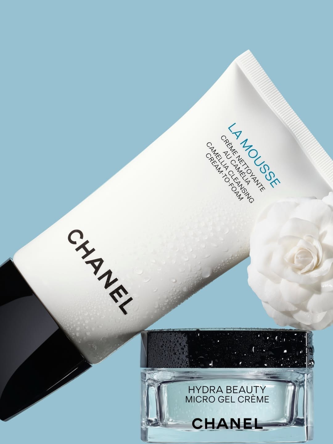
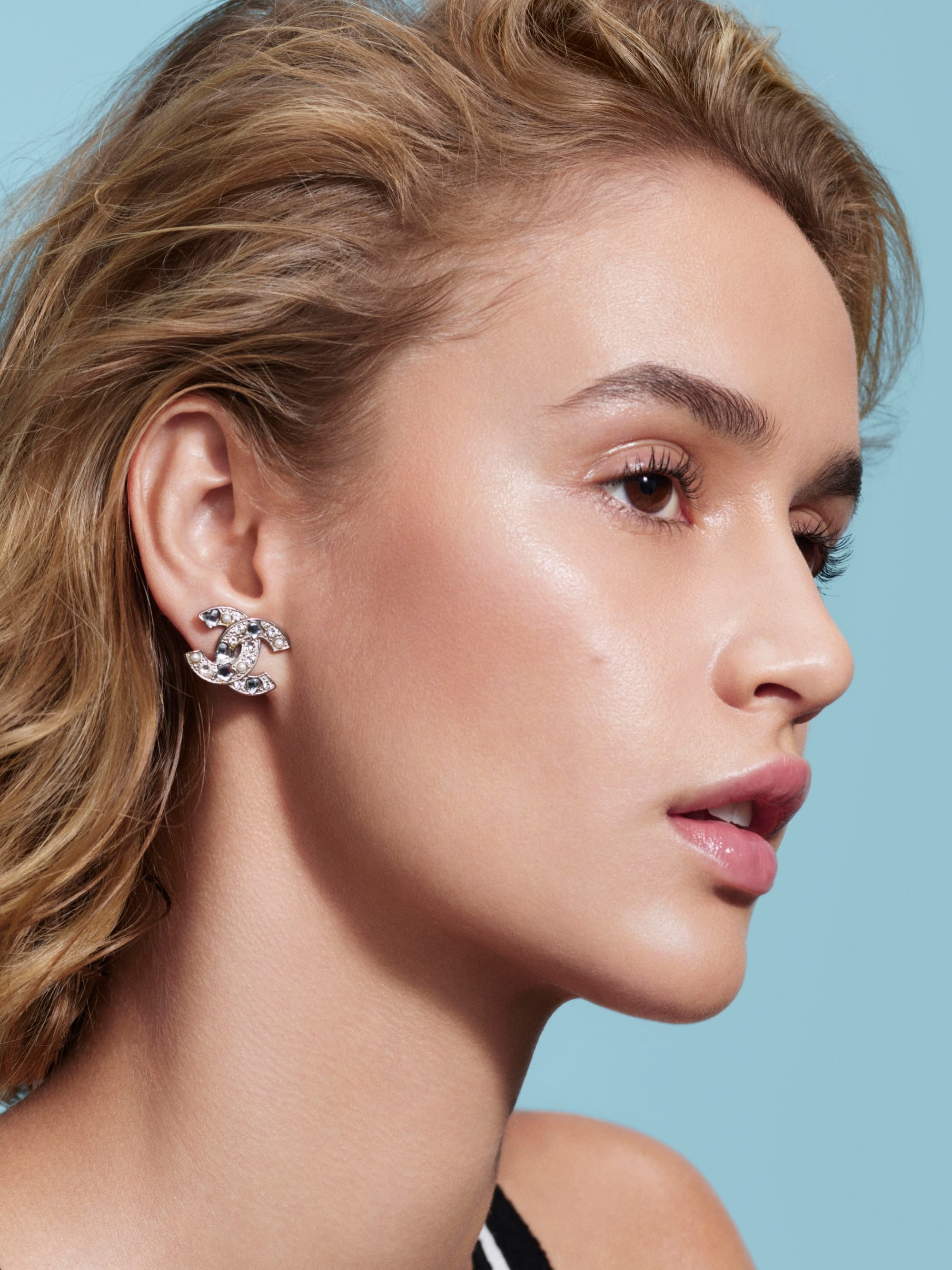
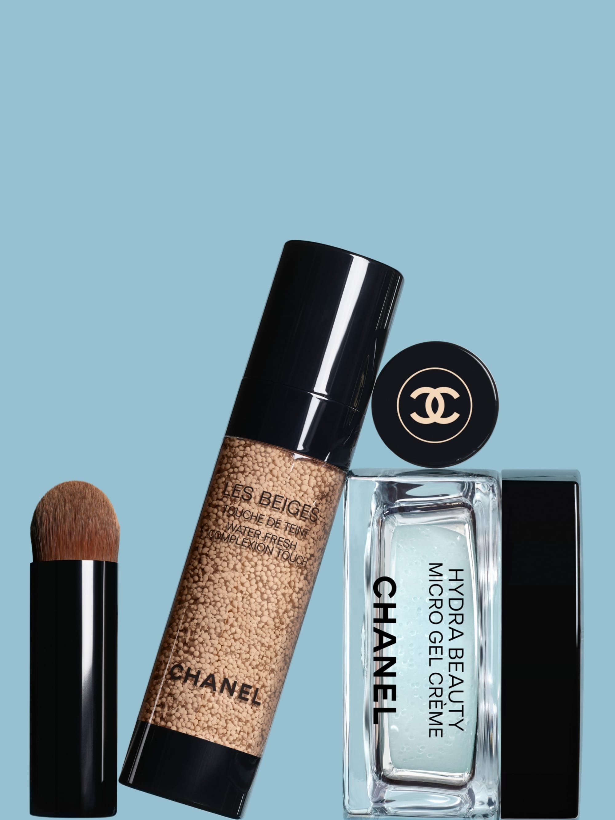
This shot pairs Chanel (@chanel.beauty) La Mousse Camellia cleanser and Hydra Beauty moisturizer, shot by Valentin Bouquio (@valentinbouquio), in a composition that immediately reads as intentional. The triangular arrangement creates a sense of stability and trust, while the diagonal placement of the tube introduces just enough dynamism to keep the eye moving.
Water droplets are used as a rhythmic element throughout the frame, but with careful restraint. They appear only on the lower portion of the tube, leaving the cap clean. It's a small decision with a big impact: letting the droplets creep higher would have cluttered the packaging and pulled focus away from the product itself.
The lighting does a lot of heavy lifting here. Hard light from the top left, positioned slightly behind the products, sculpts the packaging and makes each water droplet pop with dimension. A soft fill from the opposite side prevents the shadows from going too deep, keeping the image feeling luminous rather than dramatic. A mirror appears to be in the mix as well, likely responsible for the crisp specular highlights, along with a secondary source that picks up the beautiful reflection sitting in the black cap.
Lancôme anti-age: Wide-angle lenses and intentional imperfection
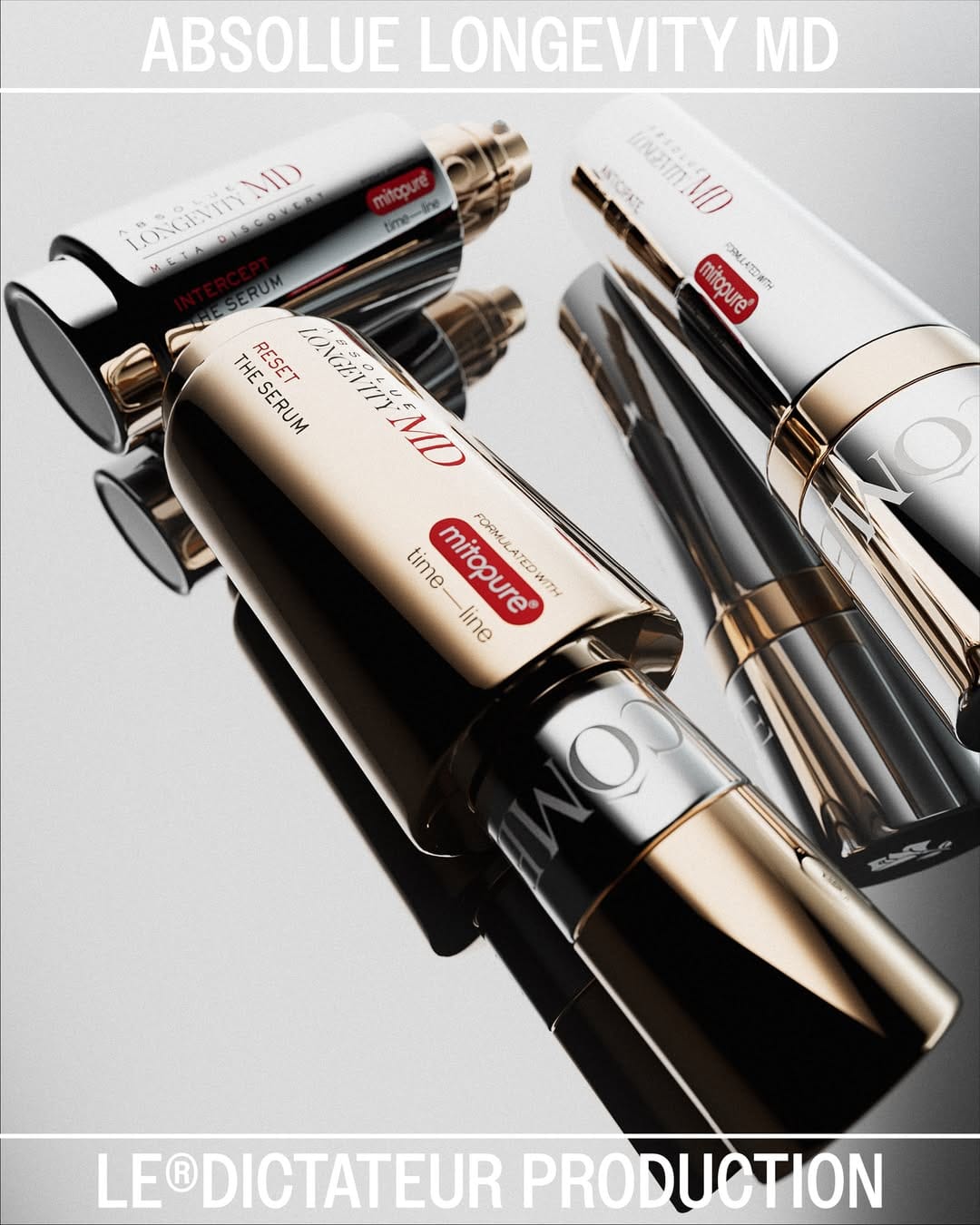
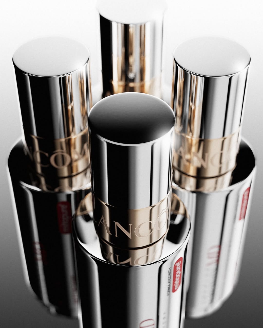
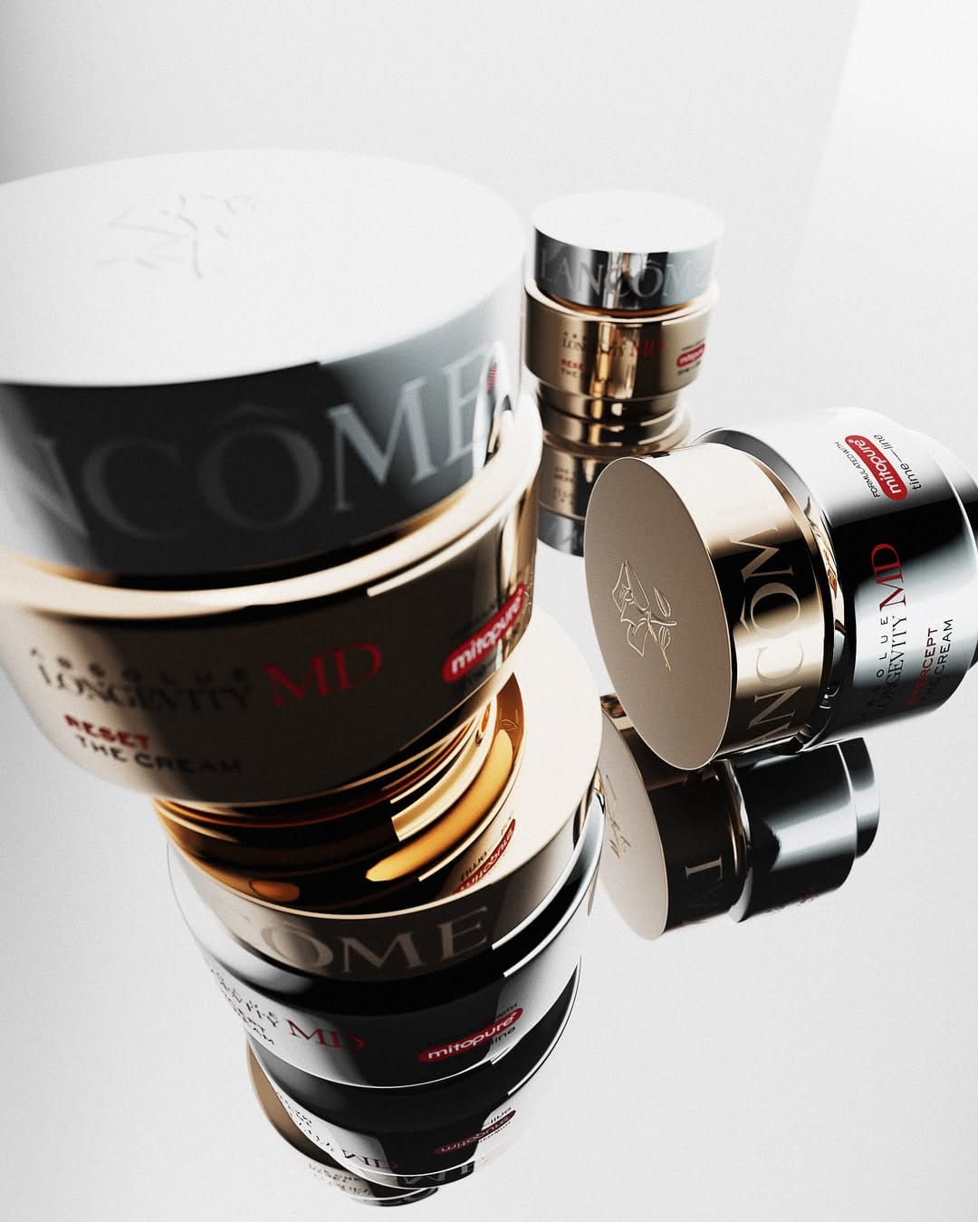
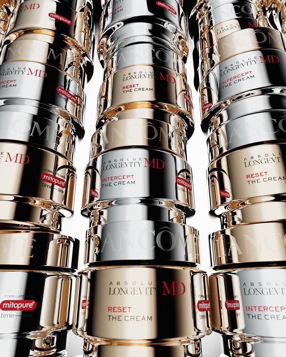
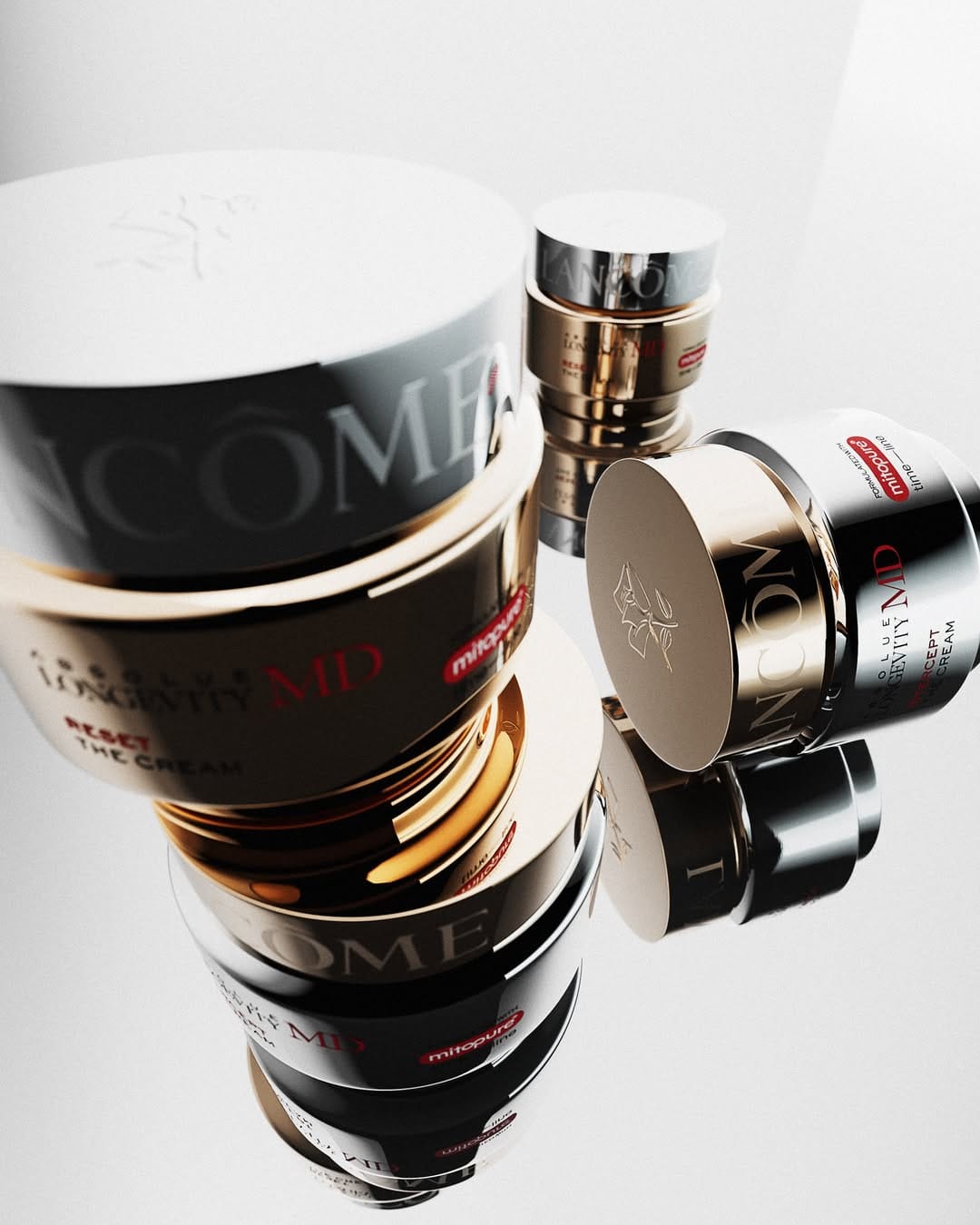
These Lancôme (@lancomeofficial) anti-age launch photos by
Le Dictateur Studio (@ledictateurstudio) are stunning. The entire series was shot on a wide-angle lens, possibly a probe lens, which immediately sets them apart from the controlled flatness of typical beauty product photography.
What stands out just as much as the compositions is the retouching approach. There's an intentional imperfection to the finish that gives the images a livelier, more energetic quality. It feels deliberate rather than overlooked, and it pays off. For an anti-age campaign, leaning into that looseness makes conceptual sense too: the wide angles, the dynamic framing, and the slightly raw retouching all work together to communicate youthfulness, vitality, and something quietly rebellious. The aesthetic mirrors the feeling the product is presumably trying to sell.
Skoah Tonik trio: When styling misses the brand mark
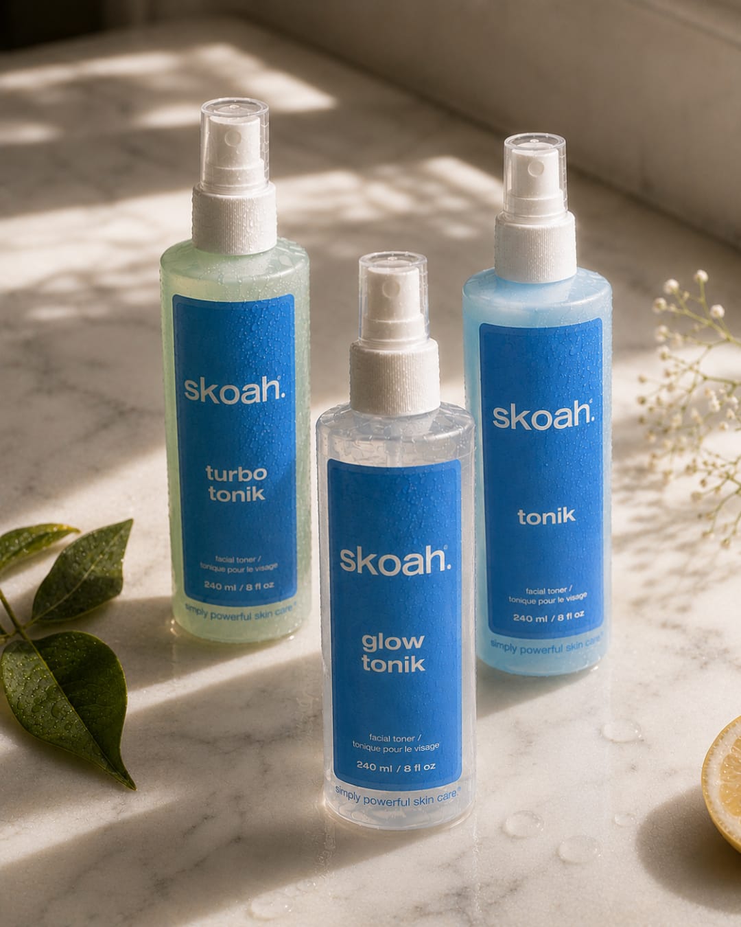
This is a shot of Skoah (@skoah)'s Tonik trio. It's an AI photo, but let's not even focus on that. The whole vibe works against the brand. Props, marble table, dirty warm color grading: all cluttered and off for a line that's supposed to emphasize fresh, hydrating toners. Skoah built its reputation on clean, expert-driven facials and Canadian-made skincare. This styling doesn't reflect any of that.
Pierre Hermé macarons: Strategic editing for brand focus
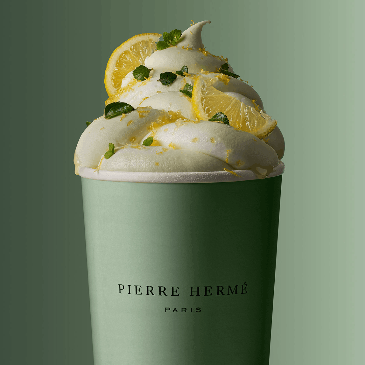
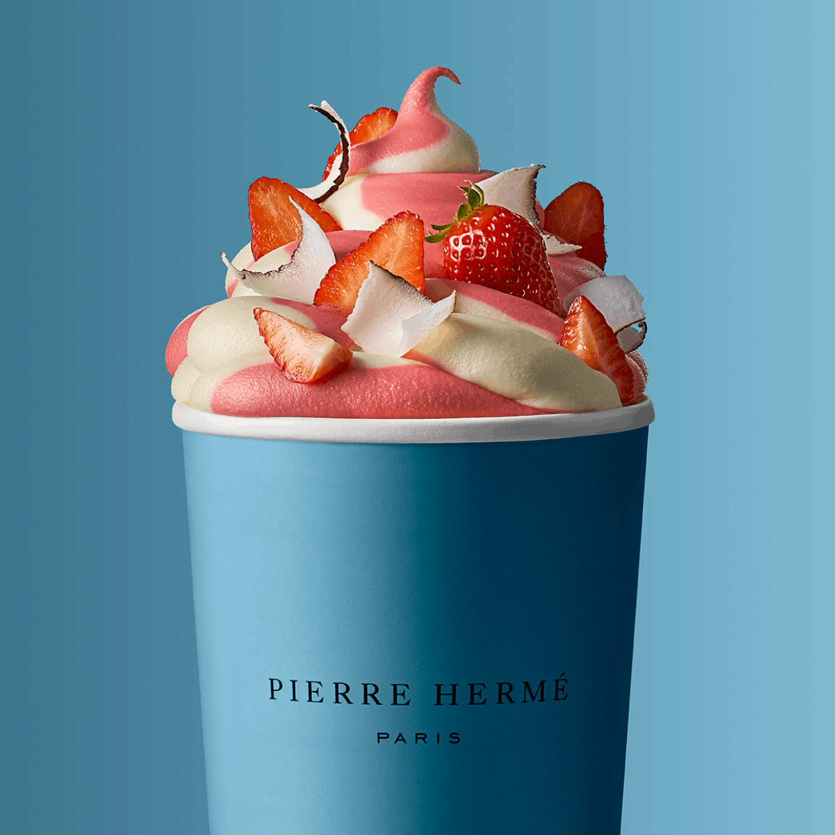
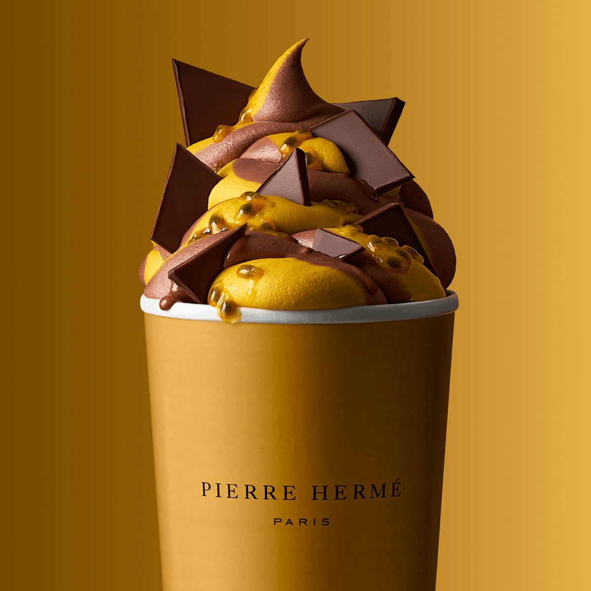
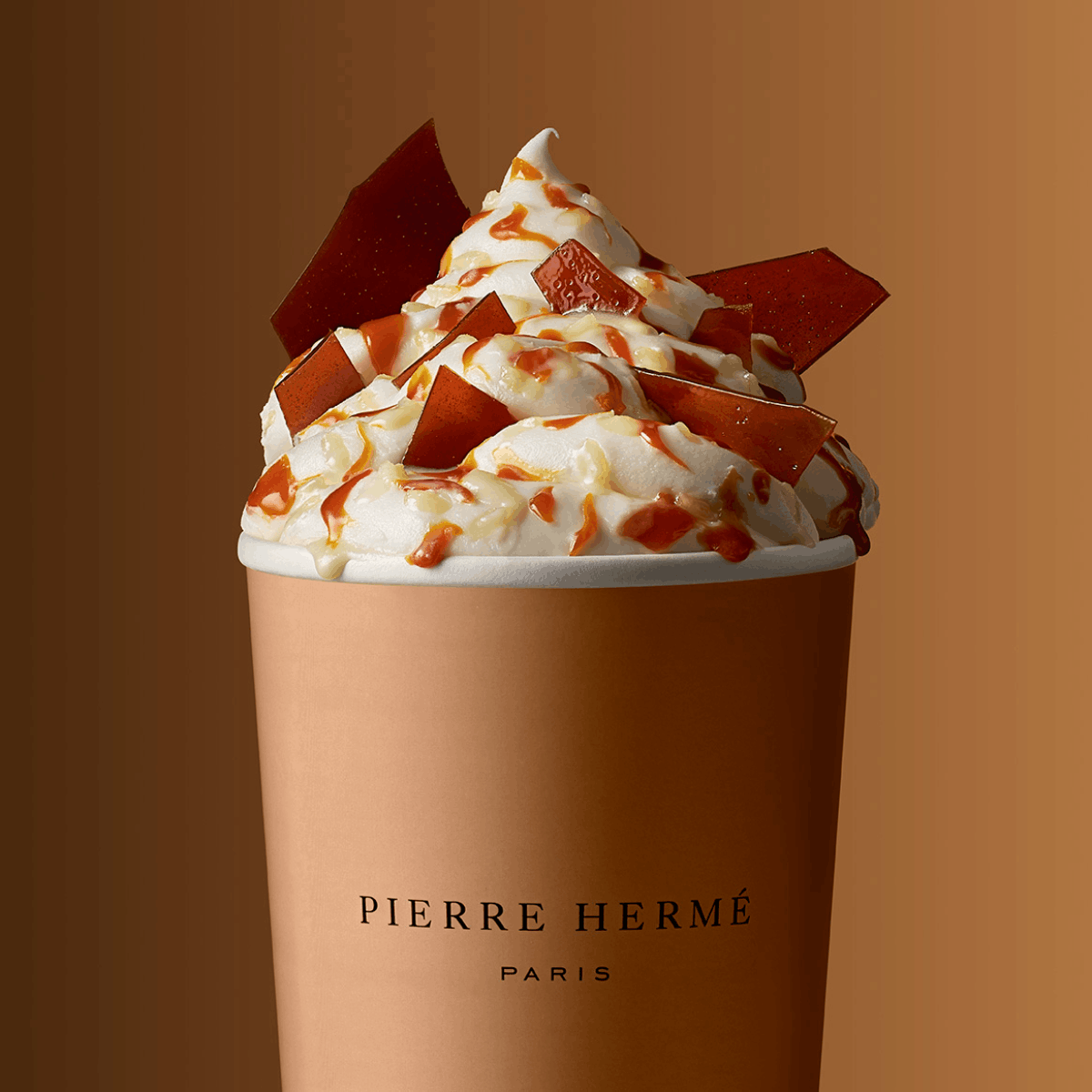
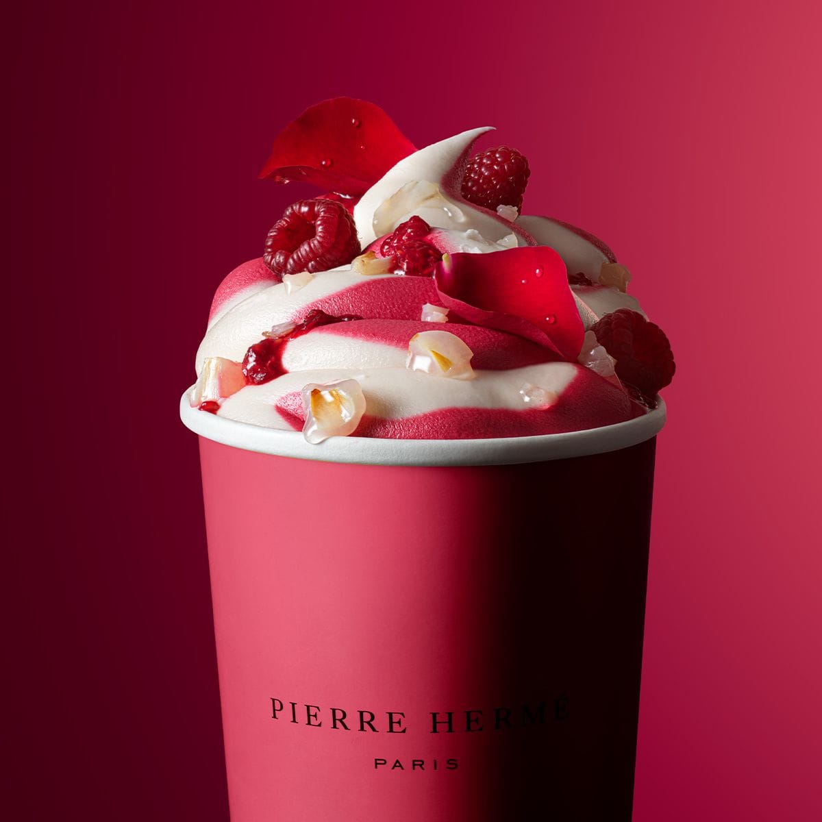
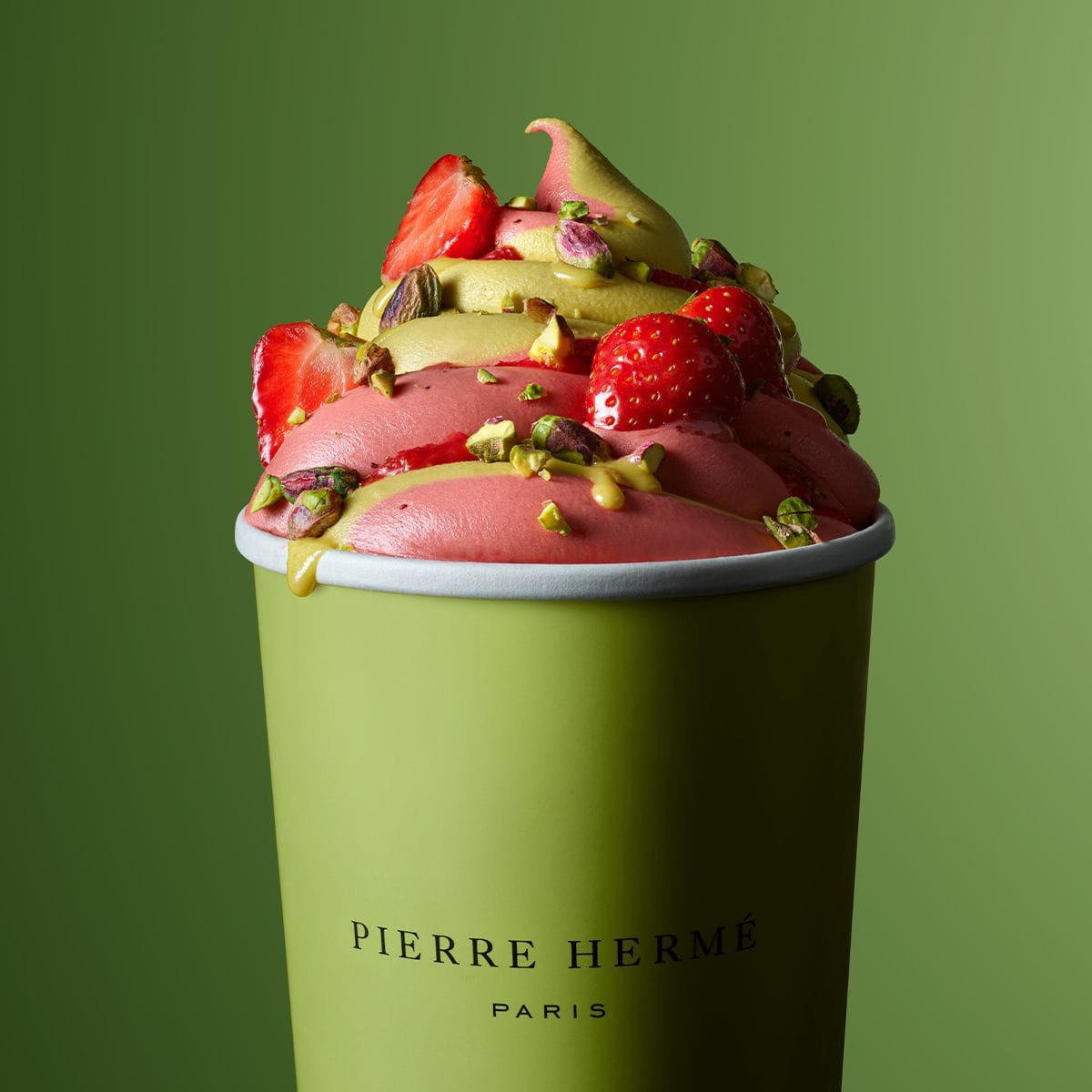
Iconic Pierre Hermé (@pierrehermeofficial) imagery by Laurent Fau (@laurentfau). Central composition makes the most sense here, and the styling is always on point. One thing I want to focus on is the editing. Even though the light is soft, the whites are usually always brighter, especially on top since the light is stronger. Here they did a very smart thing by lowering them down, and by doing so the focus went back to the logo. This is a very smart and strategic move, and it's exactly what separates strategic commercial shots from just pretty ones.
Sanctuary Whisky: When gorgeous colors can't overcome compositional chaos
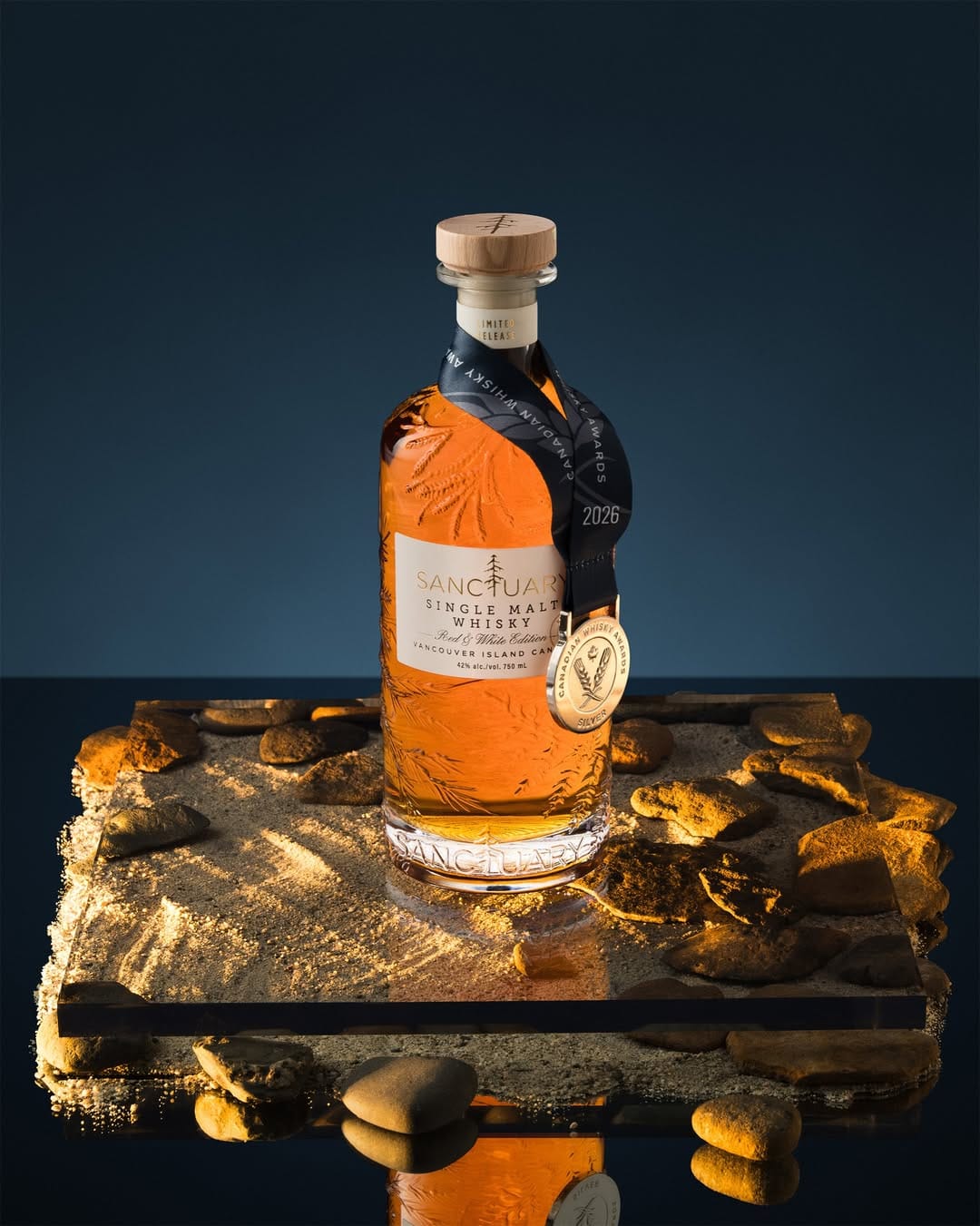
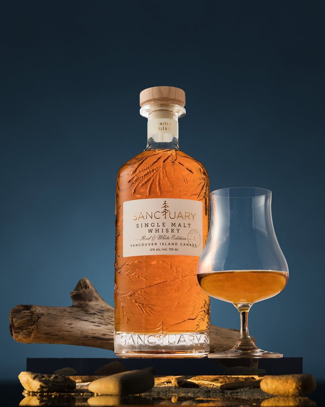
I saw this photo as an ad on Instagram. My first reaction was: wow, beautiful rich colors. But my eye didn't stay on the bottle long enough to read what the product was. It immediately got distracted by a very busy bottom of the frame. There's too much going on: mirror surface, sand, rocks, acrylic platform, and all of this shot with hard "sunset" light. It's way too busy. So even though the photo looks gorgeous, it failed to sell. The second photo is definitely better as a main image for Sanctuary Whisky (@sanctuarywhisky)'s 2026 Signature Edition release.
About the Author
Elina is a Ukrainian-Canadian commercial photographer based in Vancouver, British Columbia.
Get in touch
Instagram: @elina.kustlyvy
X (Twitter): @elinakustlyvy
Images are shown for criticism and review and remain the property of their owners. The Shot List is independent and not affiliated with any brand featured. If you worked on one of these images, use “Claim this shot” on its page or email [email protected].
Get the next issue
New reviews of beauty and fragrance photography, in your inbox every week.