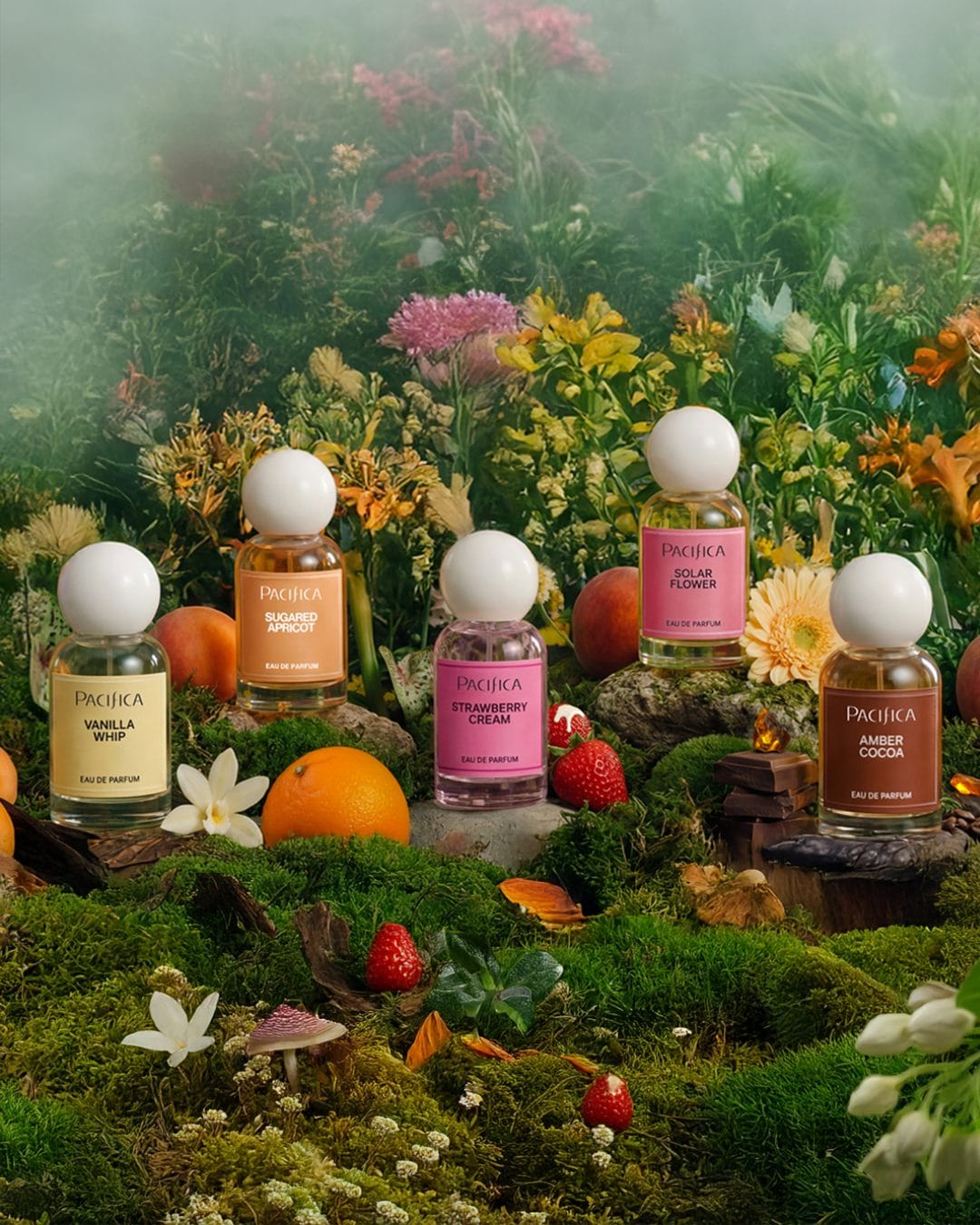
Pacifica's fragrance line
Playful pastels and product-dense composition
From a commercial photography perspective, this image is built around a dense, product-heavy composition that showcases the full fragrance line as a collection rather than focusing on individual bottles. The styling feels casual and slightly cluttered, which supports an accessible, mass-market positioning but sacrifices some visual hierarchy and luxury polish. Color-wise, it leans into a playful, pastel-driven palette that matches Pacifica (@pacificabeauty)'s Mood-Activating Fragrance scent names (vanilla, strawberry, apricot, cocoa, solar) and helps each SKU feel distinct while staying cohesive as a family. The lighting is soft and even, prioritizing legibility of labels and packaging over dramatic shadows, which works well for social feed performance but doesn't add much depth or dimensionality. Overall, it's an effective, high-impact thumbnail for Walmart and social retail contexts, but could be refined with stronger focal hierarchy, breathing space, and more intentional styling if the goal were a premium beauty launch.