Tom Ford, MAC, YSL, NYX, and Dolce&Gabbana Beauty: What Works and What Doesn't in Recent Product Photography
From concept-to-execution sprints to liquid rendering missteps, this roundup examines what works and what doesn't across recent luxury and mass beauty campaigns.
Tom Ford fragrance photography: Warm amber tones and ingredient styling
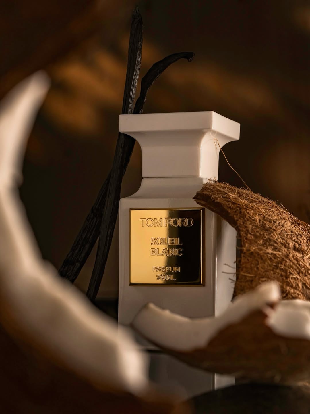

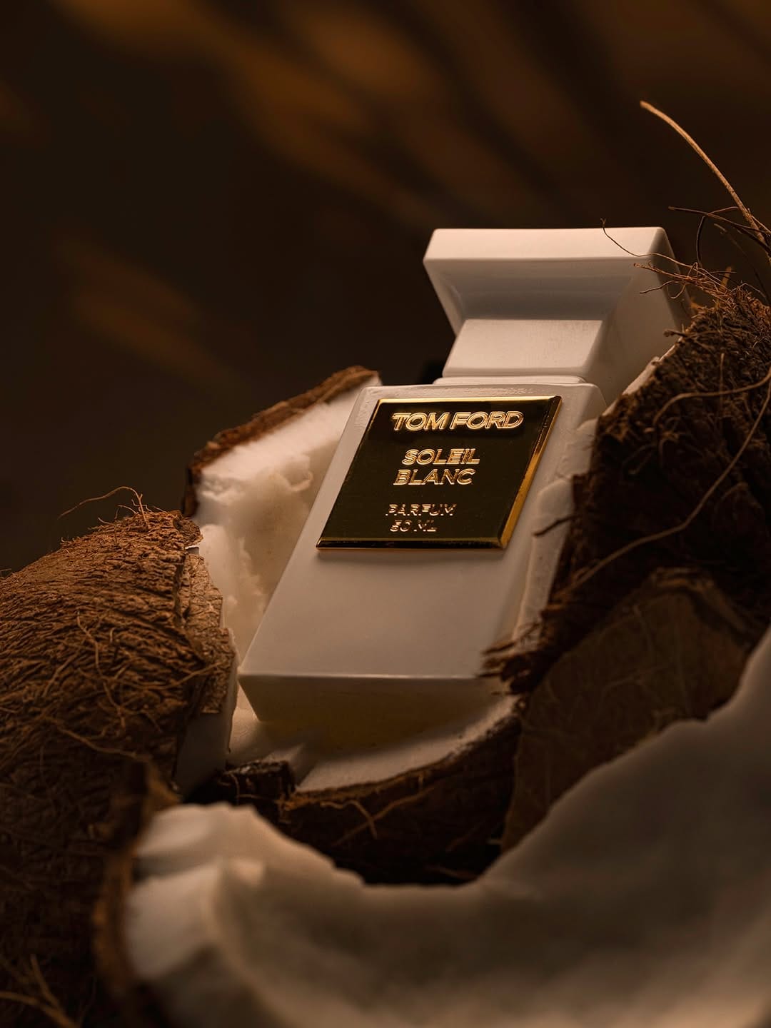
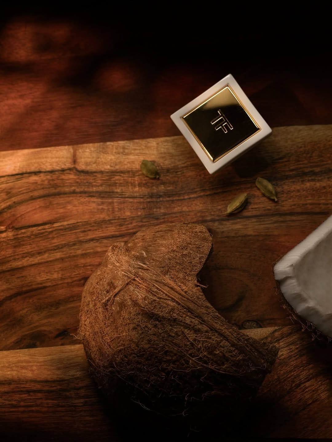
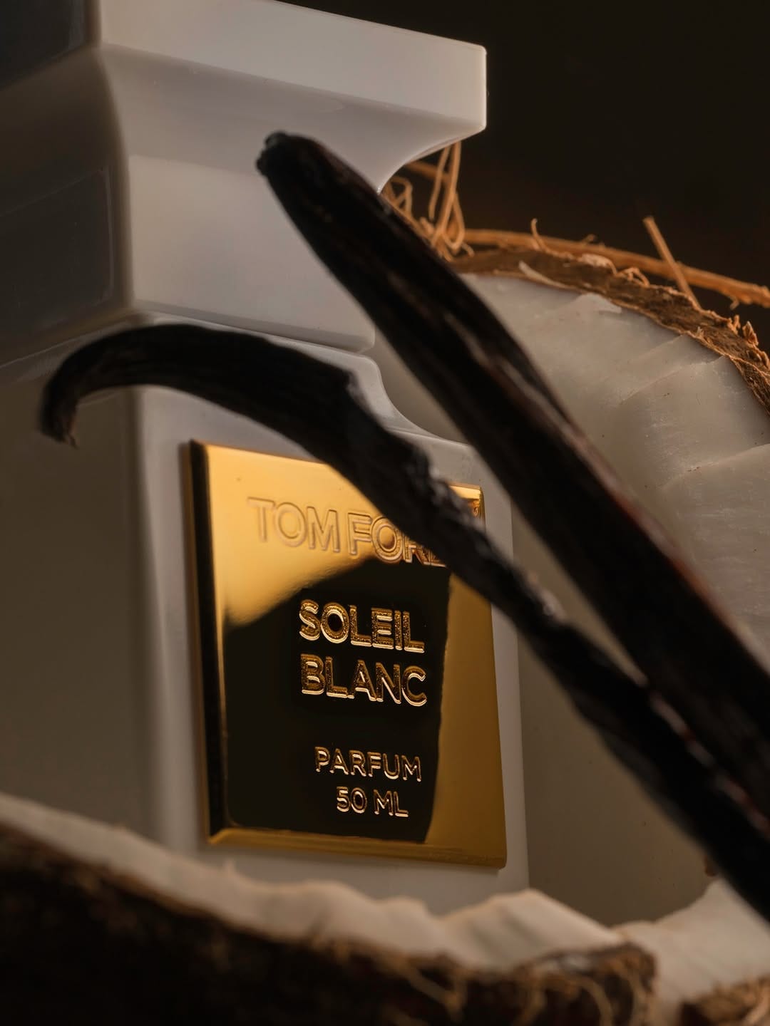

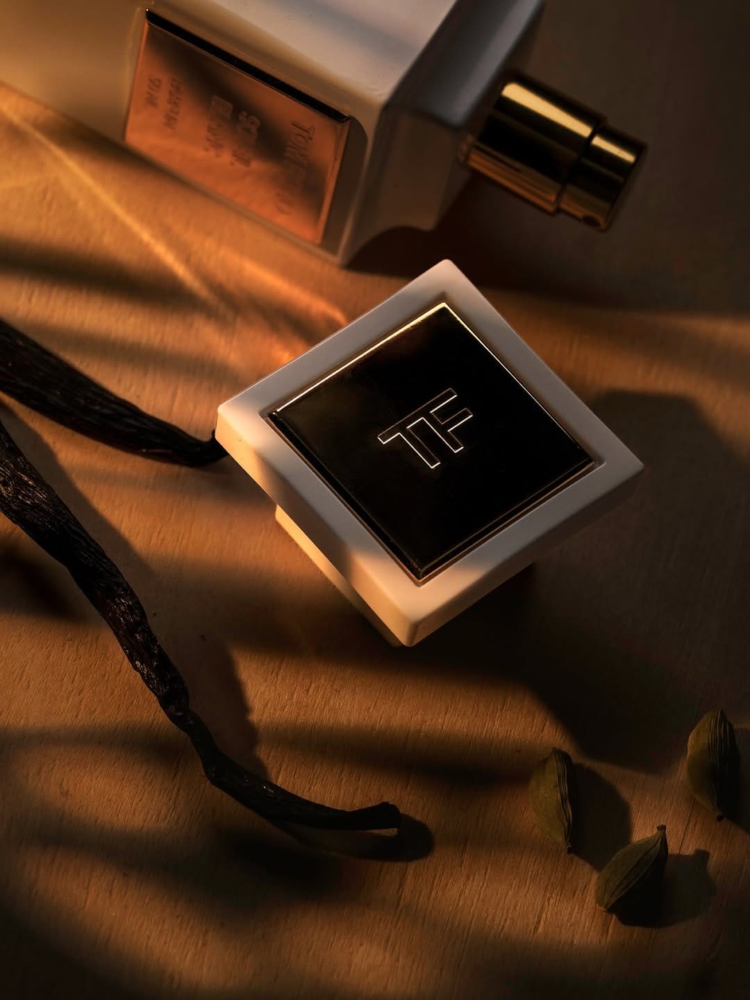
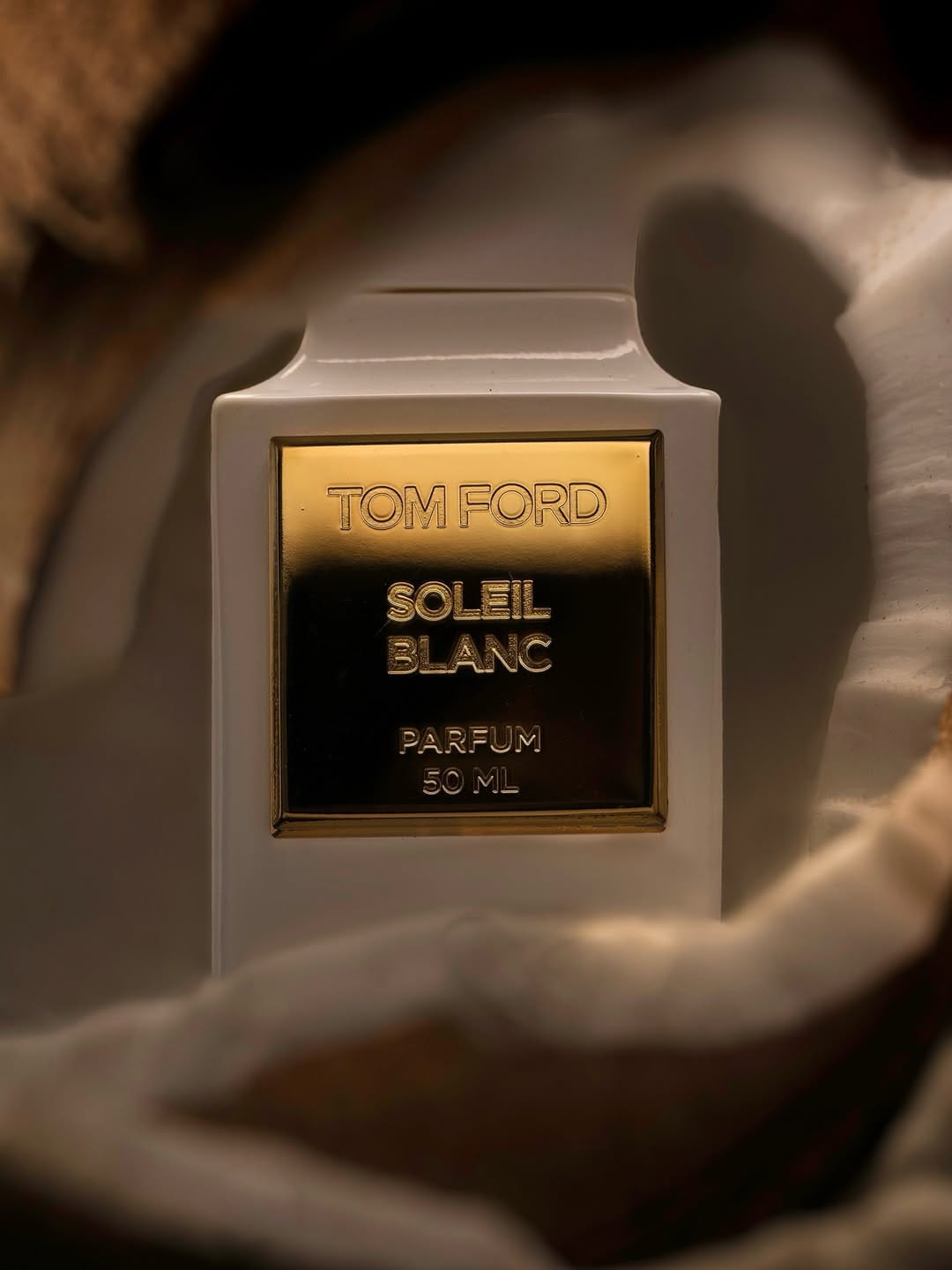
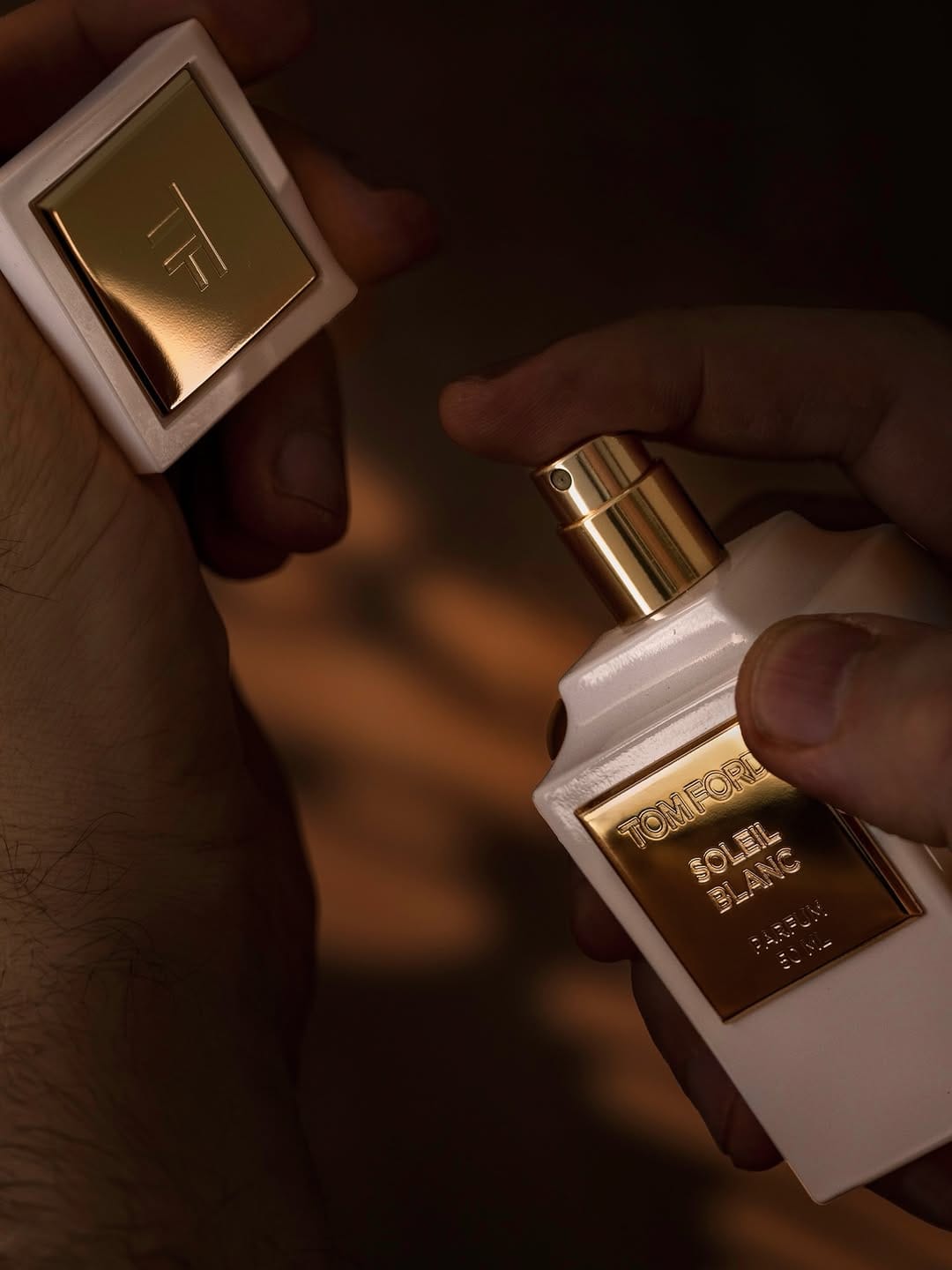
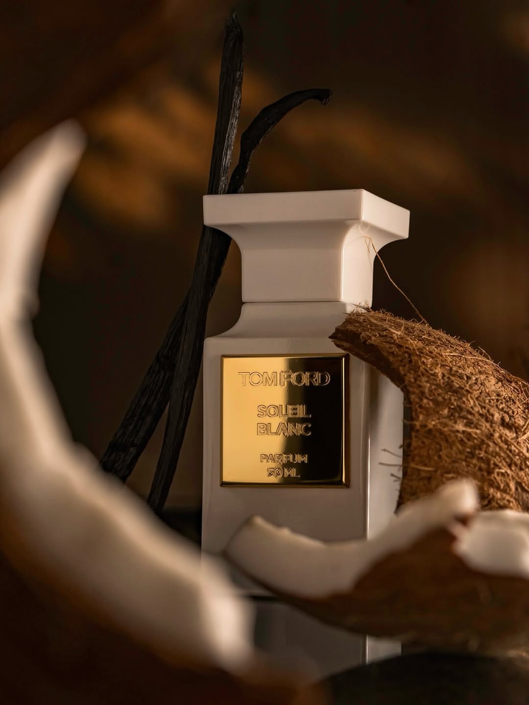
This reads as a personal project more than brand work from Tom Ford Beauty (@tomfordbeauty). The warm amber palette and ingredient styling communicate the fragrance notes well enough, but it doesn't align with Tom Ford's actual visual language, which is cooler, more controlled, and far more minimal. The series leans into moody and textural in a way that feels like the photographer's own aesthetic rather than the brand's.
The bigger issue is the repetition. Coconut and vanilla beans appear across multiple frames without the composition or perspective changing meaningfully enough to justify it. By the third or fourth shot covering the same ground, the series loses momentum rather than building it.
For brand use, a carousel like this would need a clearer editorial logic. Each frame should advance the story, not revisit it. Here the variety isn't quite there, and neither is the brand alignment.
MAC Cosmetics moon landing campaign: concept to execution in seven days
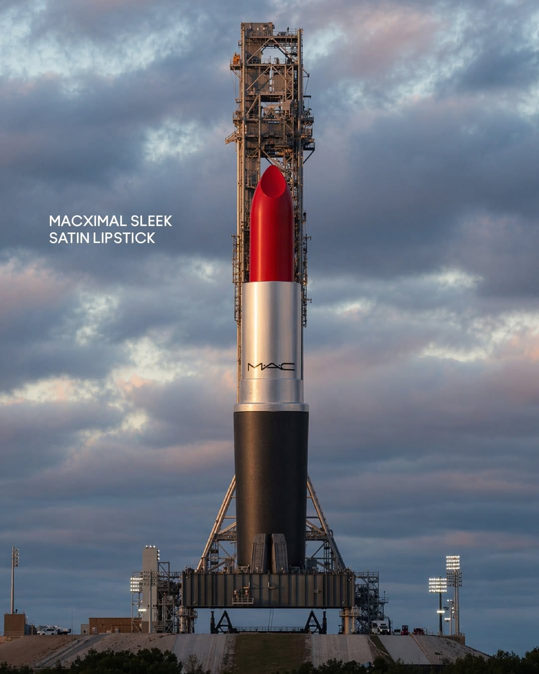
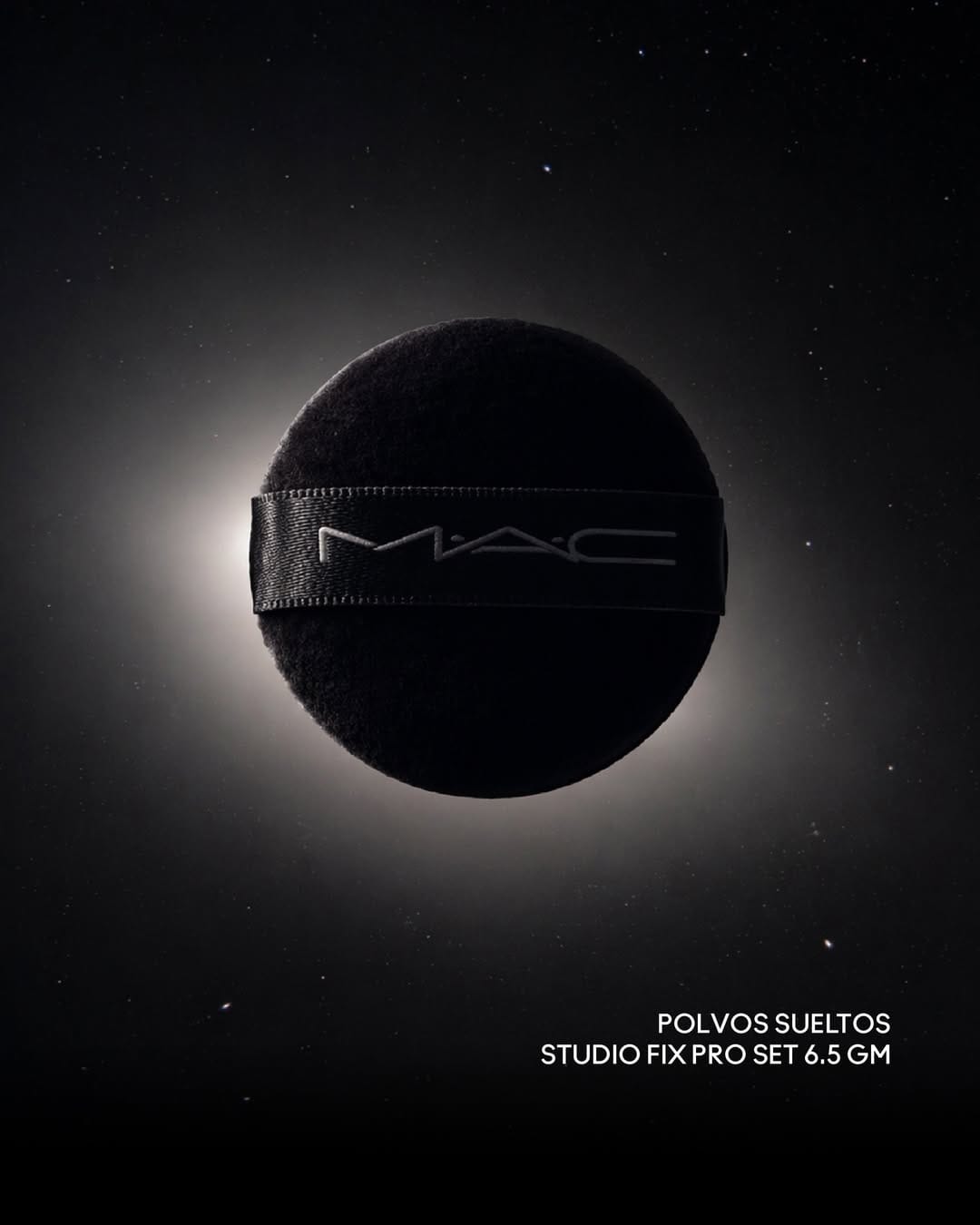
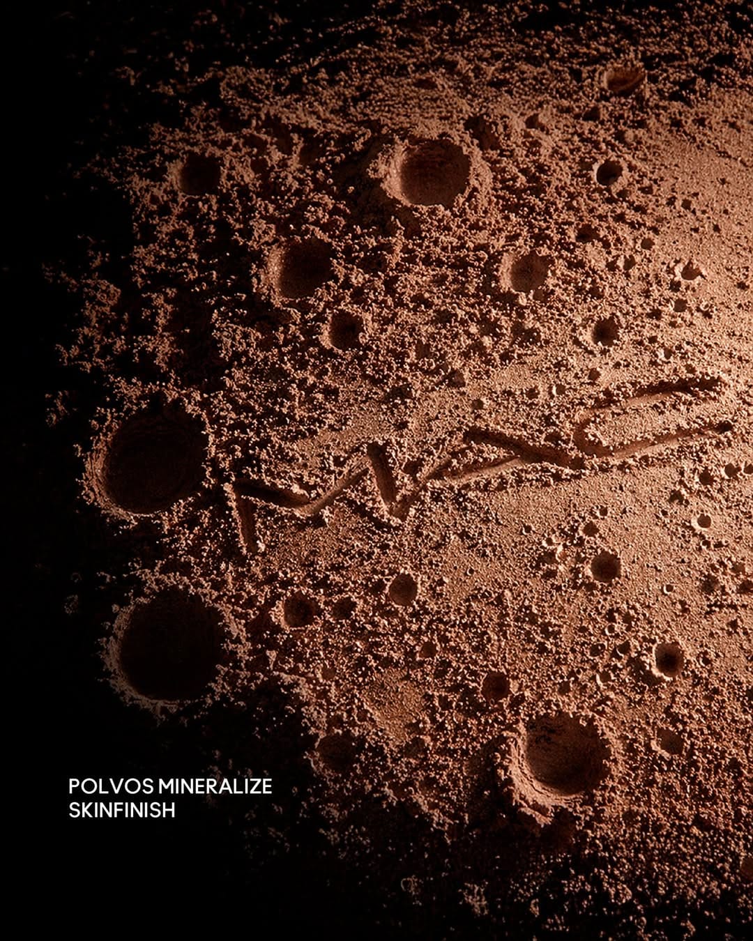
Absolutely love the idea here from M·A·C Cosmetics Perú Market (@maccosmeticspe). It was also posted fast after the actual moon landing, so the whole shoot from idea to release took just seven days. So fast.
YSL Beauty MYSLF: Strong mineral aesthetic with liquid rendering issues
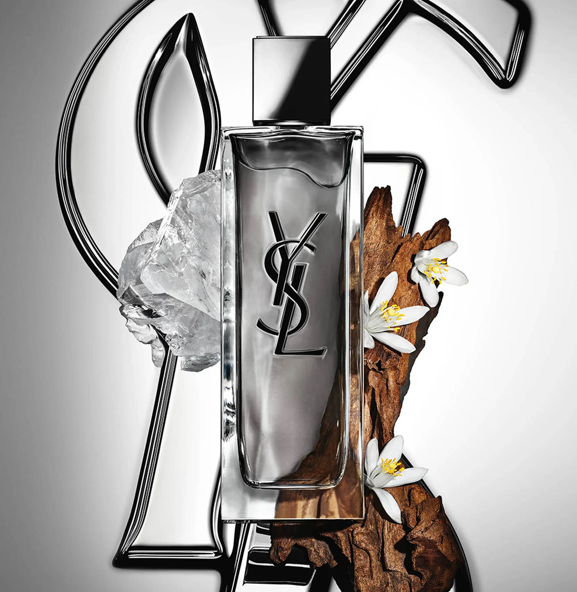
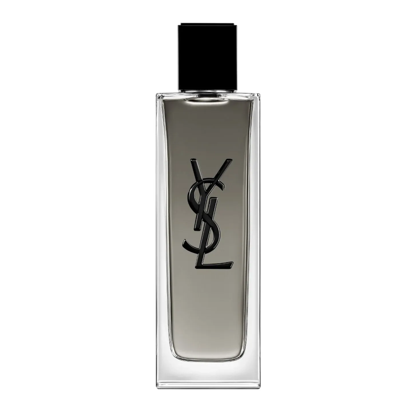
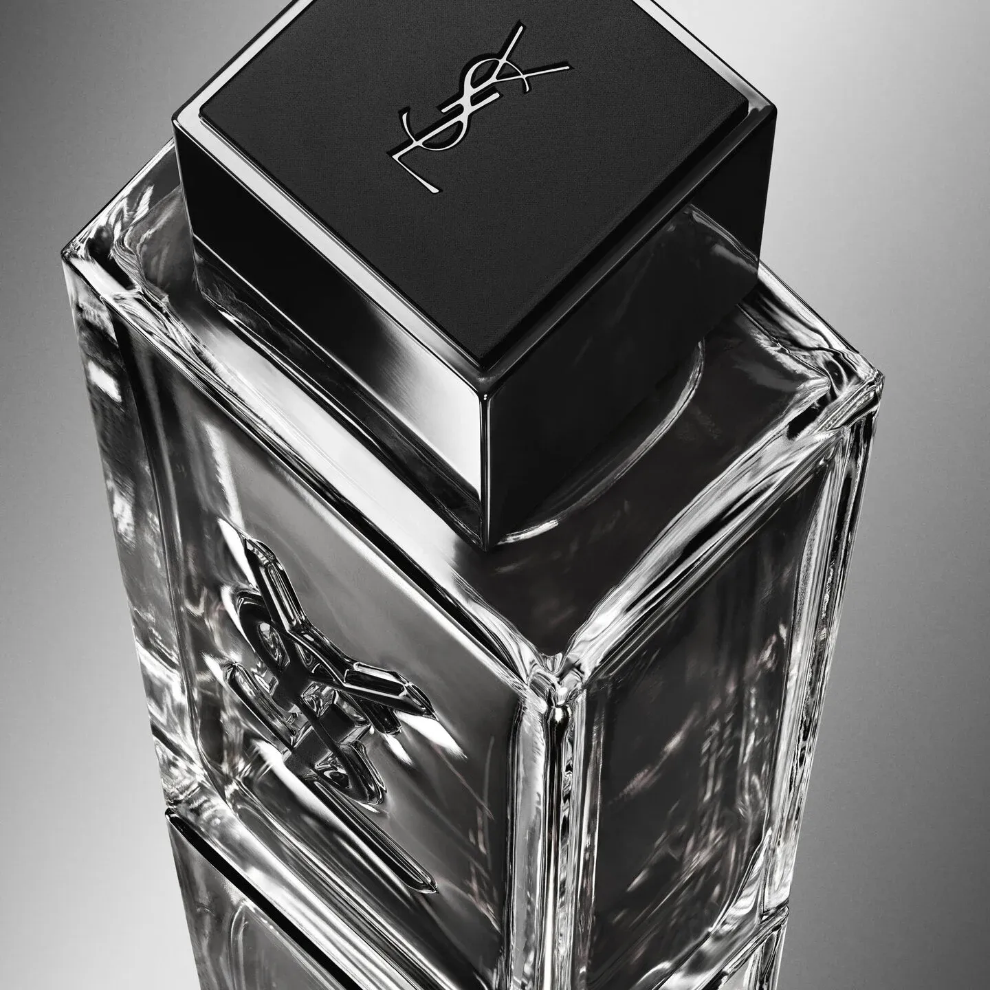
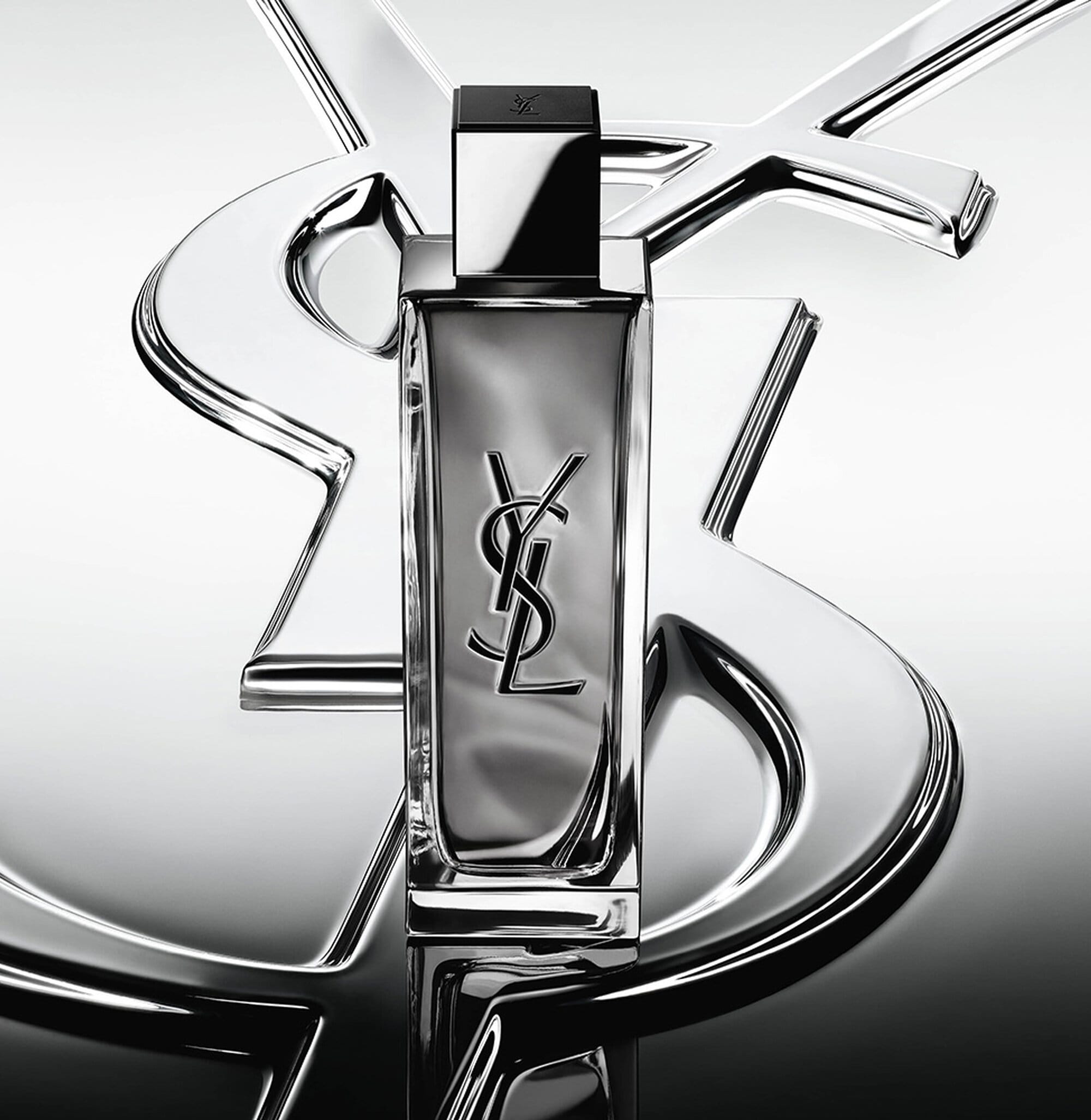
Beautiful photos from YSL Beauty (@yslbeauty). But something is off with the liquid in the bottle. It looks incomplete even though the catalog shot looks fine. The YSL Beauty MYSLF work with Austin Butler has that mineral, intensely musky aesthetic they're going for, but the liquid rendering needs a technical pass. When you're shooting luxury fragrance photography, incomplete fills read as production errors, not intentional design choices.
NYX Cosmetics: Unretouched beauty with saturated color punch
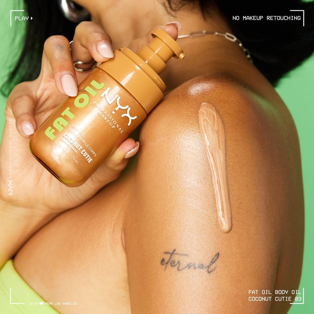
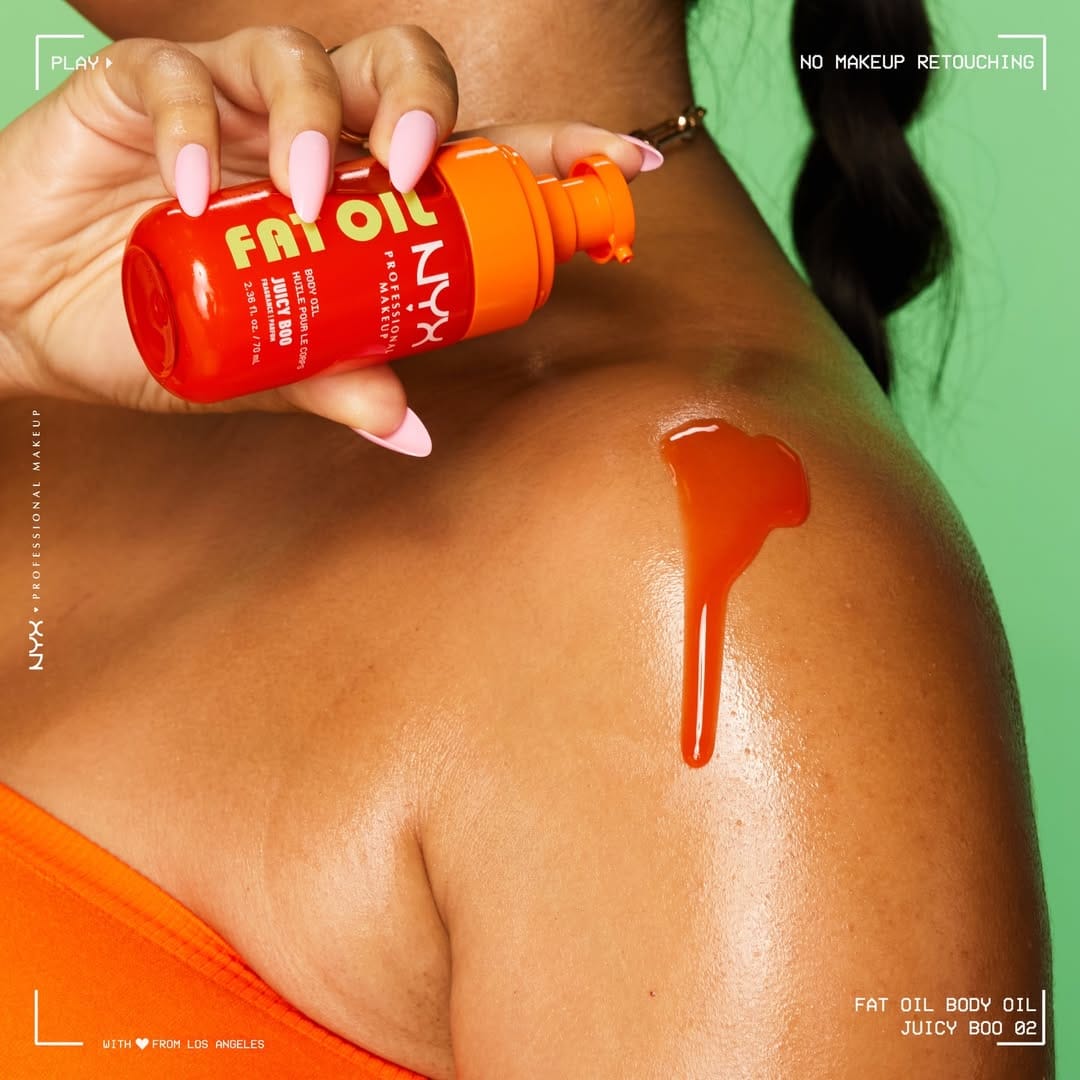
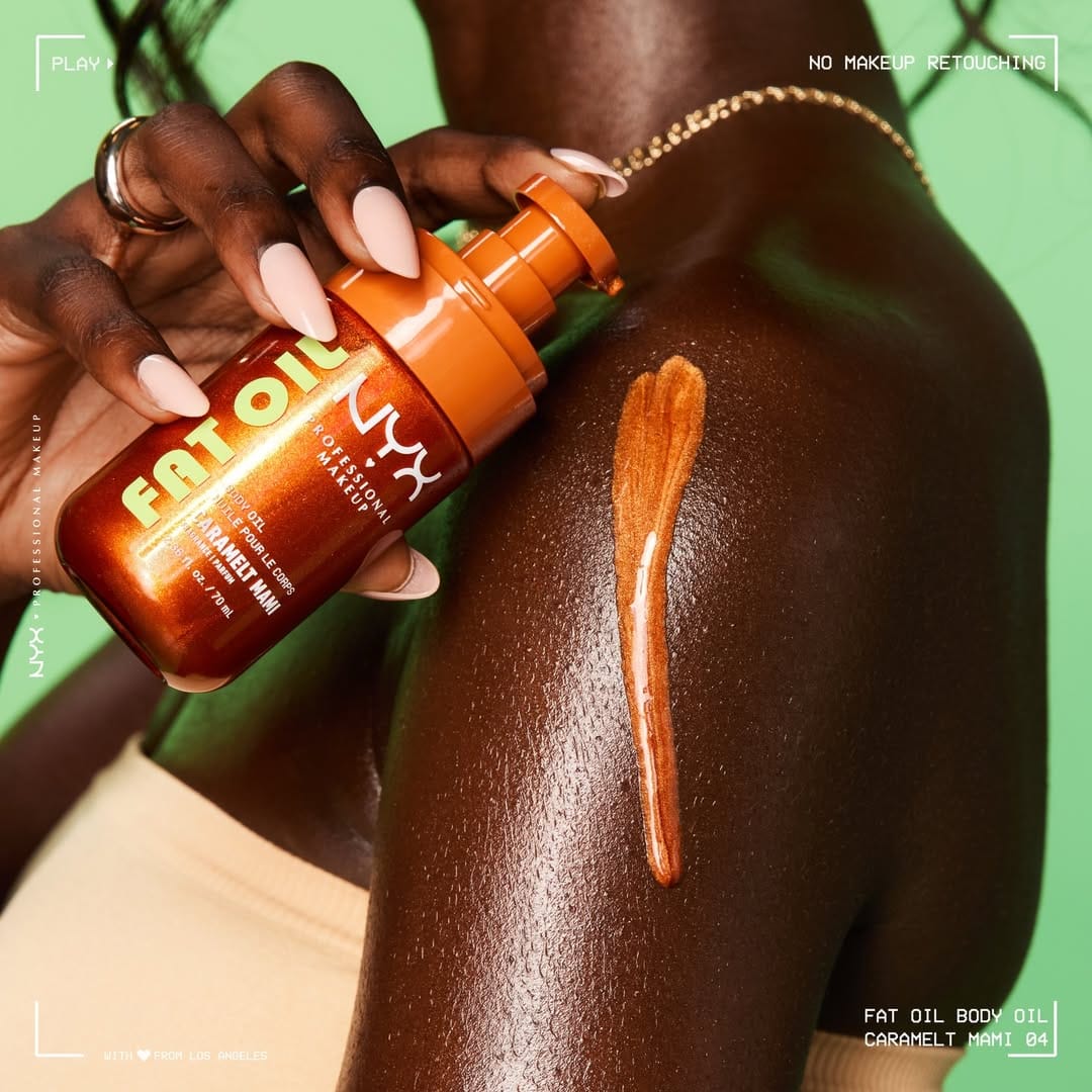
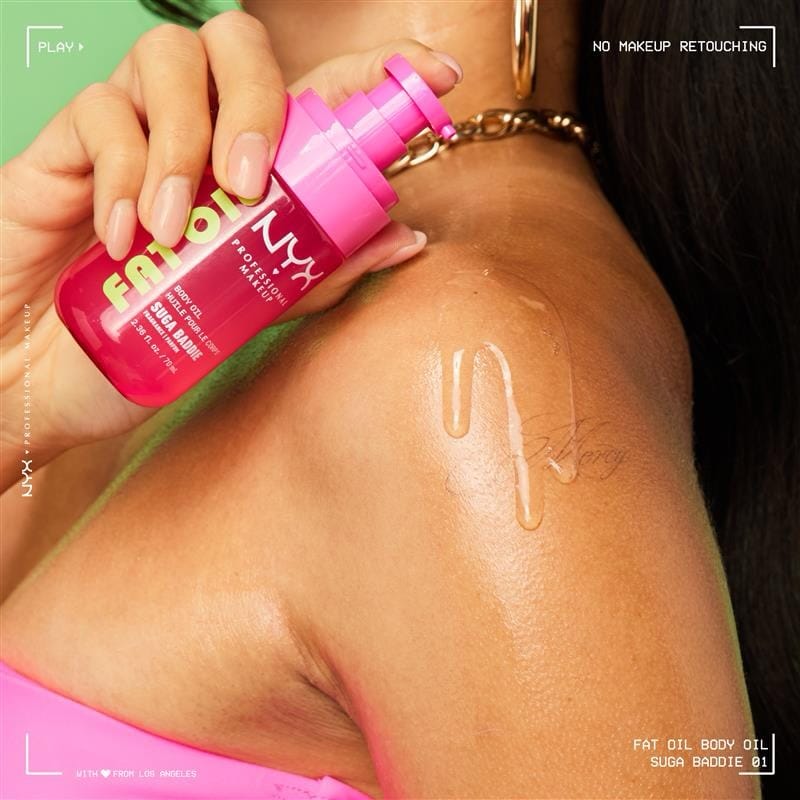
NYX (@nyxcosmetics) product photography shot by Brooke Nipar (@brookenipar) matches their "On the Bright Side" commitment: no retouching, visible tattoos, real skin texture, and those punchy saturated colors they're known for. It's refreshing to see a brand actually follow through on their positioning instead of just talking about it.
Dolce&Gabbana Beauty: From fresh flat lays to muted editorial tones
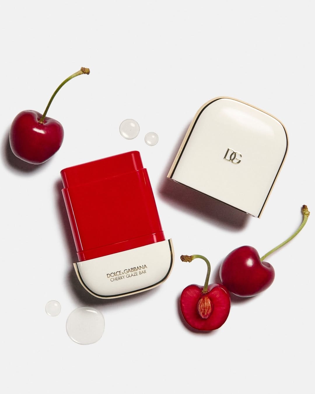
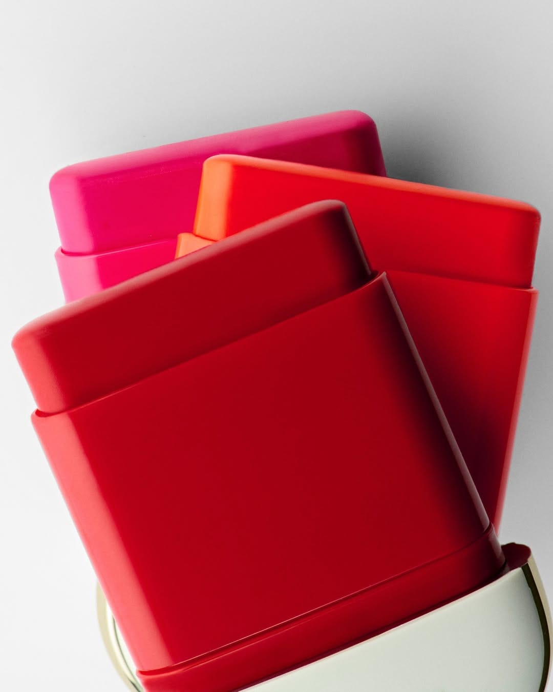
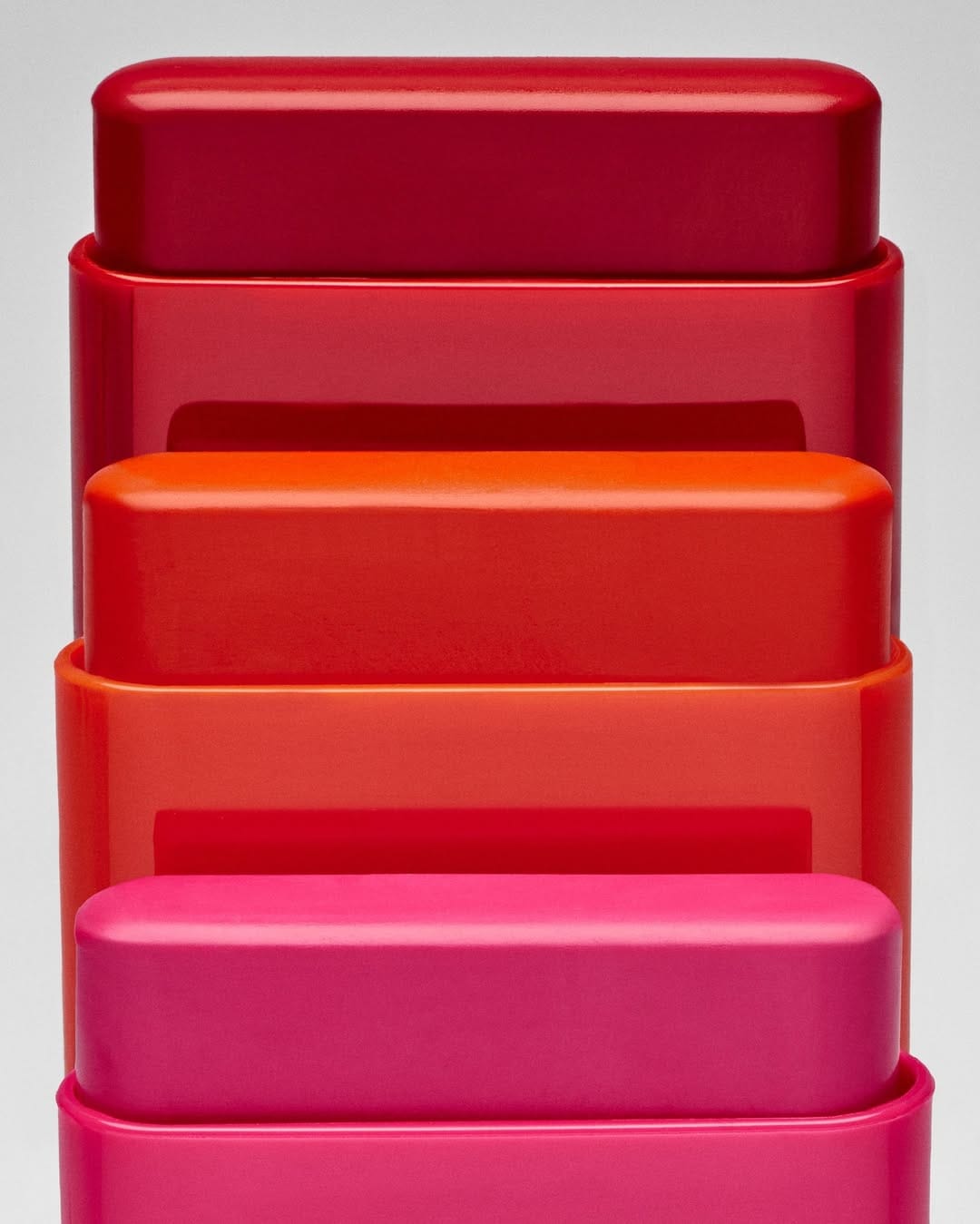
The first photo from Dolce&Gabbana Beauty (@dolcegabbana_beauty) is a simple summer flat lay showing ingredients and texture. The lighting is straightforward, and there's minimal retouching. It reads like an easy lifestyle ingredient shot without visual overload. But the next two images shift completely: the light and editing go more trendy and muted, keeping the product clear and centered with none of that playfulness from the opener.
About the Author
Elina is a Ukrainian-Canadian commercial photographer based in Vancouver, British Columbia.
Get in touch
Instagram: @elina.kustlyvy
X (Twitter): @elinakustlyvy
Images are shown for criticism and review and remain the property of their owners. The Shot List is independent and not affiliated with any brand featured. If you worked on one of these images, use “Claim this shot” on its page or email [email protected].
Get the next issue
New reviews of beauty and fragrance photography, in your inbox every week.