Grown Alchemist, Armani Beauty, Clinique, Diptyque, and Kylie Cosmetics: Five Approaches to Shooting Beauty, From Clinical to Maximal
Grown Alchemist is doing something quietly clever here: the image matches exactly what the copy promises. That kind of alignment is rarer than it should be.
Grown Alchemist travel skincare: Calm, minimal styling with soft light
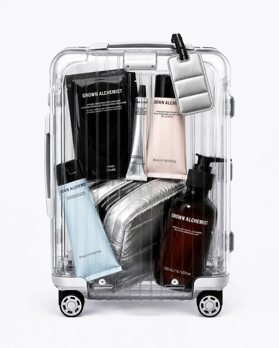
Hey, this shot fits the vibe from Grown Alchemist (@grownalchemist) shot by Ulysse Fréchelin (@ulysseulysse)! The copy talks about traveling between time zones, and the image feels like a calm little ritual you'd pack for a flight, not a messy pile of products. Everything is neat and spaced out so the products and text are easy to read. Colors are soft and muted, no loud chaos like a lot of skincare stuff right now. The light looks soft too, just enough shine on the tubes to feel a bit fancy without being harsh.
Overall it feels calm, clean, and kind of luxurious, which matches that whole travel skincare photography thing brands are doing lately.
Armani Beauty blush compacts: Soft luxury and collectible appeal
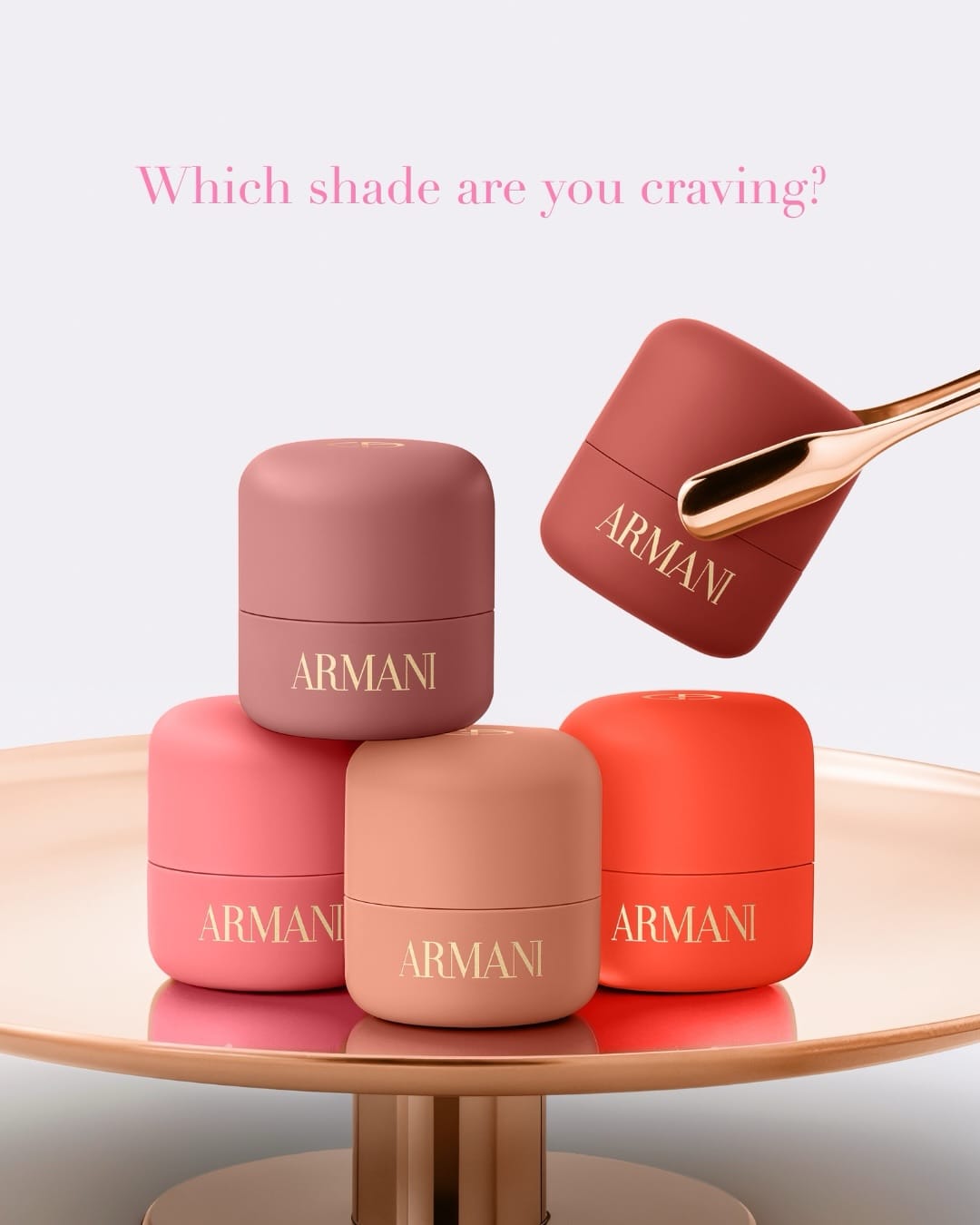
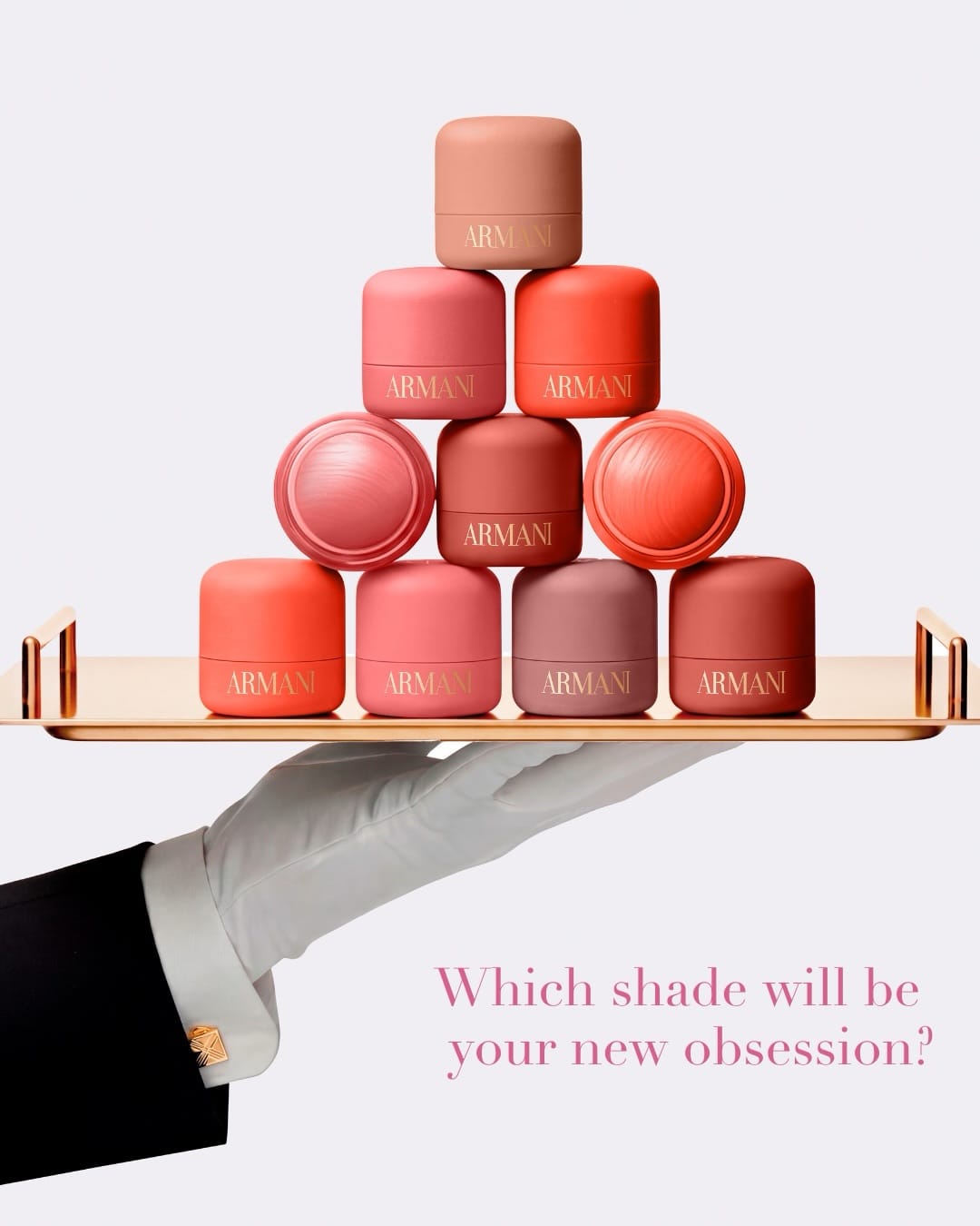
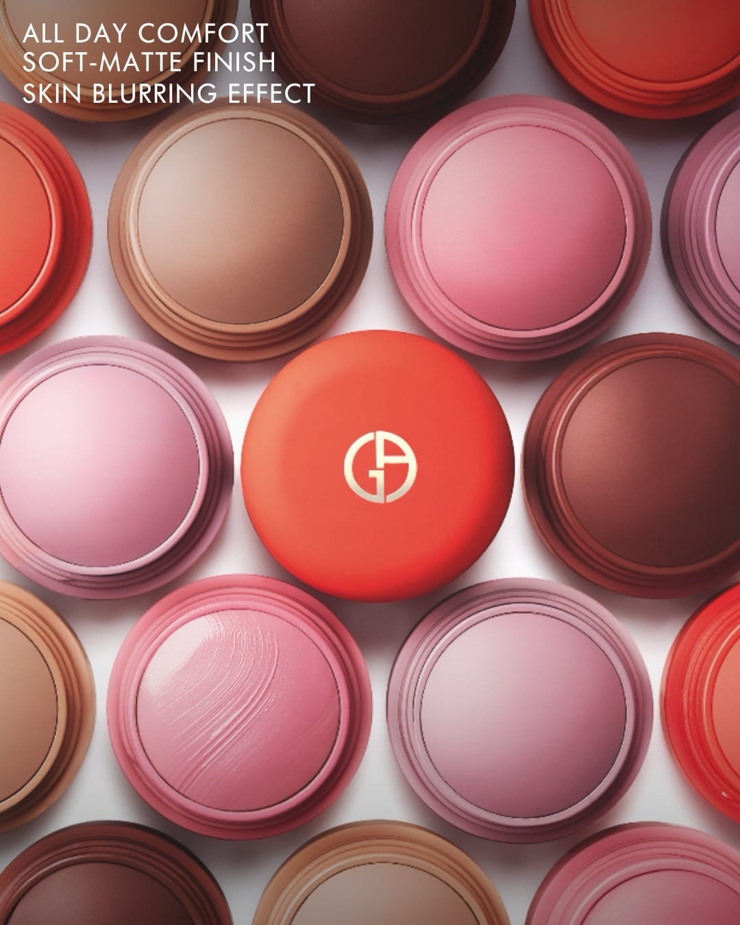
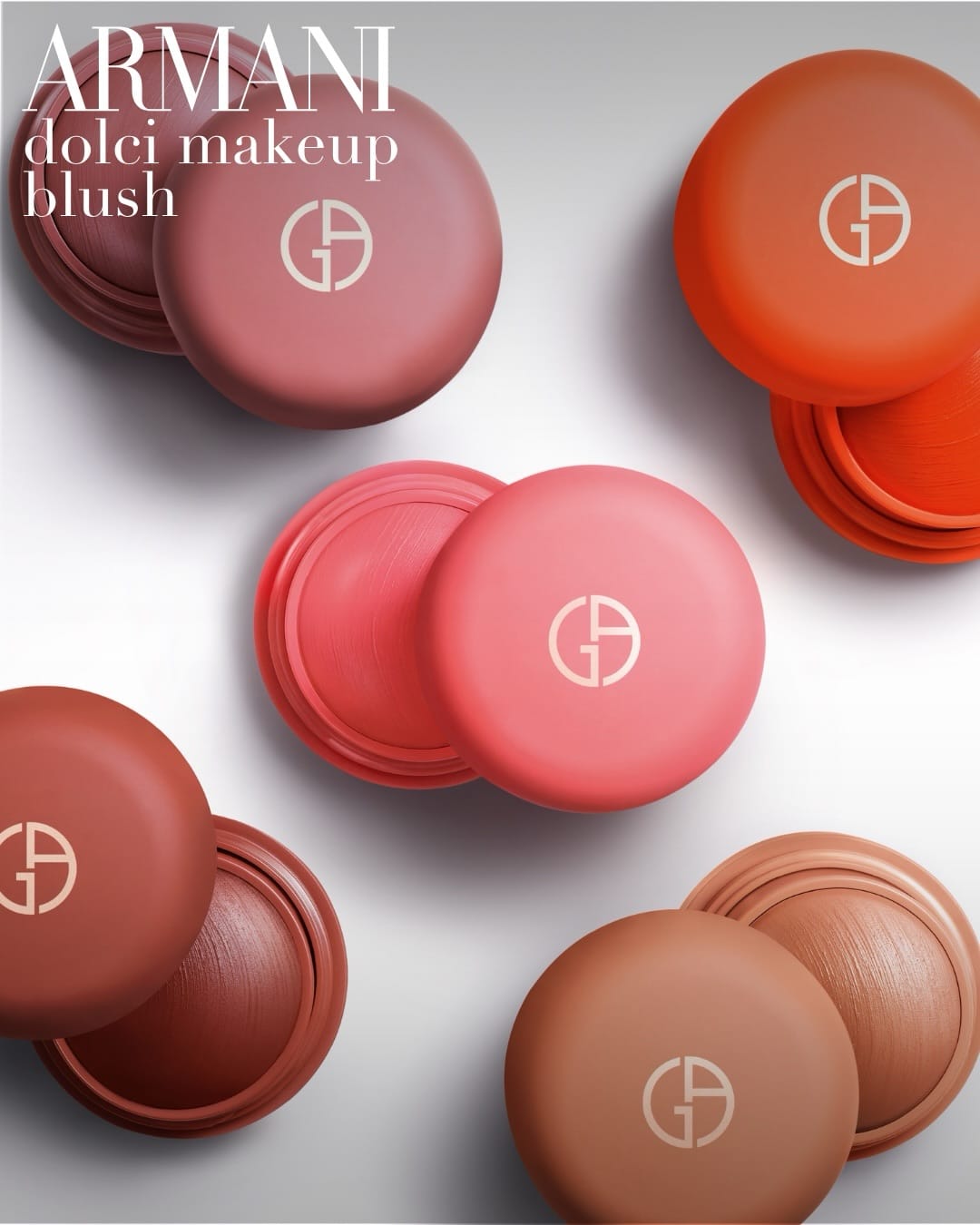
This one from Armani Beauty (@armanibeauty) by Charles Helleu (@studiohelleu) feels like fun luxury. It's got that fancy Armani feel but softer and sweeter, like little collectible treats you want to line up and own all five of. The compacts are probably set up neatly in a row or grid so you can see the whole set at once, which makes people want to pick their favorite or just buy them all. I also love how they show the texture by lightly brushing over it, which adds necessary commercial information. The colors are all warm blush tones: rose, apricot, caramel, cinnamon, mauve. They look like real skin tones instead of supersaturated fake colors. The light is soft and creamy with just a little shine on the compacts, enough to look rich and touchable without being too shiny.
It feels sweet, soft, and a bit indulgent, which fits that whole cute collectible makeup trend going around right now.
Clinique skincare: Classic clinical approach with informative packaging focus
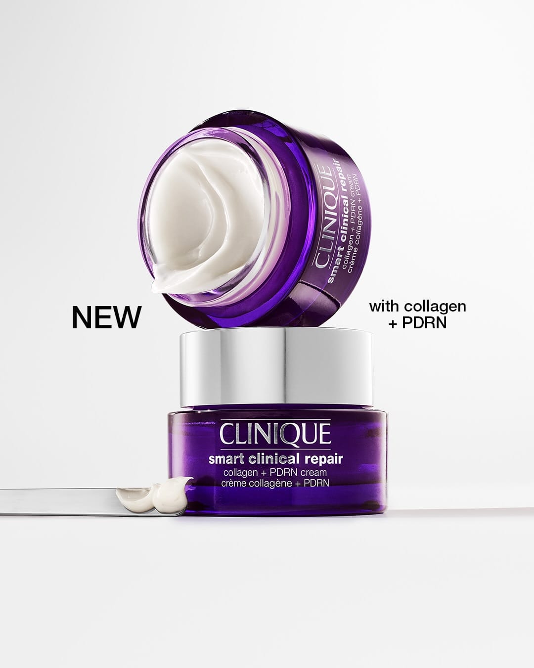
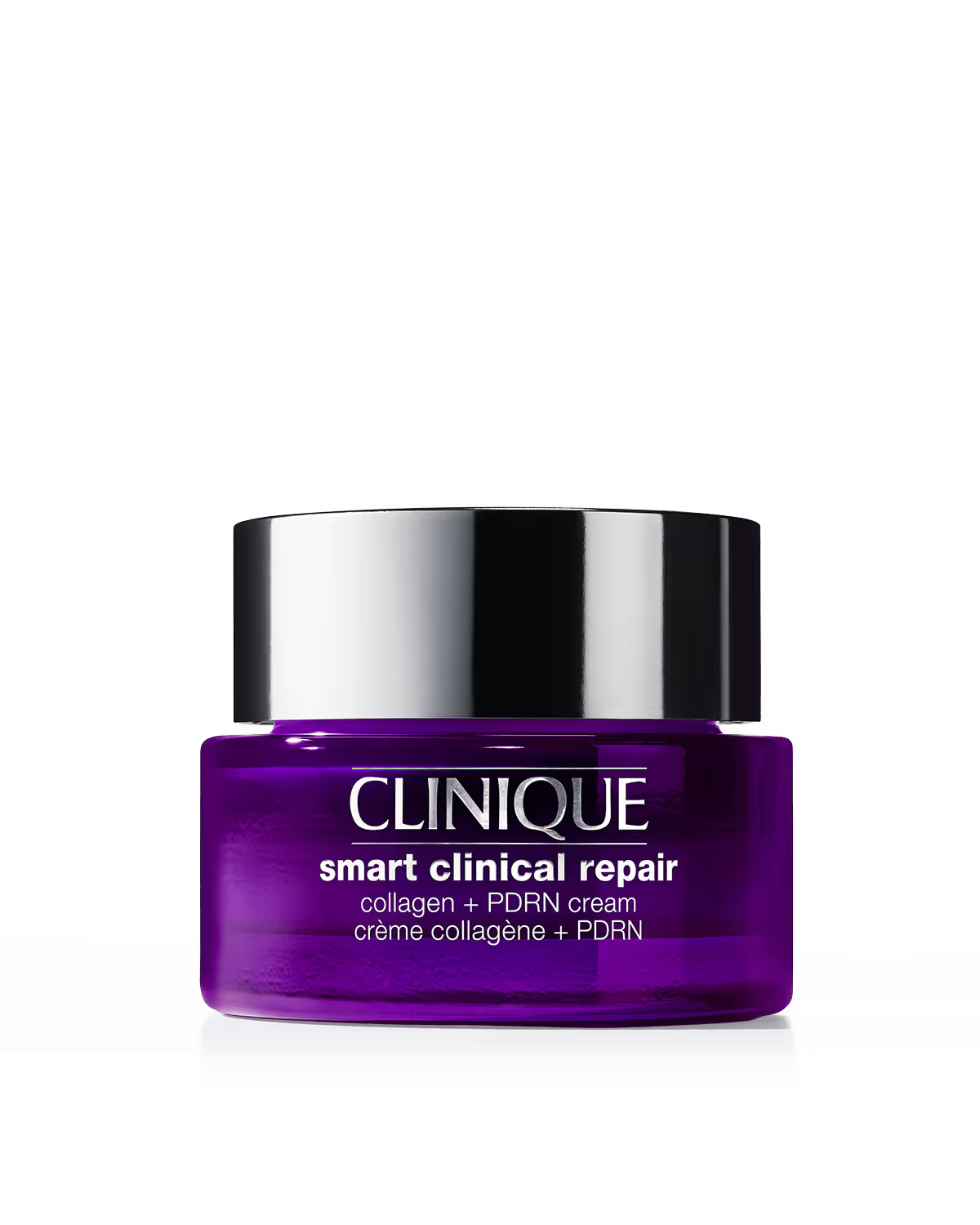
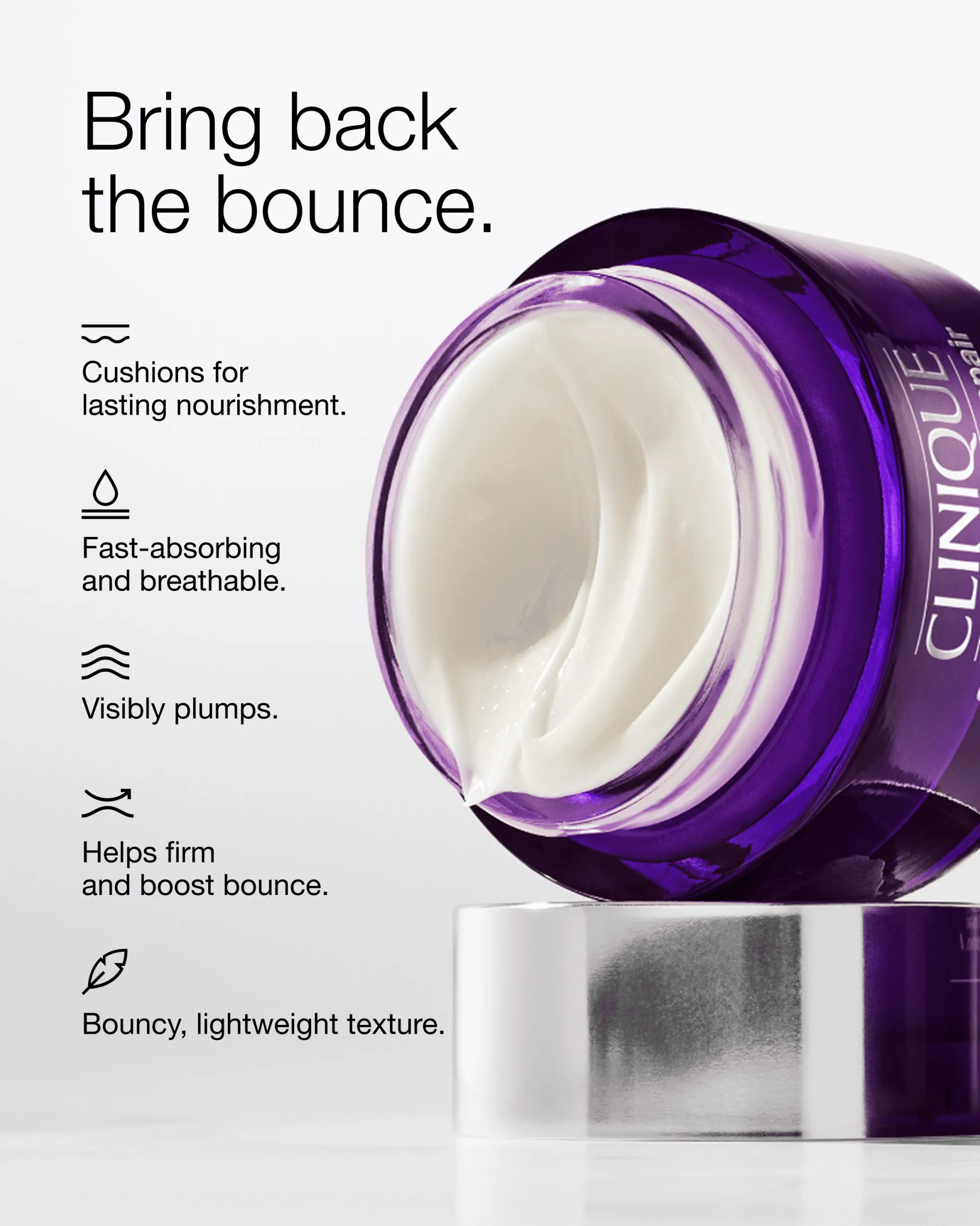
Yeah, this one from Clinique (@clinique) feels more old school. It's got that clinical pharmacy vibe: big jar, lots of text on the box, feels more like information than mood. The layout is just a straight-on shot with no props, but it feels a bit busy because the text is competing with the product instead of letting it breathe.
Colors are classic Clinique: white and purple with bold black text, but it comes off more like a dermatologist flyer than something sexy or premium. The light is bright and even but pretty flat, no shadows or depth, so it feels a little dated next to what other prestige skincare brands are doing now. It reads safe and informative but not very exciting or aspirational.
Diptyque candles: Quiet luxury styling with soft directional light
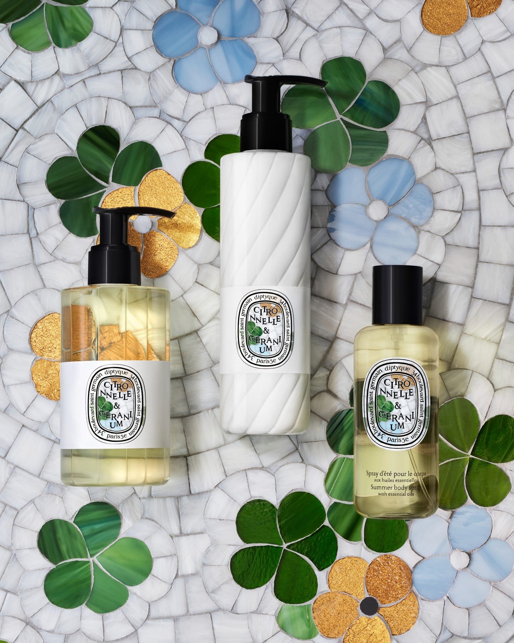
This one from Diptyque (@diptyque) by Mathilde Jonquière (@mathildejonquiere) feels like a quiet little ritual instead of just products lined up. The three Diptyque items are set close together, maybe slightly staggered, so they read as a family but you can still see each one. Labels face forward so you know exactly what they are. Colors are soft: off-white and cream with a bit of muted green and yellow, and the black text keeps it looking chic instead of crunchy granola. The light is soft but still has a little direction to it, just enough shine on the glass and caps, with gentle shadows instead of anything harsh.
Overall it feels calm and put together, more quiet luxury than loud or trendy, which fits that whole minimal French fragrance photography thing right now.
Kylie Cosmetics lip butters: Maximal fruit props and saturated color
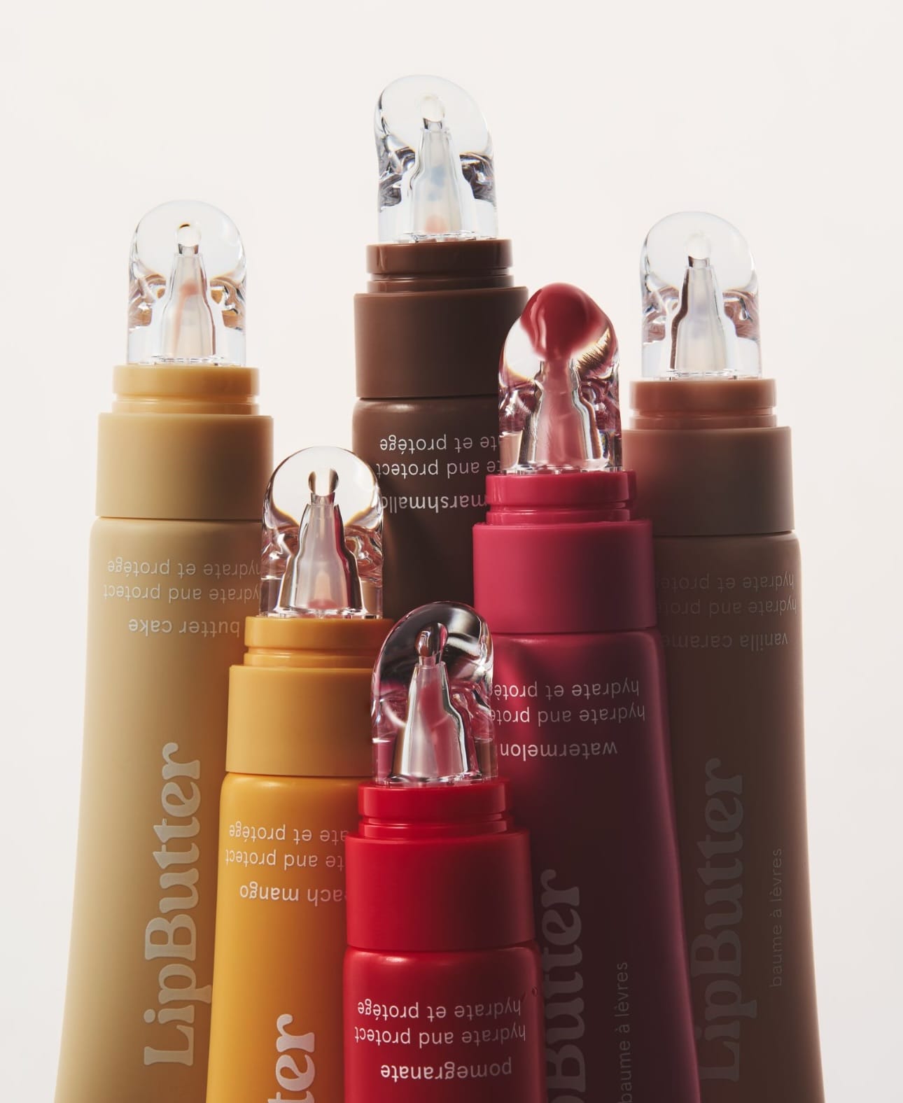
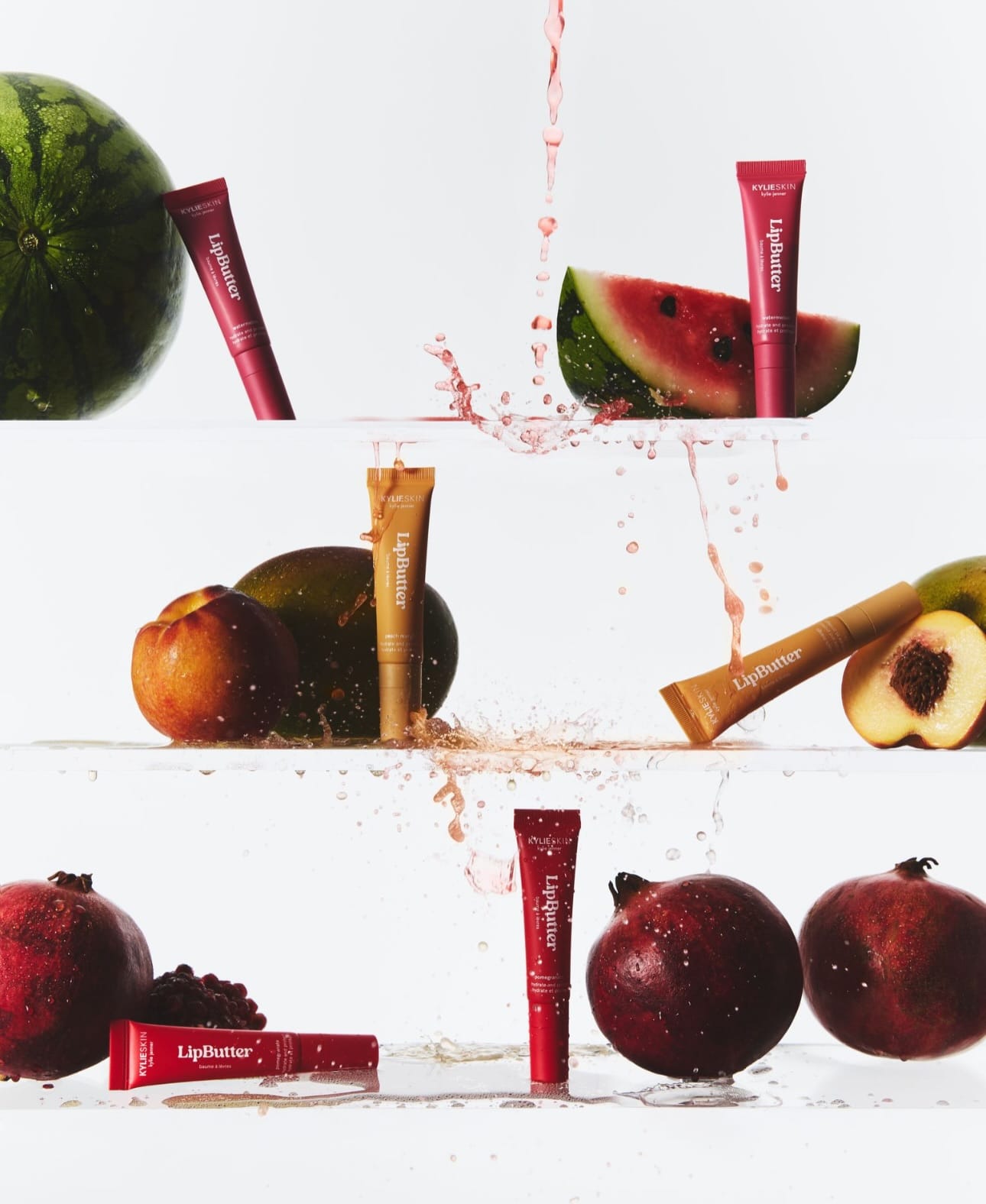
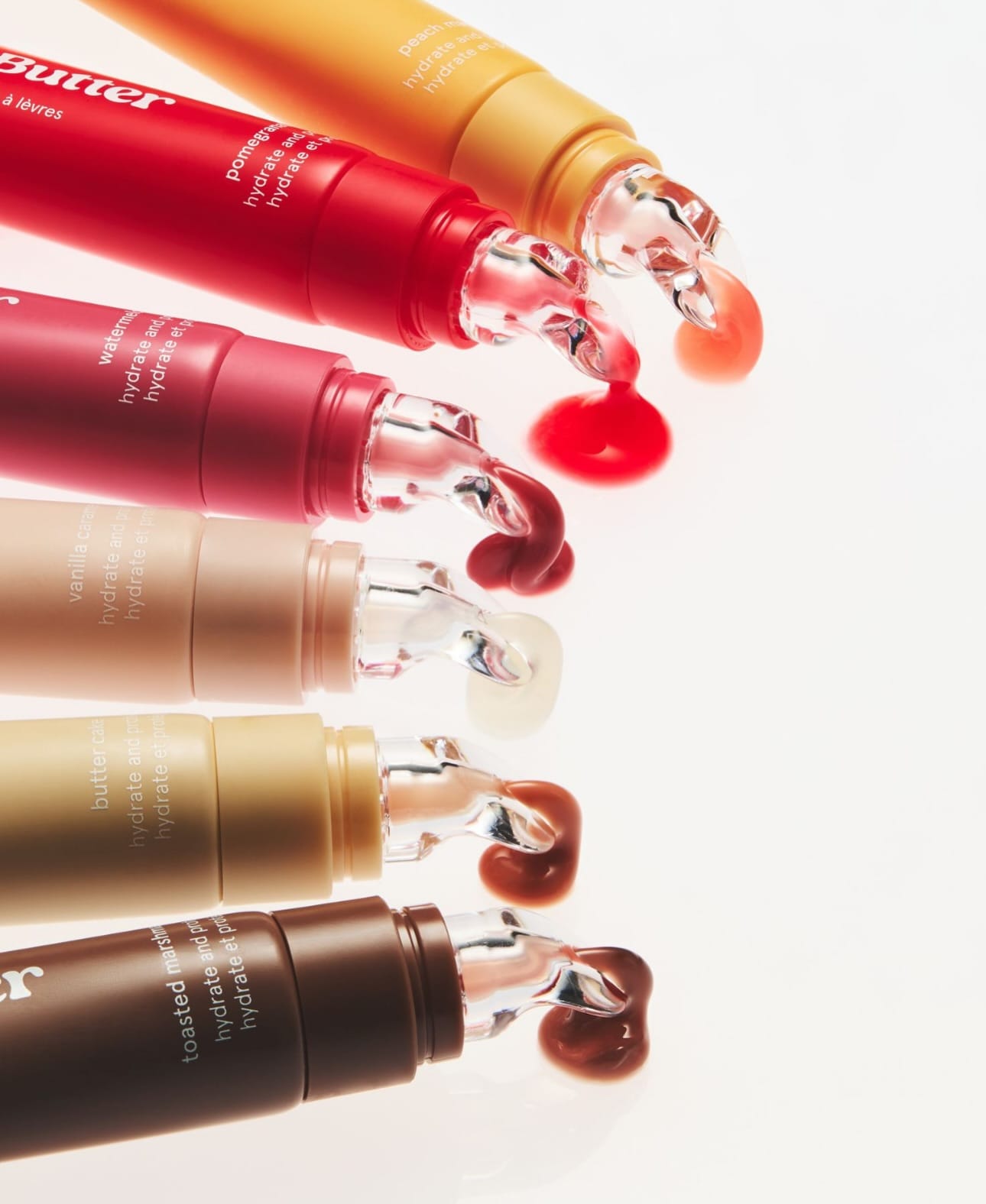
This Kylie Cosmetics (@kyliecosmetics) set by Dichen Chen (@dichen_chen) is full-on maximal, flavor-driven pop commercial: it's about abundance and fun more than restraint. The composition stacks a lot of elements into frame (tubes, jars, maybe swatches, and a riot of fruits) so your eye jumps around the lineup instead of resting on a single product, which matches the "full lip butter lineup" story.
Color is cranked: saturated pinks, reds, corals, and candy tones plus bright fruit colors, pushing hard into playful, almost candy-shop territory rather than sophisticated skincare minimalism. Lighting is big, soft, and glossy, with generous highlights on packaging and fruit to make everything look juicy and edible, very aligned with TikTok and Gen Z beauty aesthetics.
Against current trends, it's a textbook "sensory overload" grid: busy, bright, maximal props and overt flavor cues, built to catch your eye through sheer color and density rather than negative space or subtlety.
About the Author
Elina is a Ukrainian-Canadian commercial photographer based in Vancouver, British Columbia.
Get in touch
Instagram: @elina.kustlyvy
X (Twitter): @elinakustlyvy
Images are shown for criticism and review and remain the property of their owners. The Shot List is independent and not affiliated with any brand featured. If you worked on one of these images, use “Claim this shot” on its page or email [email protected].
Get the next issue
New reviews of beauty and fragrance photography, in your inbox every week.