
NARS foundation: Matte paper mirrors product texture
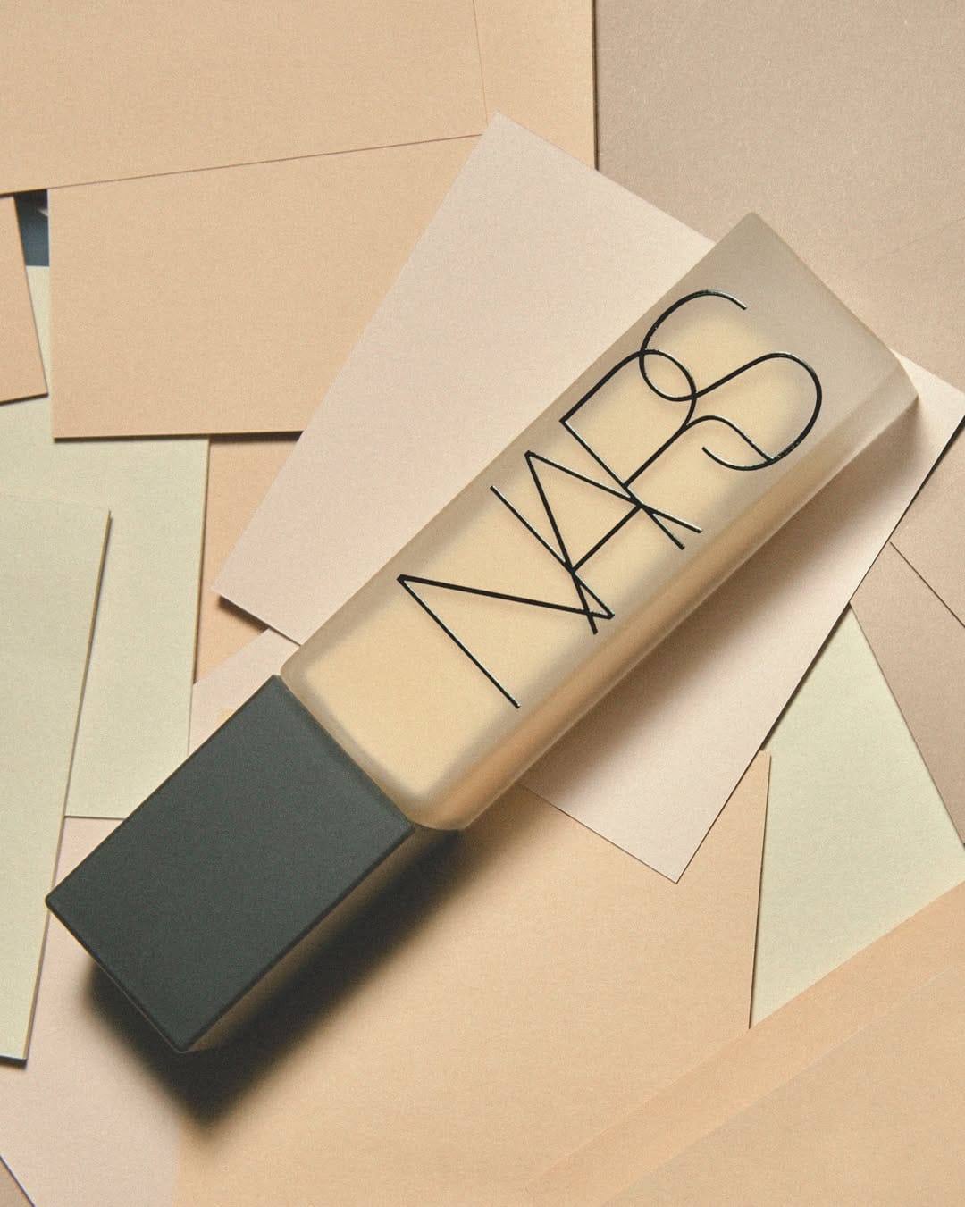
Love how they captured the foundation's matte finish by shooting on matte paper. The different colored papers hint at the shade range without being literal about it.
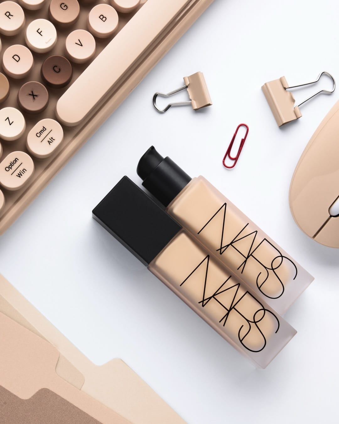
The office theme for NARS (@narsissist)' Face Everything campaign, shot by François Nars (@francoisnars_official), is an interesting choice. It grounds the product in everyday reality instead of some aspirational fantasy. It's refreshing to see foundation positioned in actual fluorescent-lit environments where you'd actually wear it.
The paper choice does double duty here: it echoes the product texture while creating these clean, graphic compositions that feel modern without trying too hard.
Glow Recipe: Fresh, tactile styling for Korean skincare
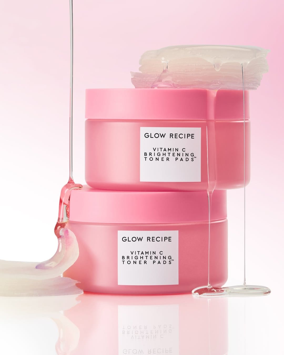
Another beautiful campaign from Glow Recipe (@glowrecipe). I love how tactile everything feels. The color and light complement the products perfectly, making the whole set feel fresh and approachable. [Category: Skincare] [Surface: Plastic] [Lighting: Soft] [Style: Editorial] [Mood: Fresh] [Palette: Pastels]
Darphin Éclat Sublime: Tactile texture and warm color palette
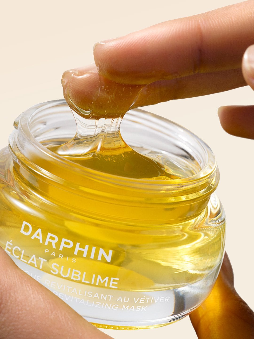
I'm obsessing over this Darphin (@darphin) shot. The texture and color palette are so tactile you can practically feel the product through the screen. The way they've captured the Éclat Sublime line makes it immediately desirable. [Category: Skincare] [Surface: Glass] [Lighting: Soft] [Style: Commercial] [Mood: Fresh] [Palette: Warm Tones]
One thing's bugging me though: that yellow background feels a bit off. The glass looks slightly desaturated compared to the warmth of the backdrop, which makes me think it might be composited in post. Could be a deliberate choice to make the product pop, but there's a subtle disconnect between the product and its environment that's hard to unsee once you notice it.
Still, the overall composition works. The lighting brings out the texture beautifully, and that color story is doing exactly what it should: making you want to reach through the screen and grab the bottle.
La Bouche Rouge: Soft gradients and delicate lighting on wood
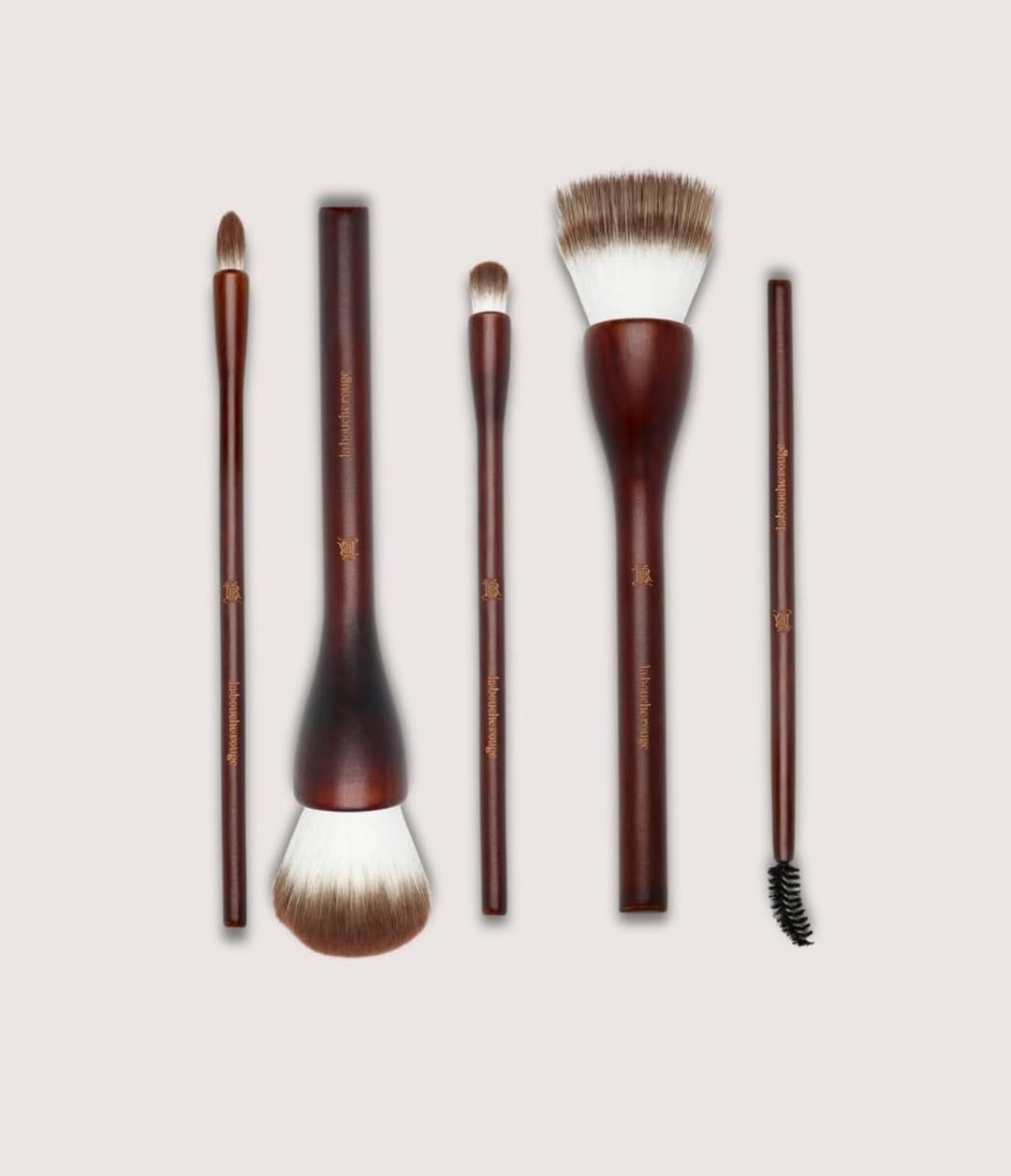
Beautiful shot for La Bouche Rouge (@laboucherougeparis), but not commercial. The edges of the products look too soft and blend into the shadow. Also, different shadow directions suggest this was composited. I love the softness of the light and delicate gradients on the wood. [Category: Cosmetics] [Surface: Wood] [Lighting: Soft] [Style: Minimalist] [Mood: Elegant] [Palette: Neutral]
Clionadh Cosmetics' Ophelia: Romantic styling with soft focus
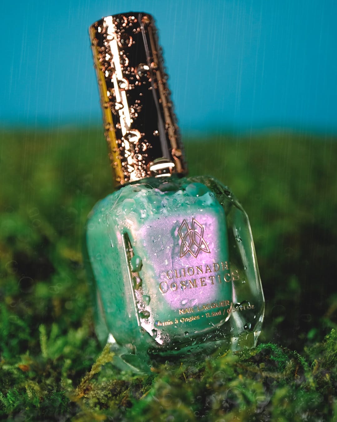
Great colors and concept for Clionadh Cosmetics (@clionadhcosmetics)' Ophelia nail polish shoot. It's the perfect mood photo, but technically a bit weak. [Category: Cosmetics] [Surface: Glass] [Lighting: Dramatic] [Style: Artistic] [Mood: Fresh] [Palette: Vibrant]
The brand, based in Ontario, created this for their Famous Paintings: Love & Loss collection. The romantic, Pre-Raphaelian inspired setup works beautifully for the product story.
What works: The styling nails the aesthetic. Soft, dreamy lighting matches the polish's ethereal quality, and the composition has that painting-like quality you'd want for this collection theme.
The technical issues: Focus feels slightly soft where it counts. The polish bottle could be sharper. There's also some inconsistency in the exposure. The highlights on the glass seem a touch hot, while some of the darker florals are losing detail.
It's frustrating because the concept is so strong. With slightly tighter focus and better exposure balance, this would be exceptional. As is, it works for social media where technical flaws compress away, but it's not quite there for larger formats. Still, the art direction deserves credit for committing to the mood over perfect technical execution.
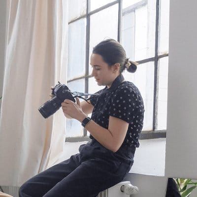
About the Author
Elina is a Ukrainian-Canadian commercial photographer based in Vancouver, British Columbia.
Get in touch
Instagram: @elina.kustlyvy
X (Twitter): @elinakustlyvy
Photographers: If I've featured your work and you'd like a credit or to be tagged, DM me your details. I'm happy to update and showcase your name.