LANEIGE lip tint: Vibrant K-beauty photography with mixed execution
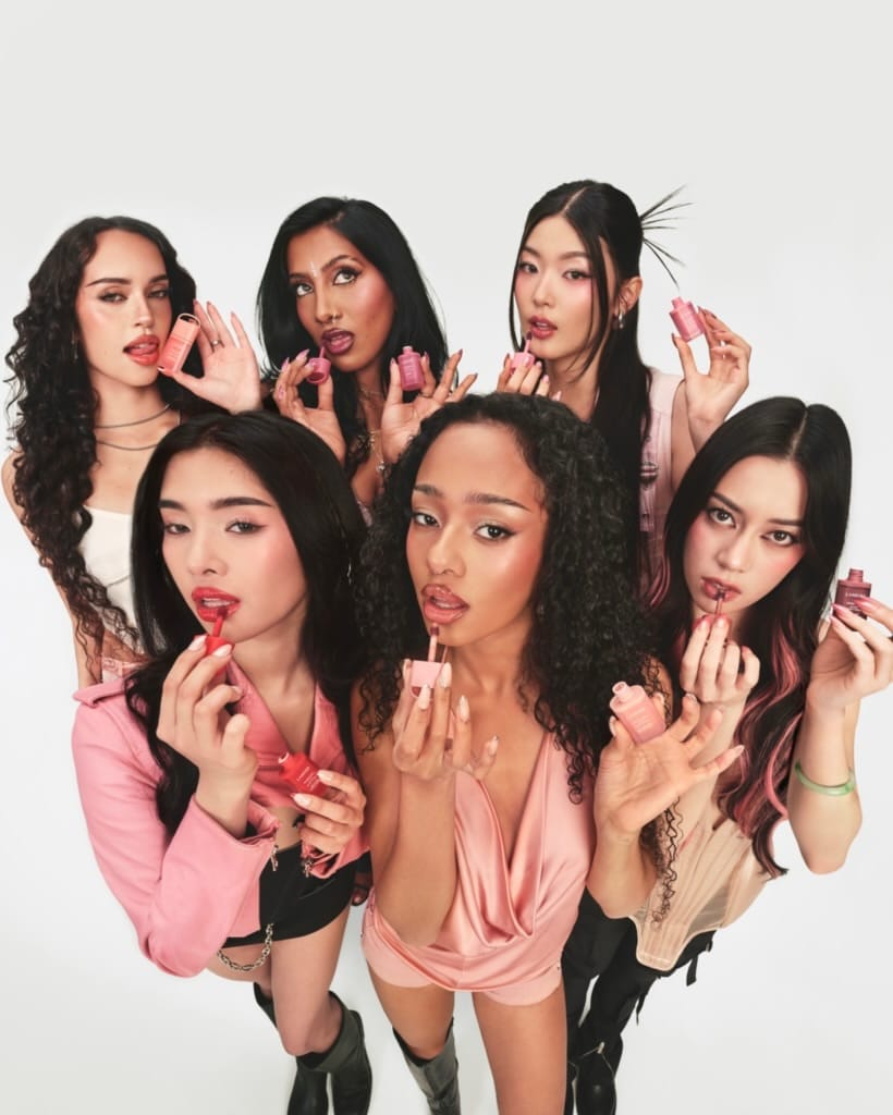
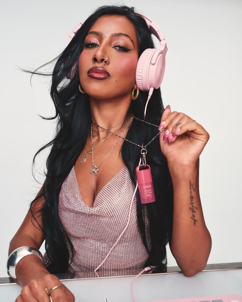
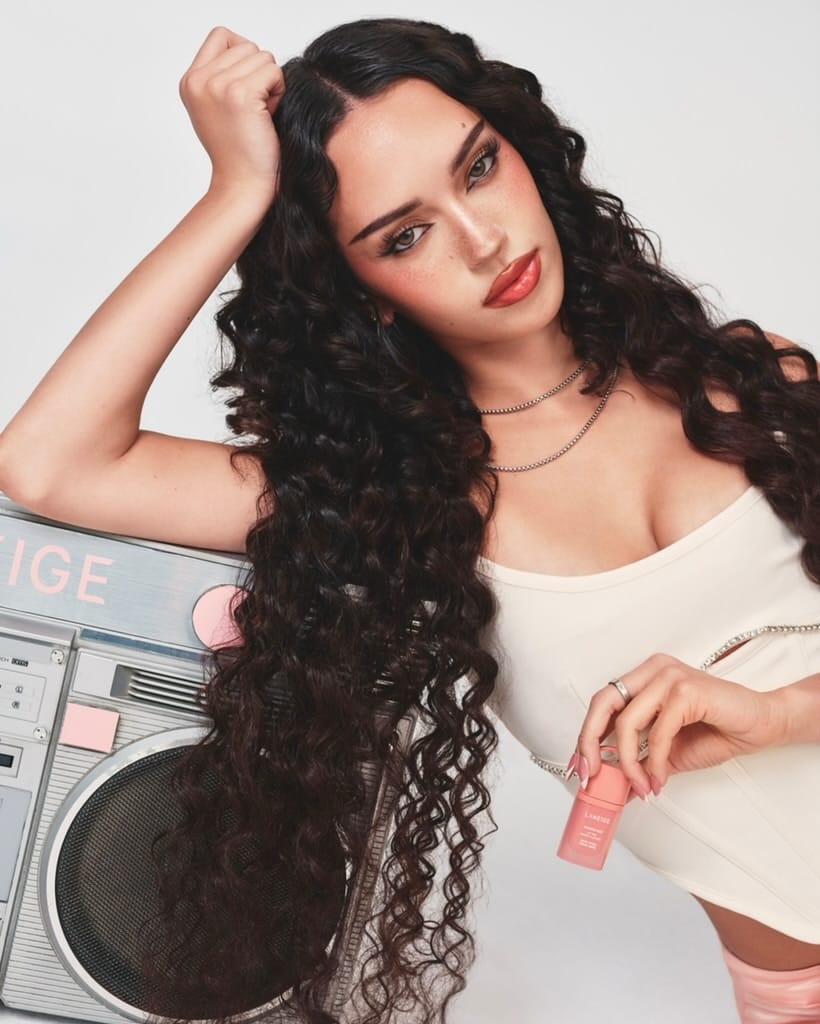
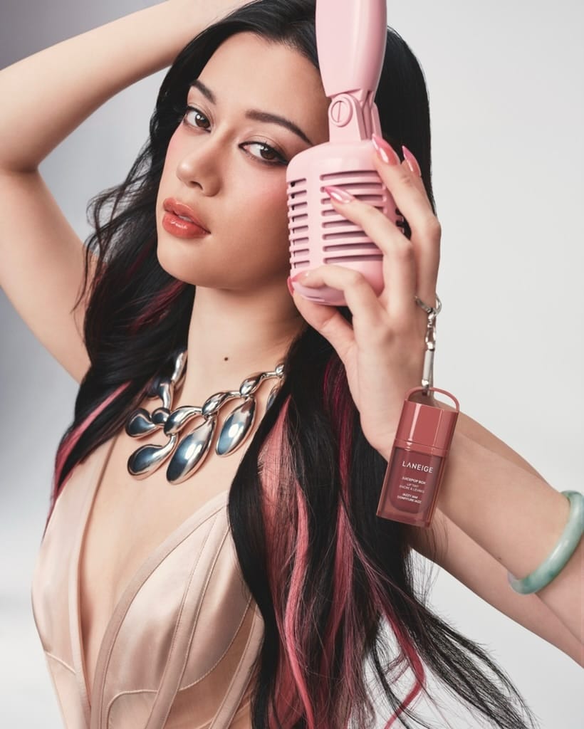
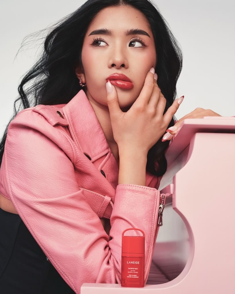
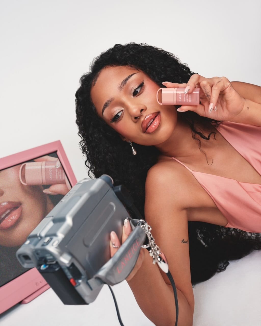
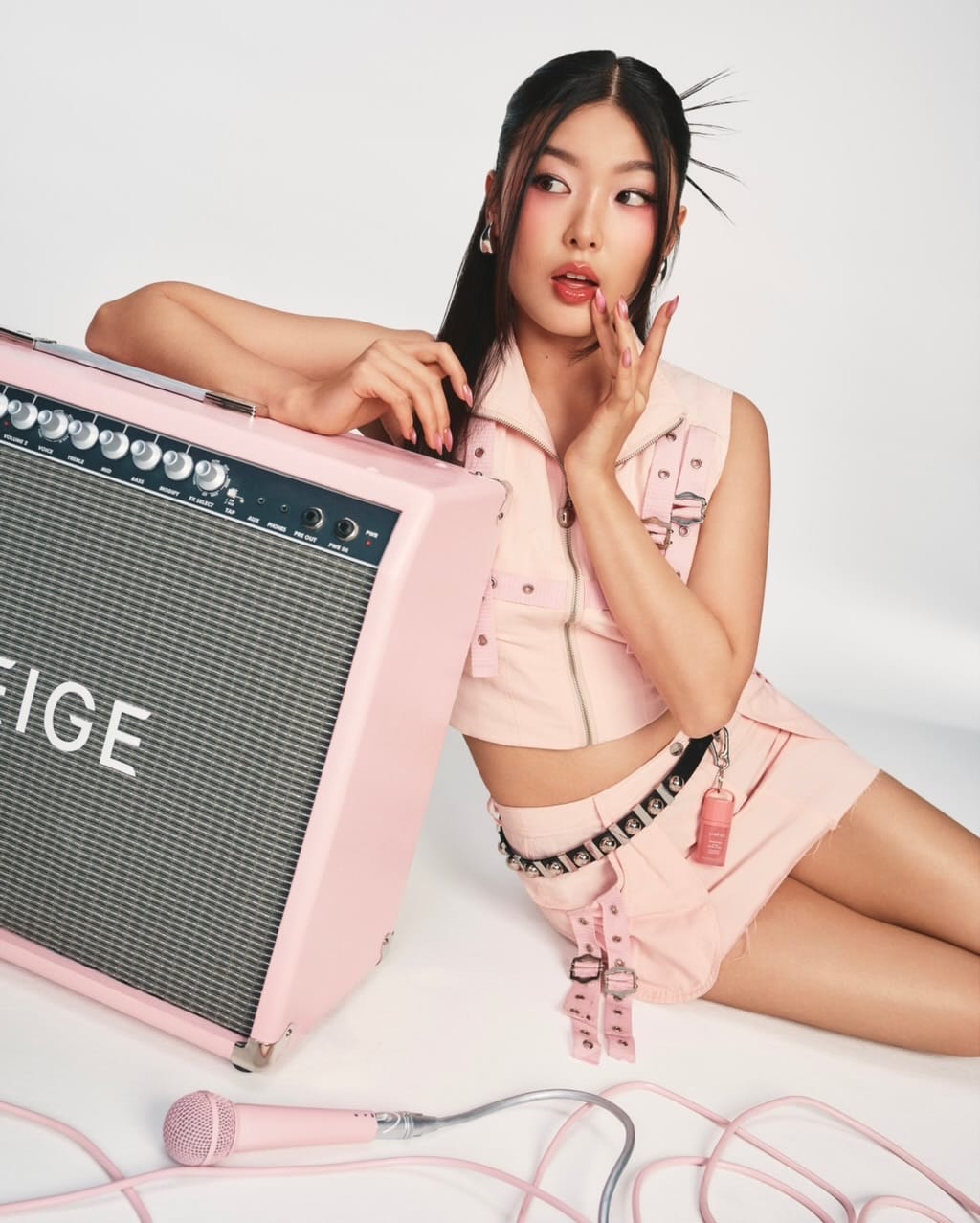
The lighting is on brand for LANEIGE (@laneige_us), but some of these images feel like they're trying too hard. One shot is definitely weaker than the rest. The arm is cropped at the elbow, which breaks a basic posing rule and just looks awkward. [Category: Lifestyle] [Surface: Skin] [Lighting: Soft] [Style: Editorial] [Mood: Sophisticated] [Palette: Pastels]
Curology's Valentine campaign: Soft pastels and on-brand lifestyle styling
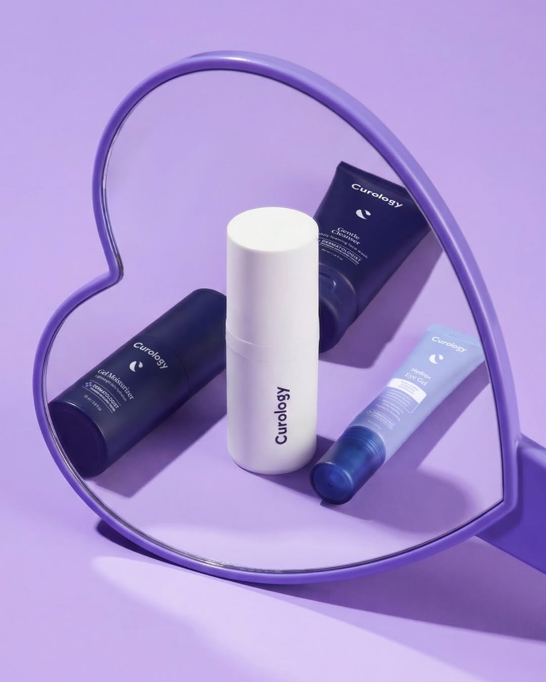
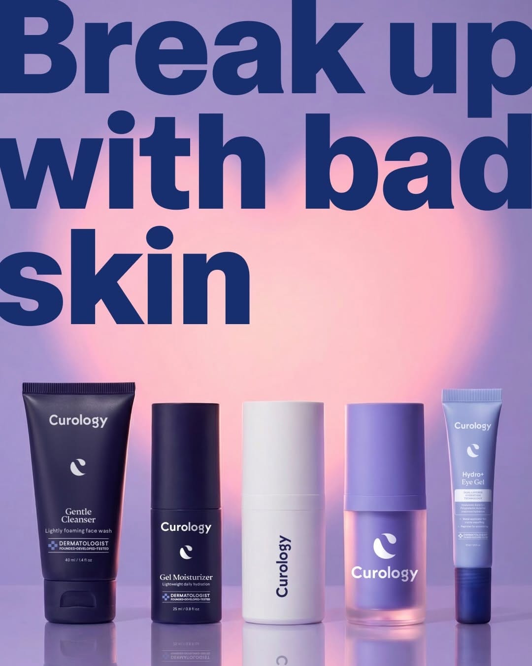
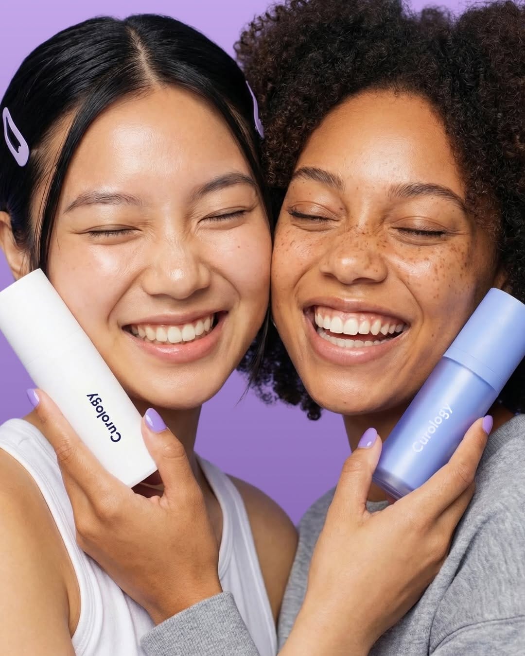
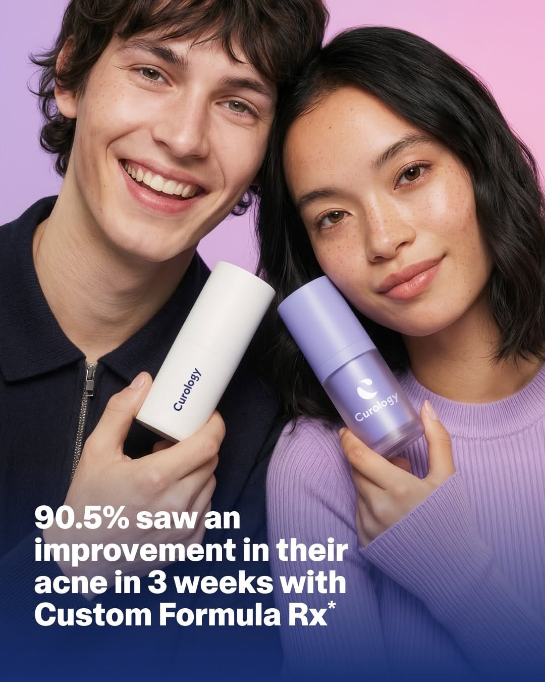
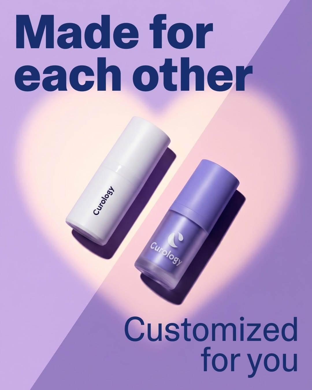
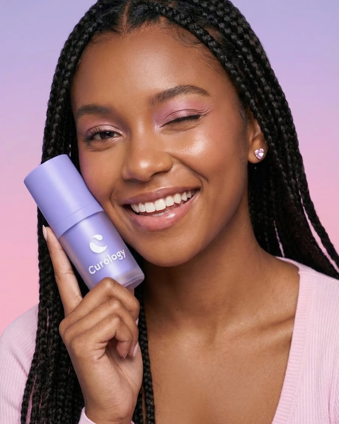
Curology (@curology)'s Valentine campaign looks great! 100% on brand with colors, light, styling, and models. The only thing I would fix is the loss of volume on their white product in the shot with two girl models. It looks flat and a bit unrealistic. I would also fix the highlight on the plastic part, but that's just my perfectionism, haha. [Category: Skincare] [Surface: Plastic] [Lighting: Soft] [Style: Commercial] [Mood: Fresh] [Palette: Pastels]
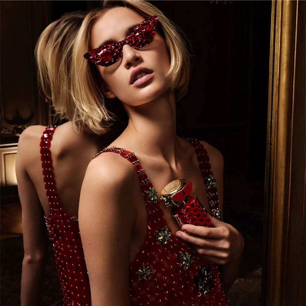
YSL Beauty Valentine's: When compositing goes too far
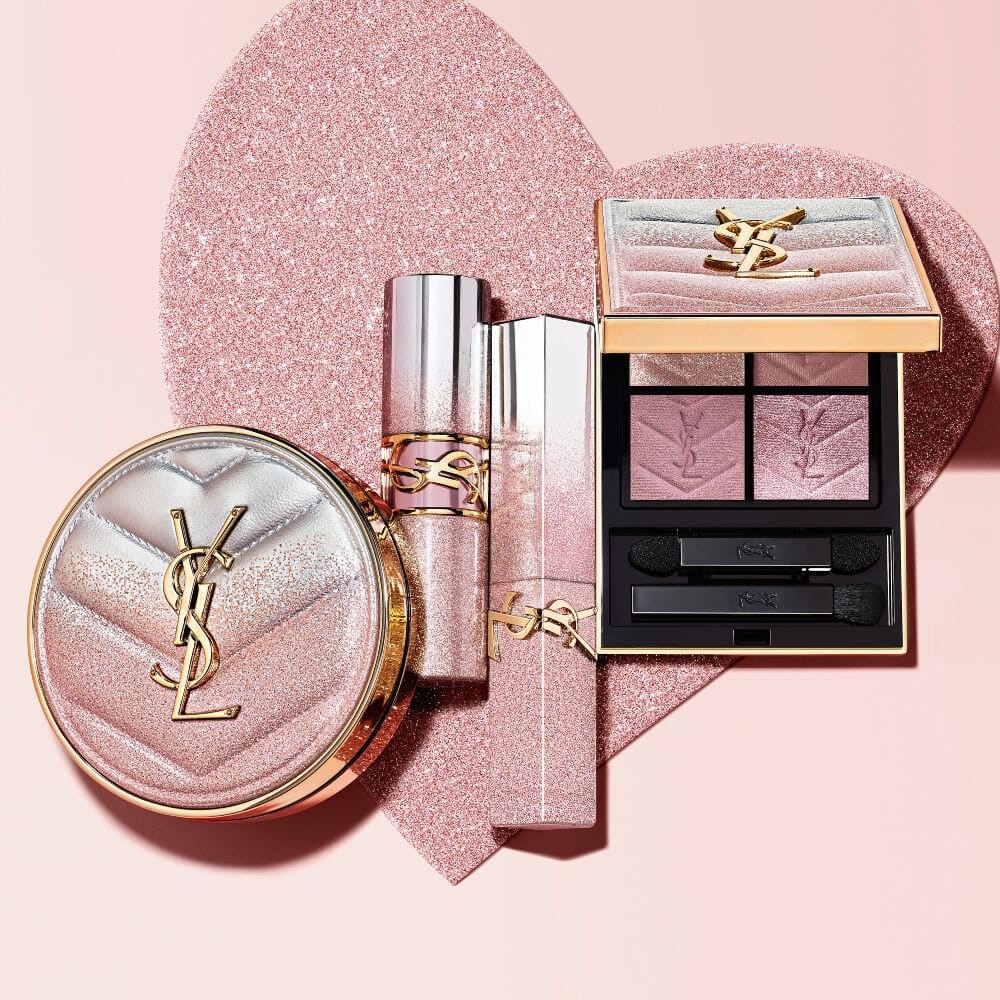
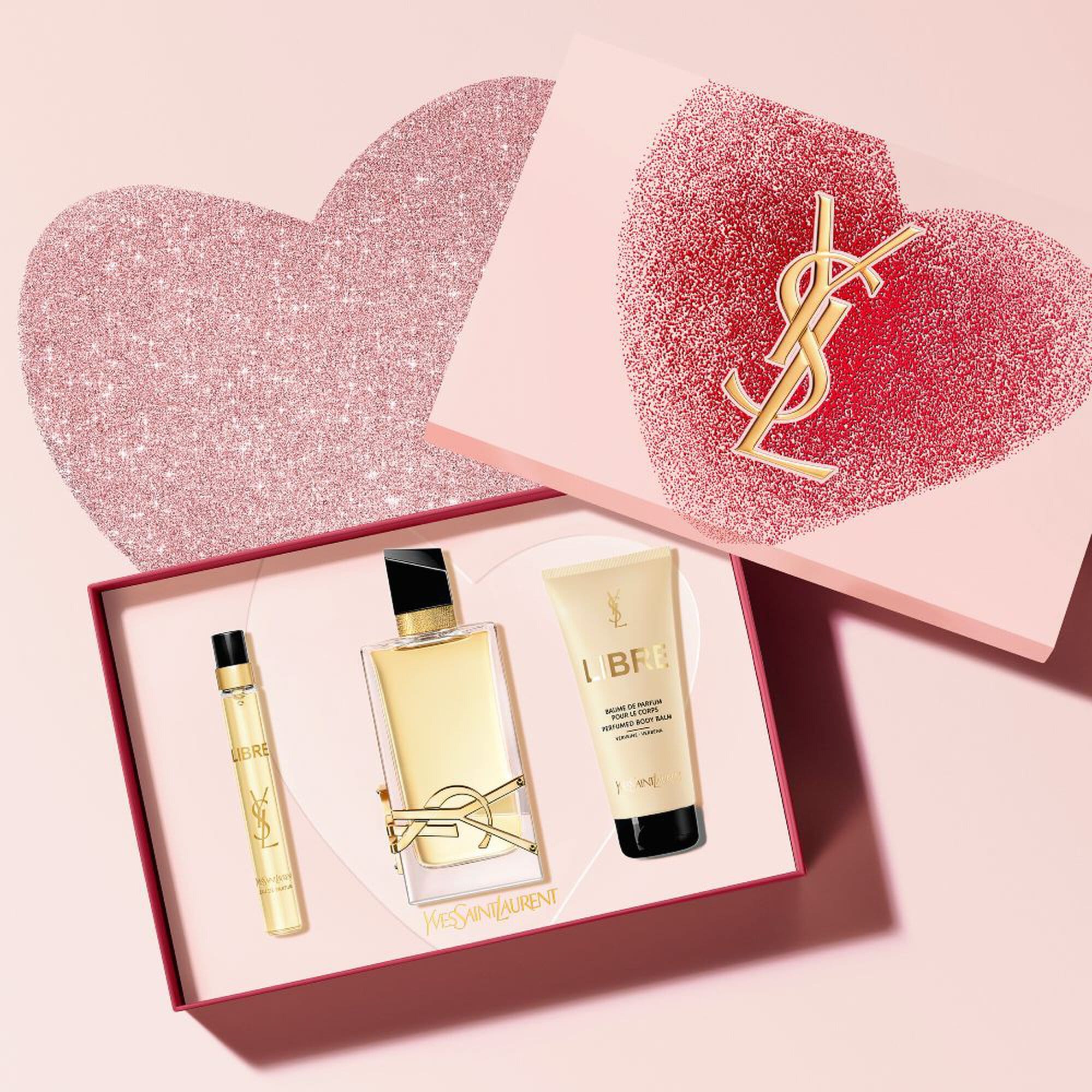
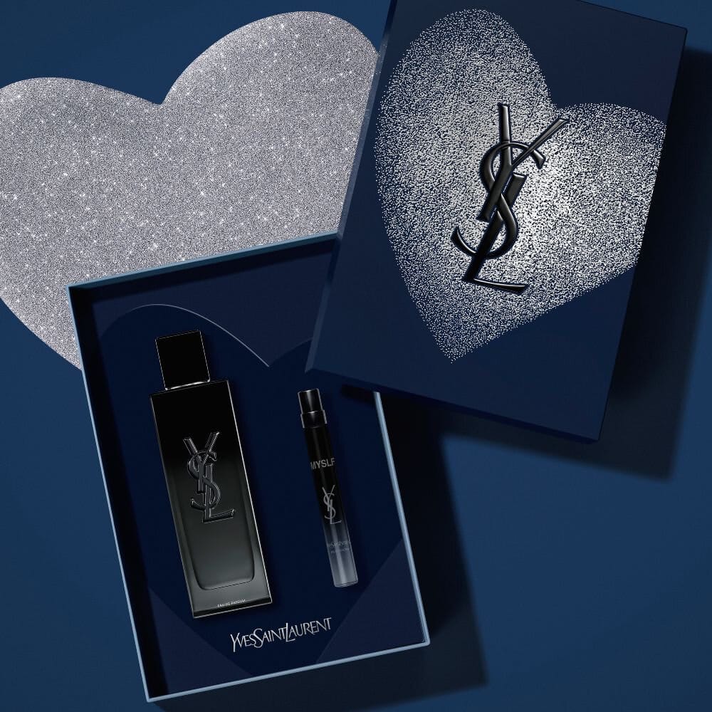
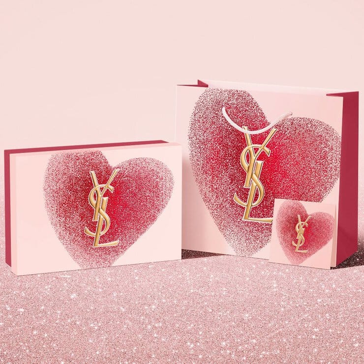
Another Valentine's campaign, this time from YSL (@yslbeauty)'s "Sparkling Desires Collectors" collection. If Curology was realistic, this one looks like too much compositing went into it. The boxes and the bag (especially pink) lack information. I cannot understand what texture it is. It just looks like someone used Paint Bucket Tool and added a bit of gradient for volume, which doesn't look realistic. The products are also photoshopped straight into the box without even trying to make them look realistic, particularly challenging with those gradient metallic finishes from silver to golden-pink. It shows they didn't care much for their images this time, just threw things together. [Category: Fragrance] [Surface: Glass] [Lighting: Bright] [Style: Editorial] [Mood: Luxurious] [Palette: Warm Tones]
Rabanne Fame In Love: Dreamy pink gradients and soft focus romance
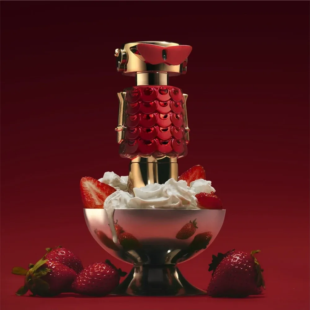
Oh la la, look at Rabanne(@rabanne)'s Fame In Love Parfum Elixir! Great concept, smart use of trends, beautiful photography and retouching. Way to go! [Category: Fragrance] [Surface: Metal, Plastic] [Lighting: Dramatic] [Style: Editorial] [Mood: Luxurious] [Palette: Warm Tones]
Guerlain Parure Gold Skin: Heavy retouching for Korean market appeal
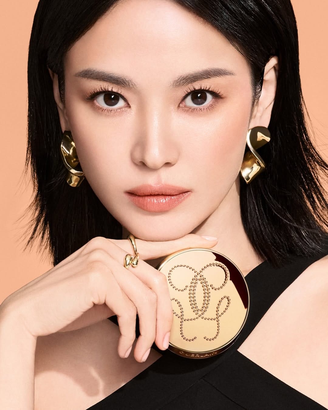
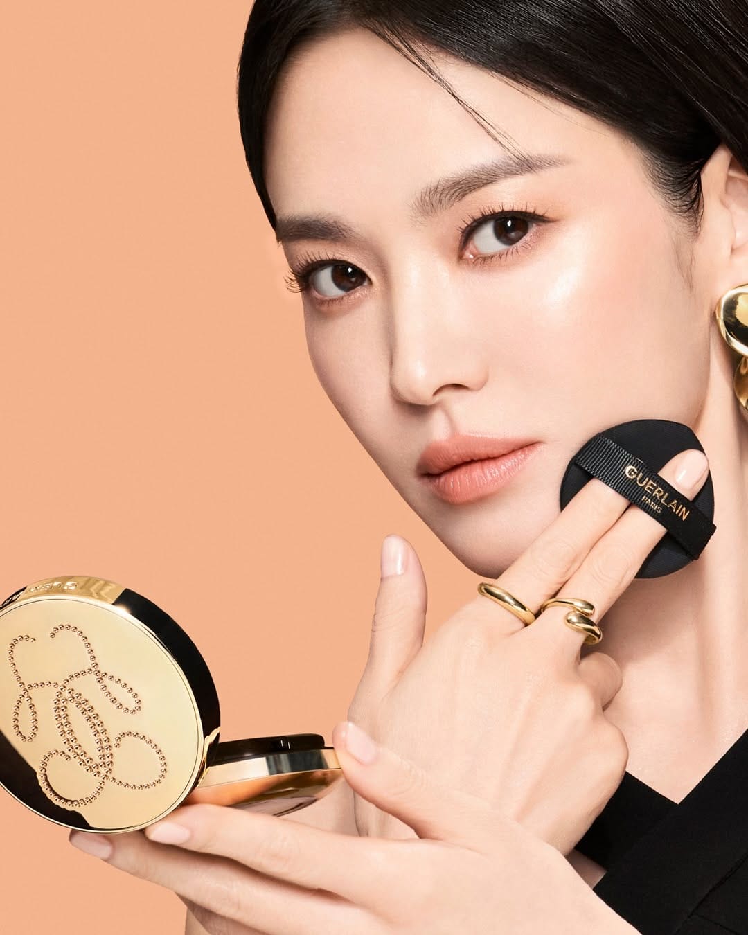
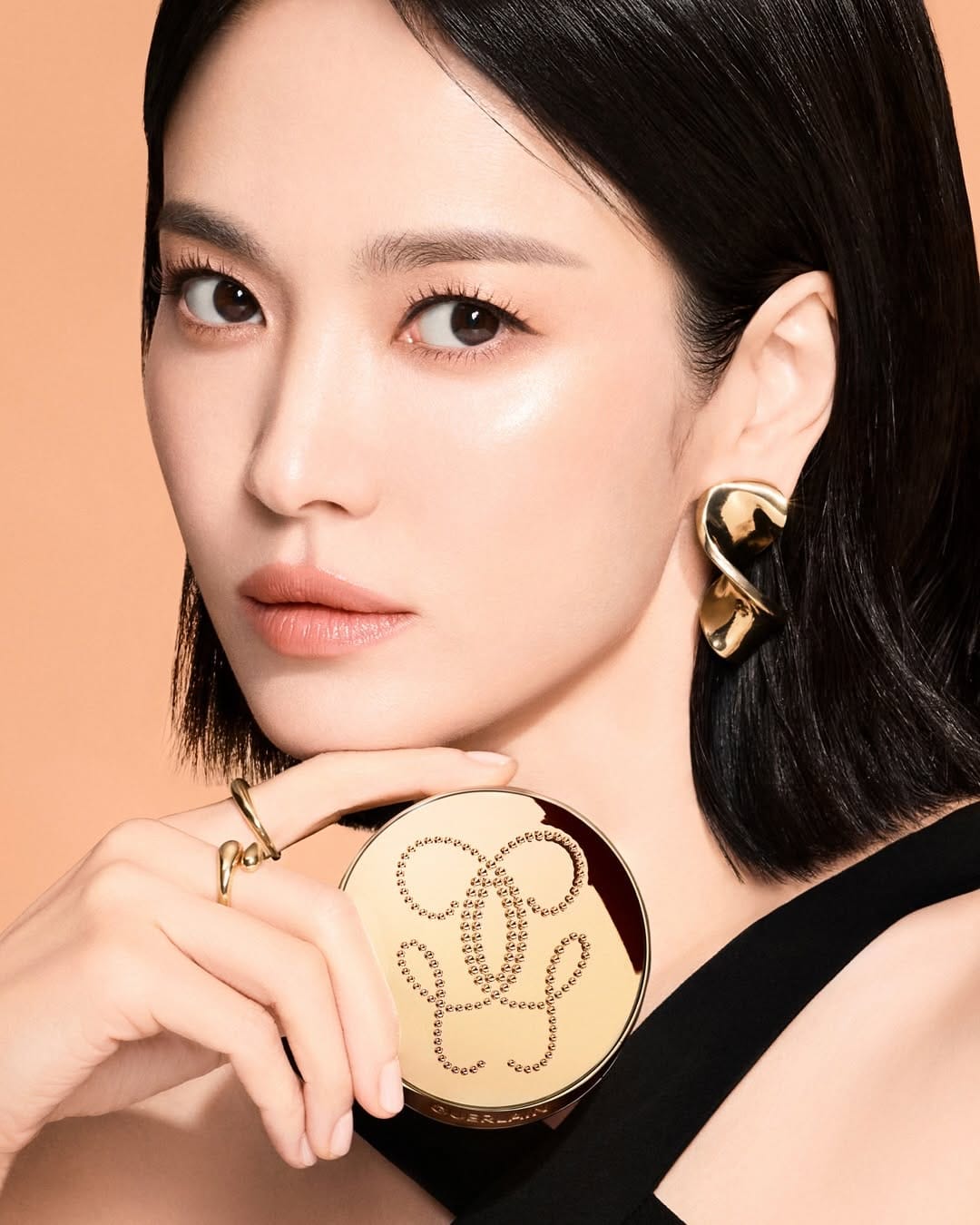
Photos by Mok Jungwook (@mokjungwook) are on brand for Guerlain (@guerlain), but they look "too perfect," which makes sense since this is for the Korean market. Still, Song Hye-Kyo (@kyo1122) looks photoshopped onto the background to me. The choppy edge work gives it away, and her hands lack volume. The retouching feels inconsistent throughout Guerlain's Parure Gold Skin work. [Category: Fashion] [Surface: Metal] [Lighting: Studio] [Style: Editorial] [Mood: Sophisticated] [Palette: Warm Tones]
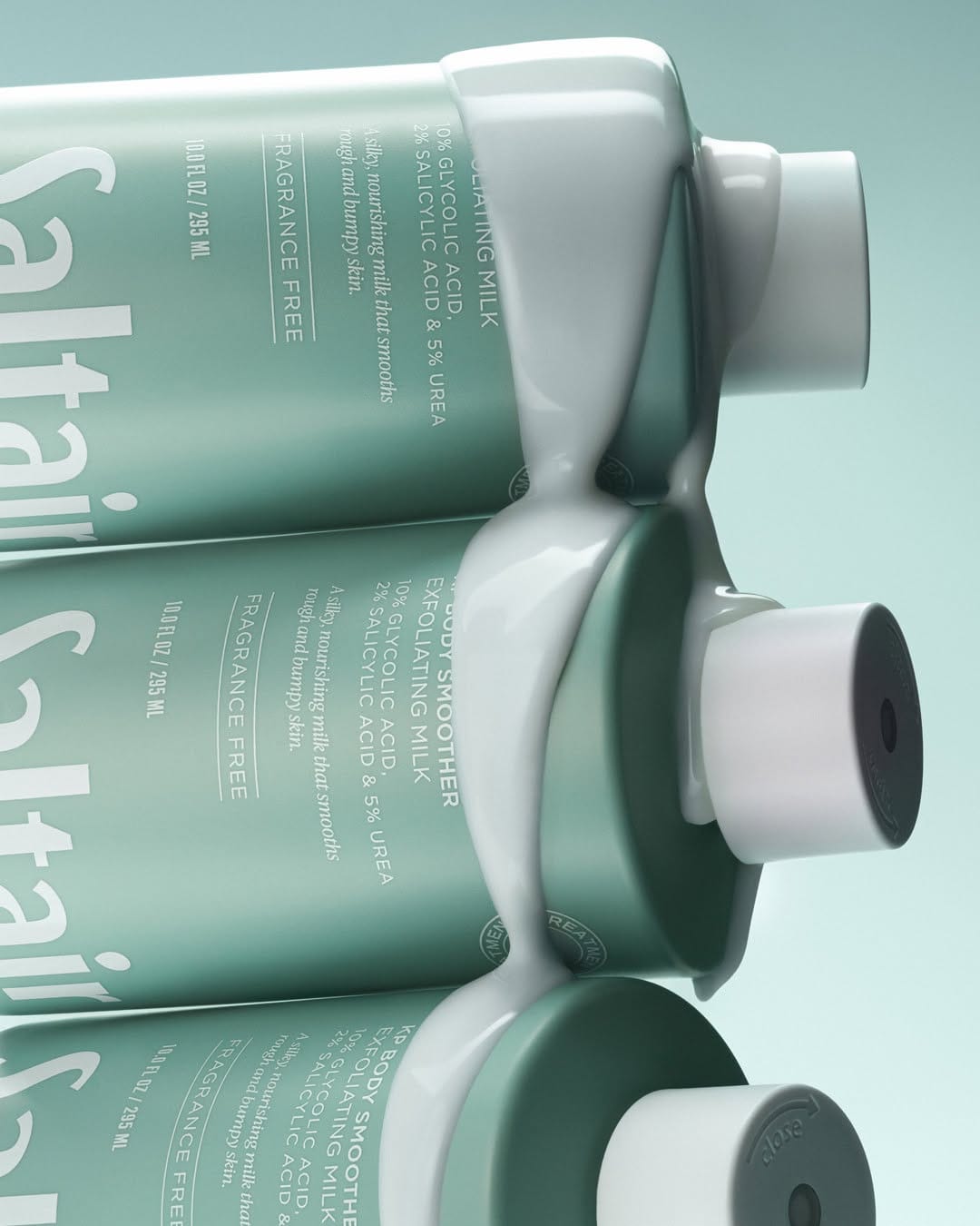
Saltair body care: Clean, tactile photography that elevates affordable luxury
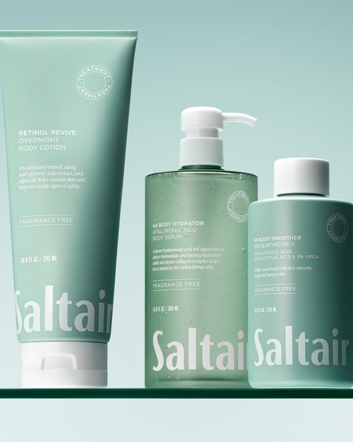

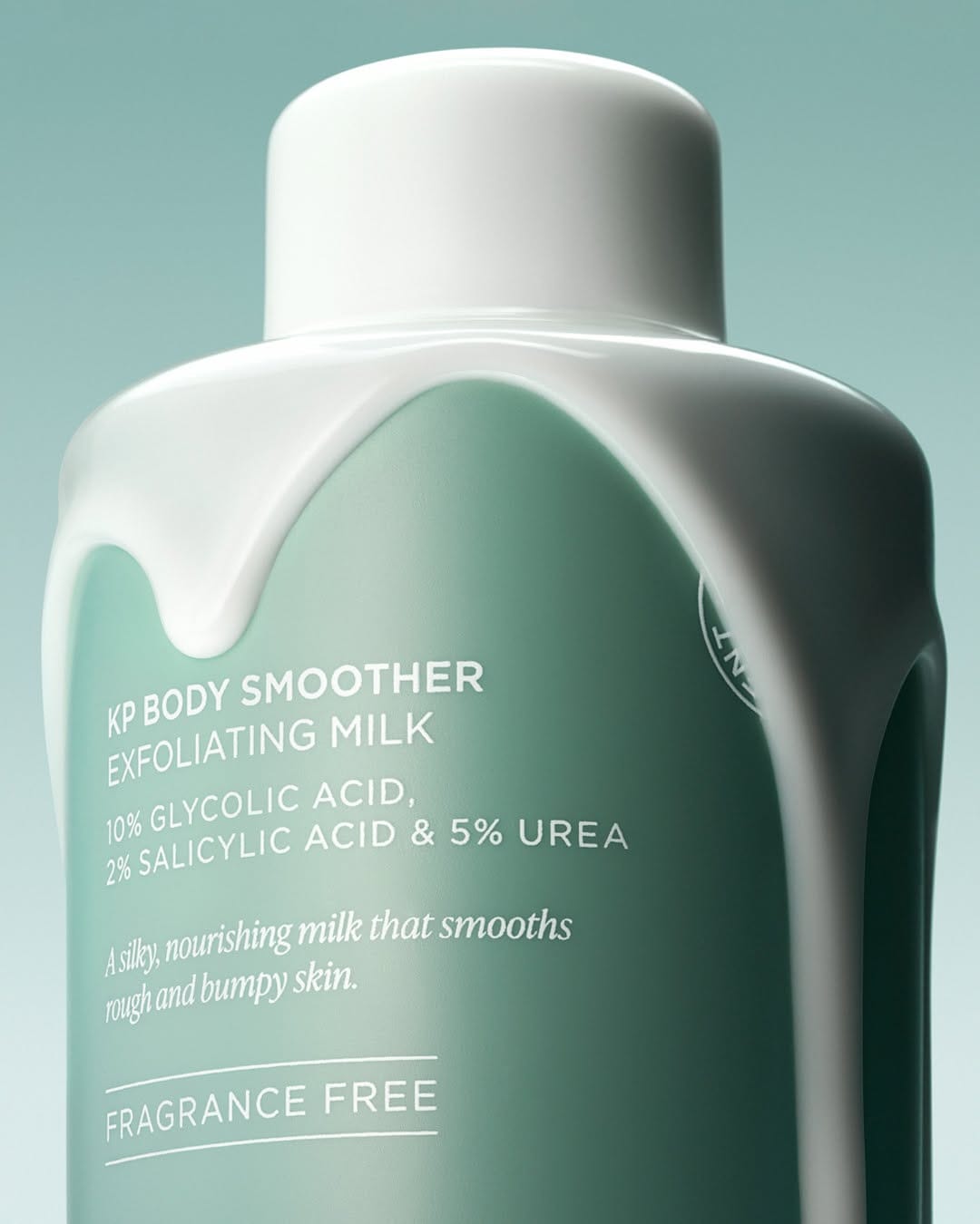
I've been obsessing over Saltair (@saltair)'s product photography lately. The images are clean, tactile, and flawless. Honestly, they sell me on the packaging alone before I even think about what's inside. You can tell the brand takes their visuals seriously, and it shows in every shot. [Category: Skincare] [Surface: Plastic] [Lighting: Soft] [Style: Clean] [Mood: Fresh] [Palette: Cool Tones]
About the Author
Elina is a Ukrainian-Canadian commercial photographer based in Vancouver, British Columbia.
Get in touch
Instagram: @elina.kustlyvy
X (Twitter): @elinakustlyvy
Photographers: If I've featured your work and you'd like a credit or to be tagged, DM me your details. I'm happy to update and showcase your name.