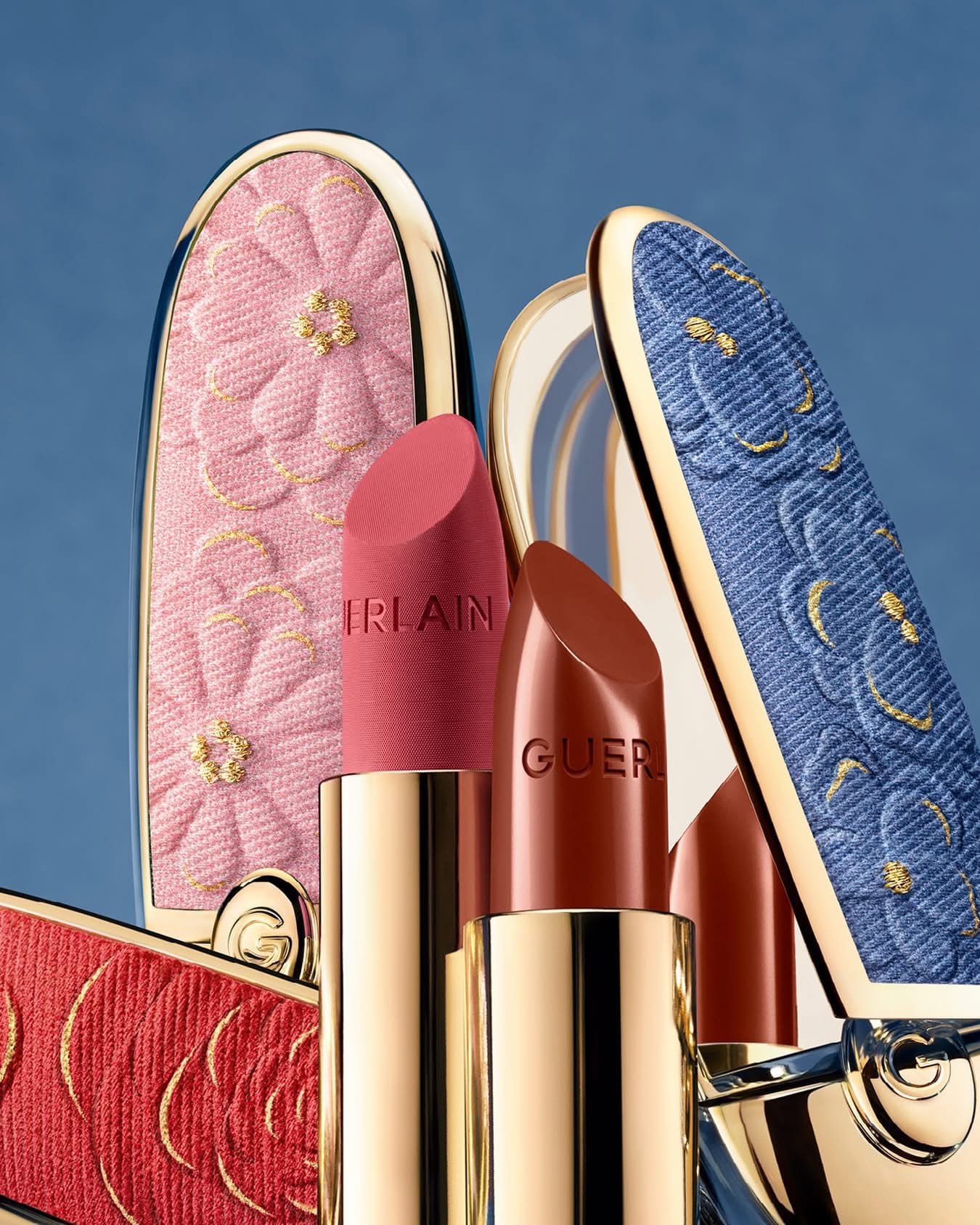
Guerlain Blooming Denim: Upcycled textures meet metallic precision
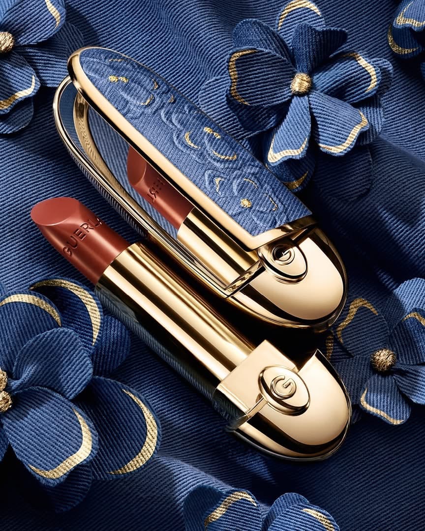
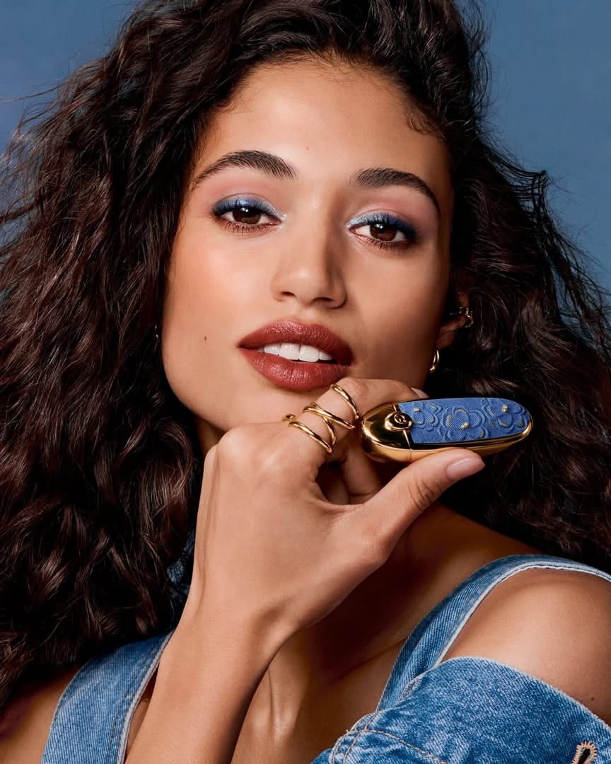
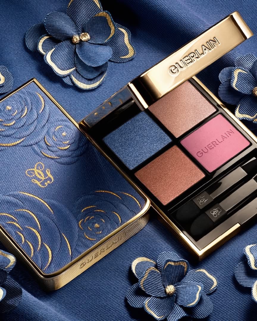
I've been obsessing over these photos from Guerlain (@guerlain)'s Blooming Denim collaboration with Nona Source (@nona_source) since I first saw them. Beautiful, flawless, on brand. Gorgeous textures and colors, especially how they captured the upcycled denim details alongside those metallic finishes. Everything looks super cohesive as a story. Retouching is good, not overdone. There were some minor errors, but most people won't see them (like on the metal part and lipstick there was a 1-degree error with a stamp tool). I would also leave more texture on the model's skin, because natural is more trendy now. Technical execution is great, beautiful gradients on metals, no blown highlights or blocked shadows. Every detail is visible. [Category: Cosmetics] [Surface: Metal] [Lighting: Studio] [Style: Editorial] [Mood: Luxurious] [Palette: Cool Tones]
Biodance skincare: Why AI-generated beauty misses the mark
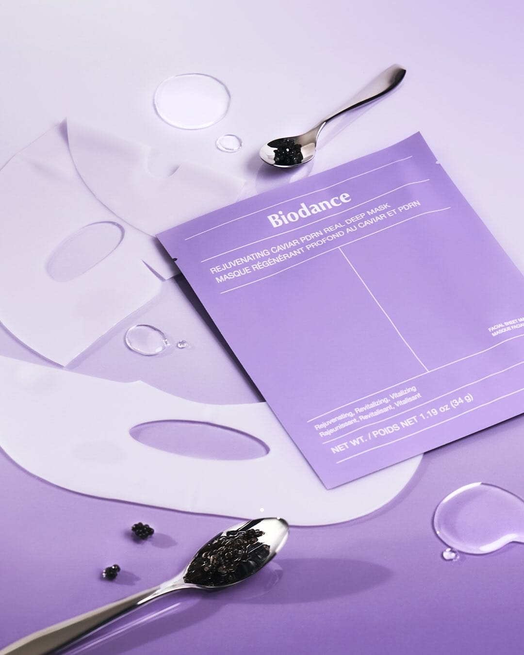
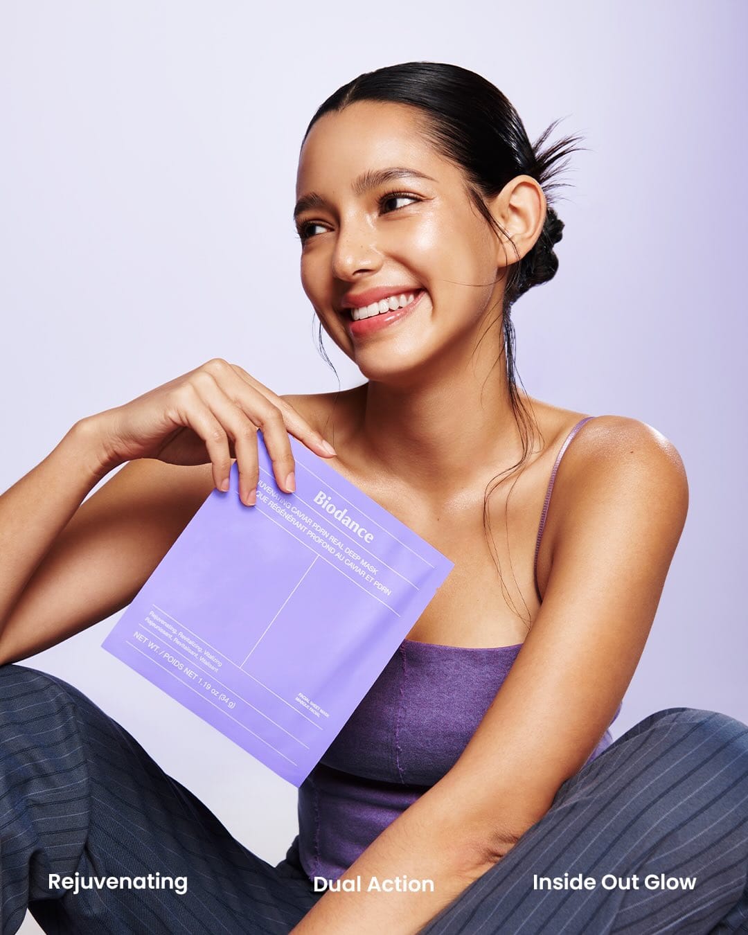
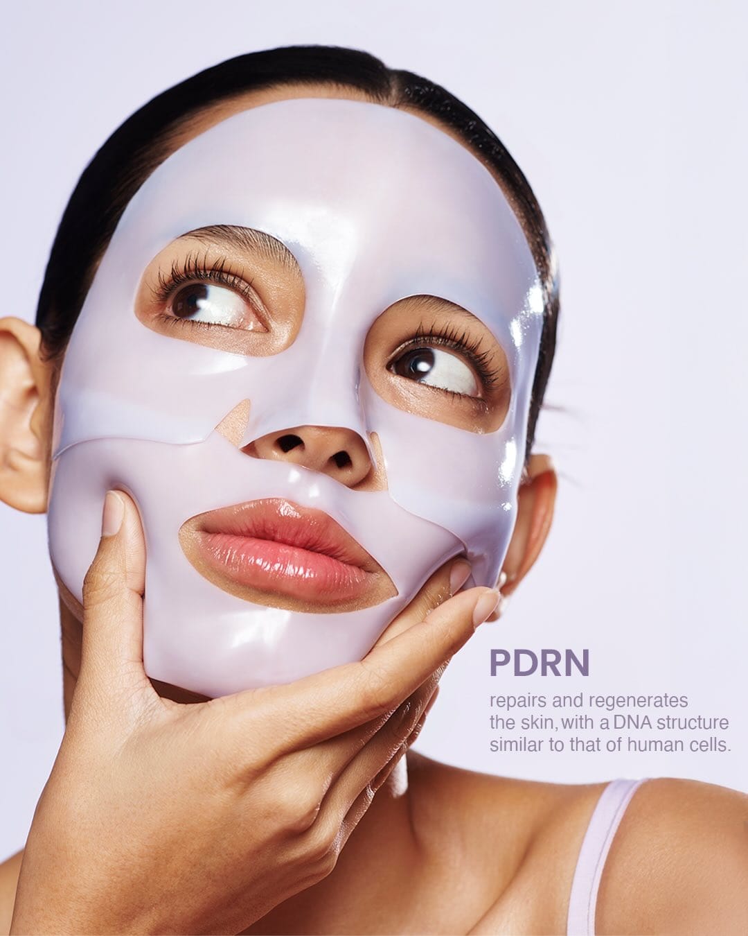
AI photos... 💔 They just look fake, exactly what you want to avoid with skincare photography. The skin texture feels off, the lighting's too perfect, and something about the proportions doesn't sit right. You can spot it immediately.
That said, it's more or less on brand for Biodance. The clean aesthetic and minimal styling match their product positioning. But when your whole pitch is skin health, showing artificial skin undermines the message. Real skin, real results, that's what builds trust in skincare imagery. [Category: Skincare] [Surface: Skin] [Lighting: Soft] [Style: Commercial] [Mood: Fresh] [Palette: Pastels]
Prada Beauty: Metallic cosmetics with uneven retouching execution
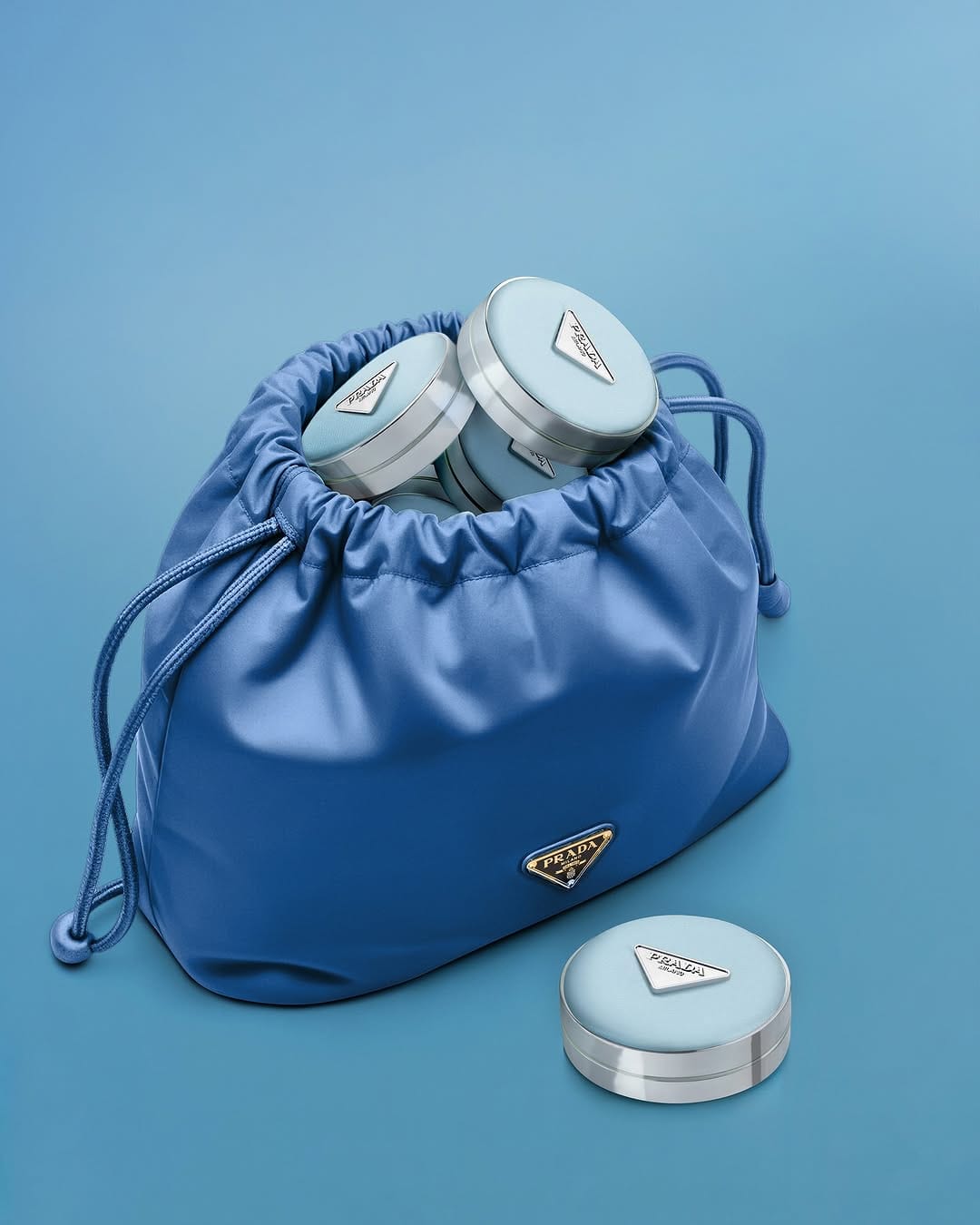
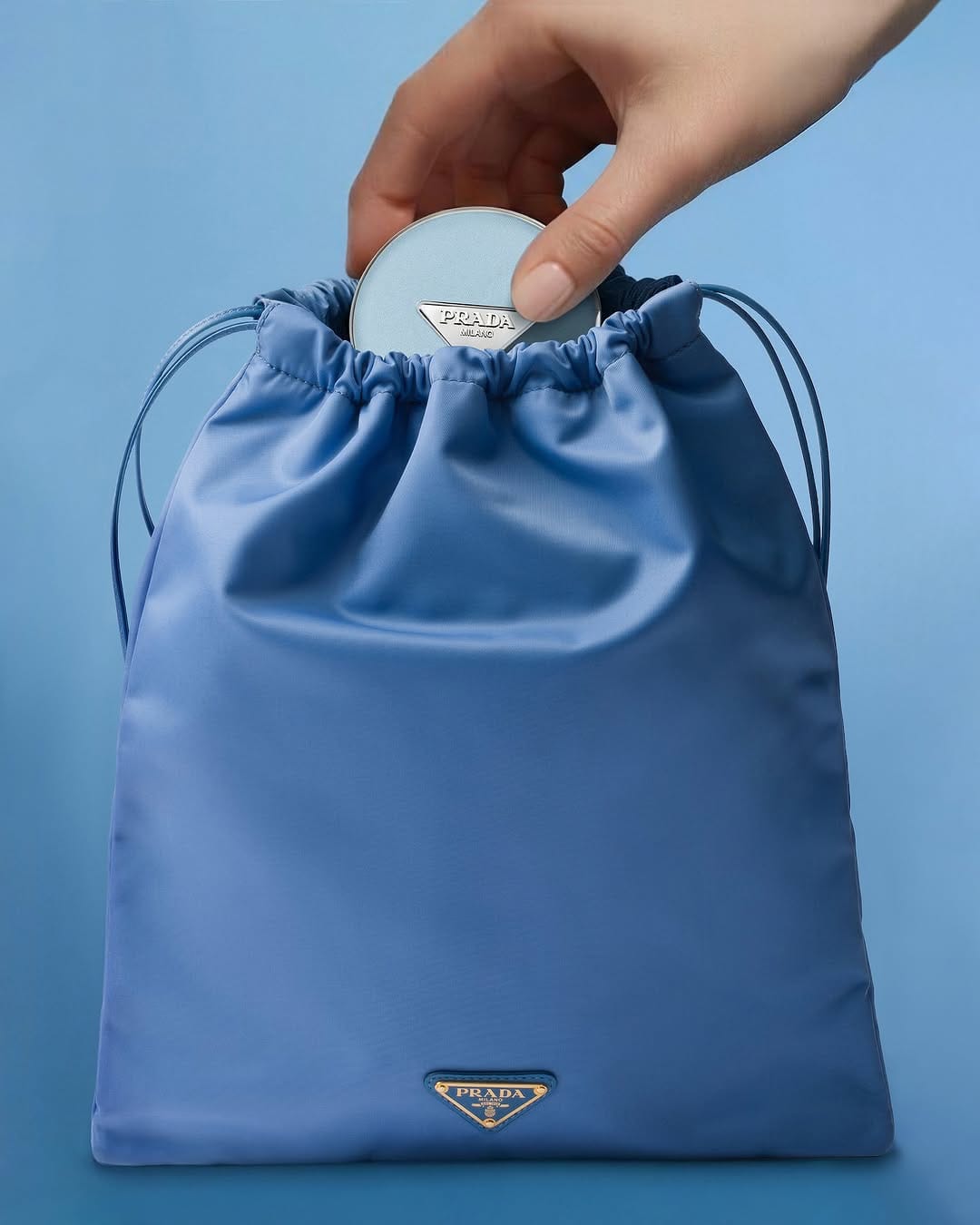
Hand looks overly retouched, almost AI-generated. The light is good and on brand, but personally I like seeing more life in the metal. The product on the backdrop looks Photoshopped in. There are no color reflexes, and the light doesn't match the metal. Some photos of Prada Beauty (@pradabeauty)'s campaign work better than others.
Another retouching note: on one photo the bag looks flawless, but on the overhead shot we see tiny wrinkles that make me question what type of fabric it is. The inconsistency breaks the illusion. For reflective cosmetics photography at this level, those details matter. [Category: Fashion] [Surface: Fabric] [Lighting: Soft] [Style: Minimalist] [Mood: Sophisticated] [Palette: Cool Tones]
Revlon Super Lustrous: When flat lighting kills product appeal
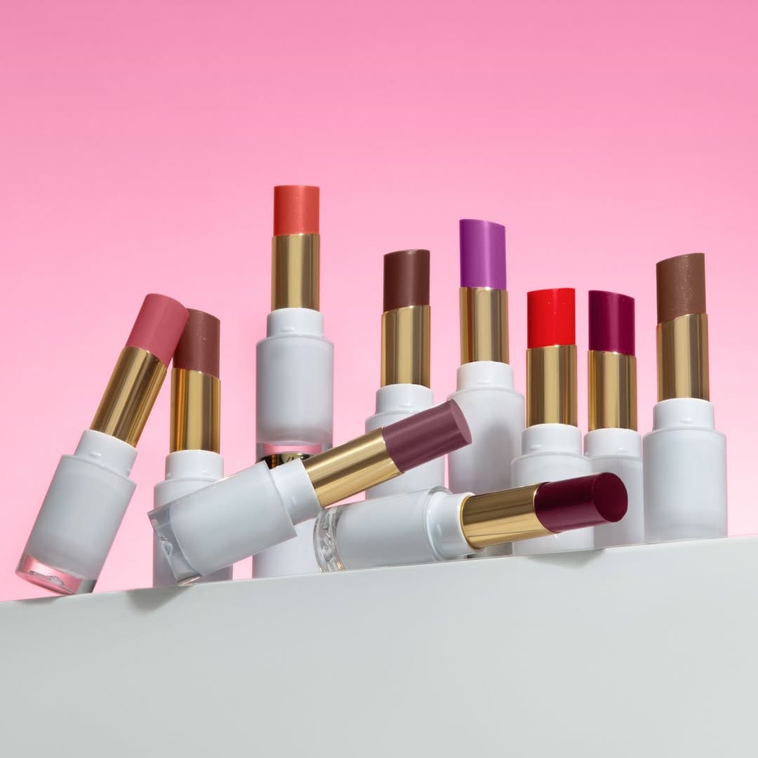
A standard group shot, but why does it look so dull? Technically this photo isn't great. Metals look flat with no control over reflections, whites are gray, lipsticks give no information. Are they glossy or matte? There's no volume in the product and it looks boring and flat. For a heritage beauty brand like Revlon (@revlon) relaunching their Super Lustrous Glass Shine Balm line, this misses the mark on showing what makes the formula special. [Category: Cosmetics] [Surface: Plastic] [Lighting: Soft] [Style: Commercial] [Mood: Playful] [Palette: Vibrant]
Rhode Skin: Tactile textures and gradient lighting perfection
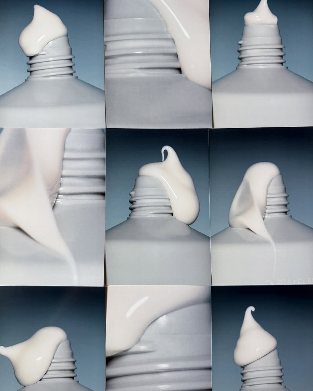
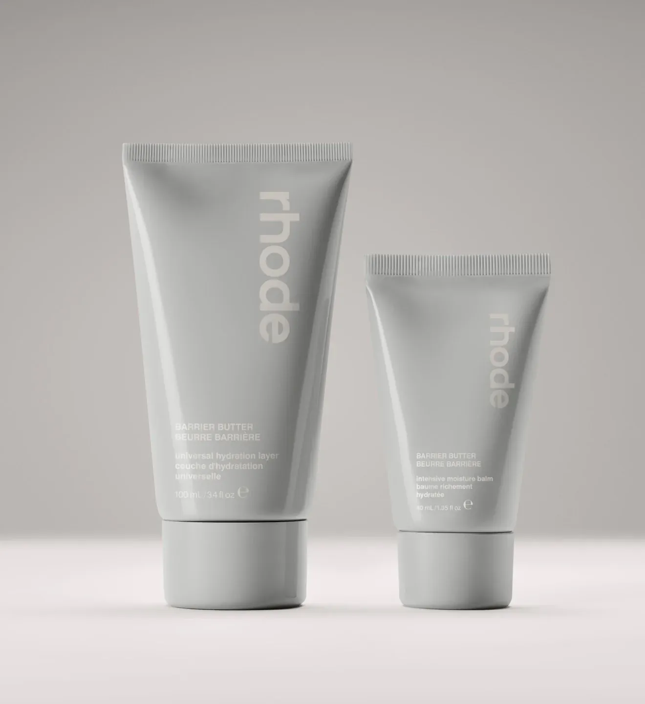
I don't even know if it's worth discussing. Rhode (@rhode) has been a trendsetter since day one. This shot with its variety of sexy textures has it all: the current obsession with tactility, gradient lighting, gorgeous highlights on those glossy surfaces. So good! [Category: Skincare] [Surface: Plastic] [Lighting: Soft] [Style: Minimalist] [Mood: Fresh] [Palette: Neutral]
About the Author
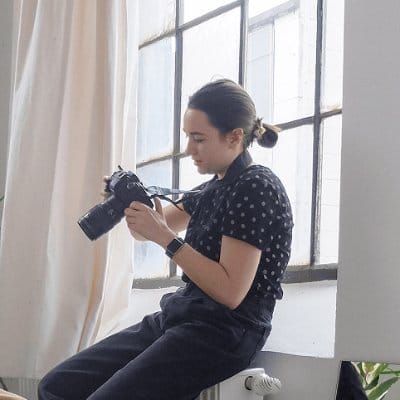
Elina is a Ukrainian-Canadian commercial photographer based in Vancouver, British Columbia.
Get in touch
Instagram: @elina.kustlyvy
X (Twitter): @elinakustlyvy
Photographers: If I've featured your work and you'd like a credit or to be tagged, DM me your details. I'm happy to update and showcase your name.