Gucci Beauty's Lunar New Year: Polished perfection with striking red accents
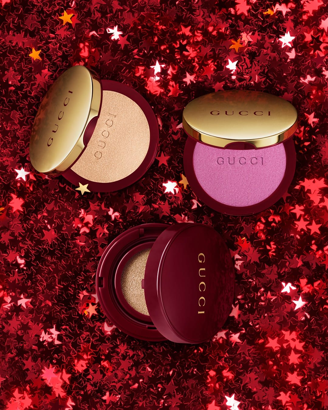
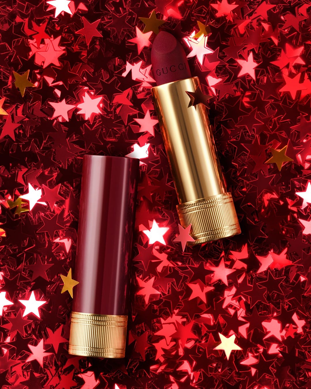
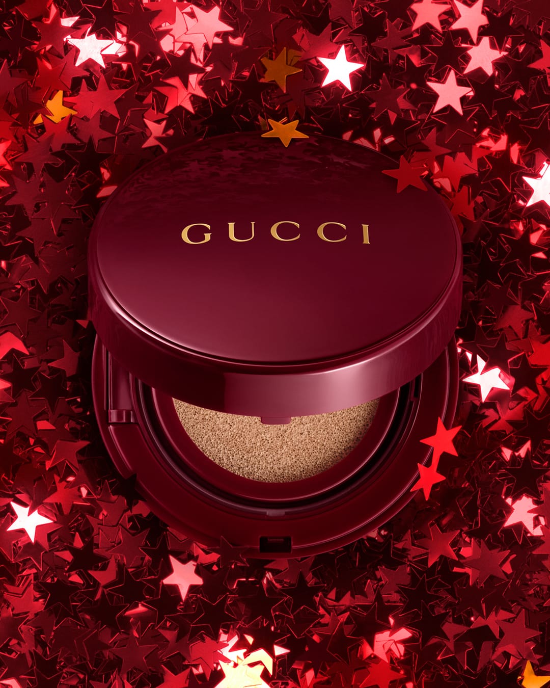
Another concept for Lunar New Year from Gucci (@guccibeauty) as flawless as the one with the moon. The only thing that bothers my eye a bit is the retouching on the red cap of the lipstick—it looks too perfect. [Category: Cosmetics] [Surface: Metal] [Lighting: Studio] [Style: Bold] [Mood: Luxurious] [Palette: Vibrant]
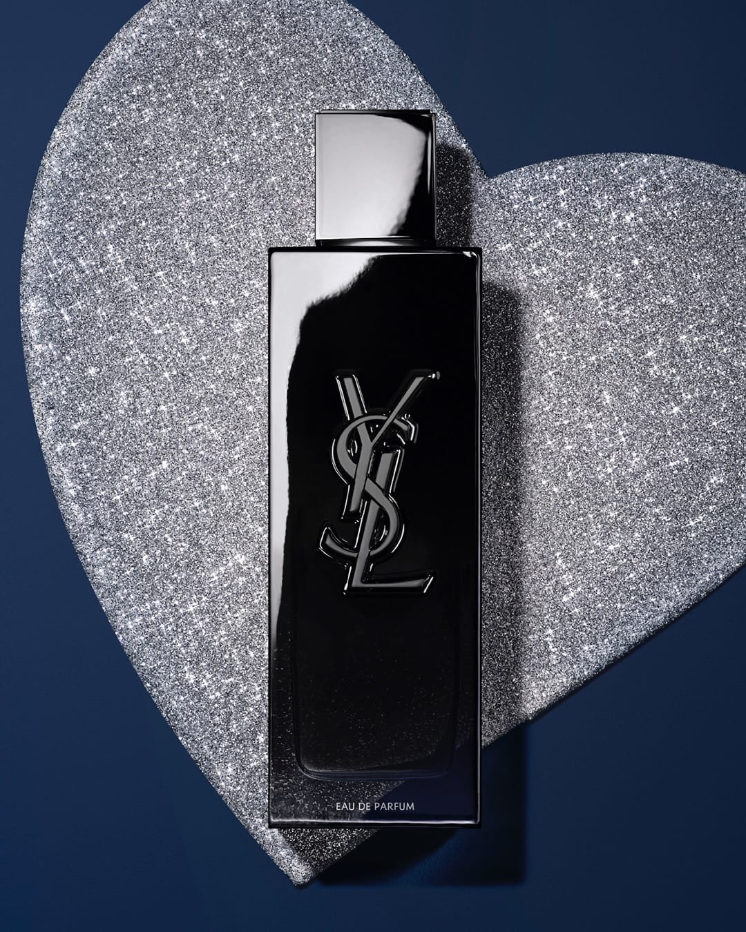
YSL Beauty fragrance: Natural glass highlights and refined retouching
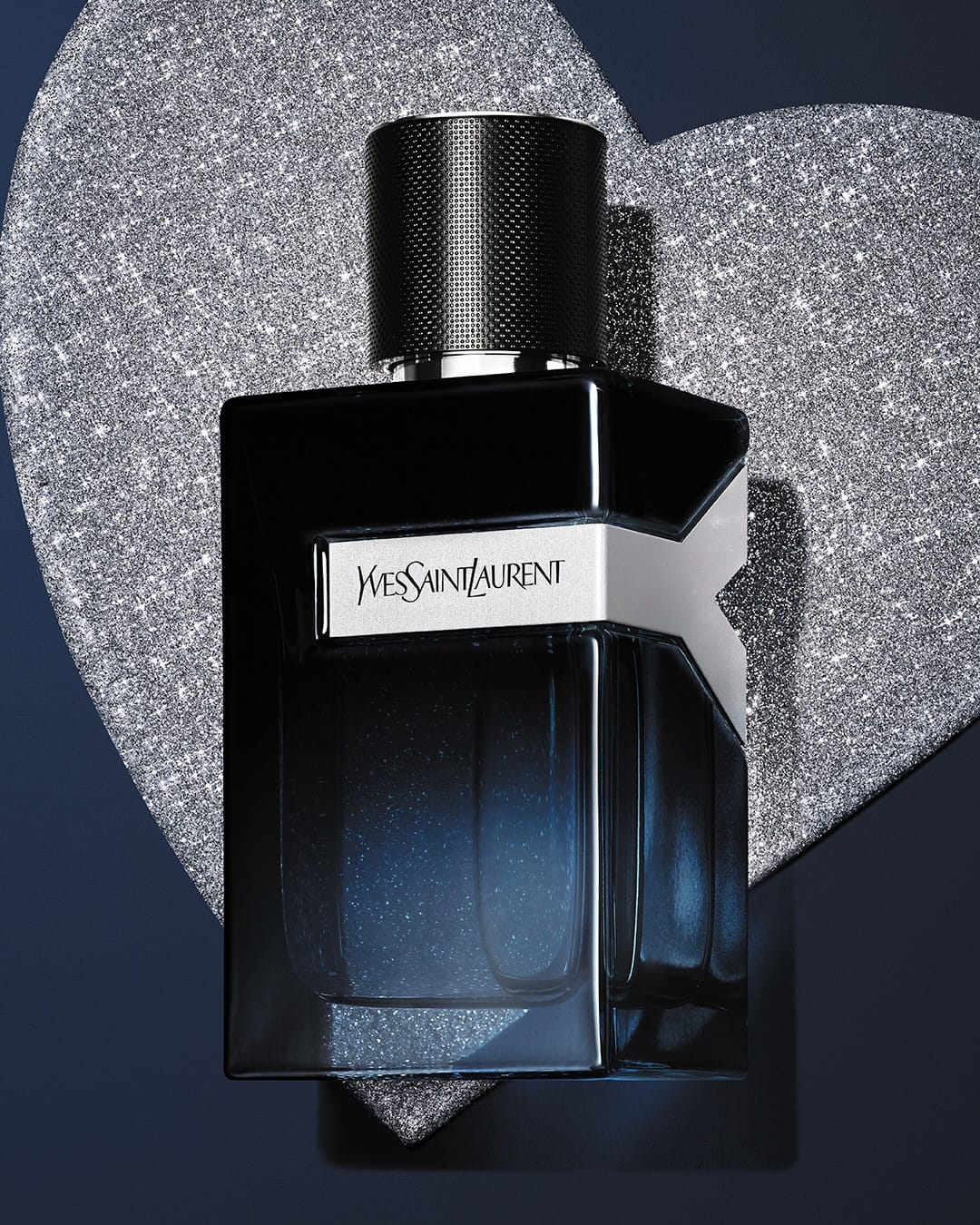
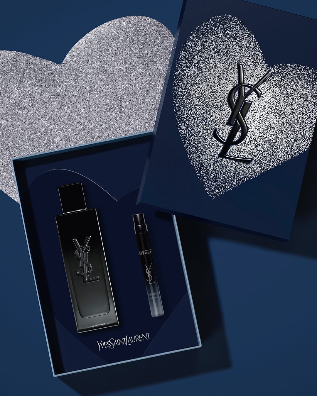
YSL (@yslbeauty) has been one of my favorite brands for their product visuals. In this set, the first shot with the products in the box is my least favorite because it's way too polished and unrealistic. The other two are great. I'm a big fan of the white highlight on the bottle that clearly shows the shape of the glass and gives you the feel of a real product, as opposed to the extra polished glitter heart and background. The retouching on all images is very clean to keep the glass clear and crisp—good reference for glass bottle photography. [Category: Fragrance] [Surface: Glass] [Lighting: Studio] [Style: Editorial] [Mood: Luxurious] [Palette: Cool Tones]
Sisley Paris lipstick: Realistic metal texture and packaging detail
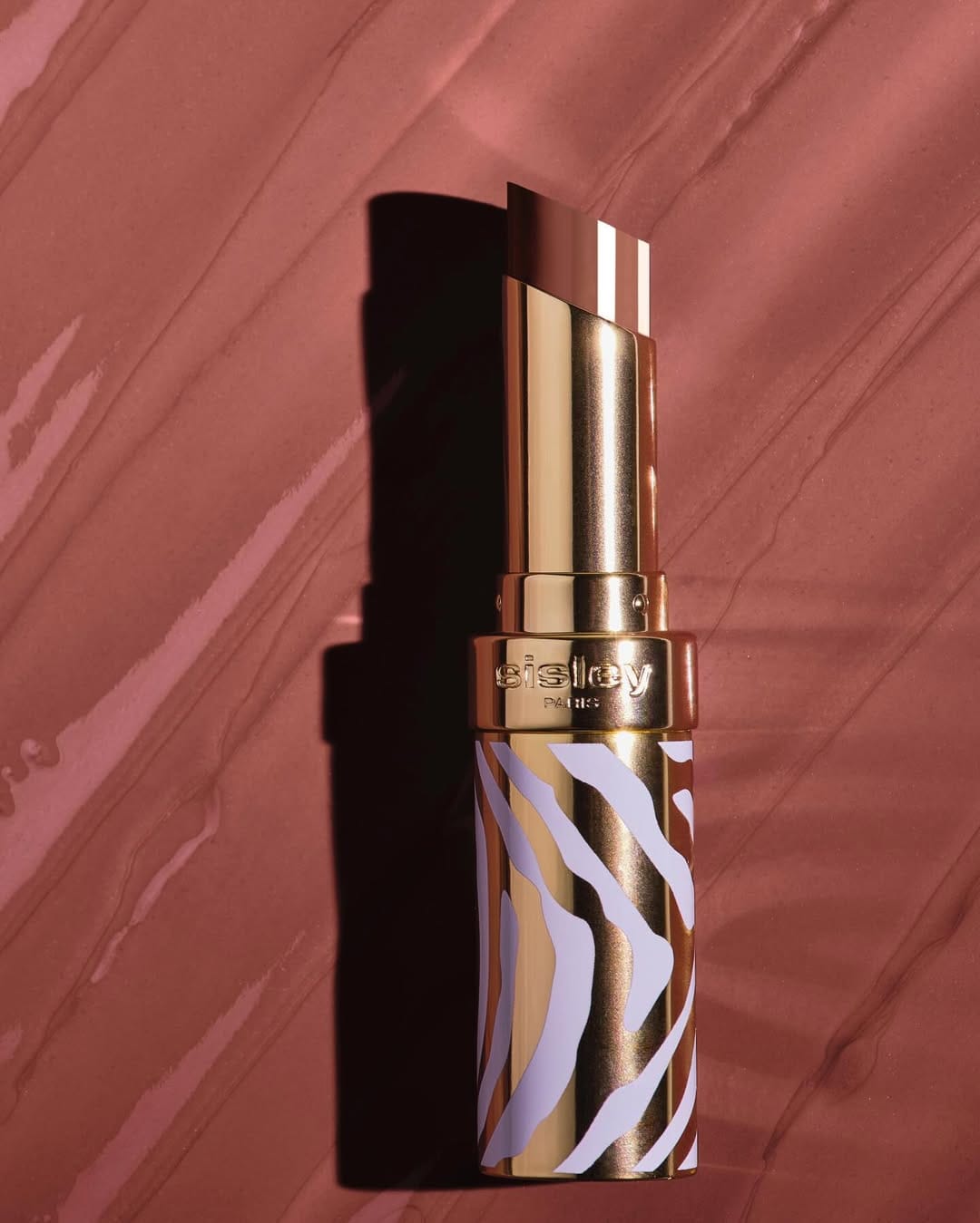
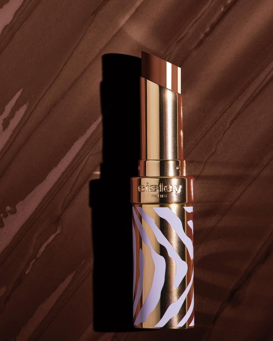
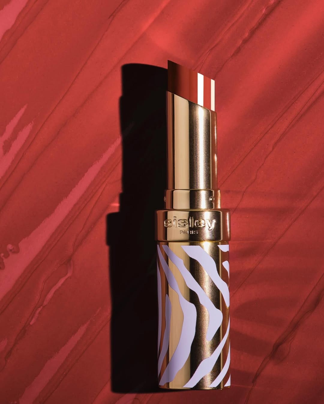
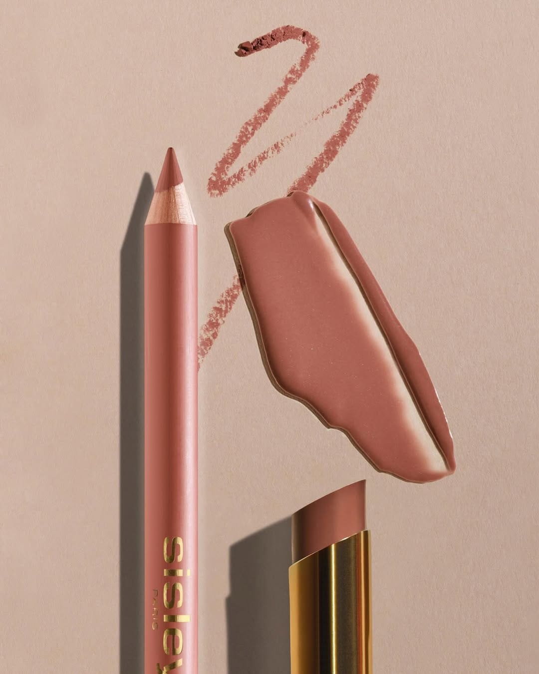
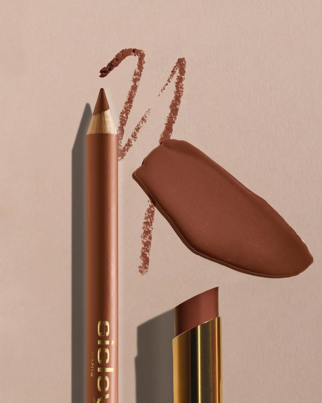
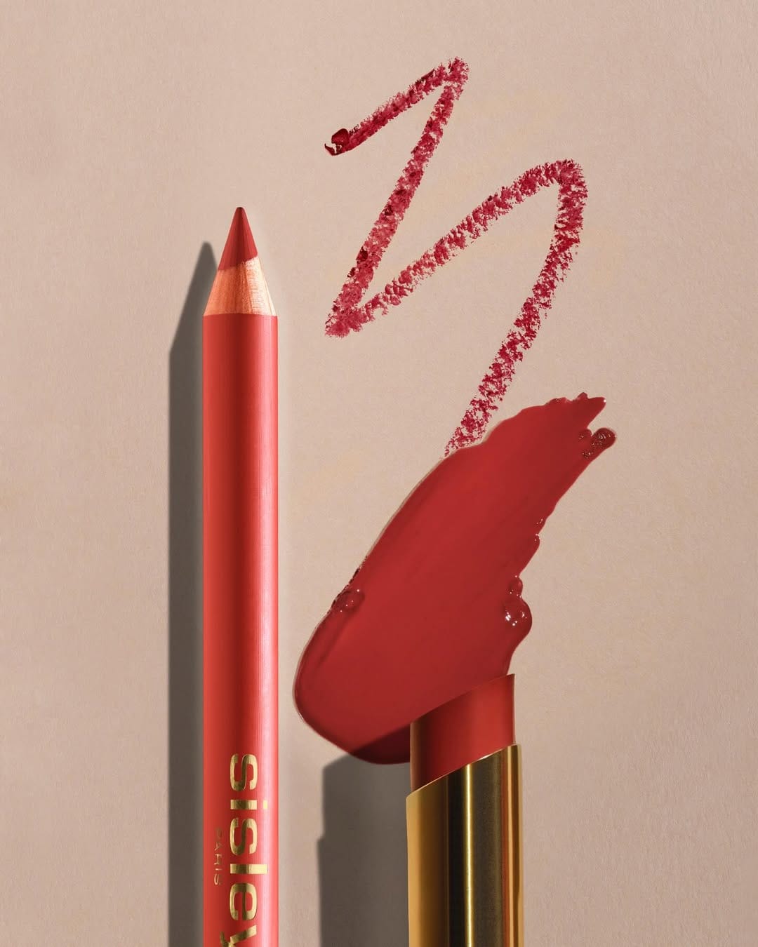
The first thing I noticed in this set is those white lines on the stick that don't match the actual product. I even went to check their website and they're not there. I don't know what's going on and why they didn't reshoot or remove it in post (but enhanced it), but it's a clear misrepresentation. The best part of the Sisley Paris (@sisleyparisofficial) lipstick photography is how they shot the metal, keeping it realistic and on trend. [Category: Cosmetics] [Surface: Metal] [Lighting: Soft] [Style: Editorial] [Mood: Sophisticated] [Palette: Warm Tones]
La Mer Lunar New Year: Bold red and symbolic storytelling
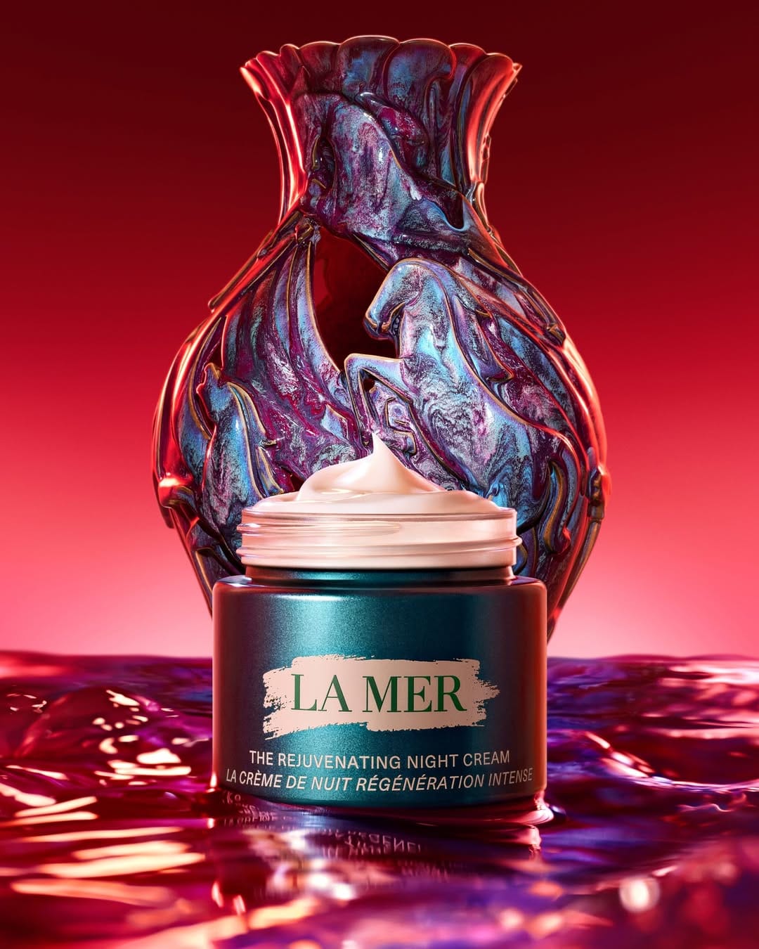
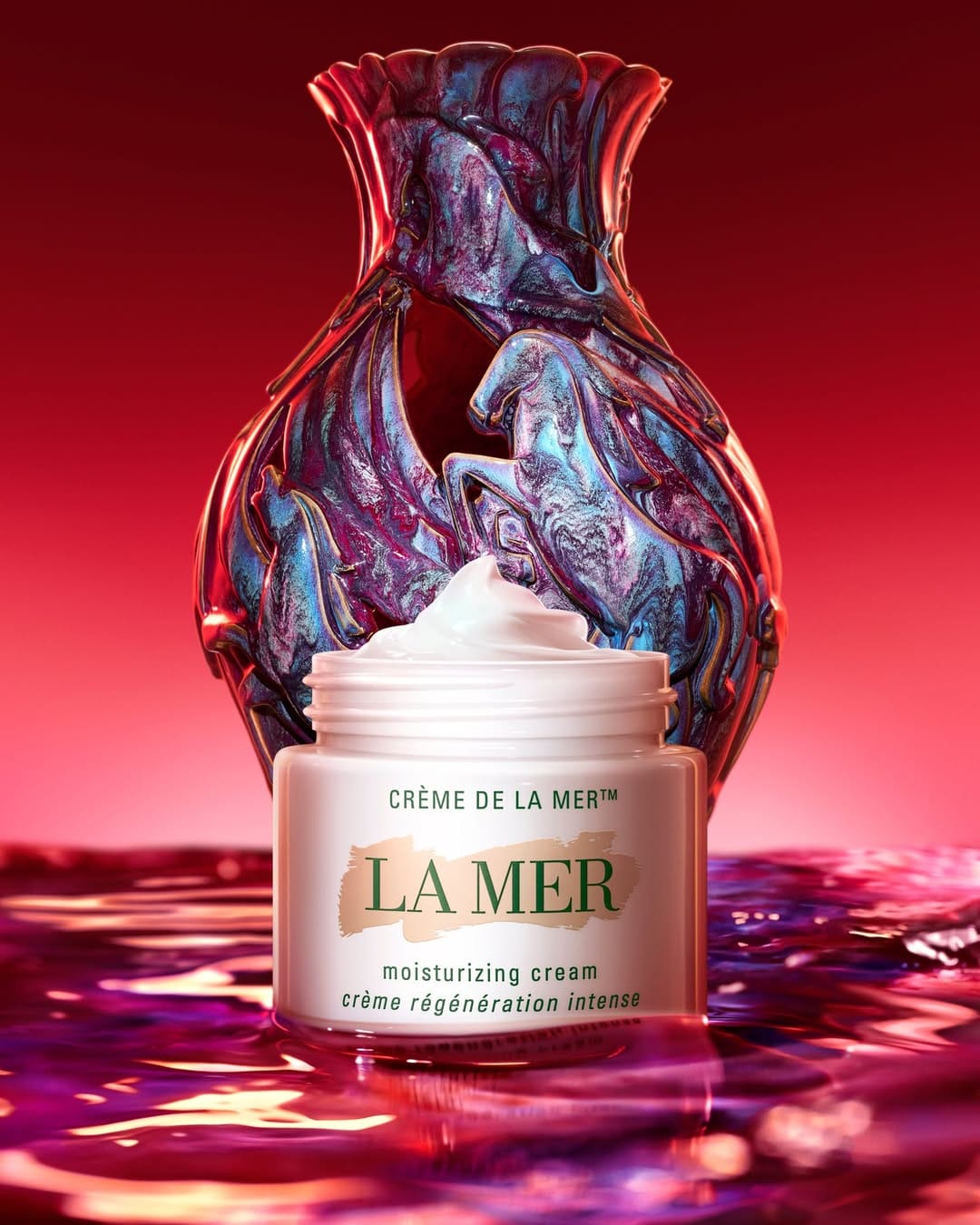
Red works, the horse works—both are solid anchors for Lunar New Year. But the vase threw me off a little. I kept trying to connect it to La Mer (@lamer)'s concept and couldn't quite get there. Was it nodding to prosperity, a specific tradition? It might have made sense in the brief, but it didn't land visually for this luxury skincare photography shot. [Category: Skincare] [Surface: Glass] [Lighting: Dramatic] [Style: Artistic] [Mood: Luxurious] [Palette: Vibrant]
Benefit Cosmetics Juice Stick & Play Daze: Grid-based launch photography
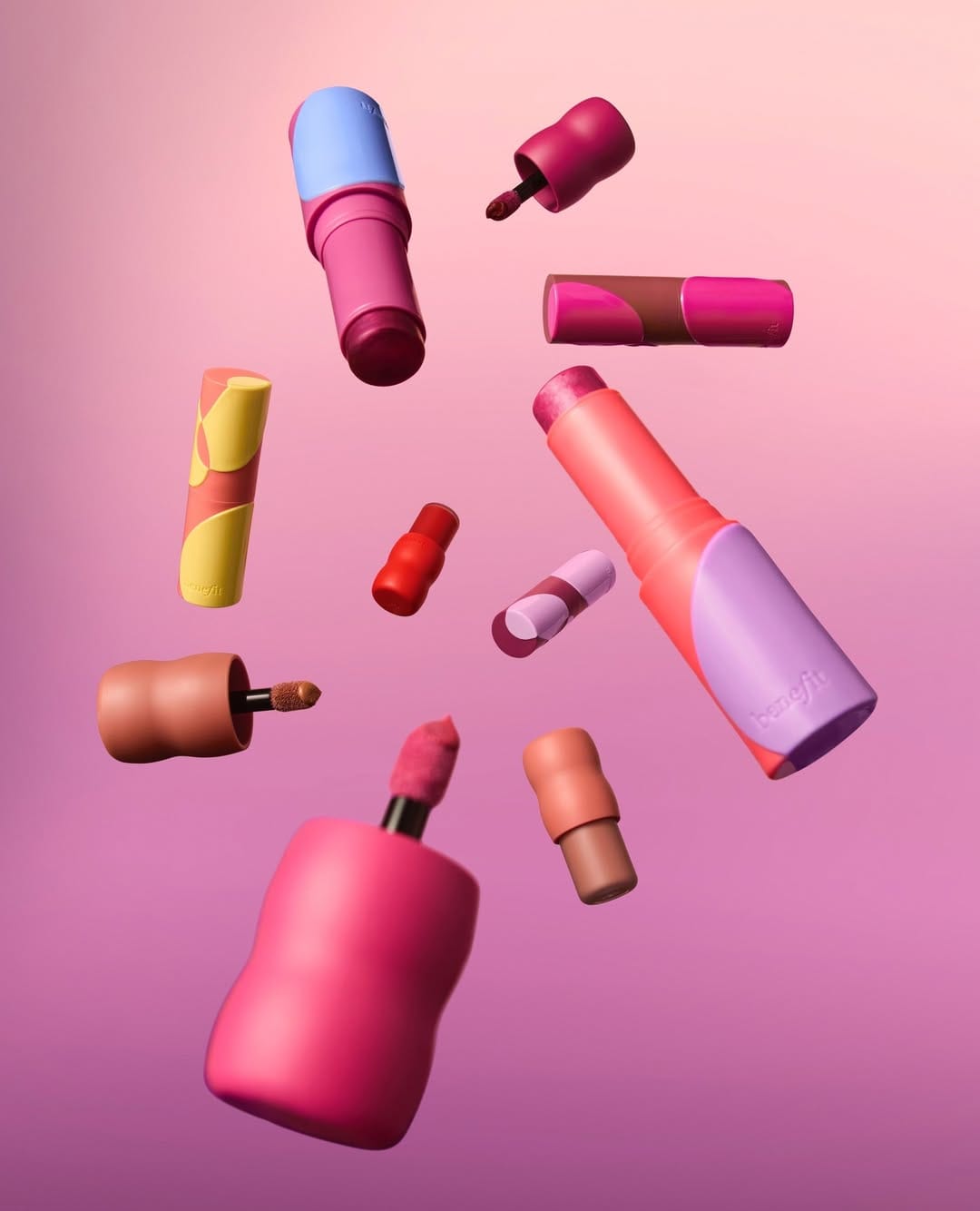
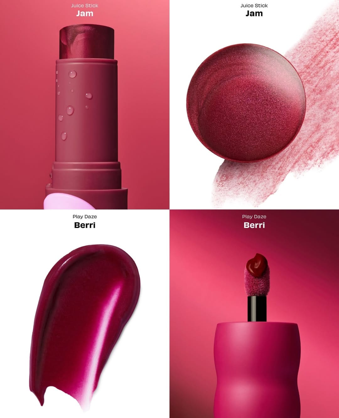
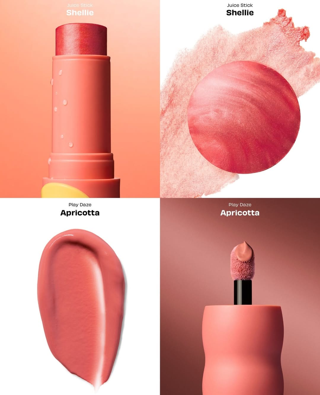
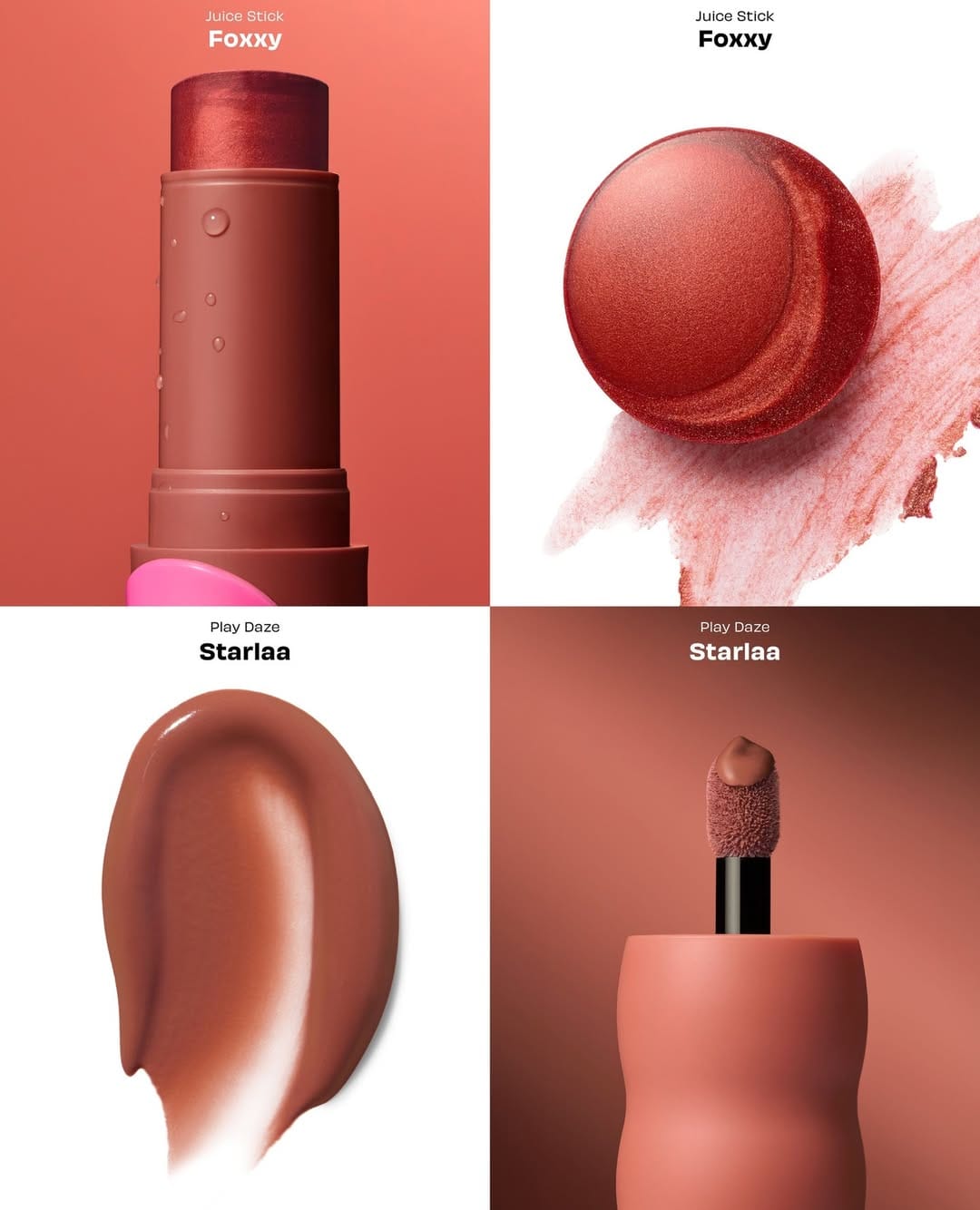
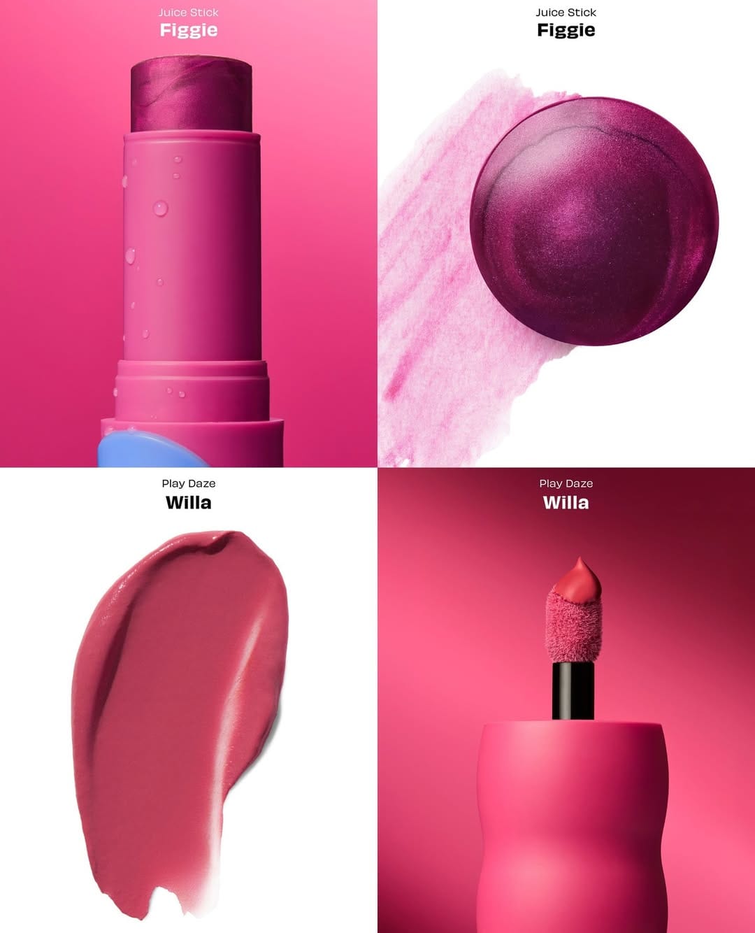
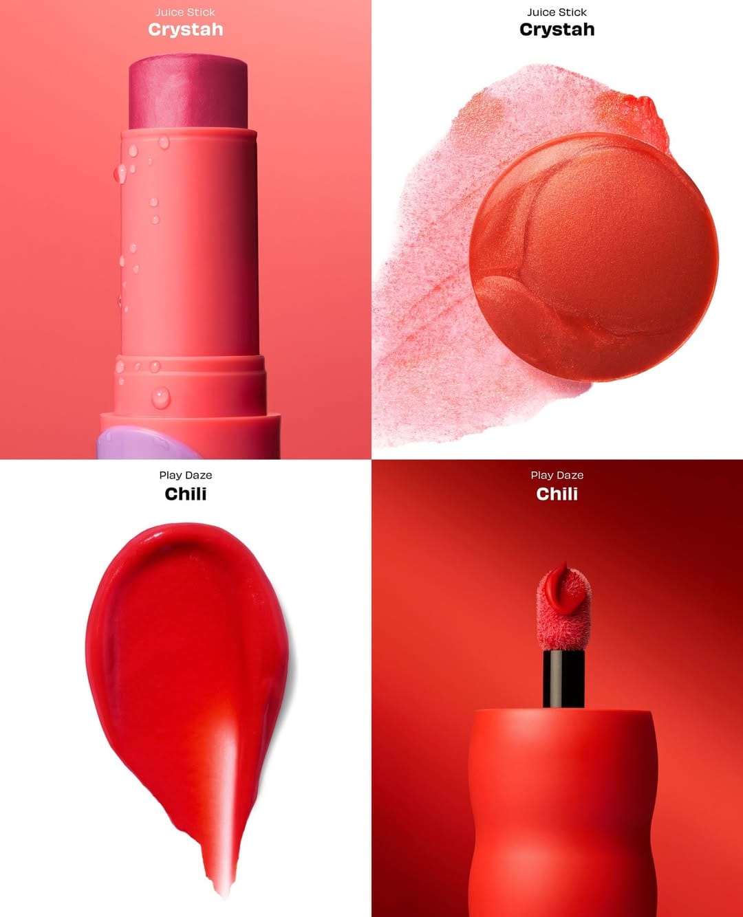
Love how this shoot covered all the bases: product shots, campaign images, and social content all at once. The individual photos are simple, intentionally so, but the grid is where it clicks. Smart planning from Benefit Cosmetics (@benefitcanada) for their Juice Stick dewy gel blush & Play Daze airy liquid blush launch—each shot works alone, but together they tell the story. [Category: Cosmetics] [Surface: Plastic] [Lighting: Studio] [Style: Clean] [Mood: Playful] [Palette: Vibrant]
Burberry Hero: Unconventional gradients and questionable background choices
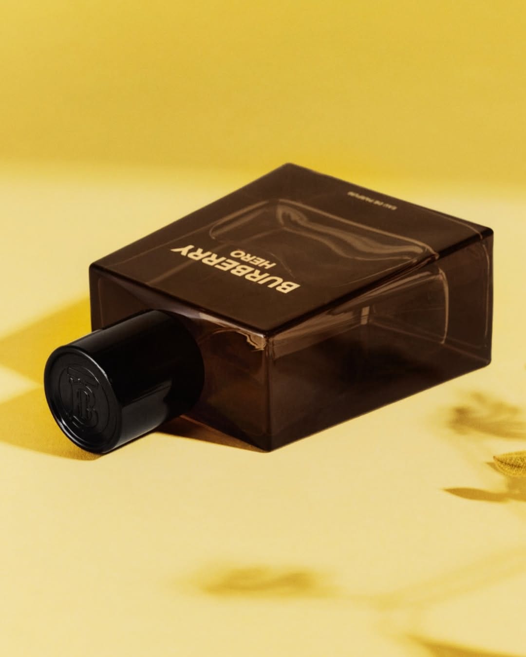
Not sure what's going on here with Burberry (@burberrybeauty), but from a commercial product photography perspective, there's a whole bunch of issues starting with the choice of background and the muddiness of the color on the bottle because of it. Also, I have a question about the darker yellow part of the background that creates this tension point where the perfume corner touches it. So it's either a bad photo or the work of a genius who broke all the photography rules. The most commercial-looking element is the cap—nice highlights showing the Burberry logo. [Category: Fragrance] [Surface: Glass] [Lighting: Soft] [Style: Editorial] [Mood: Sophisticated] [Palette: Warm Tones]
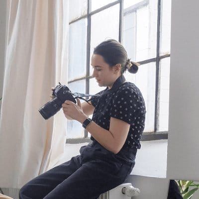
About the Author
Elina is a Ukrainian-Canadian commercial photographer based in Vancouver, British Columbia.
Get in touch
Instagram: @elina.kustlyvy
X (Twitter): @elinakustlyvy
Photographers: If I've featured your work and you'd like a credit or to be tagged, DM me your details. I'm happy to update and showcase your name.