Fugazzi fragrance: Conceptual styling with refinement opportunities
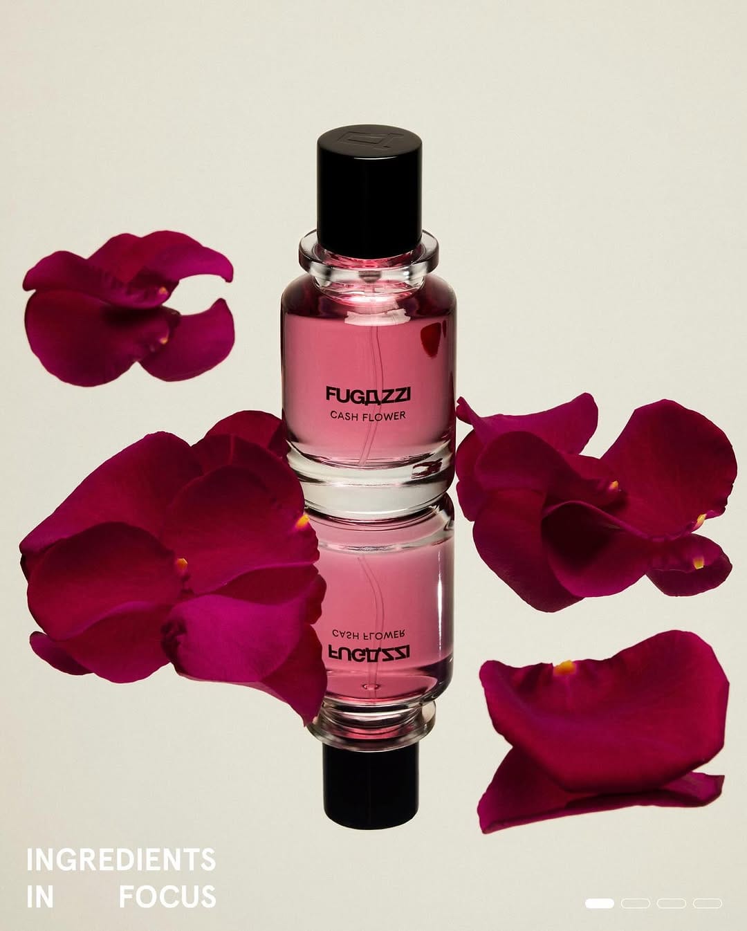
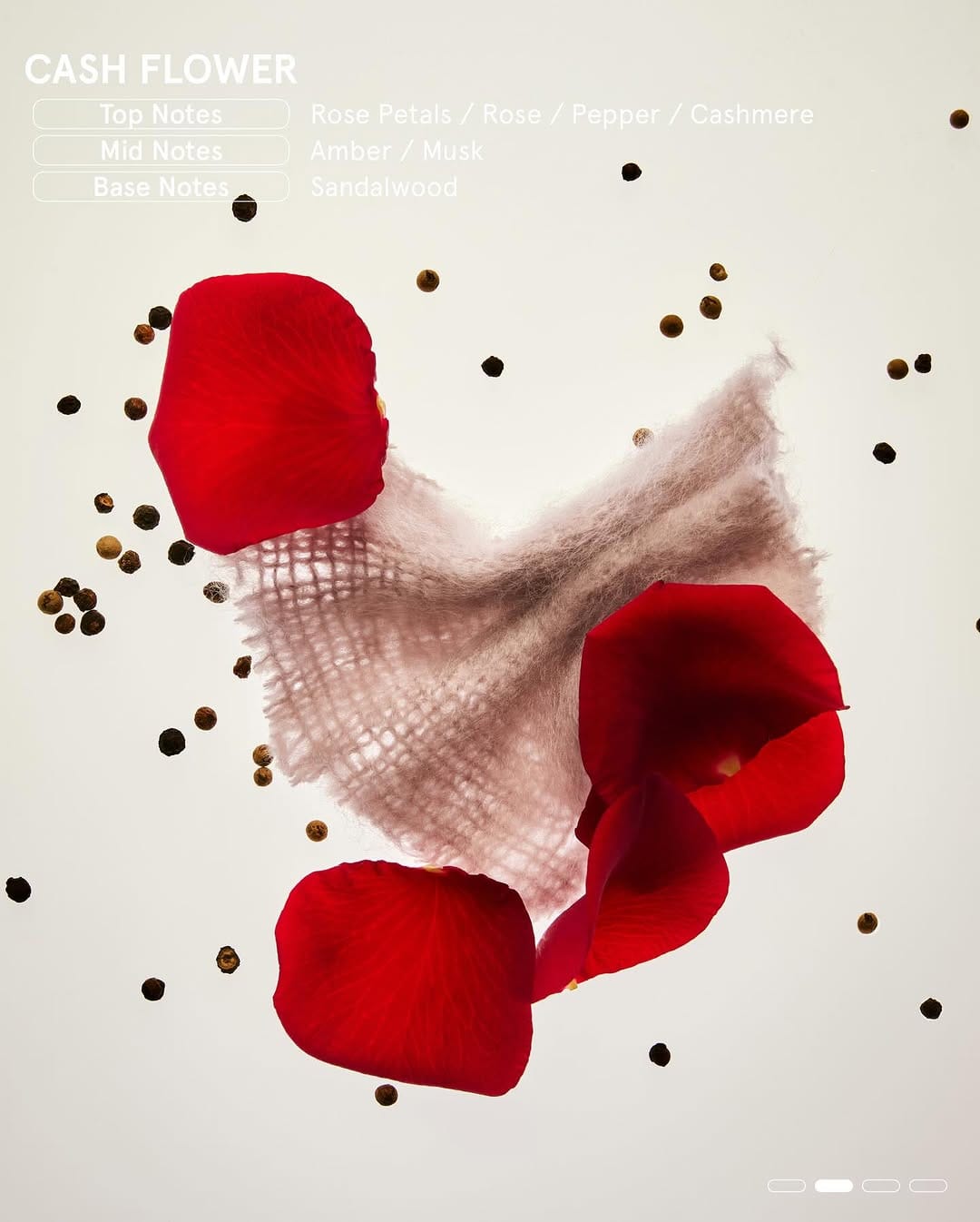
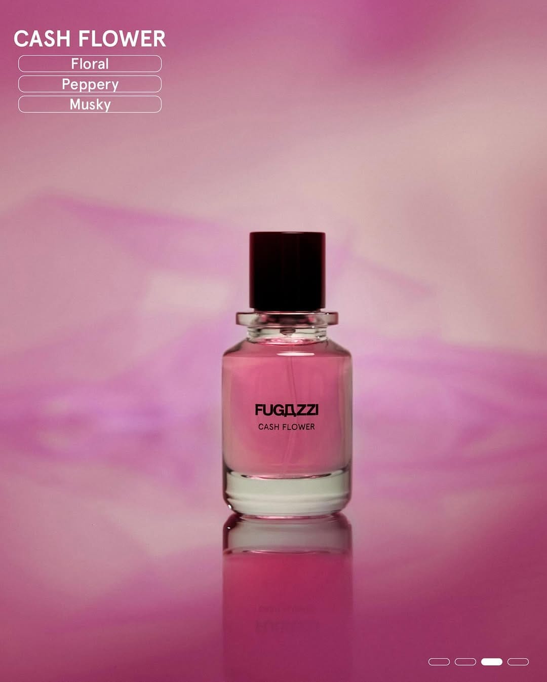
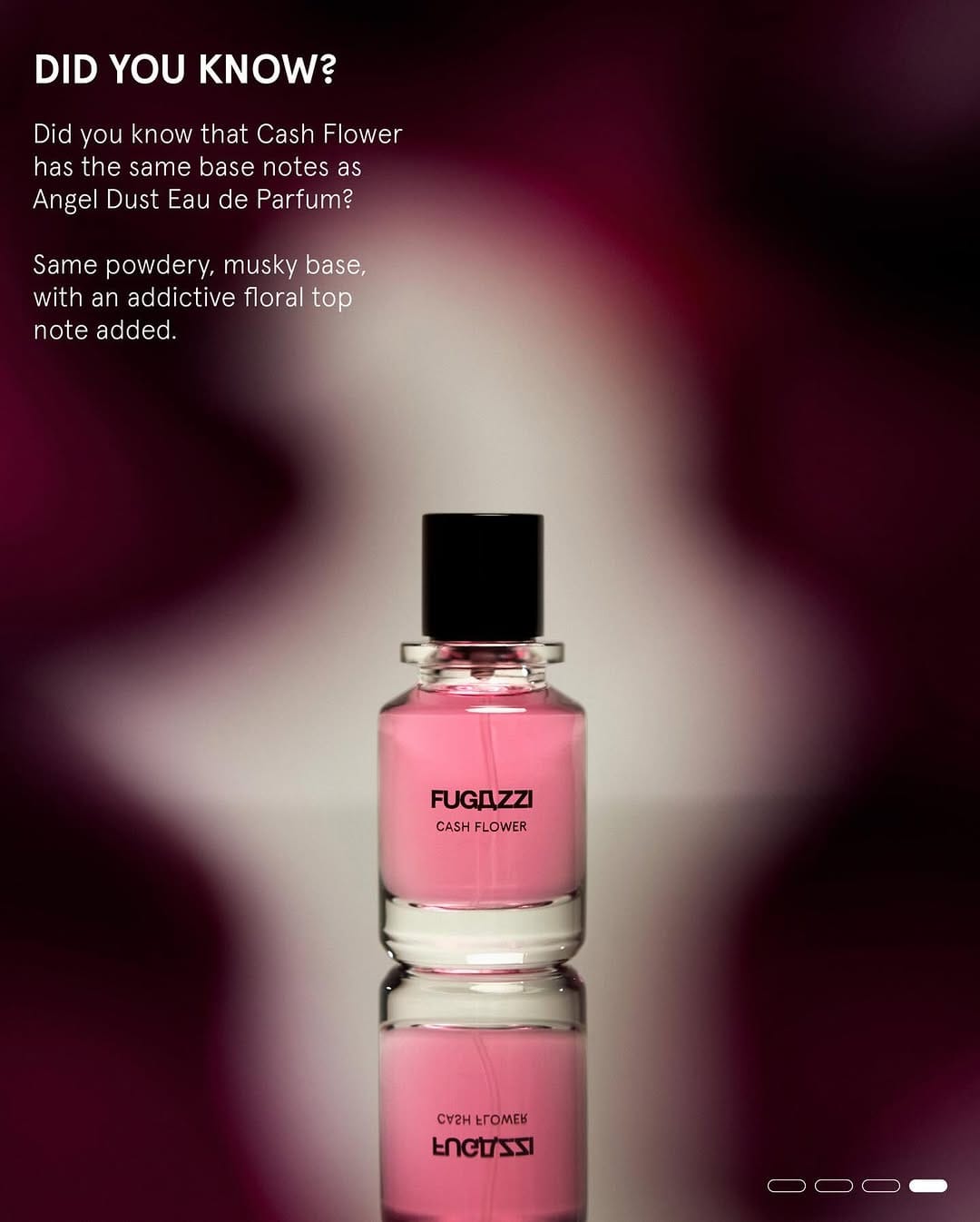
Interesting work by MADEBYSEM Studio (@madebysem_studio) for Fugazzi Fragrances (@fugazzifragrances), though some shots don't quite read as high-end. The label lacks clarity, and parts of the bottle fall out of focus. The concept is solid, but the execution could be sharper. [Category: Fragrance] [Surface: Glass] [Lighting: Soft] [Style: Editorial] [Mood: Luxurious] [Palette: Warm Tones]
Sol de Janeiro Jelly Perfume Balms: Vibrant color with natural texture
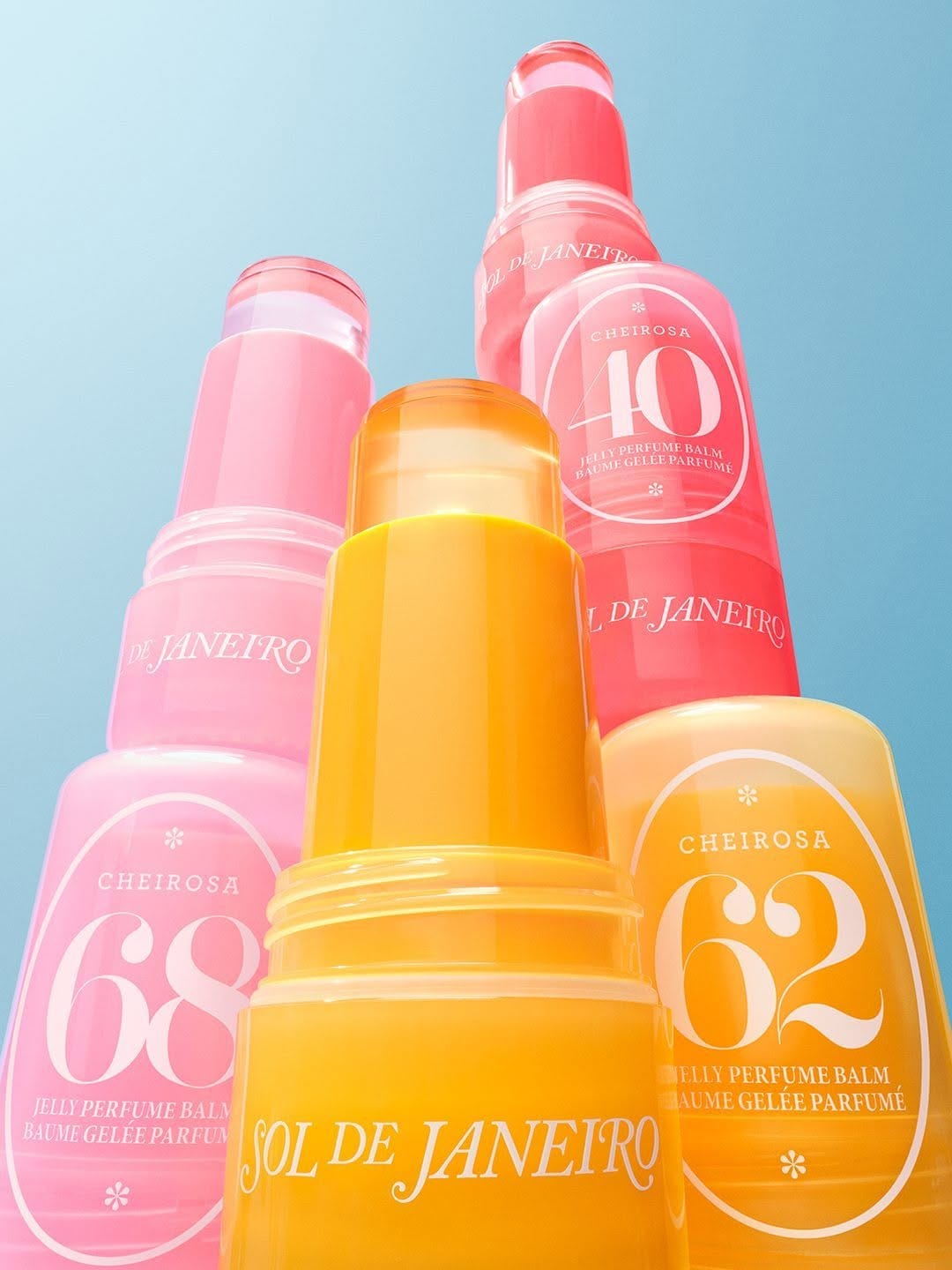
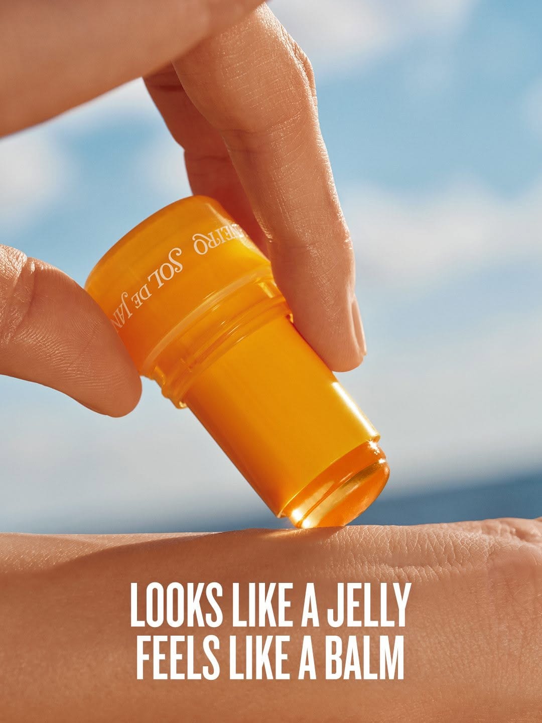
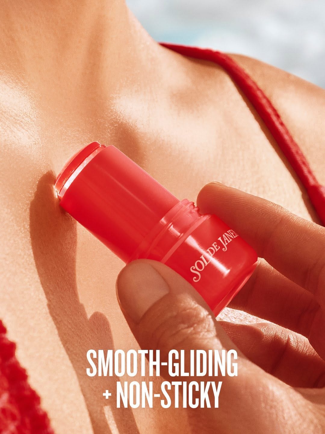
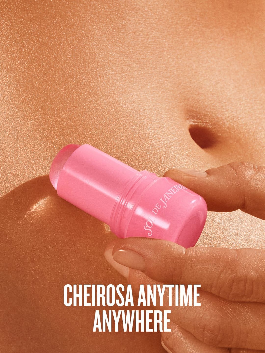
Great photos of Sol de Janeiro (@soldejaneiro)! The composition, colors, and light all work beautifully together. I really like how the retouching feels natural and enhanced instead of overly polished. Sol de Janeiro's Jelly Perfume Balms show how colorful fragrance photography can stay vibrant without losing that sense of touchable texture. [Category: Skincare] [Surface: Skin] [Lighting: Natural] [Style: Commercial] [Mood: Fresh] [Palette: Warm Tones]
Floris Special No. 127: Hard light with inconsistent execution
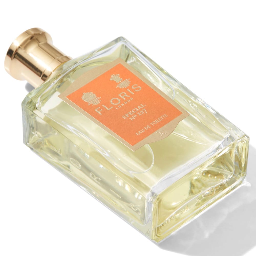
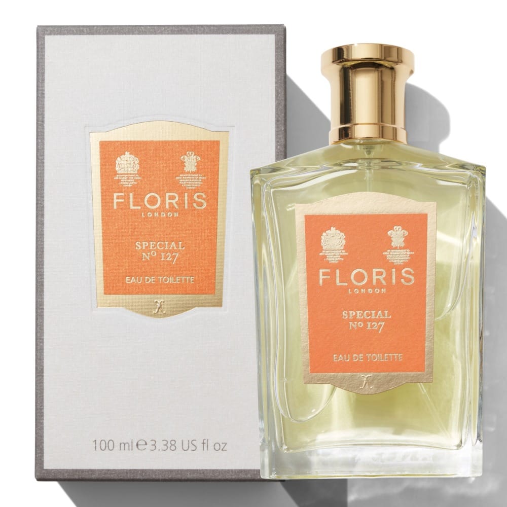
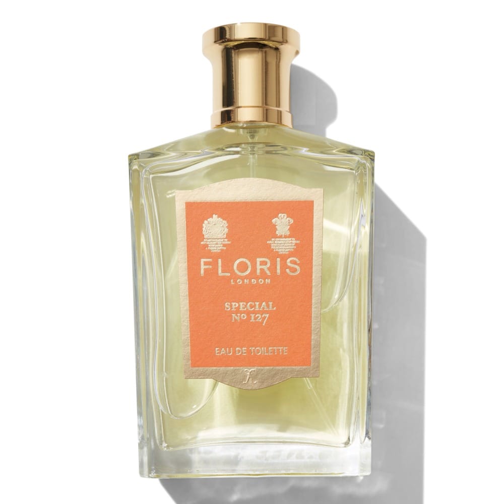
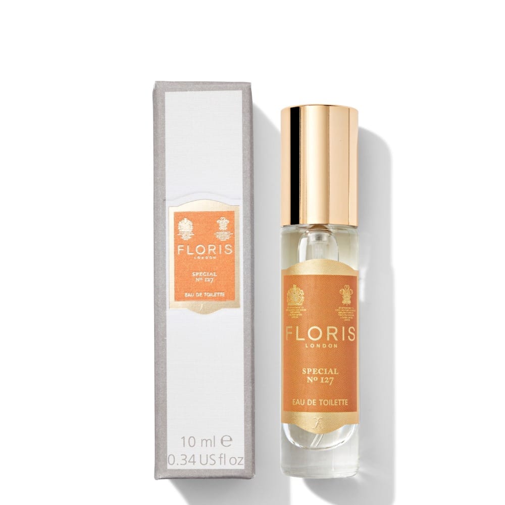
Honestly, it could be better. Ecom shots by Lux Studio London (@luxstudiolondon) do the heavy lifting of selling, but these images didn't deliver. The idea of using hard light for ecom isn't new, and I feel like it fits this perfume. The right shadow could enhance the masculinity and make the image look more premium. Good parts: labels are clean and readable, I get a clear sense of what materials they're made of. What could be done better: focus stacking is absent, shadows are inconsistent, flat glass is a big no-no, retouching is nonexistent (especially on metal parts), and straight-on shots need proper geometrical transformation. For a heritage fragrance like Floris London (@florislondon)'s Special No. 127, the execution should match the product's legacy. [Category: Fragrance] [Surface: Glass] [Lighting: Soft] [Style: Minimalist] [Mood: Sophisticated] [Palette: Warm Tones]
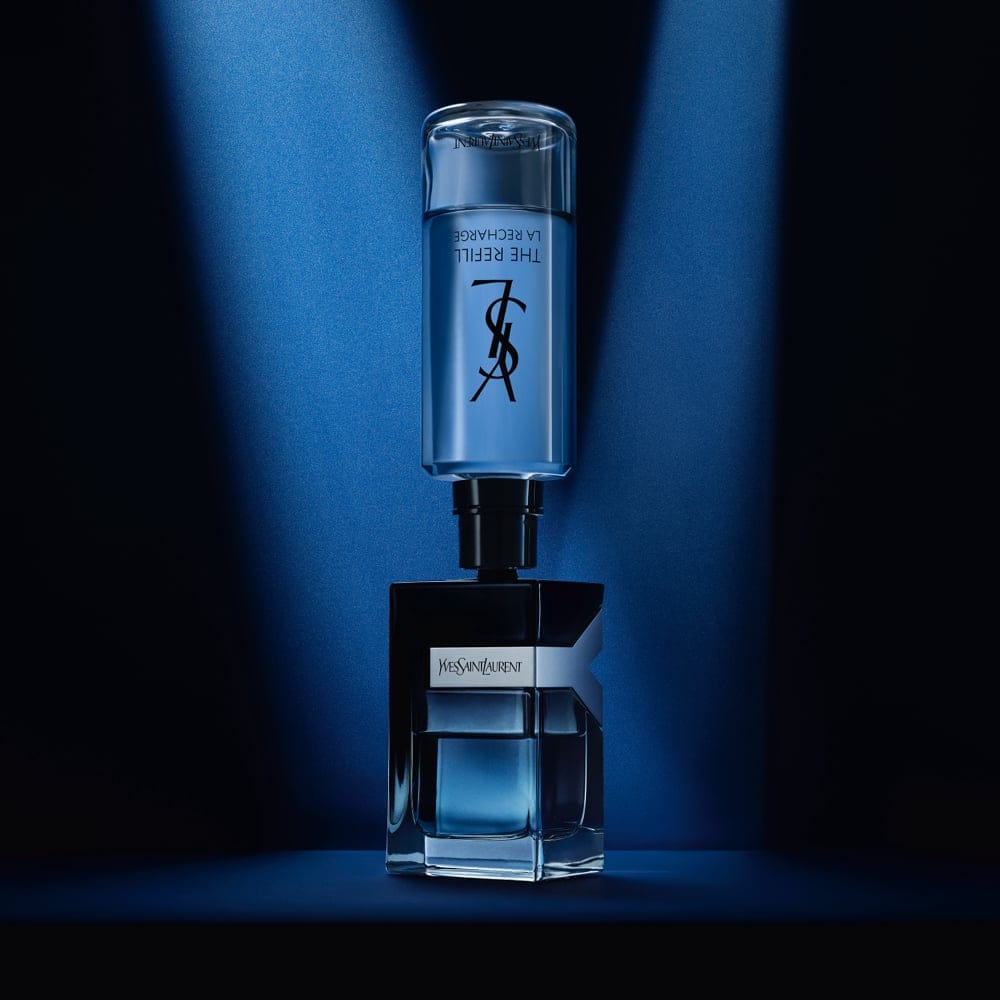
YSL Y Eau de Parfum: Polished gradients and refined simplicity
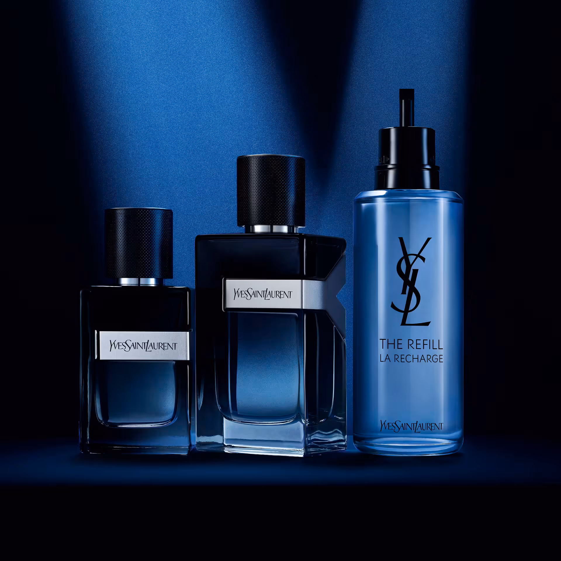
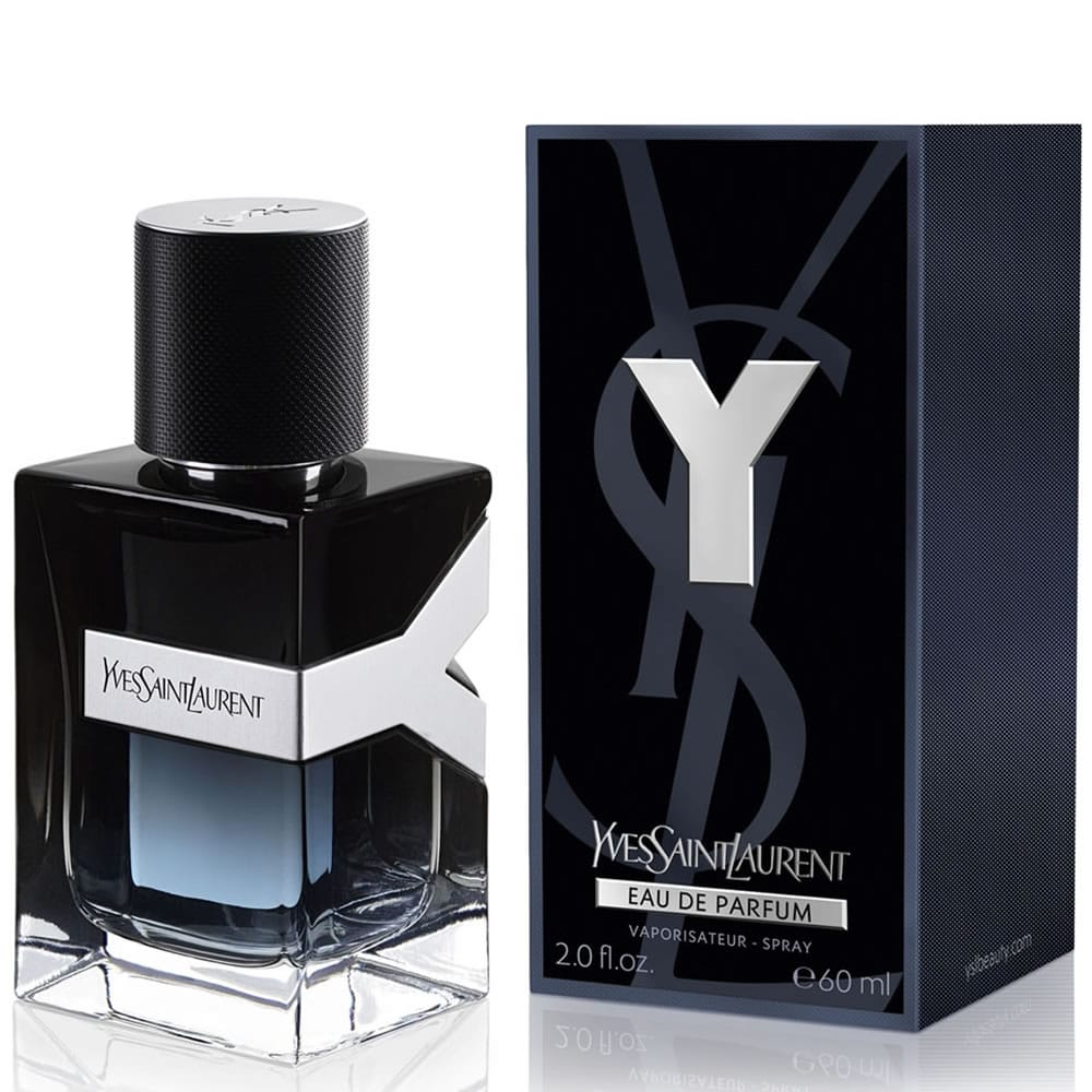
Yes! That's what I'm talking about! Also men's fragrance photography, same price point as the last one, but look how much cleaner YSL Beauty (@yslbeauty)'s Y Eau de Parfum images look. Very sharp, clear, stunning gradients that give the product dimensionality and a more sophisticated polished look. Retouching is on point. The box looks polished and detailed, very clean, and the glass bottle stays realistic. And that's only the ecom shot on white. Beautiful concept of staged products, color story supports the product same as the leading light streaks. The visual simplicity ties directly to that iconic "white t-shirt and black jacket" look the fragrance is inspired by. Obsessed! [Category: Fragrance] [Surface: Glass] [Lighting: Studio] [Style: Commercial] [Mood: Sophisticated] [Palette: Neutral]
CHANEL fragrance: Oversized product styling with clean minimalism
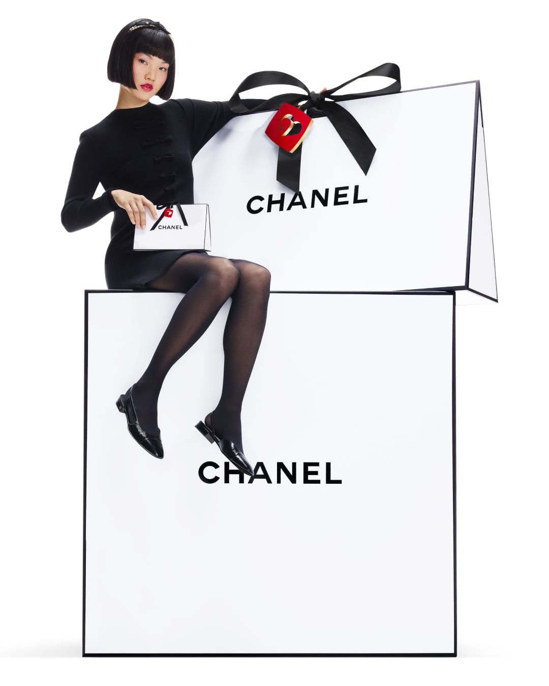
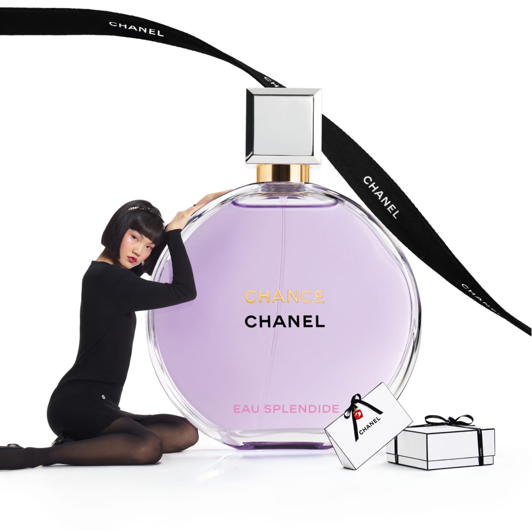
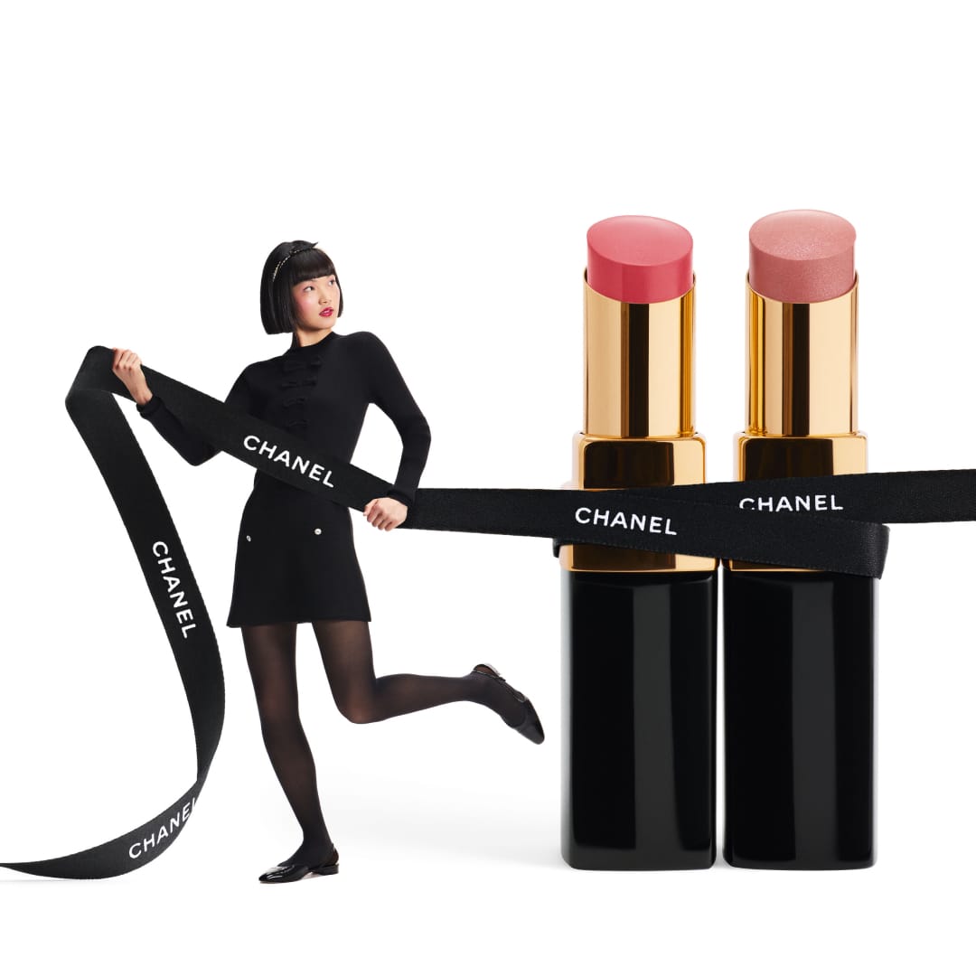
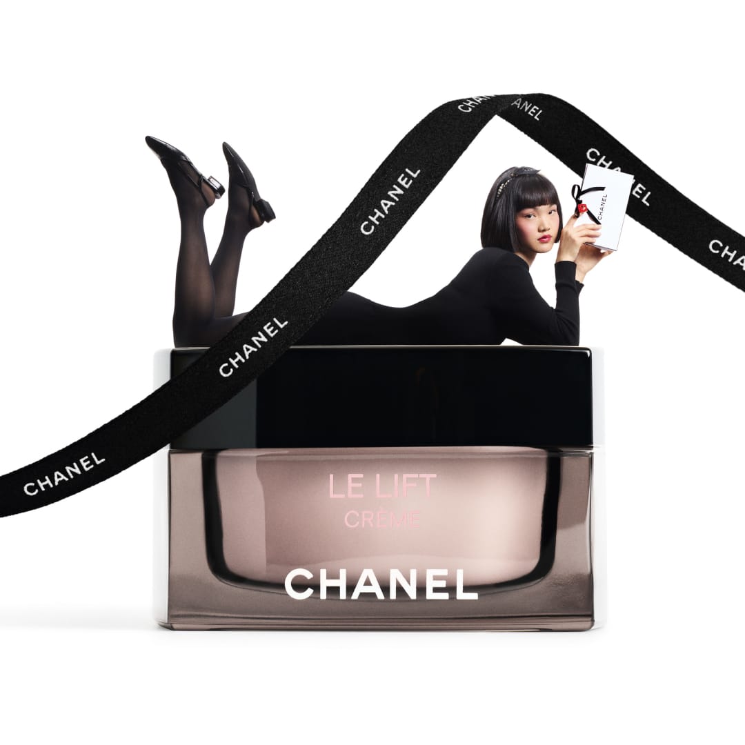
I'm on a roll with perfume images today. CHANEL (@chanelofficial) is playing with the trendy oversized product concept here, which looks refreshing and fun. Very clean and on brand. There are some things that give away the compositing, but in this case it's acceptable since these aren't campaign shots. [Category: Fashion] [Surface: Glass] [Lighting: Bright] [Style: Editorial] [Mood: Luxurious] [Palette: Monochrome]
About the Author
Elina is a Ukrainian-Canadian commercial photographer based in Vancouver, British Columbia.
Get in touch
Instagram: @elina.kustlyvy
X (Twitter): @elinakustlyvy
Photographers: If I've featured your work and you'd like a credit or to be tagged, DM me your details. I'm happy to update and showcase your name.