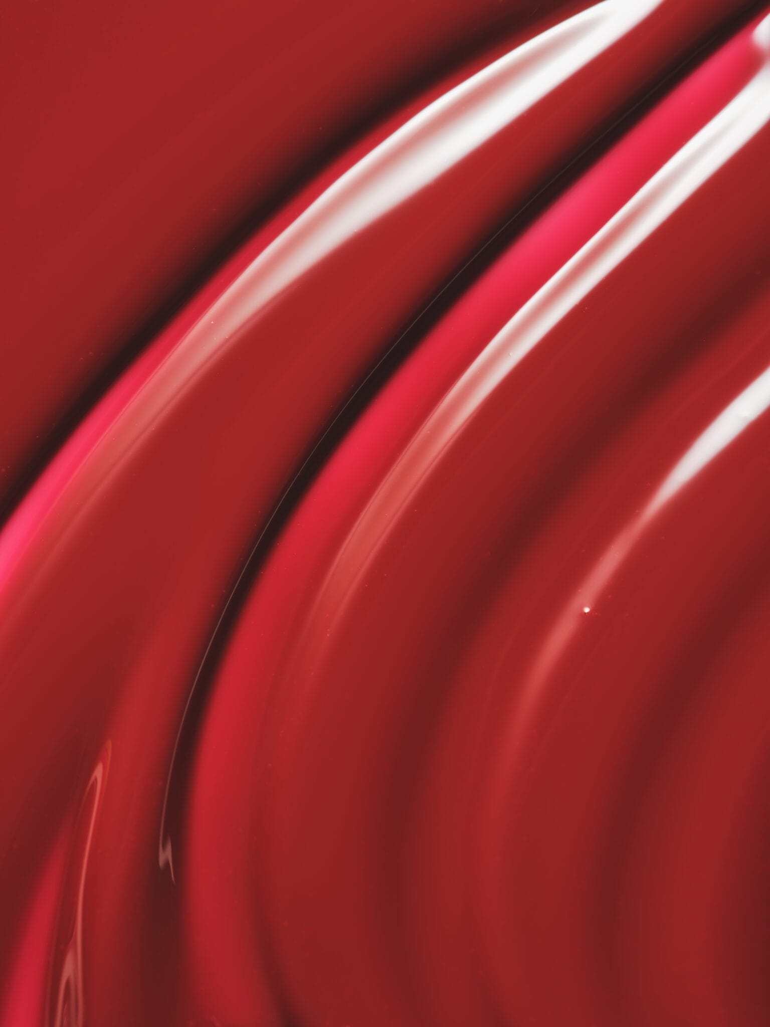
Charlotte Tilbury: Polished luxury makeup photography at its finest
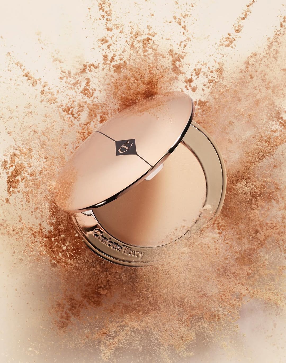
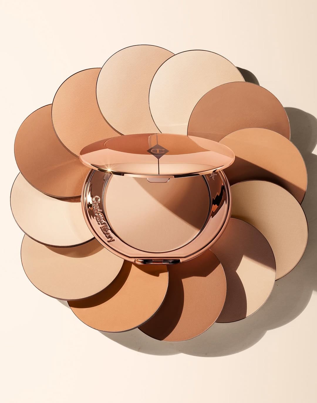
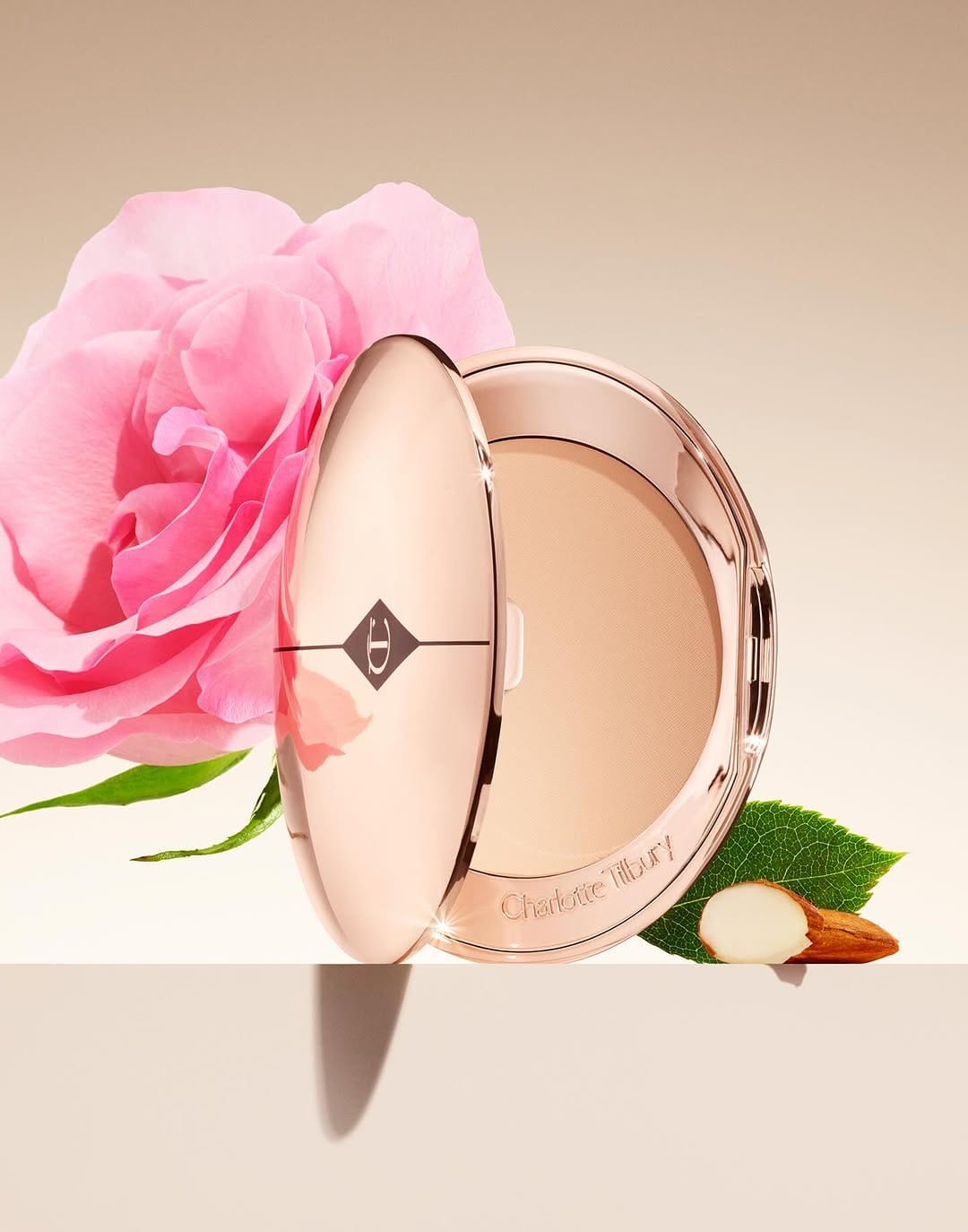
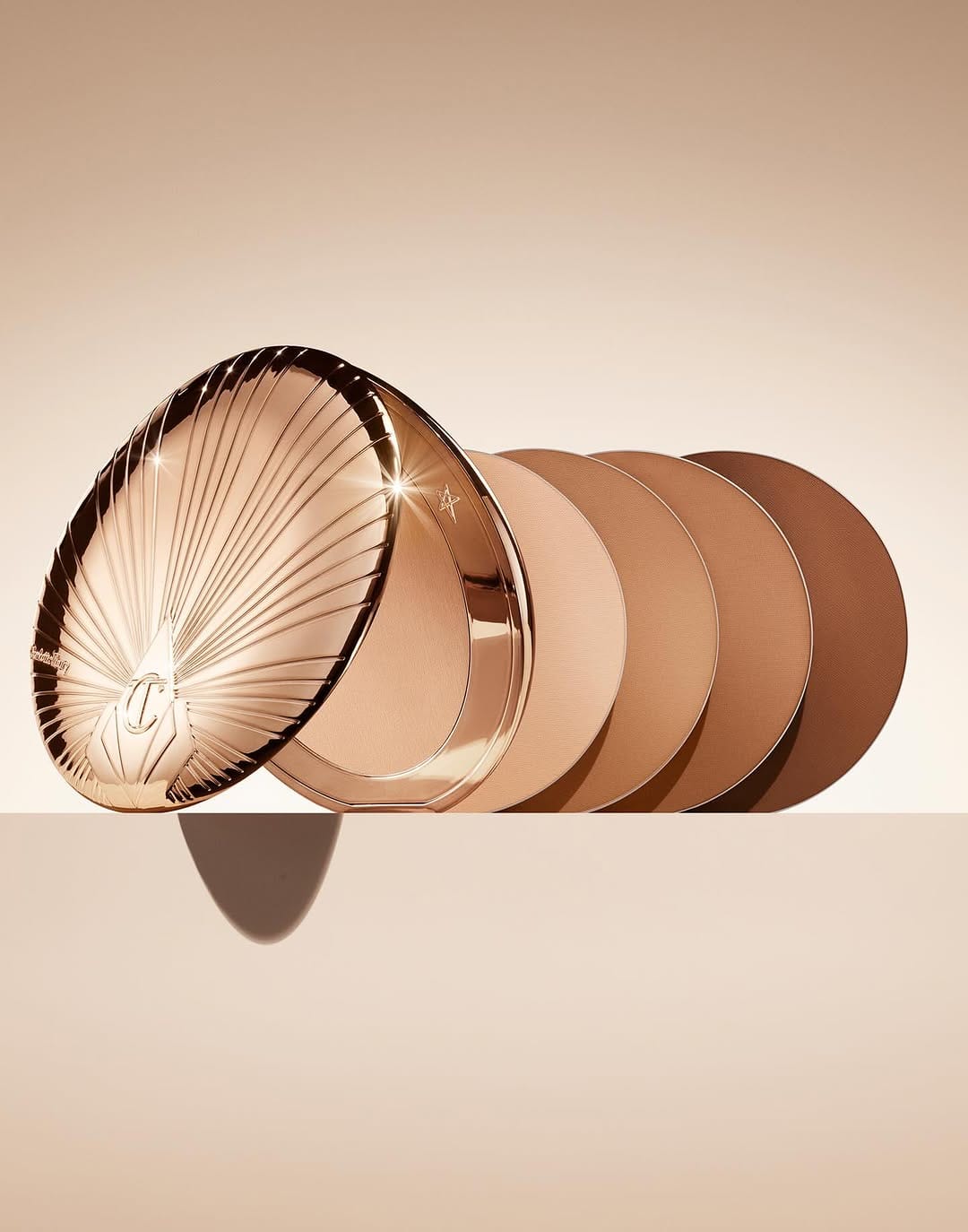
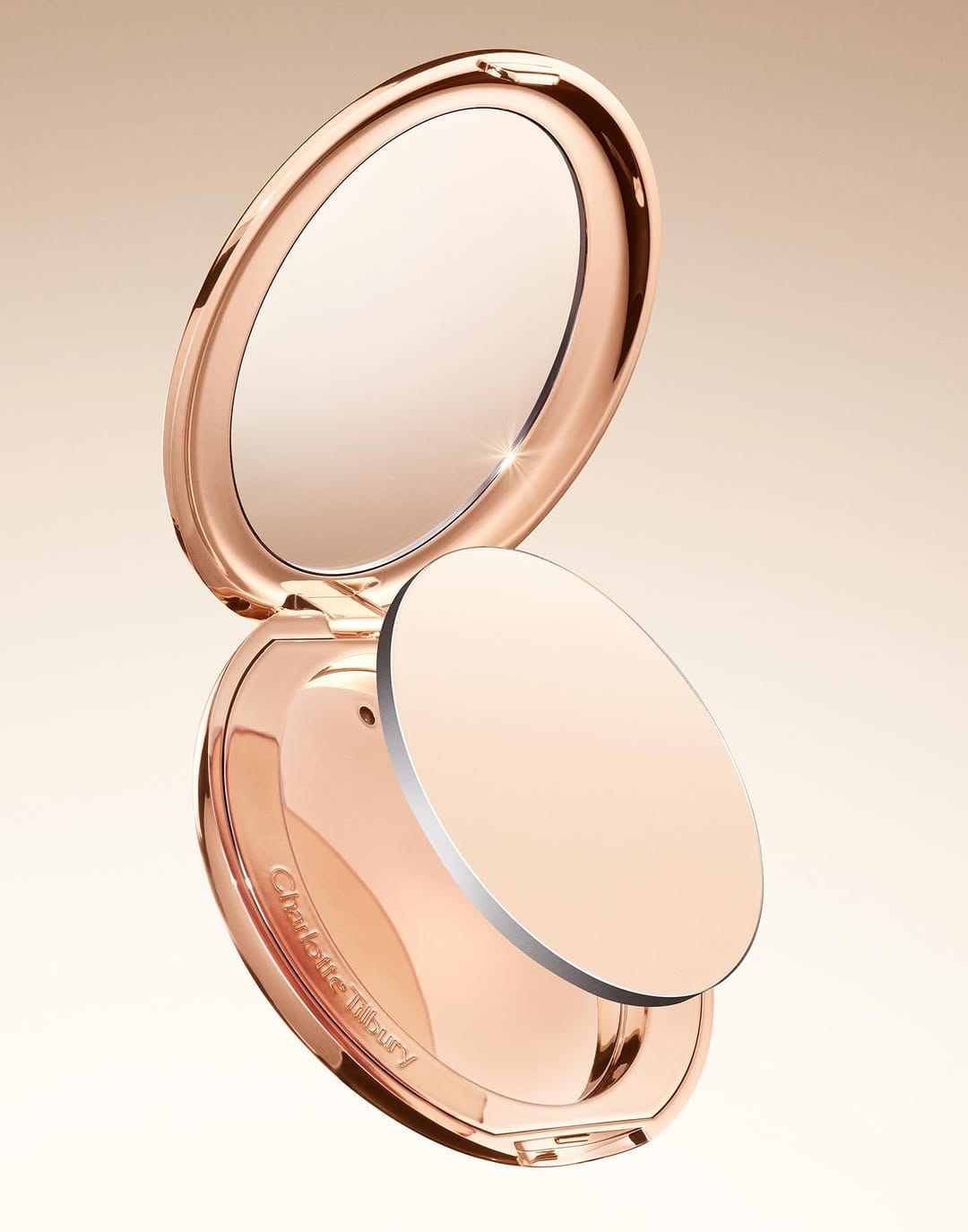
Jonathon Kambouris (@the_mrjk) is a technical wizard. Everything is clean, detailed, polished. This is what high-end luxury makeup photography looks like. The only thing that caught my eye was a fake black and white gradient on the metal part, but these things aren't made to be looked at that closely so it's okay 😄 [Category: Cosmetics] [Surface: Metal] [Lighting: Soft] [Style: Clean] [Mood: Sophisticated] [Palette: Warm Tones]
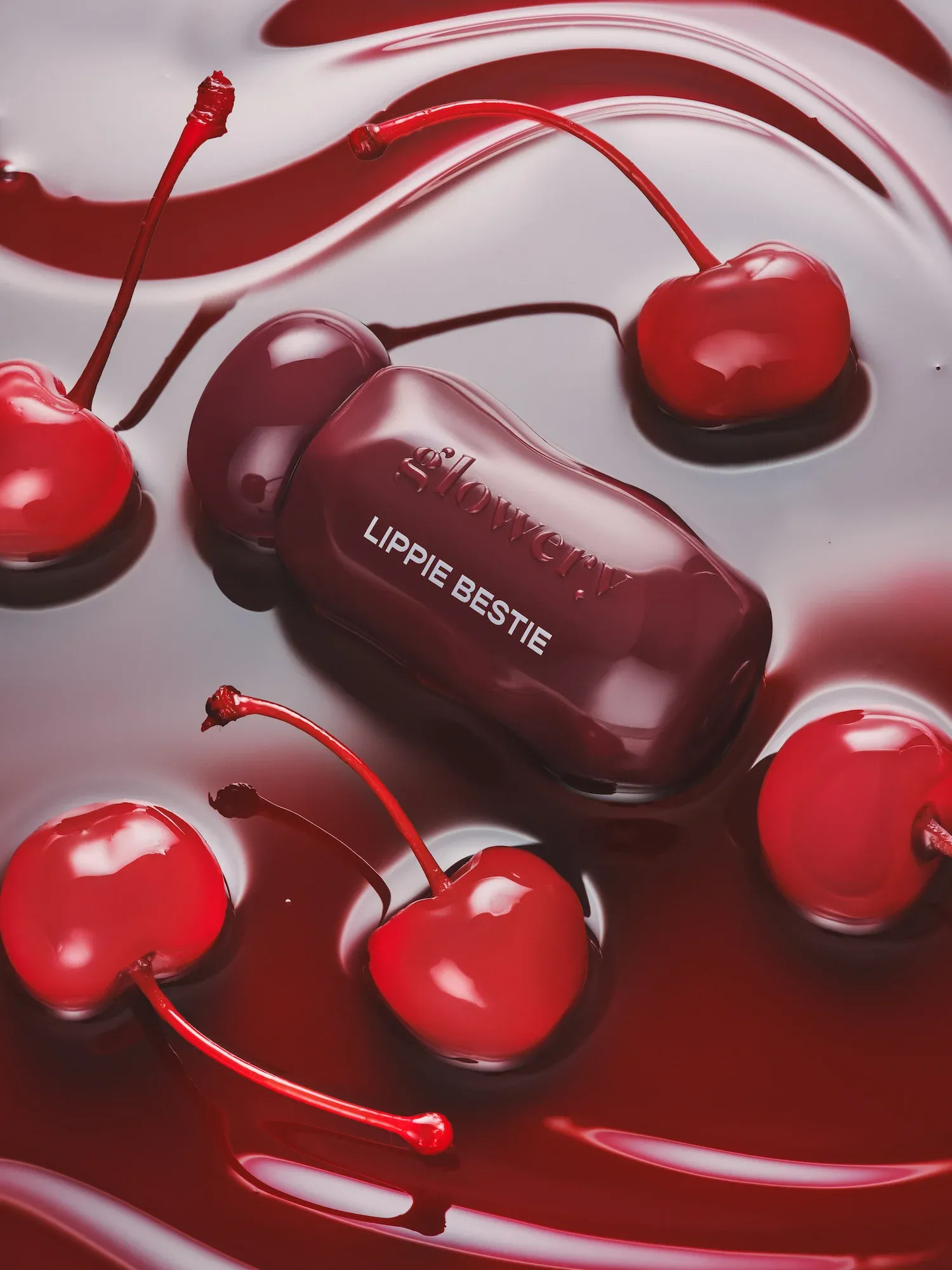
Glowery's mirror-shine lip oils: Tactile textures and vibrant color
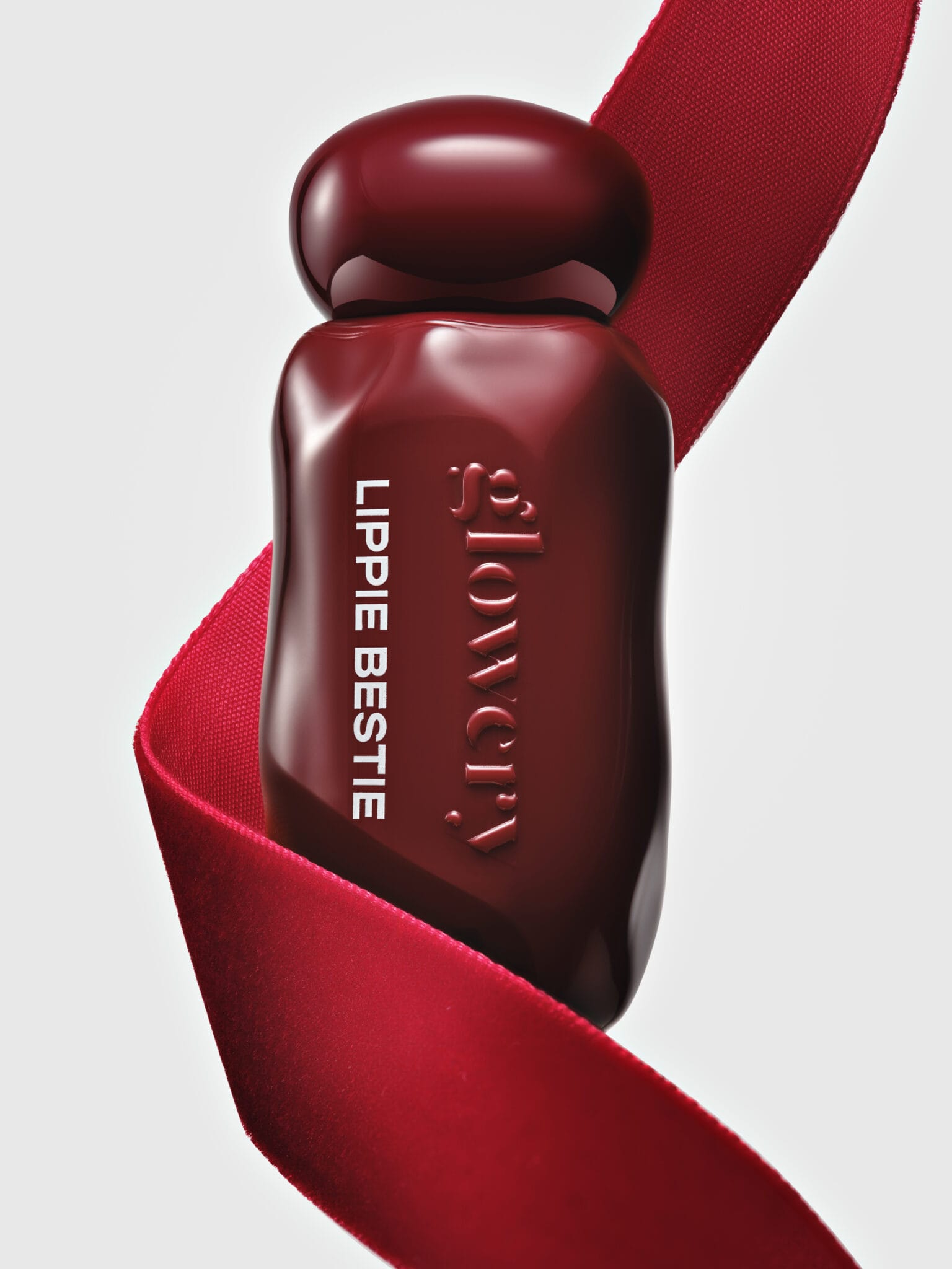
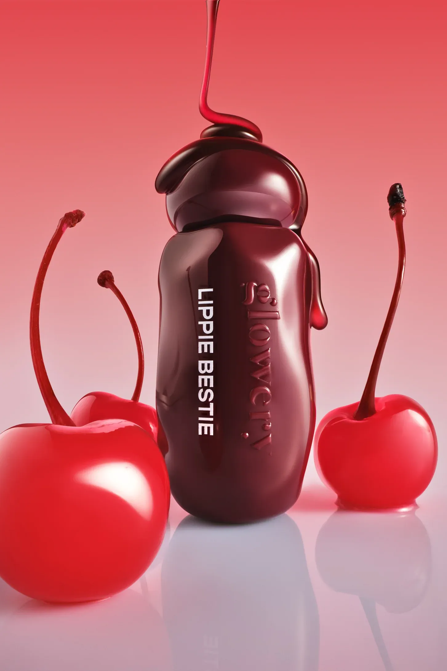
This project by Studio LIIT (@studio.liit) of Anna Becker is an absolute banger. The textures, the colors, the highlights... I just want to buy all these products right now! The images are on brand, great concept and execution. Studio LIIT nailed the look for Glowery's "Lippie Besties" mirror-shine lip oil range. The textured beauty product photography really makes you want to reach through the screen and grab one. [Category: Cosmetics] [Surface: Glass] [Lighting: Studio] [Style: Editorial] [Mood: Luxurious] [Palette: Warm Tones]
Azzaro Parfums: Dramatic lighting on metallic bottles
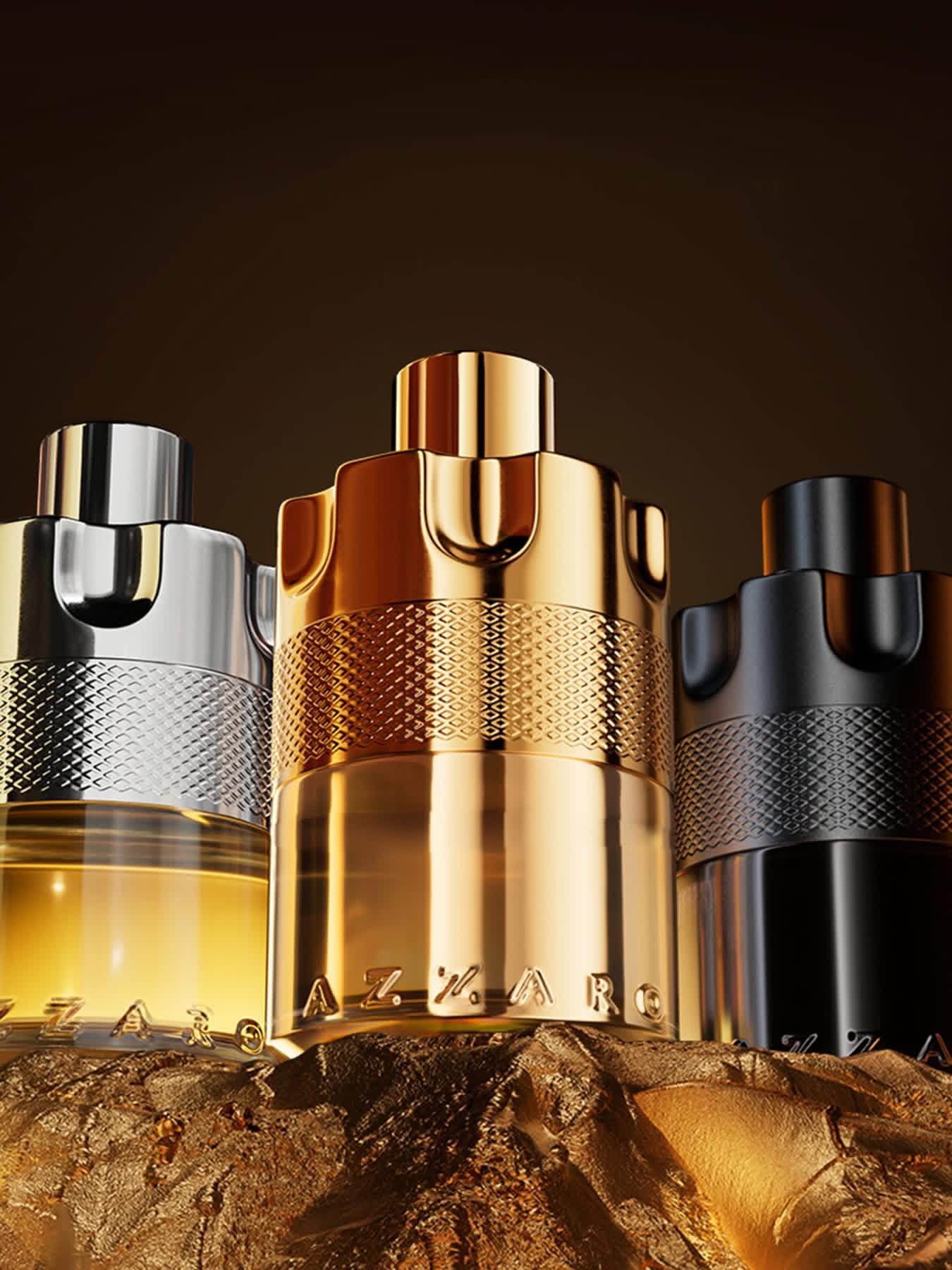
Gorgeous light on metal and black perfume packaging. The highlights on the metal catch beautifully, but the retouching could use some refinement. There's not quite enough separation between the left bottle and the pedestal. They're reading as one form. The highlight on the glass could be more polished too.
I got curious whether the background could work harder, so I pulled it into Photoshop. Made it a bit darker and increased the color depth. Immediately the products stood out more. Sometimes a small tonal shift is all it takes to make the hero elements pop without touching the product lighting itself. [Category: Fragrance] [Surface: Metal] [Lighting: Dramatic] [Style: Editorial] [Mood: Luxurious] [Palette: Warm Tones]
Chanel Coco Crush: High-contrast jewelry on trending black backgrounds
Chanel (@chanelofficial) is one of my favorite brands whose photography I constantly monitor, haha. This jewelry shot by Mikael Jansson (@mikaeljansson) immediately grabbed my attention with the trendy black background. I've noticed many brands use black backgrounds as opposed to white, a trend that's been around for a few months. Chanel definitely rocked it because it's part of their branding too. This piece is from their Coco Crush collection. Stunning high-contrast metal and beautiful detailed retouching work for this statement piece! [Category: Jewelry] [Surface: Metal] [Lighting: Studio] [Style: Minimalist] [Mood: Luxurious] [Palette: Neutral]
Issey Miyake L'Eau d'Issey: Ocean-inspired minimalism
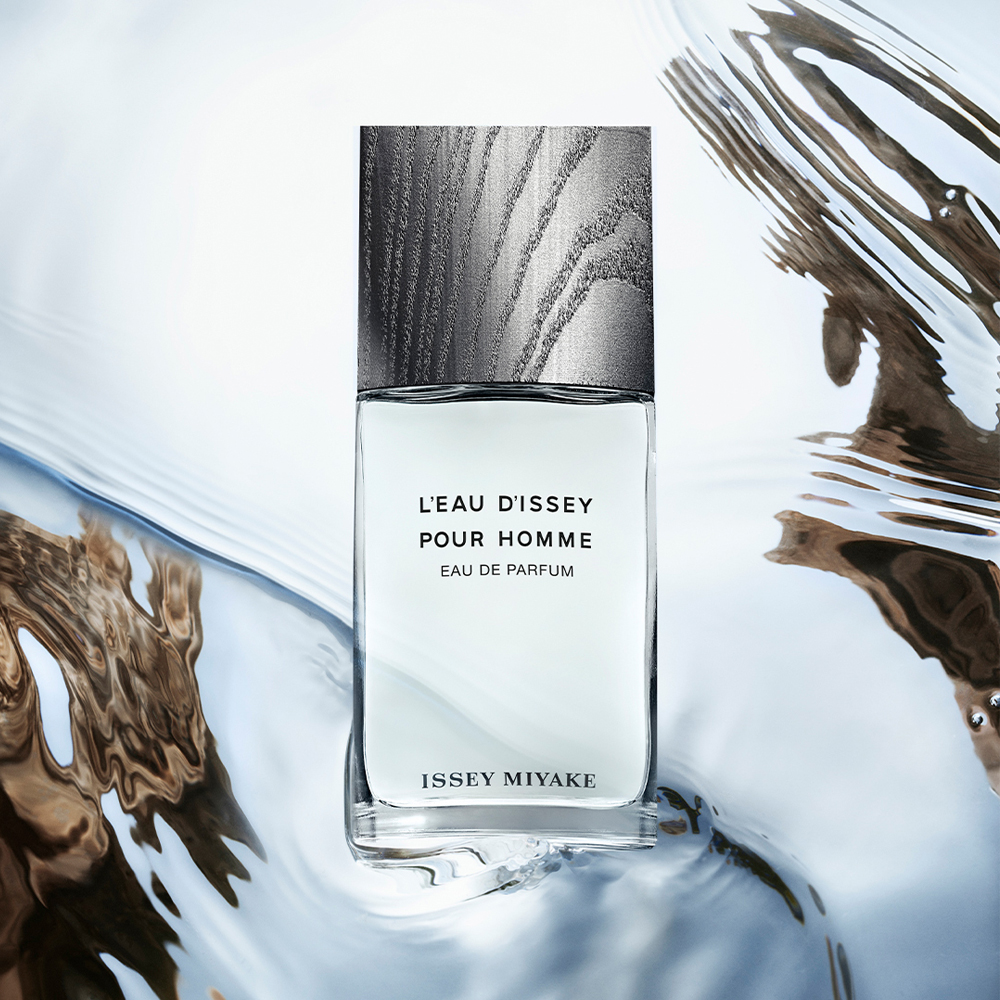
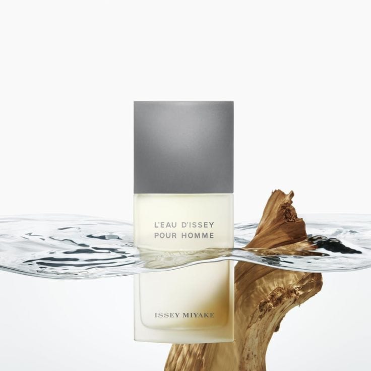
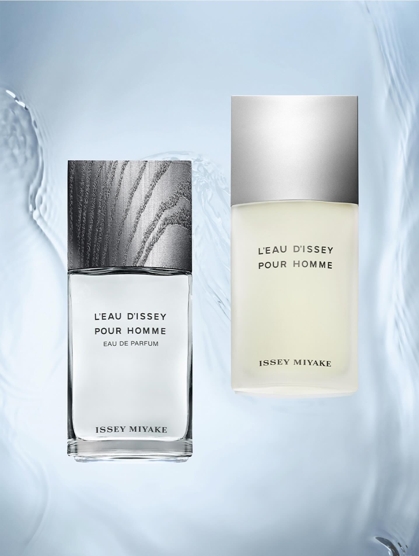
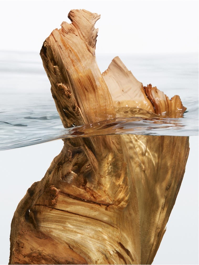
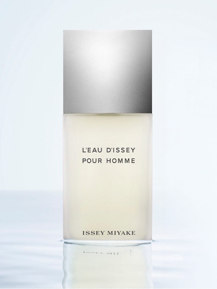
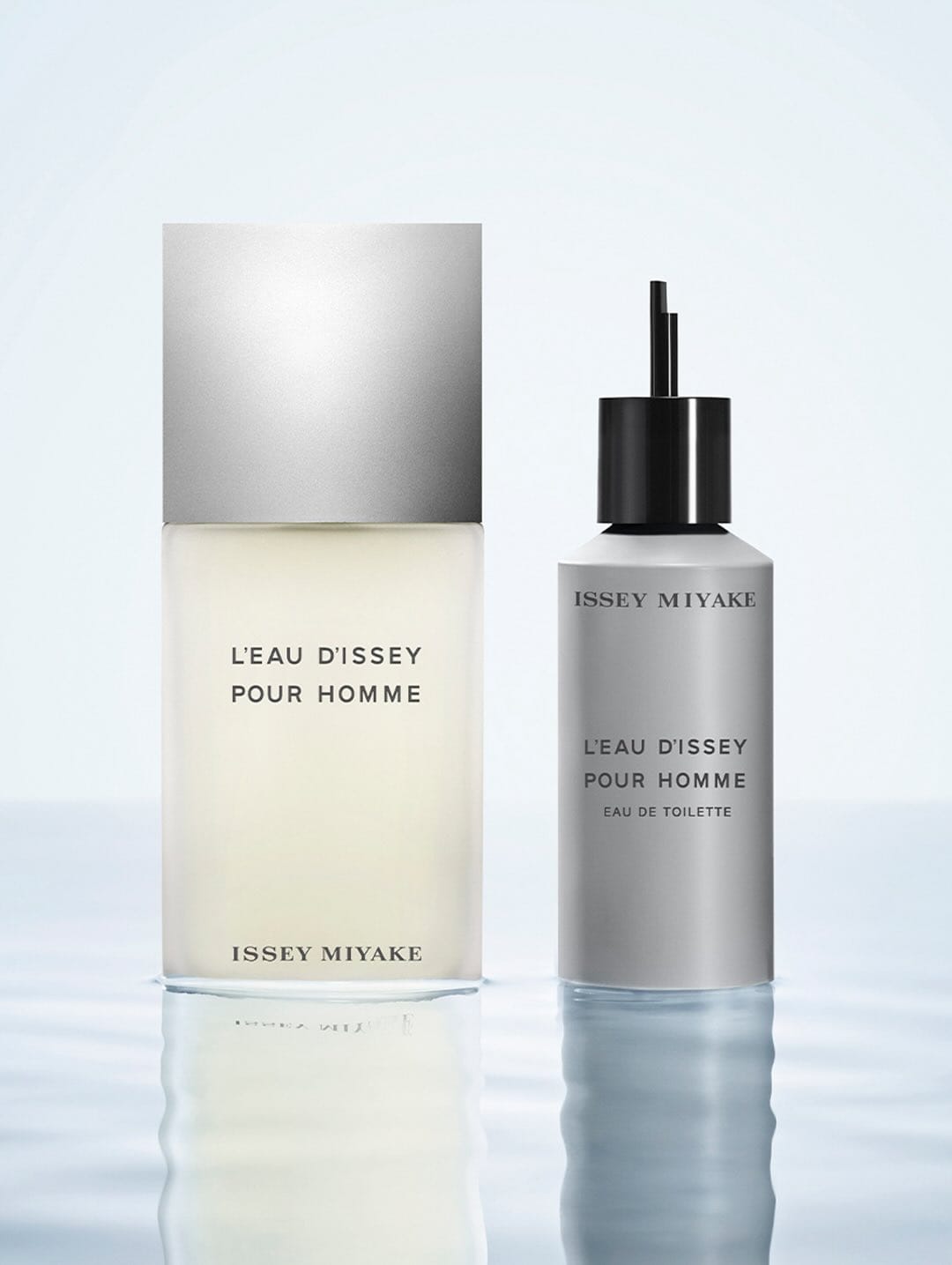
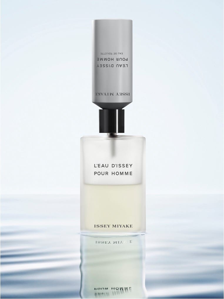
Beautiful ocean-inspired campaign for Issey Miyake (@isseymiyakeparfums)'s L'Eau d'Issey pour Homme by Alexis Rosenfeld (@alexis.rosenfeld). Minimalistic, clean, calming. Love the execution and the concept of the photos. The only thing is that metal cap on the perfume. It looks like a Photoshopped square. I wish there was more visual information about what it actually looks like. What shape is it? On one photo it's one shape, on another it's different. It makes me a bit confused as a customer. [Category: Fragrance] [Surface: Glass] [Lighting: Soft] [Style: Minimalist] [Mood: Sophisticated] [Palette: Neutral]
About the Author
Elina is a Ukrainian-Canadian commercial photographer based in Vancouver, British Columbia.
Get in touch
Instagram: @elina.kustlyvy
X (Twitter): @elinakustlyvy
Photographers: If I've featured your work and you'd like a credit or to be tagged, DM me your details. I'm happy to update and showcase your name.