Element Eight serum: Clinical luxury and controlled lighting
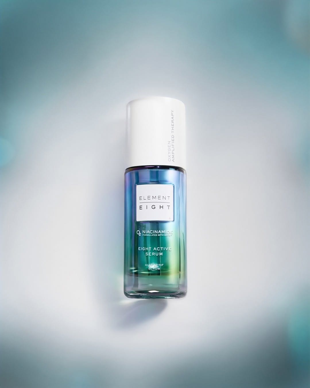
They're leaning into a really clean, clinically-luxury skincare story here for Element Eight (@elementeight). Shot by Andrew Macpherson (@andrewmacpherson_official), the concept-wise, the "not doing the most, just what works" line matches the image: the bottle feels confident and minimal, not trying to scream for attention, which supports a science-first, efficient formula narrative. Composition looks intentional and premium: product is clearly the focus, strong vertical presence, lots of negative space, and everything else (if anything) recedes into the background so your eye stays on the serum. The light is polished and controlled. Crisp speculars on the glass, even gradients, no harsh distractions. It reads as high-tech and oxygen/"air" adjacent rather than moody or cozy. Retouching feels tight, with clean edges, no dust, and a slightly perfected texture that still feels believable. The bottle really is the most memorable element: strong shape, luxe finish. But the shot itself sits more in "solid e-comm" territory than a highly iconic campaign visual. [Category: Skincare] [Surface: Glass] [Lighting: Soft] [Style: Minimalist] [Mood: Sophisticated] [Palette: Cool Tones]
Mugler Alien Pulp: Bold lighter pairing and dramatic styling
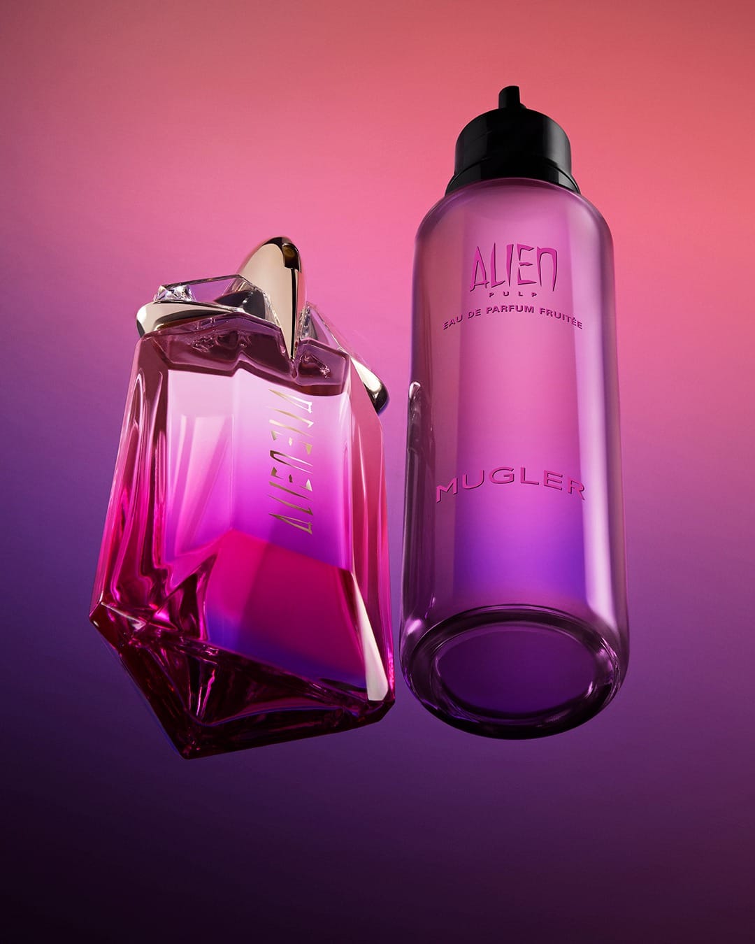
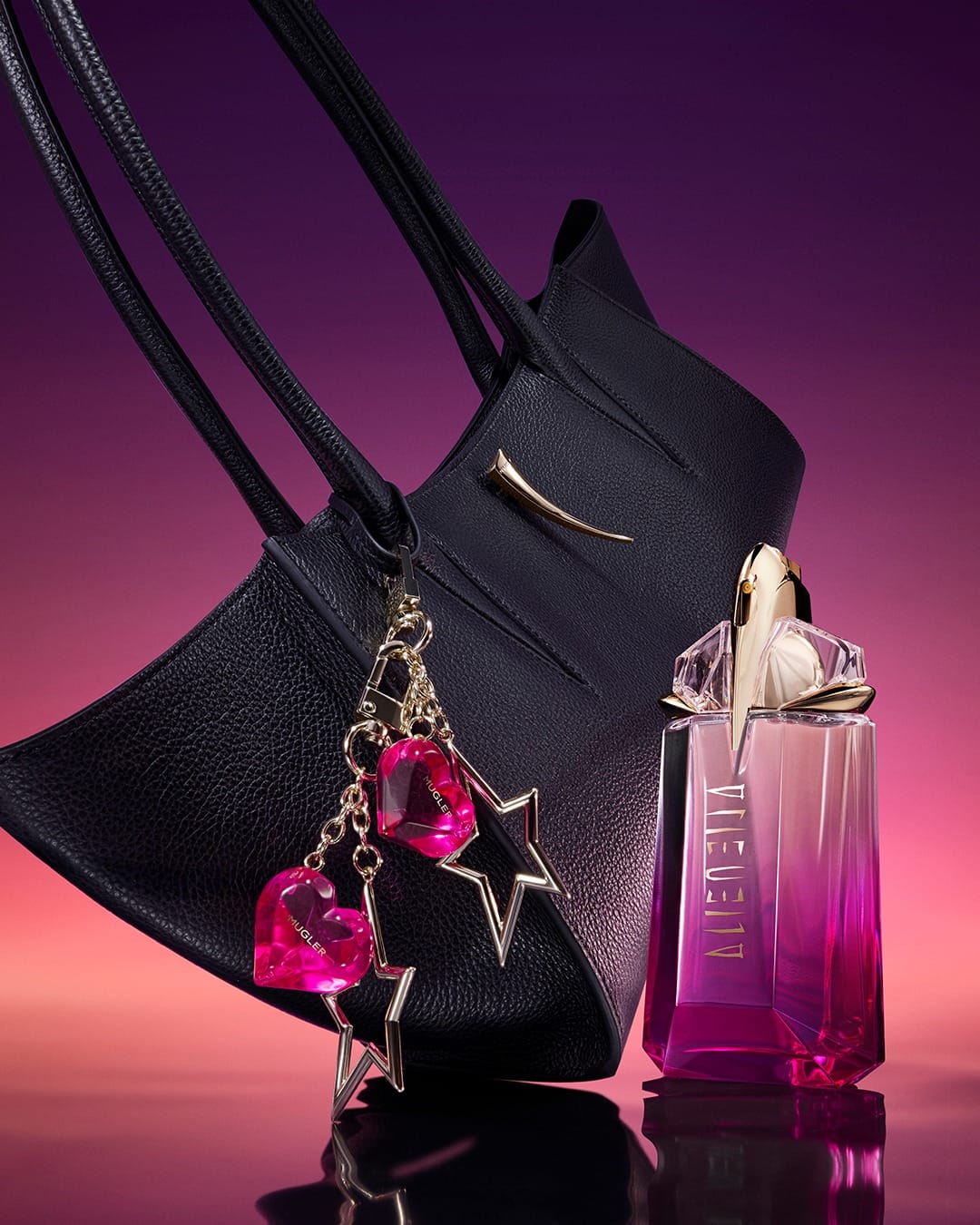
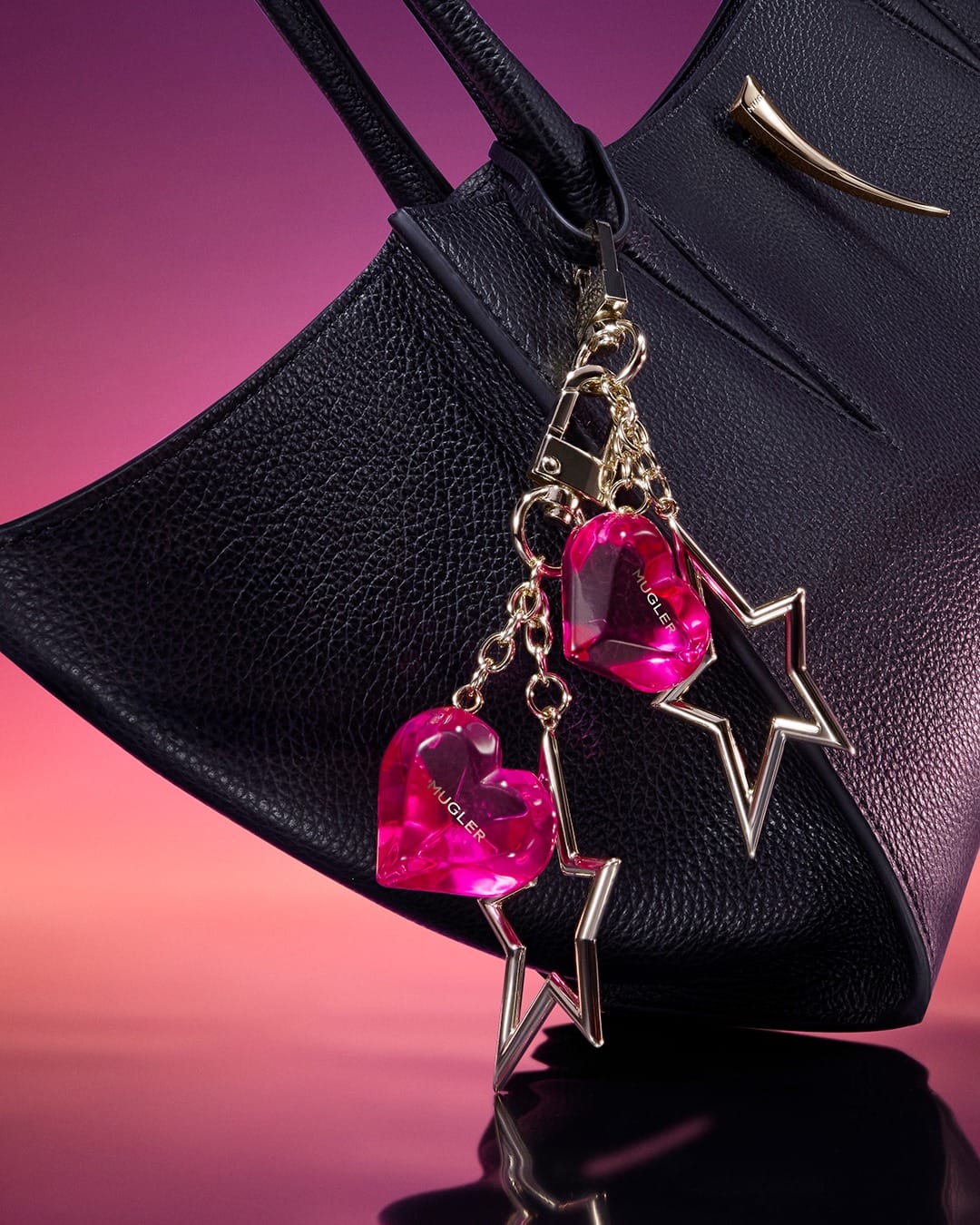
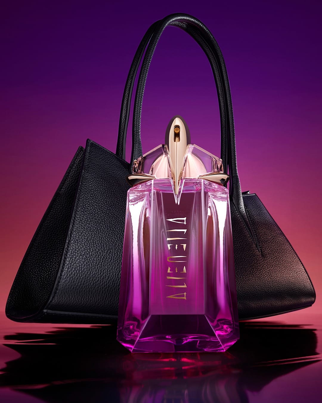
Strong, very on-brand commercial shot from Mugler (@muglerofficial), shot by Mario Godlewski (@mario_godlewski), that sells "temptation" without feeling cheap. Concept-wise, the pairing of fragrance and handbag is clever: it positions the perfume as a luxury accessory, reinforcing the idea that it belongs in your everyday essentials alongside a designer bag. The composition looks tight and intentional, with the objects arranged in a simple, graphic way that makes the bottle stand out while the bag works as a supporting prop, not a distraction. The lighting feels controlled and stylized, probably directional with crisp highlights and defined shadows so the glass, liquid, metal cap, and leather texture all pop against that gorgeous pink-to-purple gradient background. Retouching keeps everything clean and polished. It aligns well with Mugler's bold, slightly edgy aesthetic and is memorable because the handbag-fragrance pairing plants a visual idea in your head instead of being just another pretty perfume bottle shot. [Category: Fragrance] [Surface: Glass] [Lighting: Studio] [Style: Editorial] [Mood: Luxurious] [Palette: Vibrant]
Maison Francis Kurkdjian: Directional light on Baccarat Rouge 540
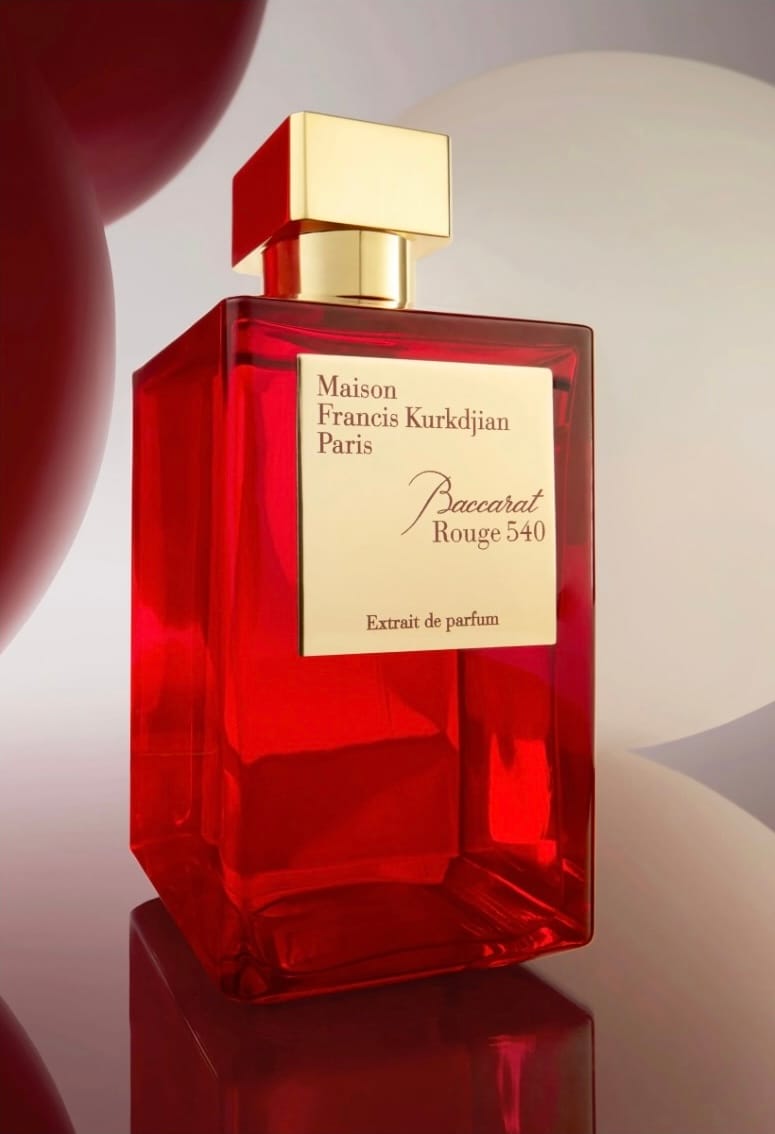
Concept-wise it's super clear for Maison Francis Kurkdjian's (@maisonfranciskurkdjian) Baccarat Rouge 540, shot by Enlarge Photography (@enlarge.photography): high-end, intense, collaborative luxury moment between Baccarat Rouge 540 and Galeries Lafayette India. Composition and light feel like a classic setup. Bottle and logo doing the heavy lifting, punchy directional light carving out the glass and red tones while staying clean and legible. The retouching is very polished-agency, dustless and contrasty with rich reds, so it's strong on brand alignment and reads as a solid luxury fragrance ad, even if it's not the most visually daring or experimental image you'll remember forever. [Category: Fragrance] [Surface: Glass] [Lighting: Soft] [Style: Clean] [Mood: Luxurious] [Palette: Warm Tones]
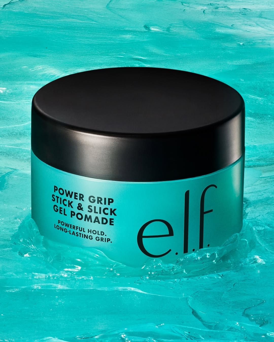
e.l.f. Cosmetics haircare: Bright, social-first product photography
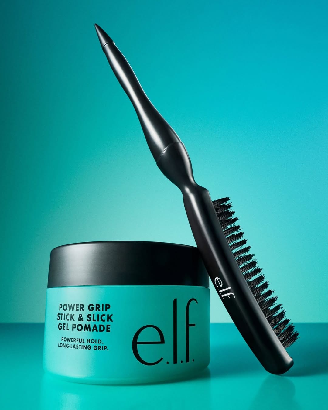
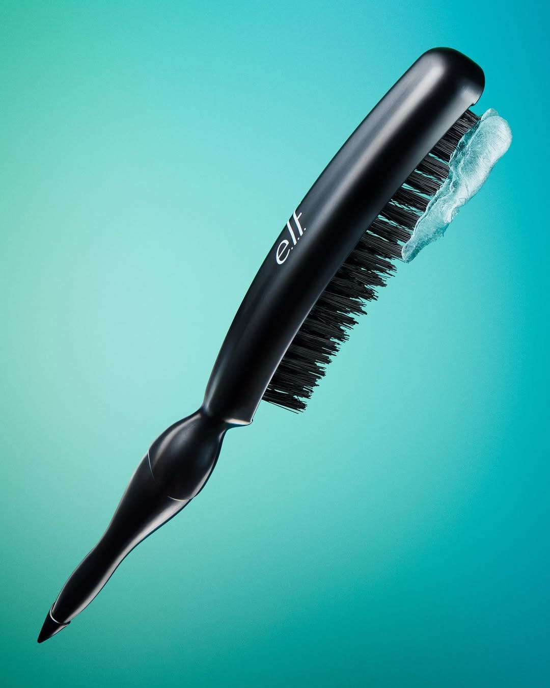
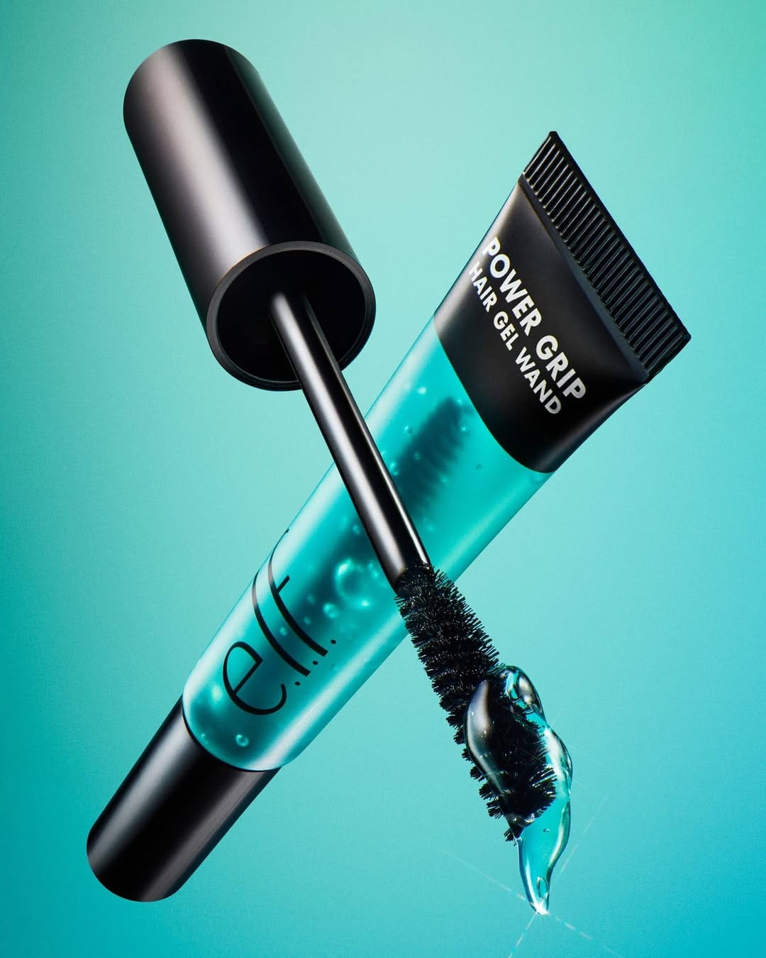
Concept-wise it's super clear: "strong, shiny, easy hair," very TikTok-viral energy. The composition is clean and product-first, so your eye hits the name and wand/gel right away. Lighting is bright and even, more "show the packaging and shine" than moody or artistic. Retouching is polished and invisible. Everything looks crisp, smooth, and a bit extra glossy. It fits e.l.f. (@elfcosmetics)'s affordable-fun vibe perfectly and is memorable mainly because it loudly announces, "oh, they have hair stuff now." The Power Grip line already went viral for its grippy primer texture, so bringing that same energy to haircare makes sense for their social-first audience. [Category: Cosmetics] [Surface: Plastic] [Lighting: Studio] [Style: Commercial] [Mood: Fresh] [Palette: Cool Tones]
Clé de Peau Beauté skincare: Luminous textures and ritual storytelling
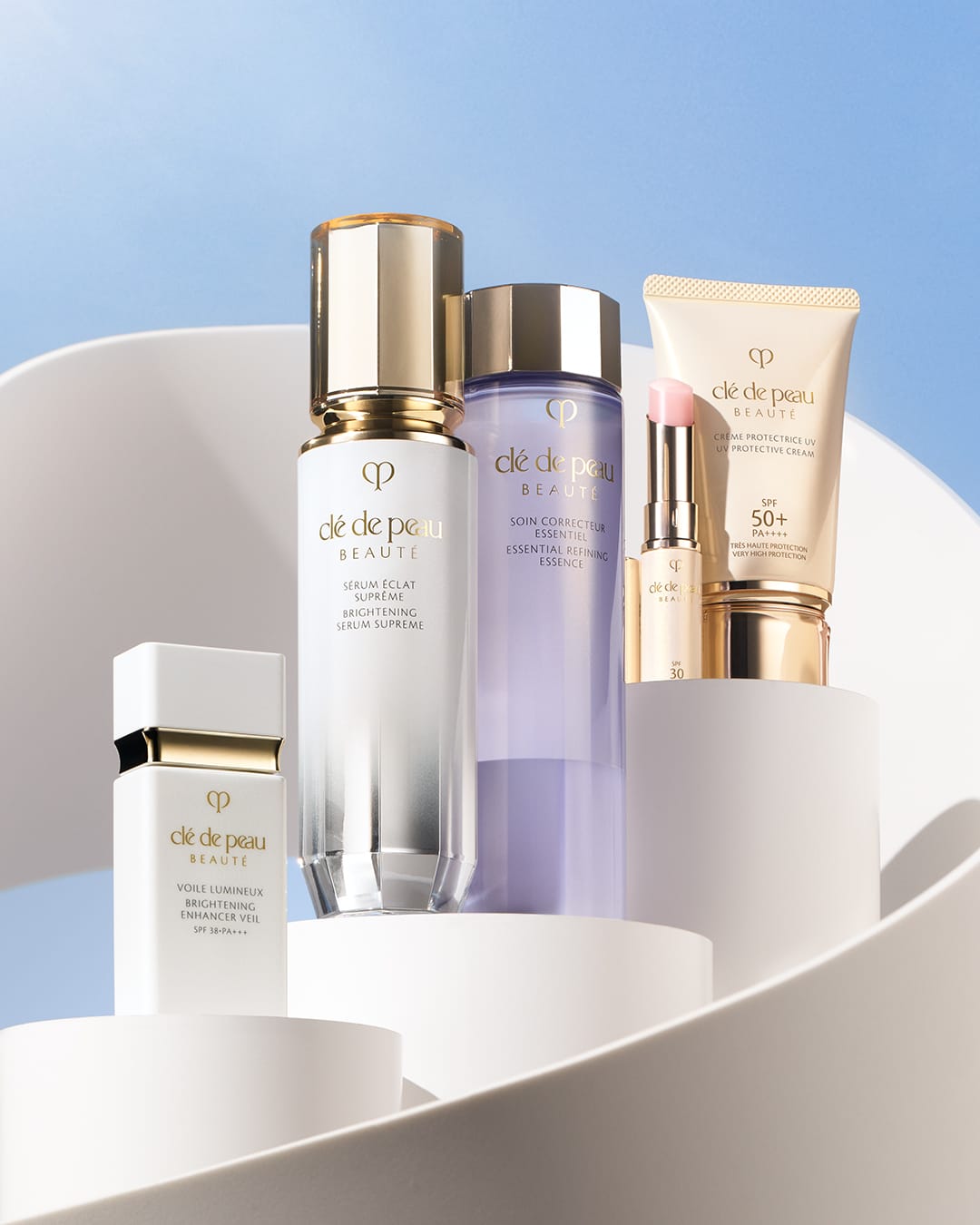
Feels like a super polished "luxury ritual" story for Clé de Peau Beauté (@cledepeaubeaute): the concept is clear (4-step path to radiance), composition is likely symmetric and ordered enough that your eye moves product to product without friction, and the copy backs that up. Light and retouching look clean, luminous, and texture-friendly rather than overly glossy, very on-brand for a science-meets-luxury skincare house. Strong piece overall, though memorability probably leans more on brand equity and consistency than on a bold, unexpected visual idea. That said, I would work a bit more on the caps for the serum and essence. They look a bit flat and dull. [Category: Skincare] [Surface: Plastic] [Lighting: Studio] [Style: Clean] [Mood: Sophisticated] [Palette: Neutral]
About the Author
Elina is a Ukrainian-Canadian commercial photographer based in Vancouver, British Columbia.
Get in touch
Instagram: @elina.kustlyvy
X (Twitter): @elinakustlyvy
Photographers: If I've featured your work and you'd like a credit or to be tagged, DM me your details. I'm happy to update and showcase your name.