Boy Smells' Sephora launch: Receipt-driven storytelling and smart retail staging
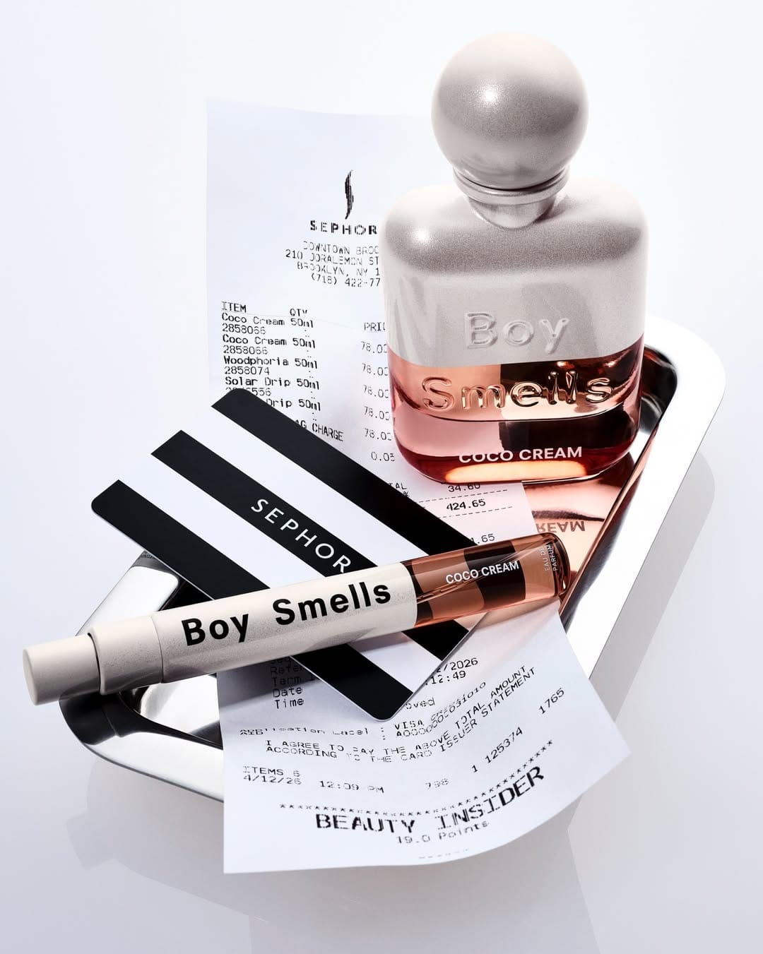
The concept for Boy Smells (@boy__smells) lands immediately: Sephora receipt, Beauty Insider points, the card. You know what they're selling and where to buy it within a second. That clarity without feeling heavy-handed is hard to pull off.
The chrome tray is doing quiet work. It grounds the composition, contains the scene, and the reflections add depth without extra lighting setups. The receipt is the smartest prop choice: functional, aspirational, and visually interesting all at once. Every element earns its place.
Bottle stays tallest, product hierarchy is correct. The bottom half gets slightly busy with the receipt layering and the mini, but that's a cropping problem more than a concept problem. Full shot for social, clean crop for web. Smart planning for Boy Smells' Sephora launch.
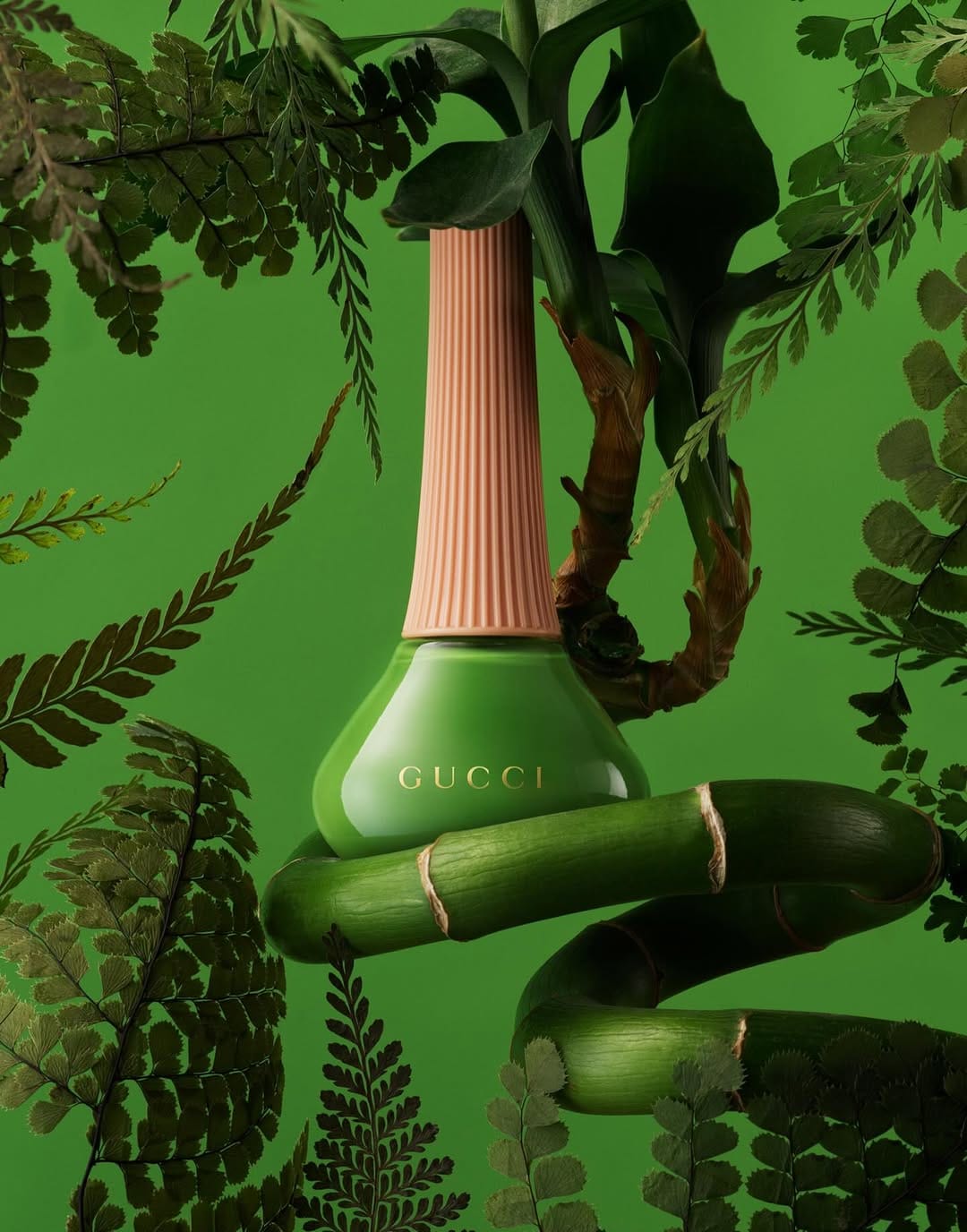
Gucci nail polish: Total green commitment with botanical layering

The color commitment here for Gucci Beauty (@guccibeauty) by Jonathon Kambouris (@the_mrjk) is total. Bottle, background, botanicals all locked into the same green, and it works because the tonal variation keeps it from going flat. The darker ferns framing the edges push the bottle forward without a single lighting trick needing to do that job.
The bamboo wrapping the bottle is the strongest choice. It ties the product to the botanical world without being generic "nature" staging. It's specific, structural, and visually interesting in a way that most floral prop work isn't.
The peach neck is the only contrast in the entire frame, and placing the gold Gucci logo right at that color break was deliberate and correct. The layering of real botanicals against what reads as a painted or composited background adds dimension that a straight studio shot wouldn't have. Lush without being chaotic, and nothing in this frame feels accidental.
Chanel Chance Eau Tendre: Conceptual bubbles in black and white
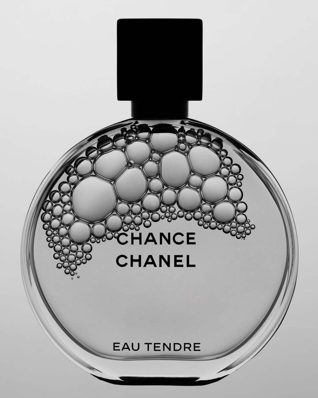
The bubble treatment for Chanel (@chanelofficial) is a smart way to reference the fragrance itself without showing liquid or a spray. It's conceptually connected to the product rather than just decorative, which is the right instinct.
Shooting in black and white strips out the actual color of Chance Eau Tendre, which is a significant trade-off. The pink is a core part of that product's identity, and losing it makes this feel more like a creative exploration than something you'd lead with.
The bubbles cascading from the cap down through the bottle read naturally, and the varying sizes keep it from feeling like a pattern. The typography placement works because the bubbles clear enough space for the logotype without crowding it.
Where it gets complicated is the bottle clarity. The circular form of Chanel's Chance bottle is one of its strongest design elements, and the bubble overlay competes with reading that shape cleanly. For an exploration shot it's interesting, but it would be tough to justify as a main image for that reason.
LORE Sublimity: Water, botanicals, and controlled tonal contrast
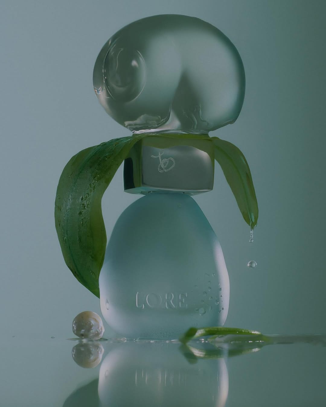
The water and botanicals communicate freshness and green notes without a single word for LORE (@loreworld) shot by Lauren Bamford (@laurenbamford). Dripping water, scattered droplets, the pearl, the reflective surface: everything builds a sensory picture specific to this fragrance profile.
Frosted bottle against muted teal is a strong tonal decision. The green leaves are the only contrast, which keeps the palette controlled while still giving the eye somewhere to land.
The reflection grounds the bottle without needing a prop tray, and the loose leaf and pearl at the base feel intentionally casual rather than over-styled. The water droplet mid-fall on the right is the detail that pushes this from a product shot into something with a moment in it.
107 Beauty scalp care: Clean glass shelf styling
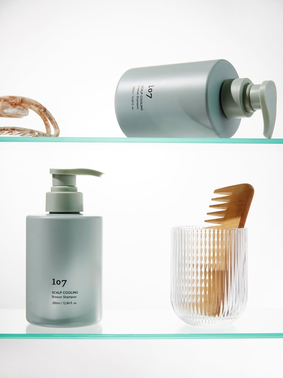
The two-shelf layout for 107 Beauty (@107beauty_global) lets you show the product from two angles without it feeling repetitive. Top shelf gets the upside-down detail shot, bottom shelf gets the full front-facing read. Smart format for a carousel post.
The glass shelves with the mint green edge suggest a bathroom context without showing a bathroom. Clean and product-focused without tipping into lifestyle.
The wooden comb earns its place: hair-adjacent, tactile, and the warm wood breaks the cool palette just enough. The tortoiseshell clip on the top shelf is less convincing, partially cropped and not adding much to the story.
Lighting is even and soft throughout, which suits the calm, clinical positioning of 107's scalp care product.
About the Author
Elina is a Ukrainian-Canadian commercial photographer based in Vancouver, British Columbia.
Get in touch
Instagram: @elina.kustlyvy
X (Twitter): @elinakustlyvy
Photographers: If I've featured your work and you'd like a credit or to be tagged, DM me your details. I'm happy to update and showcase your name.