Balmain Beauty fragrance: Metallic textures and tactile luxury styling
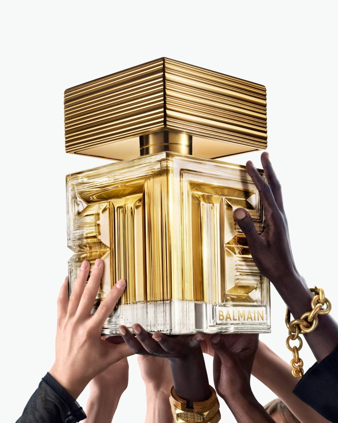
I love this concept from Balmain Beauty (@balmainbeauty) by Carlijn Jacobs (@carlijnjacobs). It feels like pure "everyone's obsession" energy in the best way. The metal and money pairing pushes that luxury/desire idea really clearly without feeling cheesy or overstyled. The contrast on the bottle and the way the highlights are handled gives it that polished, campaign-level finish while still reading very tactile and real. The labyrinth motif and gold striations on the bottle play nicely into that tactile quality without overpowering the composition. Overall it looks intentional, expensive, and very on brand for a modern Balmain launch. [Category: Fragrance] [Surface: Glass] [Lighting: Studio] [Style: Editorial] [Mood: Luxurious] [Palette: Warm Tones]
Chanel Rouge Allure Velvet: Natural reflections with intentional imperfection
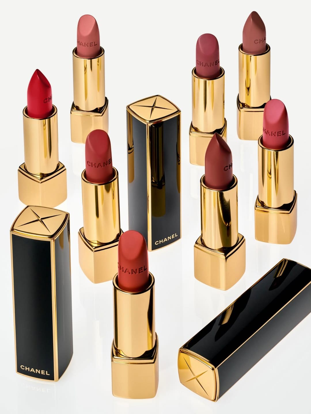
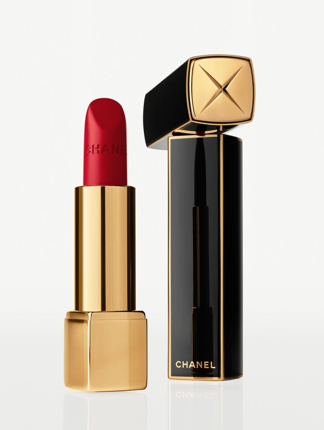
Another beautiful campaign from Chanel (@chanelofficial) shot by Karim Sadli (@karimsadli). I love that they're moving away from the unrealistic perfect image and going more toward real reflections, though still controlled. And even though it looks so imperfect, you can still see how much work and intention went into creating these images for the Rouge Allure Velvet collection. [Category: Cosmetics] [Surface: Metal] [Lighting: Bright] [Style: Commercial] [Mood: Luxurious] [Palette: Neutral]
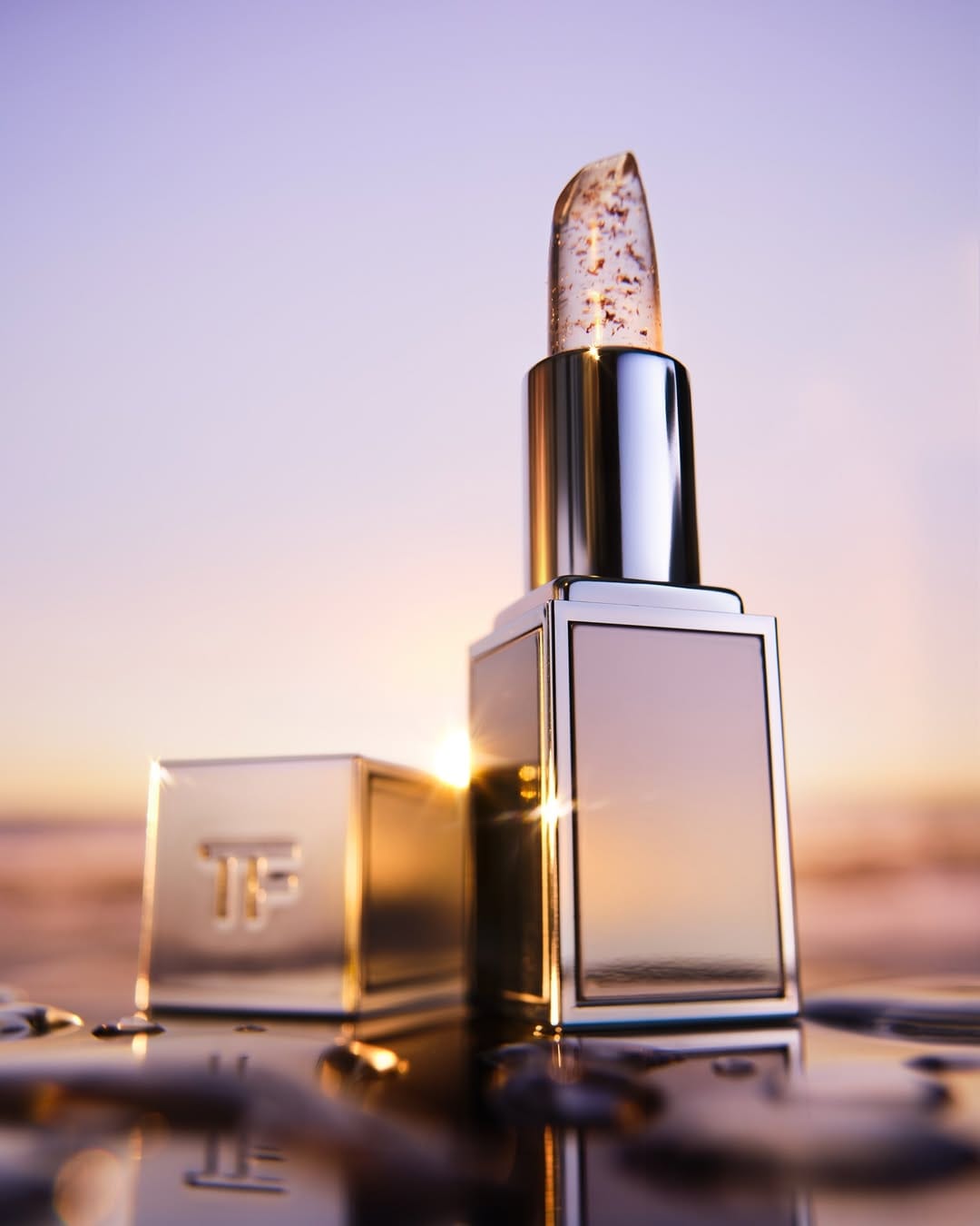
Tom Ford Beauty: Sunset-inspired lighting with warm-cold balance

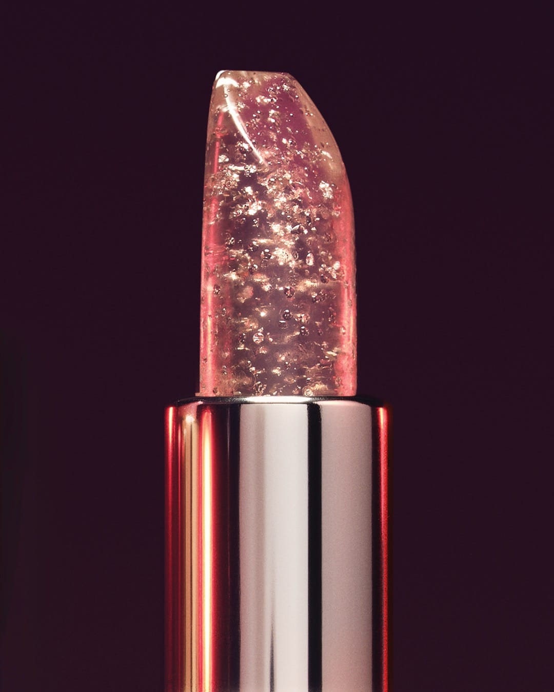
OMG this is a whole mood from Tom Ford Beauty (@tomfordbeauty) by Maxime Guyon (@maximeguyon)! Not only amazing color work impeccably replicating sunset light with warm and cold tones, but also the composition. Soft focus, central composition, and typical Tom Ford main image composition where the product stands solid on the ground. Catchlights on the stick and on the metal, that stunning gold edge of the stick, marvelous light on the metal and the textures. There is so much about the photo to talk about! Obsessed! [Category: Cosmetics] [Surface: Metal] [Lighting: Dramatic] [Style: Editorial] [Mood: Luxurious] [Palette: Warm Tones]
Guerlain fragrance photography: Soft focus and natural ingredient styling
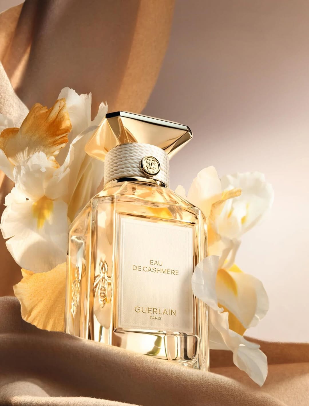
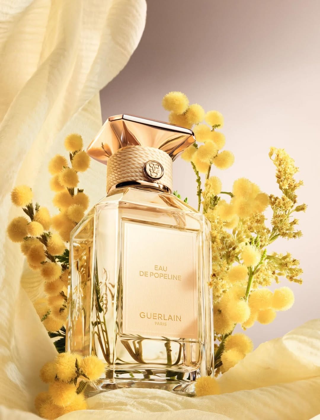
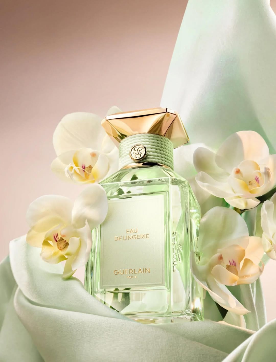
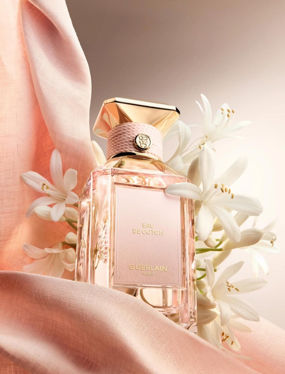
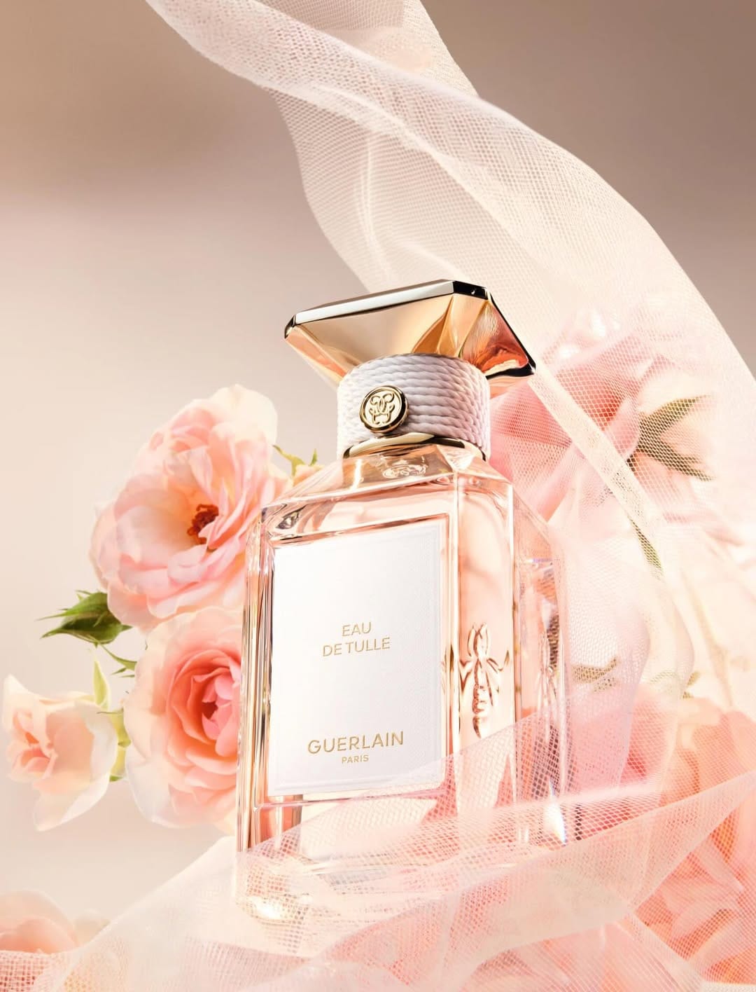
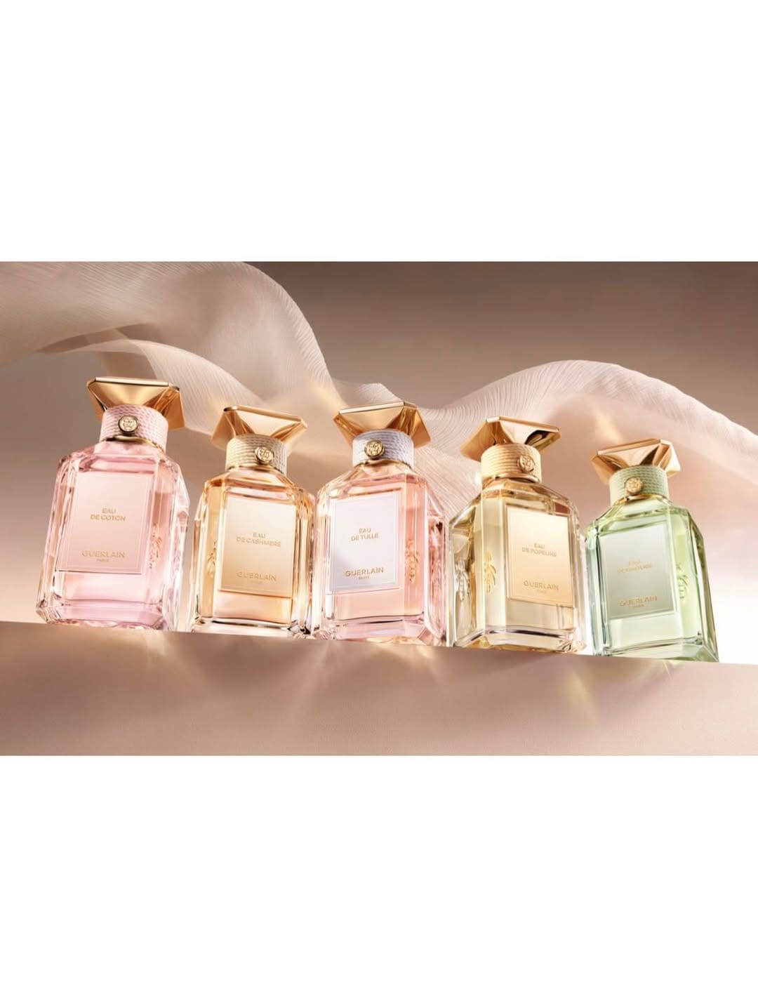
New fragrance collection by Guerlain (@guerlain) shot by Pol Baril (@polbaril), and the photos perfectly show what the scents are about. From a product photographer's view, I'm really enjoying the delicate light of the scene: cashmere and flowers, soft focus but also the detailed work compositing all the perfume elements. The collection's natural ingredients like rose, vanilla, and iris come through in how they've lit and styled everything. [Category: Fragrance] [Surface: Glass] [Lighting: Soft] [Style: Artistic] [Mood: Elegant] [Palette: Warm Tones]
Nars lip gloss: Clean e-commerce with a color cast question
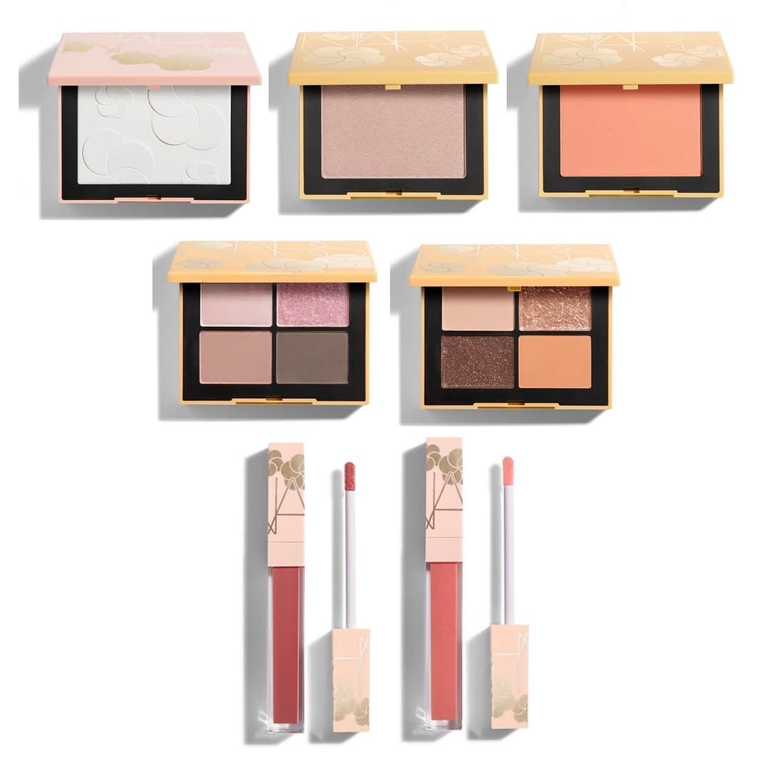
Simple, clean e-commerce work from NARS Cosmetics (@narsissist) that does the job. The lighting's even, the product's sharp, and there's nothing getting in the way of seeing what you're buying.
One thing bugs me though: why does the applicator wand read purple when it should be white? Could be a white balance issue or maybe the reflections from the product are bouncing color back onto it. Either way, it's distracting once you notice it.
Otherwise, solid product photography. Nothing fancy, but it doesn't need to be.
About the Author
Elina is a Ukrainian-Canadian commercial photographer based in Vancouver, British Columbia.
Get in touch
Instagram: @elina.kustlyvy
X (Twitter): @elinakustlyvy
Photographers: If I've featured your work and you'd like a credit or to be tagged, DM me your details. I'm happy to update and showcase your name.